Ekundayo E.O. Environmental monitoring
Подождите немного. Документ загружается.

Visual Detection of Change Points and Trends Using Animated Bubble Charts
331
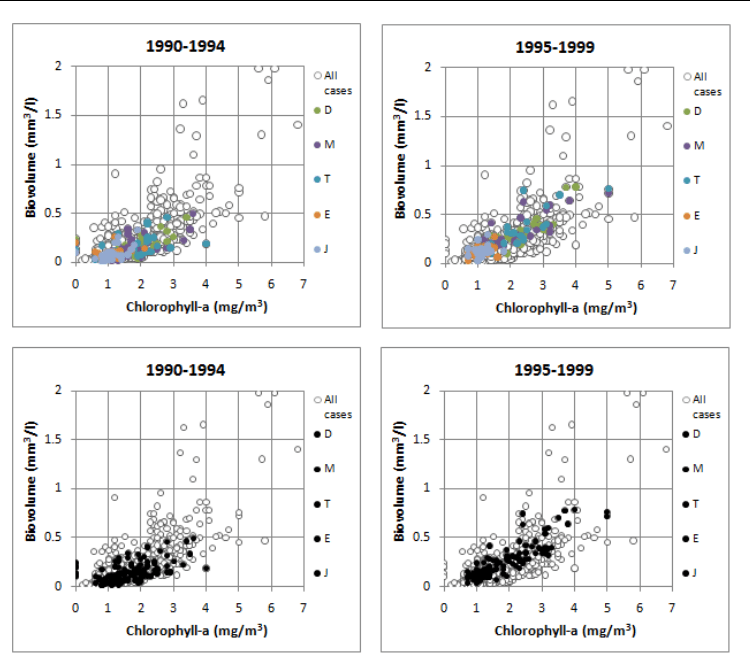
the content of chlorophyll-a changed very little. It should also be kept in mind that if
different colours are used in the same panel, they may interfere with each other. Spatial
patterns in strong colours may conceal patterns in light colours, if the background is
white.
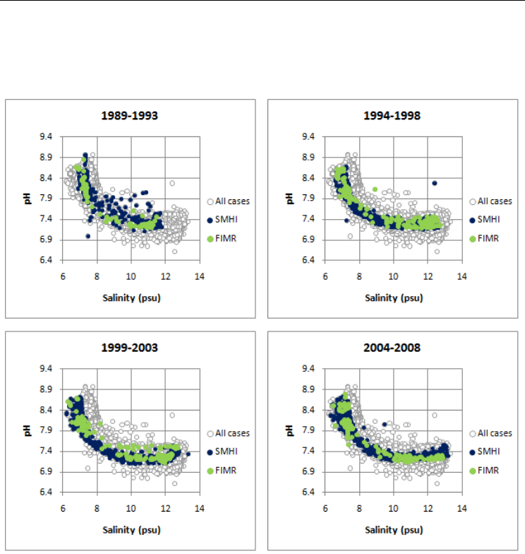
Fig. 2. Four consecutive frames from an animation of salinity and pH data for seawater
samples collected in the Eastern Gotland Basin in the Baltic Proper (sampling site BY15) and
analysed by the Swedish Meteorological and Hydrological Institute (SMHI) and the Finnish
Institute of Marine Research (FIMR).
Size-coding of bubble chart markers is another tool that should be employed with great
caution, unless the user actually wants to suppress some data points or the dataset is so
small that the markers can be inspected one by one. Furthermore, it is worth noticing
that the (average) size of the markers has a strong impact on the perception of a pattern
formed by a set of markers . Markers that are too small tend to blur the contours of a cloud
of points, and large markers can make it difficult to comprehend the number of points in
different subsets of data.
Environmental Monitoring
332
Fig. 3. Bubble charts of phytoplankton data from three sites in Lake Vänern (D,
Dagskärsgrund N; M, Megrundet N; T, Tärnan SSO) and two sites in Lake Vättern (E,
Edeskvarnaån NV; J, Jungfrun NV) in Sweden. The coloured markers in the upper panels
have been changed to black markers in the lower panels. Data source: the Swedish
University of Agricultural Sciences (SLU).
4.2 Jittered bubble charts
A jittered plot adds some random noise to the x or the y coordinate, or both. Such plots are
particularly useful for categorical and ordinal data, because they can give a realistic visual
impression of the number of cases in different parts of the chart. In environmental
monitoring, jittered plots are particularly useful when the x coordinate represents a class
variable such as month or season, or the y coordinate represents a count variable such as the
number of species found in the analysed sample.
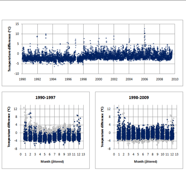
Figure 4 illustrates a suspected artificial level shift in temperature data from the Czech
Republic. The time series plot indicates that the temperature difference between the two
investigated meteorological stations increased in 1998. By using a jittered plot to visualize
the differences by month, it can be seen that the level shift was present during all seasons
and was particularly pronounced during the warmer months.
Visual Detection of Change Points and Trends Using Animated Bubble Charts
333
Fig. 4. Ordinary time series plot and jittered bubble charts of the difference in daily mean
temperatures between the meteorological stations Protivanov and Jevičko in the Czech
Republic. A small amount of noise has been added to the month number. Data source: the
Czech Hydrometeorological Institute, Brno.
4.3 Bubble charts with trend lines
When there is pronounced seasonal variation in the collected data, it may be of interest to
animate changes in trend slopes by month. This can be achieved by using the month as
animation variable and one of the built-in trend line options in Excel®. Figure 5 shows long-
term temperature trends in central England, and the four panels draw attention to the fact
that the trend slope gradually decreases from March to June. In principle, this pattern could
have been revealed by producing a series of static plots. However, this process can be
automated by using software for animation. In addition, animation can help to identify
between which months of the year that the major changes in trend slopes occur. Such
differences in slopes between adjacent months can be further accentuated by standardizing
the data so that differences in monthly means are eliminated.
Environmental Monitoring
334
Fig. 5. Four consecutive frames from an animation of trends by month for the Central
England Temperature series compiled by the Hadley Centre, UK.
4.4 Gradient charts
In many environmental monitoring programmes, the sampling sites have a natural order.
For example, samples from the marine environment are often taken along salinity or depth
gradients, air pollutants are measured at different distances from a point source, and river
water quality can be measured at different runoff levels. This calls for techniques that can
efficiently visualize how relationships between two or more variables change along a
gradient.
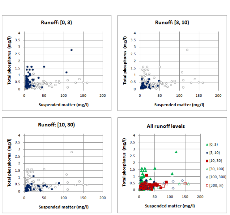
Figure 6 illustrates in two different manners how the relationship between the
concentrations of phosphorus and suspended matter in a small stream varies with the
runoff level. It is obvious that, compared to a static chart in which colour- and shape-
coded markers are used to indicate runoff levels, an animated display has two
advantages. First, there is no perceptual interference between the different subsets of data.
Second, the analyst can inspect one highlighted subset while the previous subset is still
fresh in memory.
Visual Detection of Change Points and Trends Using Animated Bubble Charts
335
Fig. 6. Relationship between the concentrations of phosphorus and suspended matter in
stream water from an agriculture-dominated catchment in southern Sweden. Data source:
the Swedish University of Agricultural Sciences (SLU), catchment code N33.
4.5 Score charts for a pair of principal components
When the collected data are multivariate and the coordinates are strongly correlated,
important information can be obtained from score charts in the coordinate system
determined by the first two principal components. An animation can refine such
information by highlighting data points by time or group. As in the gradient plots in the
previous section, the advantage of an animated display is that there is no perceptual
interference between the different subsets of data.
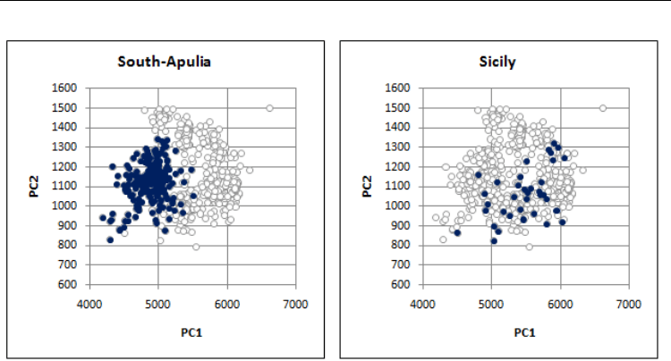
Figure 7 shows an animation of regional differences in the chemical composition of olive oil
from different regions in Italy. The score charts draw attention to the fact that some groups
of objects are more heterogeneous than others. By ordering the regions from south to north,
or according to some characteristic of the areas, this type of animations can also highlight
various gradients in the chemical composition.
Environmental Monitoring
336
Fig. 7. Two frames from an animation of score charts derived from a dataset containing
information about the content of eight different fatty acids in olive oil from nine different
regions in Italy. Raw data were obtained from the Ggobi Website.
5. Computational aspects
The technical performance of Excel-based animations is markedly influenced by the
technique that is used to update the content of the worksheet cells. In particular, the
computational time can be reduced considerably, if large arrays are updated by a single
command rather than by creating a loop in which individual cells are updated one by one.
The performance can also be improved by turning off the automatic screen updating and
the automatic calculation of worksheets during parts of the execution of the animation
macro.
The design of the markers in the bubble chart is yet another factor that strongly influences
the computational time. It takes longer to update large bubbles than small markers, and
more elaborate bubbles that resemble 3D balls can greatly retard the animation.
Test runs using a dataset comprising 10,000 cases showed that a chart with 400 highlighted
bubbles could be updated in less than two seconds on a standard PC. If the dataset is
substantially larger, it may be preferable to base the animation on a (random) sample of the
original data.
6. Discussion
When multiple views or complex graphical coding of multivariate data are used to bring
loads of information into a single display, there is a considerable risk that the data
representation will be visually impenetrable. Displays with multiple views can suffer from
visual fragmentation, and perceptual interference can occur between different graphical
codes in the same display (Healey, 2000; Bartram, 2001). The animated bubble charts
presented in this article represent an attempt to simultaneously reduce visual fragmentation
and perceptual interference.

Visual Detection of Change Points and Trends Using Animated Bubble Charts
337
The static background composed of open markers showing the distribution of the entire
dataset enables rapid assessment of the distribution of a highlighted subset of data points.
Moreover, the animation facilitates detection of change, because the analyst can inspect the
shape and size of a highlighted point cloud while the previous point cloud is still fresh in
memory.
Using filled markers of standardized shape makes it easier to discern the colour coding.
Further, perception of a scatter plot can be strongly affected by the size of the markers, and
hence it is worth noting that the built-in scaling feature in Excel can be used to reduce or
increase the size of the bubbles in the charts. However, as emphasized in the introduction,
only a few different colours and bubble sizes can be readily distinguished by visual
inspection, and there may be perceptual interference between colour and size coding
(Healey, 2000; Bartram, 2001). In addition, it should be mentioned that static visualizations,
such as a small multiples display, are still viable alternatives to animated graphs (Robertson
et al., 2008).
Much of the work presented here was inspired by Rosling and co-workers (Gapminder,
2011), who demonstrated that the animated bubble chart is a powerful tool for visualizing
temporal trends in official statistics and other data collected annually for a set of objects.
When one variable is plotted against another, and a video is created to simultaneously
display changes over the period of data collection, the motion of the bubbles can draw
attention to subsets of objects that move simultaneously in the same direction. Similarly, the
motion makes it easier to identify deviating objects that move in a completely different
direction.
Our work here has demonstrated that animated bubble charts are also very useful for
inspecting temporal changes in the shape and size of 2D point clouds. For example, such
animations can efficiently reveal changes in the presence of outliers or in the conditional
mean and variance of one variable given another. Moreover, detection of change across time
or groups can be greatly facilitated if open bubbles representing the entire dataset are
allowed to form a static background, while selected subsets of data points are sequentially
highlighted at a rate determined by the user.
Also, it should be noted that animated bubble charts can be useful, even if the order of the
highlighted subsets lacks meaning. Without writing any computer code, a large number of
simple bubble charts can be created and inspected at a pace determined by the analyst. Our
animated 2D score charts represent yet another example of a time-saving procedure that can
create a good overview of a complex dataset.
This article has focused on construction of animated bubble charts in a spreadsheet
program where charts that are added are automatically updated when the contents of
some worksheet cells are updated. Other software or programming environments can
provide other solutions to animation problems. In R, for instance, a sequence of frames
representing different time stamps are combined into a video prior to the animation,
whereas the Google gadget Motion Chart provides several means of interaction. The main
technical advantages offered by the Excel-based animations presented here are flexibility
and the capacity to handle fairly large datasets. Test runs showed that, compared to
Google Motion Chart, our tools can handle larger datasets. Furthermore, they are very
flexible in three respects: (i) an arbitrary numerical or string variable can be used to
determine the order in which different subsets of data are highlighted; (ii) any Excel tool
can be used to modify the design of the bubble chart prior to the animation; (iii)
multidimensional data can be scrutinized by first performing a principal components

Environmental Monitoring
338
analysis and then animating a score chart in which the observations are plotted in a
coordinate system determined by the first two eigenvectors.
7. Conclusions
Our study demonstrated that animated bubble charts can facilitate detection of change
points and trends. More specifically, we emphasized that such charts have the following
advantages:
i. the analyst can inspect the shape and size of a highlighted point cloud while the
previous point cloud is still fresh in memory;
ii. bubble charts in which the entire dataset is allowed to form a static background put the
high-lighted subset into a wider perspective;
iii. animations are time-saving procedures that can readily create a good overview of
complex datasets.
Furthermore, we showed that our Excel-based software solutions are very flexible in three
respects:
i. an arbitrary numerical or string variable can be used to determine the order in which
different subsets of data are highlighted;
ii. any Excel tool can be used to modify the design of the bubble chart prior to the
animation;
iii. multidimensional data can be scrutinized by first performing a principal components
analysis and then animating a score chart in which the observations are plotted in a
coordinate system determined by the first two eigenvectors.
In summary, our results demonstrate that animation can simultaneously reduce visual
fragmentation and perceptual interference.
8. Acknowledgements
The authors are grateful to the Swedish International Development Cooperation Agency
(SIDA) and its Department for Research Cooperation (SAREC), and the Faculty of Science
(FOS) at the National University of Laos (NUOL) for providing financial support and
facilities for this research. We are also grateful to the Swedish University of Agricultural
Sciences, the Swedish Meteorological and Hydrological Institute, and the Czech
Hydrometeorological Institute for supplying environmental data.
9. References
Asimov D. The grand tour: A tool for viewing multidimensional data. SIAM. Journal of
Science and Statistical Computing 1985; 6:128–143.
Bartram LR. Enhancing information visualization with motion. PhD Thesis, School of Computer
Science, Simon Fraser University, 2001.
Becker RA, Cleveland WS. Brushing scatterplots. Technometrics 1987; 29:127-142.
Becker RA, Cleveland WS, Wilks AR. Dynamic graphics for data analysis. Statistical Science
1987; 2:355-396.

Visual Detection of Change Points and Trends Using Animated Bubble Charts
339
Bederson B, Boltman A. Does animation help users build mental maps of spatial
information? Proceedings of the 1999 IEEE Symposium on Information Visualization
(InfoVis 1999), San Francisco, CA, Oct 1999.
Bundesen C. A theory of visual attention. Phsychological Review 1990; 97:523 – 547.
Caussinus H, Mestre O. Detection and correction of artificial shifts in climate series. Applied
Statistics 2004; 53:405-425.
Cleveland WS, McGill R. Graphical perception: Theory, experimentation, and application to
the development of graphical methods. Journal of the American Statistical Association
1984; 79:531-554.
Cook D, Swayne, DF. 2007. Interactive and Dynamic Graphics for Data Analysis – with R
and Ggobi. New York: Springer Verlag.
Gilmore W, Gertman D, Blackman H. User-Computer Interfaces in Process Control: A
Human Factors Engineering Handbook. Academic Press: San Diego, 1989.
Hawkins DM. Testing a sequence of observations for a shift in location. Journal of the
American Statistical Association 1977; 72:180-186.
Hawkins DM. Fitting multiple change-point models to data. Computational Statistics and Data
Analysis 2001; 37:323-341.
Healey CG. Building a perceptual visualisation architecture. Behaviour and Information
Technology 2000, 19:349-366.
Hochheiser H, Baehrecke EH, Mount SM, Shneiderman B. Dynamic querying for pattern
identification in microarray and genomic data. Proceedings of the IEEE Multimedia
Conference and Expo, July 2003, Baltimore, MD, 2003.
Landesberger TV, Bremm S, Rezaei P, Schreck T. Visual analytics of time dependent 2D
point clouds. Computer Graphics International 2009; pp 97–101.
Newton C. Graphics: From Alpha to Omega in Data Analysis. In Graphical Representation of
Multivariate Data. Academic Press: New York, 1978; pp 59-92.
Robertson G, Fernandez R, Fisher D, Lee B Stasko J. Effectiveness of animation in trend
visualization. Visualization and Computer Graphics 2008; 14:1325–1332.
Srivastava MS, Worsley KJ. Likelihood ratio tests for a change in the multivariate normal
mean. American Statistical Association 1986; 81:199-204.
Stephens DA. Bayesian retrospective multiple-changepoint identification. Journal of the Royal
Statistical Society: Series C 1994; 43:159-178.
Swayne DF, Lang DT, Buja A, Cook D. GGobi: evolving from XGobi into an extensible
framework for interactive data visualization. Computational Statistics and Data
Analysis 2003; 43:423-444.
The GGobi website. http://www.ggobi.org/ [12 July 2011]
The Gapminder website. http://www.gapminder.org/ [12 July 2011]
The Google website.
https://docs.google.com/templates?type=spreadsheets&q=motion+chart&sort=ho
ttest&view=public [12 July 2011]
The Australian Bureau of Statistics website.
http://www.abs.gov.au/websitedbs/d3310114.nsf/home/Population%20Pyramid
%20-%20Australia [12 July 2011]

Environmental Monitoring
340
Unwin AR, Wills G. Eyeballing time series. Proceedings of the 1988 ASA Statistical Computing
Section 1988; pp 263−268.
Ware C. Information Visualization: Perception for Design (2
nd
edn). Morgan Kaufmann
Publishers, 2004.