Lawson B. How Designers Think: The Design Process Demystified
Подождите немного. Документ загружается.


architects illustrate this variation. Sir Denys Lasdun clearly sees
the architect as having a responsibility to lead the client forward:
Our job is to give the client not what he wants but what he never
even dreamt he wanted . . . what I have previously said about the client
affects the methodology of design.
(Lasdun 1965)
By contrast at around the same time, Sir Basil Spence was to
portray the architect as a ‘tailor who measures the thin chap and
the fat chap and makes them both comfortable’. For Spence the
architect was most definitely not a reformer.
I have found that one of the characteristics which many very
good designers share in common is the extent to which they focus
on the client and see the client playing a role in the very design
process itself. Certainly a supportive and understanding client
can make an enormous difference to the success of a project, as
Michael Wilford has pointed out:
Behind every building of distinction is an equally distinctive client, not
necessarily high profile, but one who takes the time and trouble to
comprehend the ideas of the architect, is supportive and enthusiastic,
who is bold, willing to take risks and above all can hold his or her nerve
during the inevitable crises.
(Wilford 1991)
A heartfelt plea to the client for this understanding comes from
Denise Scott Brown who talks of the client ‘letting you be on their
side’. Her partner, Robert Venturi explains how important and yet
delicate this can be:
you need not to worry about saying something stupid . . . you need
sometimes to think out loud and be free to say stupid things . . . and if
the client has faith this can often lead to something . . . we think that
architecture has to derive from collaboration and we learn a lot from
the client . . . we get some of our best ideas from clients, we love
collaborating with them.
(Lawson 1994)
Perhaps only the best designers have the confidence to allow their
clients into what is a delicate and easily disturbed creative process.
Users
As we have already seen, the needs of the clients of design and the
users of design are not always exactly the same. If a designer is lucky,
HOW DESIGNERS THINK
168
H6077-Ch10 9/7/05 12:34 PM Page 168
the client will express a single clear view on all matters relating to the
brief, although this is by no means always the case. Users, however,
are all different and likely to make differing demands on the final
design. The different kinds of users involved in buildings often makes
this extremely complex. In designing hospitals for example, I often
found that what seemed to be convenient for the nursing staff was
rather disliked by the patients. In investigating buildings in use I have
found that what students think makes a good lecture theatre can be
almost diametrically opposed to the views of their lecturers (Lawson
and Spencer 1978). Herman Hertzberger positively revels in this mass
of conflicting demands since his guiding principles are built around a
general concern for the inhabitants of buildings as people rather than
as representatives of the roles they play (Fig. 10.3). Resolving the
potential conflicts between these roles appeals to him:
I prefer, for instance, to make a school over making a house, because
the house I feel has too much of a constraint just to follow the particu-
larity and idiosyncrasy of just one person or couple. I prefer to have a
school where you have a board, you have teachers, you have parents
and you have children, and the users are all of them.
(Lawson 1994b)
In architecture, then, there are sometimes opportunities to involve
the users of buildings in the design process. One of the most
GUIDING PRINCIPLES
169
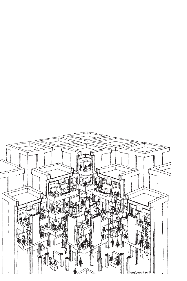
Figure 10.3
Herman Hertzberger’s famous
office building for Centraal
Beheer at Appledorn in Holland
is an example of a user-centred
approach to architecture
H6077-Ch10 9/7/05 12:34 PM Page 169

notable attempts to explore the implications of this is to be found in
the housing work of the Dutch architect Habraken who believed that
‘the process simply does not work if the occupants are not involved’.
This led Habraken to write his famous treatise, Supports, in which he
advocated the deliberate separation of those parts of the solution
which he thought must be determined by the architect from those
which he felt must be more capable of being determined by the
users. This leads to a design process which consciously allocates
responsibilities between designer and user (Habraken 1972).
Practical
The practical constraints offer fertile ground for guiding principles.
For those designers who are fascinated by the materiality and
process of making things, these practical constraints can offer major
generative design ideas. The so called ‘high-tech’ school of design
depends on the glorification of the technology and the expression
of the technology in a very self-conscious way.
In architectural design, the business of making buildings stand up,
span large spaces and withstand the forces of nature offer a whole
range of structural ideas. For some designers the structural elements
should describe how they do their job. Thus Richard Rogers tells us
that he designs each structural member to be efficient and reflect
the nature of the loads imposed upon it:
Tension chords become the thinnest of solids, compression members
are steel tubes; the differing diameters describe the various loads each
member must carry.
(Suckle 1980)
By contrast, Arthur Erikson tells us that:
I have long preferred in spite of structural inefficiency, the visual ambiguity
of columns and beams being the same size. Logically the beams should be
narrow and deep for bending moments and the columns in compression
proportionally smaller, but this makes for a great deal of visual tension.
(Suckle 1980)
The great architect and engineer Santiago Calatrava studied moving
folding structures for his doctorate. To this day he retains a keen
interest in the idea of ‘dynamic equilibrium’ in which structures
balance but in rather more athletic ways than the more normal, rather
static forms used in architecture. Calatrava is fascinated by the human
body and in particular its ability to move and thus take up a variety of
HOW DESIGNERS THINK
170
H6077-Ch10 9/7/05 12:34 PM Page 170

configurations each of which is stable and suitable for resisting a par-
ticular set of forces. The exhibitions of his work show how he explores
these ideas in abstract sculptures as well as in realised designs:
It is very good to do a sculpture because you can have it at home and
look at it every night, you can meditate on it and turn it. This is the only
quiet moment in the whole process to bring a project to realisation . . .
this focus is very important because it gives you a certain authority . . .
you can also show it to people and they understand.
(Lawson 1994b)
Calatrava is also fascinated by the properties of materials rather
than just the structural configuration of his work:
For me the antagonism between materials, especially materials like steel
and a material like concrete or stone creates a simple dualism which you
can see sometimes in the sculptures. I have done this with two or three
materials hitting each other.
Often we find the design ideas are not as new as they first seem,
and in this case Calatrava himself readily acknowledges the histor-
ical influence of Violet-le-Duc on his work. The interior designer
and architect Eva Jiricna also uses a design process very much
driven by decisions about materials:
In a way material dictates the concept . . . and materials are not inter-
changeable . . . to me the material really is the starting point of the
story.
(Lawson 1994b)
Keeping engineering and technology in the background can be a
guiding principle as much as expressing it. The product designer,
Dick Powell considers that they ‘should simply be slaves of the
market place’:
It’s people who determine what products are. We’ve been entrusted
with the task of trying to reflect what people want. We have to bend
technology to suit that purpose . . . our work is a constant compromise,
a half-way point between artistic creation and a logical engineering
approach to design.
(Gardner 1989)
This difficult balancing act is referred to by the architect Ian Ritchie
who has something of a ‘high-tech’ reputation but who neverthe-
less does not feel that technology is a design generator for him:
When people ask me this question I use an analogy. I describe this
beautiful parrot sitting on my shoulder – multi-coloured, very beautiful –
called ‘technology’. Very often he leaps off the shoulder and onto the
GUIDING PRINCIPLES
171
H6077-Ch10 9/7/05 12:34 PM Page 171

paper and shits all over it before we’ve actually started thinking and you
have to get hold of him and stick him back up there. He is tame, he
does behave himself and he doesn’t always end up in the project at all,
but he’s there and we talk to him all the time.
(Lawson 1994)
Radical
The radical constraints may offer the most obvious source for a
set of guiding principles in design, but actually it turns out not to
be so. The very central purpose and reason for existence of the
object being designed will inevitably be at the centre of the
attention of any good designer, and so hardly needs any further
focus. Of course such constraints are also often so specific and
local to the problem that they rarely offer a opportunity for more
generic investigation. Some designers, however, do become
known for specialising in certain kinds of problems and, thus, sets
of radical constraints. Some architects certainly have reputations
for designing certain types of buildings such as hospitals, offices
or housing.
Of all the constraints, however, perhaps the radical issues are
those which most ‘get under the skin’ of designers. To hear the
architect Frank Duffy lecture about office design is to become
aware of his depth of study and interest in the subject. This interest
has led to a series of publications which have a wider concern than
normally expected of an architect (Duffy 1993). Duffy has for many
years worked on the design of office buildings but his experience
has taken him beyond the mere building to the socio-economics of
the workplace itself. The product designers Seymour Powell have
been responsible for a growing list of new motorcycles working for
Norton, Yamaha, MZ and BSA. The work is innovative and much
admired, but a visit to their design practice reveals a deeper inter-
est. The studios are housed in a converted chapel which is set back
slightly from the road and usually displays a wide range of motor-
cycles belonging to the members of the practice. Richard Seymour
talks about these machines with an enthusiasm and dedication
which makes it clear that they are not just part of his job, but part
of his life!
Thus, when Duffy talks about a particular office design or Seymour
about a specific motorcycle, it is clear that there is a passion which
has underpinned the design process and a set of attitudes which
informed it but which transcends any one design.
HOW DESIGNERS THINK
172
H6077-Ch10 9/7/05 12:34 PM Page 172

Formal
The visual composition of objects, and in particular designed objects,
is usually of interest to most designers. For some, however, formal
constraints can be assembled into geometric and proportional rules
which form continuing sets of guiding principles. We have already
discussed the work of the classical architects such as Vitruvius and the
Renaissance architects such as Palladio and Alberti who studied their
systems. We have seen even a modernist architect like Le Corbusier
laying down proportional systems, albeit less rigid ones. The use of
geometric principles in design has more recently found a new lease
of life in the work of some of those interested in the application of
computers to design. Here it is possible to introduce these rules in
the form of ‘shape grammars’ to a computer so that it may produce
designs which follow the underlying principles of a particular
designer or stylistic period.
The power of formal geometry to offer guiding principles to
architects was studied for many years at the Martin Centre in
Cambridge (March and Steadman 1974). These studies showed
how geometry may be used to understand both abstract and con-
crete formal possibilities. Such branches of mathematics as top-
ology and Boolean algebra and, more recently, fractal geometry can
offer designers powerful tools for describing and generating form.
In some cases such studies have led to an understanding of how
traditional designs work, whilst others simply offer pattern books
of ideas. A recent interest in the tesselations and other patterns of
Islamic and oriental art has opened up new possibilities, especially
for decoration which is beginning to reappear after a period of
minimalism.
The use of these geometrical ideas as guiding principles is evident
in the work of the architect Richard MacCormac, once a student at
the Martin Centre, and famous for a series of highly admired domes-
tic scale buildings often involving some element of repetition such
as university halls of residence:
We look for a clear geometric analogy for the content of the problem.
All our schemes have a geometric basis, whether it is the pinwheel
arrangement of Westoning, the courtyard system of Coffee Hall flats and
Robinson College, the specific tartan grid of the Blackheath houses or
the circle-based geometry of Hyde Park Gate . . . Geometry is used as a
means of making distinctions between one kind of place and another so
that different activities take place in situations which have their own
identity and, through use, can increase their distinctiveness.
(MacCormac and Jamieson 1977)
GUIDING PRINCIPLES
173
H6077-Ch10 9/7/05 12:34 PM Page 173

Richard MacCormac describes how his practice has built up what
he calls a ‘repertoire of tricks’ which seem to draw heavily not only
on his time at the Martin Centre but also on his study of the work
of the great English architect Sir John Soane. In the catalogue
which accompanied the exhibition of the work of James Stirling
and Michael Wilford, at the RIBA in 1996, Michael Wilford wrote of
the ‘series of interlocking strategies’ which they had developed
over three decades of work:
• The expression of the primary functional activities of the building
through a rich, hierarchical composition of formal geometries.
• Incorporation of coherent circulation patterns to provide clear
routes and connections in and around the building.
• Development of spatial sequences to reinforce the circulation
patterns and functional activities.
• Articulation of spaces in and around the building to enhance the
public realm.
• Subordination of structure and systems to formal and spatial
objectives.
• Use of solid and void, light and shade, colour, texture, a limited
pallet of materials and landscaping in support of formal and spatial
objectives.
This can be seen as a remarkably clear description of a set of
guiding principles mainly centred around developing formal con-
straints to organise and express the radical functions and circulation
of people. There is also a clear wish to relegate the practical con-
straints to a lower level. Elsewhere in the same catalogue Michael
Wilford claims that ‘architecture, as a pragmatic art, cannot be about
style’. Critics have noted over the years how the work of Stirling, first
with Gowan and then with Wilford, went through a series of phases.
Perhaps the critics would do better to concentrate less on the super-
ficial apparently stylistic changes and pay more attention to these
guiding principles which can be seen to have an increasingly consis-
tent influence on Wilford’s work with Stirling, and since.
Symbolic
In general the modern movement in design was a period of
emphasis on the formal rather than the symbolic and, in this sense
can be interpreted as another cycle in the historical tendency for
HOW DESIGNERS THINK
174
H6077-Ch10 9/7/05 12:34 PM Page 174

periods of formalism and expressionism or classicism and romanti-
cism to alternate. Even the explicitly expressive and communicative
design fields such as graphic and stage design went through
periods which might be thought to be austere or, even, brutal. The
product designer, Richard Seymour makes this point in describing
the approach of Seymour/Powell who try to give their designs a
‘personality’:
Unfortunately it doesn’t lend itself to methodology, though many
designers try . . . back in the 1960s and 1970s the idea was that if you
got the ergonomics right, the moulding right, the material right and
usability and function correct, then in a mysterious way it would make
itself into a good design . . . but we don’t do that, we start with the
total product.
(Gardner 1989)
Typefaces without serifs were popular and theatrical sets became
indicative rather than an attempt faithfully to recreate the scene.
Richard Buckle, describing the work of the famous ballet designer
Sophie Fedorovitch, ‘believed in cutting down the decor and
dresses of a ballet to the minimum’. However, such minimalism
still had its symbolic job to do and Buckle explains how
Fedorovitch achieved this trick in her acclaimed set for Nocturne:
She only used a few pillars stuck with posters, framing a ground-row
and a well-lit sky cloth yet we knew we were on the Butte Montmarte,
with Paris sleeping below. Her dresses were often mere wisps of colour
without any pattern: her sets were sometimes hardly there at all.
(Buckle 1955)
Similarly in her final design for Veneziana, only to be produced
posthumously, Fedorovitch maintained this almost stubborn refusal
to use the obvious symbols:
How many designers could have resisted introducing a suggestion of
the Salute, the Rialto, the Campanile or St Mark’s, one of the famous
Venetian landmarks? She contented herself with an empty looming,
thunder coloured sky over the lagoon, framed by pink walls and gilded
lattices. The revellers wore clashing yellows, pinks and reds; there was
a white Punchinello, a tremendous tragic courtesan in black and dia-
monds. At the end four lanterns on poles were carried in. Nothing
could have been more romantically Venetian.
Such a consistent body of work clearly suggests that Sophie
Fedorovitch had some guiding principles about the minimal use
of symbolic material in theatre design. Of course, a member of the
audience for Fedorovitch’s ballets knew only too well where they
were set, and one suspects this game of seeing how little purely
GUIDING PRINCIPLES
175
H6077-Ch10 9/7/05 12:34 PM Page 175
symbolic material was needed could become a highly intellectual
one. Even so it is by no means unknown to hear boos at the opera
or ballet when a designer goes further with this game than some of
the audience feel is acceptable.
The product designer Richard Seymour talks about the ‘X-factor’
in the work of Seymour/Powell:
The X-factor in a product is its essential personality, its desirability
quotient ...We’re constantly searching for that elusive product
iconography, the psychological bridge between consumers as they are
and consumers as they’d like to be.
(Gardner 1989)
This idea of creating a product with a ‘personality’ to express some
features of the lifestyle of its owner is demonstrated by a whole
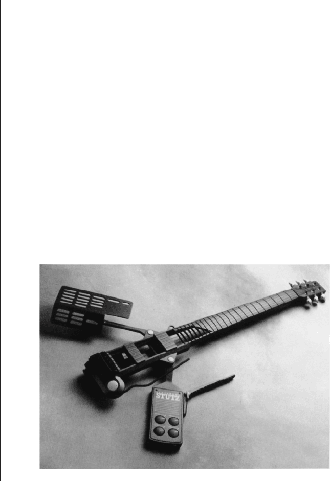
series of designs by Seymour/Powell including their remarkable
Blackhawk Stutz electric guitar designed in 1986 which is intended
for the rock performer, and departs radically from the traditional
form inspired by the need for an acoustic enclosure (Fig. 10.4). In
graphic design things need to be even more direct:
It is in symbolic, visual terms that the designer ultimately realises his per-
ceptions and experiences; and it is in a world of symbols that man lives.
The symbol is thus the common language between artist and spectator.
(Rand 1970)
In architectural design, the symbolic is less directly necessary than
for theatre and graphic design, but none the less important
HOW DESIGNERS THINK
176
Figure 10.4
The Blackhawk Stutz
Electric Guitar designed by
Seymour/Powell expresses the
rock performer for whom it was
intended
H6077-Ch10 9/7/05 12:34 PM Page 176

according to some writers who have warned against the danger of
architects only attending to formal constraints:
Spatial structure is not a goal in itself, but is only relevant if it concre-
tises the spatial implications of a character.
(Norburg-Schultz 1975)
The great philosopher Wittgenstein, who became something of a
student of architecture through his friendship with Adolf Loos went
so far as to insist that this was an essential distinguishing feature of
architecture as opposed to mere building. He wrote in a private
notebook that:
Architecture immortalises and glorifies something. Hence there can
be no architecture where there is nothing to glorify . . . Architecture
is a gesture. Not every purposive movement of the human body is
a gesture. And no more is every building designed for a purpose
architecture.
(Wilson 1986)
Conclusions
Designers do not work or think in the sort of mental strait-jacket
implied by the analysis used in this chapter to map out the
range of influences on guiding principles. The Malaysian archi-
tect, Ken Yeang has attracted considerable attention for his
approach to building in the tropical countries of south-east Asia.
A review of his own books reveals the guiding principles behind
this growing and consistent corpus of work. Ken investigated the
ecological issues involved in architectural design for his doctorate
at Cambridge somewhat before such ideas became fashionable.
He started to lecture and write about these ideas, and began his
architectural practice in Kuala Lumpur where he inevitably found
himself contributing to the increasingly vertical skyline of that city.
Concerned to develop a sense of regional identity in the face of
unthinkingly imported western architectural ideas, he began to
study the locally traditional forms and construction of buildings.
Such a study led him to the conclusion that one of the strongest
influences on traditional architecture was a response to the cli-
mate. The hot, wet tropical climate of south-east Asia suggested
GUIDING PRINCIPLES
177
H6077-Ch10 9/7/05 12:34 PM Page 177