Tidwell J. Designing Interfaces (Second Edition)
Подождите немного. Документ загружается.

The Patterns 103
Figure 3-28.
Capturing the state of a visualization at Many Eyes
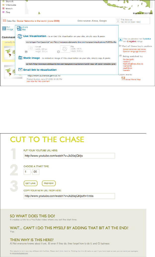
Its interface doesn’t advertise it, but YouTube lets you put a timestamp into the URL for a
video. When loaded, this brings the viewer directly to the specified time in the video. The
site http://youtubetime.com explains how to do it (see Figure 3-29): add
#t=XmYs to the end
of the URL, where X is the number of minutes and Y the number of seconds.
Figure 3-29.
YouTubeTime’s explanation of how to use the URL to deep-link into the middle of a video
104 Chapter 3: Getting Around: Navigation, Signposts, and Wayfinding
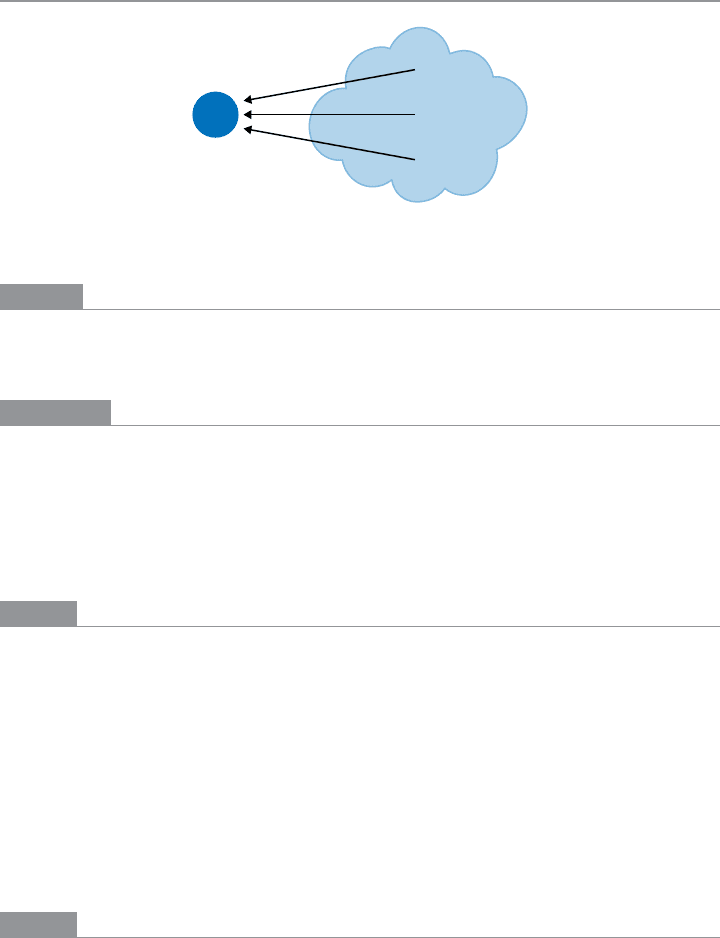
Escape Hatch
Figure 3-30.
Escape Hatch schematic
What
On each screen that has limited navigation options, place a button or link that clearly gets
the user out of that screen and back to a known place.
Use when
You’ve got pages that constitute some sort of serial process, such as a wizard, or any pages
that lock the user into a limited navigation situation, such as a
Modal Panel. These might
be pages that users can reach out of context, as they could do via search results.
(
Escape Hatches sometimes aren’t necessary when you have Sequence Maps or Breadcrumbs
on a page. Users who understand them can use those to get back to some known place.)
Why
Limited navigation is one thing, but having no way out is quite another! If you give the
user a simple, obvious way to escape from a page, no strings attached, he’s less likely to
feel trapped there.
This is the kind of feature that helps people feel like they can safely explore an app or site.
It’s sort of like an undo feature—it encourages people to go down paths without feeling
like they’re committing to them. See the
Safe Exploration pattern in Chapter 1.
Now, if these are pages that users can reach via search results, it’s doubly important that
Escape Hatches be put on each page. Visitors can click these to get to a “normal” page that
tells them more about where they actually are.
How
Put a button or link on the page that brings the user back to a “safe place.” This might be
a home page, a hub page in a hub-and-spoke design, or any page with full navigation and
something self-explanatory on it. Exactly what it links to will depend upon the applica-
tion’s design.
The Patterns 105
Examples
Websites often use clickable site logos as home-page links, usually in the upper left of a
page. These provide an
Escape Hatch in a familiar place, while helping with branding.
In some dialogs, a Cancel button or the equivalent can serve this purpose. These also let
the user say, “I’m done with this; forget I ever started it.”
Have you ever called a company—say, your bank—and had to work your way through a
set of phone menus? They can be long, confusing, and time-consuming. If you find your-
self in the wrong menu, you may just hang up and try again from the top. But many phone
menu systems have a hidden
Escape Hatch that they don’t tell you about: if you dial “0” at
any point, you might be connected to a human operator.
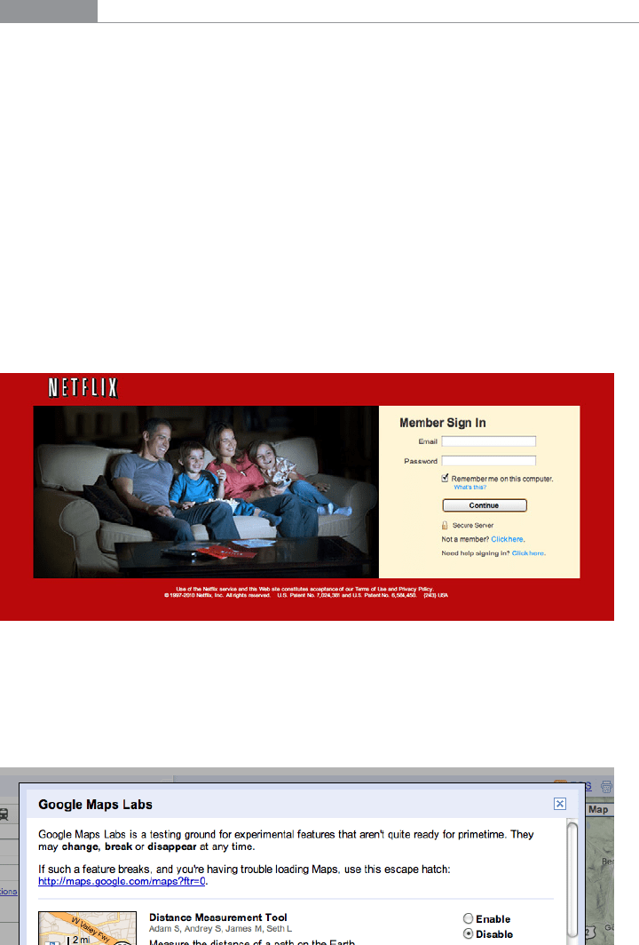
Many websites have certain pages that limit navigation options, such as
Modal Panels and
pages without global navigation. The Netflix login screen is one example. If a user finds
herself here and doesn’t want to log in, she can click on the Netflix logo to go back to the
home page (see Figure 3-31).
Figure 3-31.
Netflix sign-in page, with the logo as an Escape Hatch
Sometimes literalism works. Google Labs offers features that aren’t ready for release, and
they occasionally break. In the example shown in Figure 3-32, Google Maps gives the user
an explicit “escape hatch” URL to use when things go wrong.
Figure 3-32.
Google Maps Labs Escape Hatch
106 Chapter 3: Getting Around: Navigation, Signposts, and Wayfinding
In other libraries
These two patterns are named “Home Link.” The concept is very similar to Escape Hatch.
http://ui-patterns.com/patterns/HomeLink
http://welie.com/patterns/showPattern.php?patternID=home
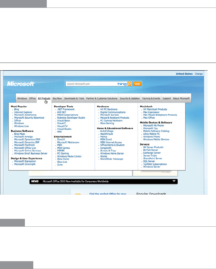
Fat Menus
Figure 3-33.
Microsoft’s All Products menu
What
Display a long list of navigation options in drop-down or fly-out menus. Use these to
show all the subpages in site sections. Organize them with care, using well-chosen catego-
ries or a natural sorting order, and spread them out horizontally.
Use when
The site or app has many pages in many categories, possibly in a hierarchy with three or
more levels. You want to expose most of these pages to people casually exploring the site,
so they can see what’s available. Your users are comfortable with drop-down menus (click
to see them) or fly-outs (roll over them with the pointer).

The Patterns 107
Why
Fat Menus make a complex site more discoverable. They expose many more navigation
options to visitors than they might otherwise find.
By showing so many links on every page, you make it possible for a user to jump directly
from any subpage to any other subpage (for most subpages, anyhow). You thus turn a
multi-level site—where subpages aren’t linked to the subpages in other site sections—into
a fully connected site.
Fat Menus are a form of progressive disclosure, an important concept in user interface de-
sign. Complexity is hidden until the user asks to see it. A visitor to a site that uses these
can look over the menu headings to get a high-level idea of what’s there, and when he’s
ready to dive in, he can open up a
Fat Menu with a gesture. He isn’t shown millions of sub-
pages before he’s ready to deal with them.
If you’re already using menus in your global navigation, you might consider expanding
them to
Fat Menus if surfacing more links makes the content more attractive to casual
browsers. People won’t have to drill down into categories and subcategories of your site
hierarchy in order to discover interesting pages—they’ll see them there, right up front.
How
On each menu, present a well-organized list of links. Arrange them into Titled Sections
(Chapter 4) if they fit into subcategories; if not, use a sorting order that suits the nature of
the content, such as an alphabetical or time-based list.
Use headers, dividers, generous whitespace, modest graphic elements, and whatever else
you need to visually organize those links. And take advantage of horizontal space—you
can spread the menu across the entire page if you wish. Many sites make excellent use
of multiple columns to present categories. If you make the menu too tall, it might go
right off the end of the browser page. (The user controls how tall the browser is; guess
conservatively.)
The best sites have
Fat Menus that work stylistically with the rest of the site. Design them
to fit well into the color scheme, grid, and so on of the page.
Some menu implementations don’t work well with accessibility technology such as screen
readers. Ensure that your
Fat Menus can work with these. If they can’t, consider switching
to a more static strategy, such as a
Sitemap Footer.
Examples
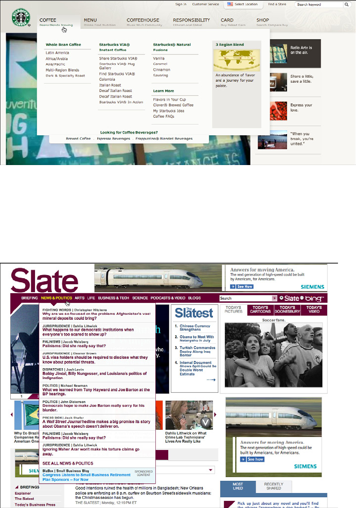
The Fat Menus on the Starbucks website are very well designed (see Figure 3-34). Each
menu is a different height but the same width, and follows a strict common page grid
(they’re all laid out the same way). The style blends in with the site, and the generous
whitespace makes it easy to read. Ads are worked into the design, but not obnoxiously.
The nonrectangular shape adds a polished look.
108 Chapter 3: Getting Around: Navigation, Signposts, and Wayfinding
Figure 3-34.
Starbucks coffee menu
As shown in Figure 3-35, Slate’s menus are less readable and more crowded (in keeping
with the overall style of the site). These don’t take full advantage of horizontal space,
either. But the idea of using them to show featured articles is clever—the knowledgeable
user can skim a large number of headlines by rolling over the menus.
Figure 3-35.
Slate’s News & Politics menu
The Patterns 109
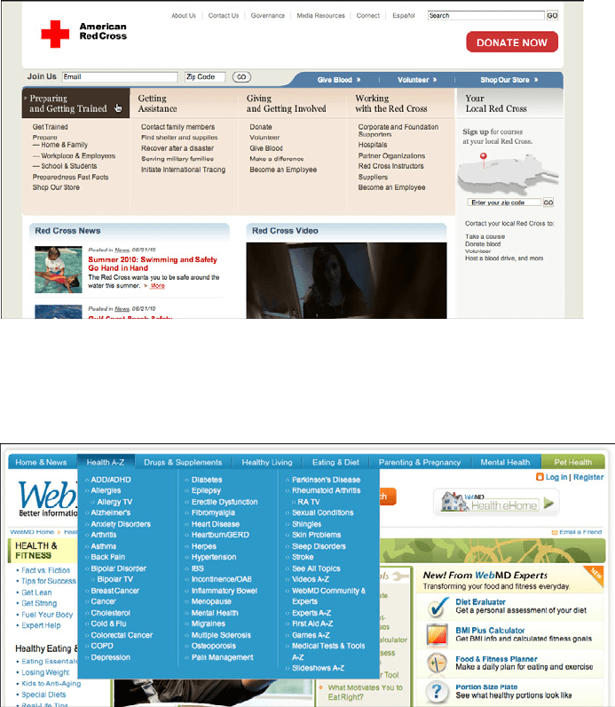
The American Red Cross doesn’t merely float its menus over the top of the page (see
Figure 3-36). When the user rolls over any top-level menu item, the resultant
Fat Menu
actually replaces a carousel-style rotating news panel, taking its space in the page. The
menu is the same for all the top-level menu items, so all the subpages in every category
are visible at once.
Figure 3-36.
The American Red Cross menus (all of them)
WebMD uses an alphabetical sorting order for its long, flat list of health topics, as shown
in Figure 3-37.
Figure 3-37.
WebMD’s Health A–Z menu
110 Chapter 3: Getting Around: Navigation, Signposts, and Wayfinding
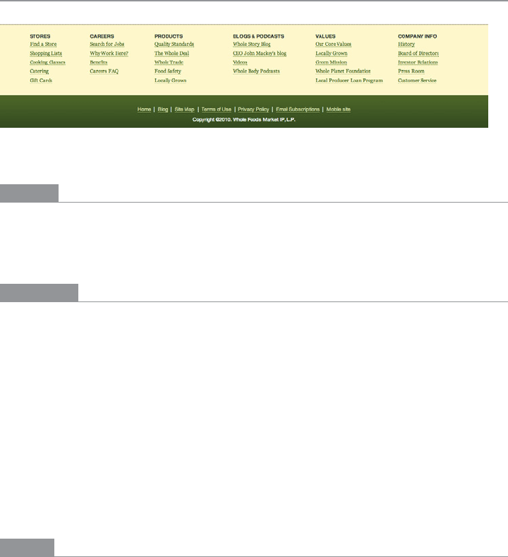
Sitemap Footer
Figure 3-38.
Whole Foods footer
What
Place a site map into the footer of every page in a site. Treat it as part of the global naviga-
tion, complementary to the header. Abridge the site map if you need to make it fit into a
compact space.
Use when
The site you’re designing uses a generous amount of space on each page, and you don’t
have severe constraints on page size or download time. You don’t want to take up too
much header or sidebar space with navigation.
The site has more than a handful of pages, but not an outrageously large number of cat-
egories and “important” pages (things that users will look for). You can fit a reasonably
complete site map—at least for pages that aren’t in the header—into a strip no taller than
about half of a browser window.
There may be a global navigation menu in the page header, but it doesn’t show all levels
in the site hierarchy—maybe it only shows the top-level categories. You prefer a simple,
well-laid-out footer instead of
Fat Menus, perhaps because of implementation ease or ac-
cessibility issues.
Why
Sitemap Footers make a complex site more discoverable. They expose many more naviga-
tion options to visitors than they might otherwise have.
By showing so many links on every page, you make it possible for a user to jump directly
from any subpage to any other subpage (or major page, anyhow). You thus turn a multi-
level site—where subpages aren’t linked to the subpages in other site sections—into a fully
connected site. The footer is where the user’s attention lands when she reads to the end of a
page. By placing interesting links there, you entice the user to stay on the site and read more.

The Patterns 111
Finally, showing users the whole site map gives them a strong sense of how the site is con-
structed and where they might find relevant features. In complex sites, that could be valuable.
You may find yourself trying to choose between a
Sitemap Footer design and a Fat Menus
design. In conventional websites, a
Sitemap Footer would be easier to implement and
debug because it doesn’t depend on anything dynamic: instead of showing fly-out menus
when the user rolls over items or clicks on them, a
Sitemap Footer is just a set of static links.
It’s also easier to use with screen readers and it doesn’t require fine pointer control, so it
wins on accessibility as well.
On the other hand, the footer may be ignored by busy or casual users who focus only on
the page content and the headers. Usability-test if you have any doubts, and watch the
click metrics to see if anyone even uses the
Sitemap Footer.
How
Design a page-wide footer that contains the site’s major sections (categories) and their
most important subpages. Include utility navigation, tools such as language choice or
Social Links (Chapter 9), and other typical footer information such as copyright and pri-
vacy statements.
This might constitute a complete site map for your site, or it might not. The idea is to cover
most of what visitors need to find, without overloading the header or sidebar navigation.
In practice, what often happens is that the global navigation options at the top of the
page reflect a more task-oriented design—it tries to answer visitors’ immediate questions
regarding “What is this about?” and “Where do I find X right this second?” Meanwhile,
the
Sitemap Footer shows the actual hierarchical structure of the site itself. This two-part
arrangement appears to work well.
If your site deals with content that itself requires complex navigation—such as a large set
of products, news articles, music, videos, books, and so on—you could use the top of the
page for content navigation and the
Sitemap Footer for almost everything else.
Here are some features that can often be found in
Sitemap Footers:
• Major content categories
• Information about the site or organization
• Partner or sister sites—for example, sites or brands owned by the same company
• Community links, such as forums
• Help and support
• Contact information
• Current promotions
• Donation or volunteer information, for nonprofits
112 Chapter 3: Getting Around: Navigation, Signposts, and Wayfinding
Examples
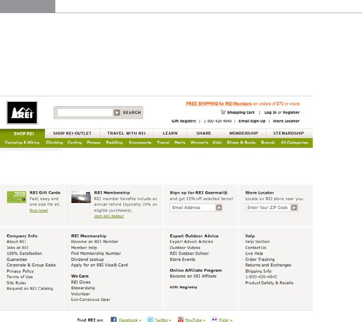
REI’s website demonstrates the difference between task-oriented top-of-page global navi-
gation and an effective
Sitemap Footer (see Figure 3-39). Shopping, learning, and travel
dominate the header, as they should—these are what most site visitors come for. The
footer handles secondary tasks that are nevertheless important: “about” information, cus-
tomer support, membership, and so on.
Figure 3-39.
REI header and footer
The Los Angeles Times footer shows much of the same content as the double tab in the
header, but flattened and organized somewhat differently (see Figure 3-40).