Ware C. Information Visualization: Perception for Design
Подождите немного. Документ загружается.

To display data on the luminance channel alone is easy; it is stimulated by patterns that vary
only from black to white through shades of gray. But with careful calibration (which must be
customized to individual subjects), patterns can be constructed that vary only for the red–green
or the yellow–blue channel. A key quality of such a pattern is that its component colors must
not differ in luminance. This is called an isoluminant or equiluminous pattern. In this way, the
different properties of the color channels can be explored and compared with the luminance
channel capacity.
Spatial Sensitivity
According to a study by Mullen (1985), the red–green and yellow–blue chromatic channels are
each only capable of carrying about one-third the amount of detail carried by the black–white
channel. Because of this, purely chromatic differences are not suitable for displaying any kind of
fine detail. Figure 4.13 illustrates this problem with colored text on an equiluminous background.
In the part of the figure where there is only a chromatic difference between the text and the back-
114 INFORMATION VISUALIZATION: PERCEPTION FOR DESIGN
Figure 4.12 The results of an experiment in which subjects were asked to name 210 colors produced on a computer
monitor. Outlined regions show the colors that were given the same name with better than 75%
probability.
ARE4 1/20/04 5:00 PM Page 114
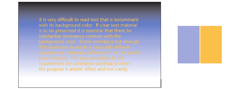
ground, the text becomes very difficult to read. Generally, when detailed information of any kind
is presented with color coding, it is important that there be considerable luminance contrast in
addition to color contrast, especially if the colored patterns are small.
Stereoscopic Depth
It appears to be impossible, or at least very difficult, to see stereoscopic depth in stereo pairs that
differ only in terms of the color channels (Lu and Fender, 1972; Gregory, 1977). Thus, stereo
space perception is based primarily on information from the luminance channel.
Motion Sensitivity
If a pattern is created that is equiluminous with its background and contains only chromatic dif-
ferences, and that pattern is set in motion, something strange occurs. The moving pattern appears
to move much more slowly than a black-against-white pattern moving at the same speed (Anstis
and Cavanaugh, 1983). Thus, motion perception appears to be primarily based on information
from the luminance channel.
Form
We are very good at perceiving the shapes of surfaces based on their shading. However, when
the shading is transformed from a luminance gradient into a purely chromatic gradient, the
impression of surface shape is much reduced. Perception of shape and form appears to be
processed mainly through the luminance channel (Gregory, 1977).
Color 115
Figure 4.13 Yellow text on a blue gradient. Note how difficult it is to read the text where luminance is equal, despite a
large chromatic difference.
ARE4 1/20/04 5:00 PM Page 115
To summarize this set of properties, the red–green and yellow–blue channels are inferior to
the luminance channel in almost every respect. The general implications for data display are clear.
Purely chromatic differences should never be used for displaying object shape, object motion, or
detailed information such as text. From this perspective, color would seem almost irrelevant and
certainly a secondary method for information display. Nevertheless, when it comes to coding
information, using color to display data categories is usually the best choice. To see why, we need
to look beyond the basic processes that we have been considering thus far.
Color Appearance
The value of color (as opposed to luminance) processing, it would appear, is not in helping us
to understand the shape and layout of objects in the environment. Color does not help the hunter
aim an arrow accurately. Color does not help us see shape from shading and thereby plan a hike
through a valley, although it does help us distinguish vegetation types. Color does not help use
stereoscopic depth when we reach out to grasp a tool. But color is useful to the gatherer. Food,
in the forest or on the savannah, is often distinct because of its color. This is especially true of
fruits and berries. Color creates a kind of visual attribute of objects: this is a red berry. That is
a yellow door. Color names are used as adjectives because colors are perceived as attributes of
objects. This suggests a most important role for color in visualization—namely, the coding of
information. Visual objects can represent complex data entities, and colors can naturally code
attributes of those objects.
Color is normally a surface attribute of an object. The XYZ tristimulus values of a patch of
light physically define a color, but they do not tell us how it will look. Depending on the sur-
rounding colors in the environment and a whole host of spatial and temporal factors, the same
physical color can look very different. If it is desirable that color appearance be preserved, it is
important to pay close attention to surrounding conditions. In a monitor-based display, a large
patch of standardized reference white will help ensure that color appearance is preserved. When
colors are reproduced on paper, viewing them under a standard lamp will help preserve their
appearance. In the paint and fabric industries, where color appearance is critical, standard
viewing booths are used. These booths contain standard illumination systems that can be set to
approximate daylight or a standard indoor illuminant, such as a typical tungsten light bulb or
halogen lamp.
The mechanisms of surface lightness constancy, discussed at some length in Chapter 3, gen-
eralize to trichromatic color perception. Both chromatic adaptation and chromatic contrast occur
and play a role in color constancy. Differential adaptation in the cone receptors helps us to
discount the color of the illumination in the environment. When there is colored illumination,
different classes of cone receptors undergo independent changes in sensitivity. Thus, when the
illumination contains a lot of blue light, the short-wavelength cones become relatively less sen-
sitive than the others. The effect of this is to shift the neutral point at which the three receptor
types are in equilibrium, such that more blue light must be reflected from a surface for it to seem
116 INFORMATION VISUALIZATION: PERCEPTION FOR DESIGN
ARE4 1/20/04 5:00 PM Page 116

white. This, of course, is exactly what is necessary for color constancy. That adaptation is effec-
tive in maintaining constancy is evident from the fact that not many people are aware how much
yellower ordinary tungsten room lighting is than daylight.
Color Contrast
Chromatic contrast also occurs in a way that is similar to the lightness contrast effects discussed
and illustrated in Chapter 3. Figure 4.14 shows a color contrast illusion. It has been shown that
contrast effects can distort readings from color-coded maps (Cleveland and McGill, 1983; Ware,
1988). Contrast effects can be theoretically accounted for by activity in the color opponent chan-
nels (Ware and Cowan, 1982). However, as with lightness contrast, the ultimate purpose of the
contrast-causing mechanism is to help us see surface colors accurately by revealing differences
between colored patches and background regions.
From the point of view of the monitor engineer and the user of color displays, the fact that
colors are perceived relative to their overall context has the happy consequence of making the
eye relatively insensitive to poor color balance. A visit to a television store will reveal that when
television sets are viewed side by side, the overall color of the pictures can differ strikingly, yet
when they are viewed individually, they are all acceptable. Of course, because the state of adap-
tation is governed by the light of the entire visual field, and a television screen takes up only part
of the field, this adaptation will necessarily be incomplete.
Saturation
When describing color appearance in everyday language, people use many terms in rather impre-
cise ways. Besides using color names such as lime green, mauve, brown, baby blue, and so on,
Color 117
Figure 4.14 A color contrast illusion. The X pattern is identical on both sides, but it seems bluer on the red
background and pinker on the blue background.
ARE4 1/20/04 5:00 PM Page 117
people also use adjectives such as vivid, bright, and intense to describe colors that seem espe-
cially pure. Because these terms are used so variably, scientists use the technical term saturation
to denote how pure colors seem to the viewer. A high-saturation color is vivid and a low-
saturation color is close to black, white, or gray. In terms of the color opponent channels, high-
saturation colors are those that give a strong signal on one or both of the red–green and
yellow–blue channels.
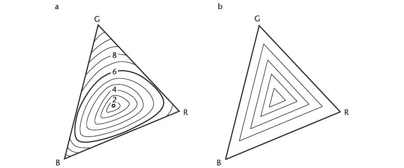
Equal saturation contours have been derived from psychophysical experiments (Wyszecki
and Stiles, 1982). Figure 4.15(a) shows a plot of equal saturation values in a CIE chromaticity
diagram. It is clear that it is possible to obtain much more highly saturated red, green, and blue
colors on a monitor than yellow, cyan, or purple values.
Brown
Brown is one of the most mysterious colors. Brown is dark yellow. Whereas people talk about
a light green or a dark green, a light blue or a dark blue, yellow is different. When colors in
the vicinity of yellow and orange yellow are darkened, they turn to shades of brown and olive
green. Unlike red, blue, and green, brown requires that there be a reference white somewhere in
the vicinity for it to be perceived. Brown appears qualitatively different to orange yellow.
There is no such thing as an isolated brown light in a dark room, but when a yellow or yellow-
ish orange is presented with a bright white surround, brown appears. The relevance to visual-
ization is that if color sets are being devised for the purposes of color coding—for example, a
set of blues, a set of reds, and a set of greens—brown may not be recognized as belonging to the
set of yellows.
118 INFORMATION VISUALIZATION: PERCEPTION FOR DESIGN
Figure 4.15 (a) The triangle represents the gamut of colors obtained using a computer monitor plotted in CIE
chromaticity coordinates. The contours show perceptually determined equal-saturation contours.
(b) Equal-saturation contours created using the HSV color space, also plotted in chromaticity
coordinates.
ARE4 1/20/04 5:00 PM Page 118
Applications of Color in Visualization
So far, this chapter has been mainly a presentation of the basic theory underlying color vision
and color measurement. Now we shift the emphasis to applications of color, for which new theory
will be introduced only as needed. We will examine five different application areas: color selec-
tion interfaces, color labeling, color sequences for map coding, color reproduction, and color for
multidimensional discrete data display. Each of these presents a different set of problems, and
each benefits from an analysis in terms of the human perception of color.
Application 1: Color Specification Interfaces and Color Spaces
In data visualization programs, drawing applications, and CAD systems, it is often essential to
let users choose their own colors. There are a number of approaches to this user interface
problem. The user can be given a set of controls to specify a point in a three-dimensional color
space, a set of color names to choose from, or a palette of predefined color samples.
Color Spaces
The simplest color interface to implement on a computer involves giving someone controls to
adjust the amounts of red, green, and blue light that combine to make a patch of color on a
monitor. The controls can take the form of sliders, or the user can simply type in three numbers.
This provides access, in a straightforward way, to any point within the RGB color cube shown
in Figure 4.5. However, although it is simple, many people find this kind of control confusing.
For example, most people do not know that to get yellow you must add red and green. There
have been many attempts to make color interfaces easier to use.
One of the most widely used color interfaces in computer graphics is based on the HSV color
space (Smith, 1978). This is a simple transformation from hue, saturation, and value (HSV) coor-
dinates to RGB monitor coordinates. In Smith’s scheme, hue represents an approximation to the
visible spectrum by interpolating in sequence from red to yellow to green to blue and back to
red. Saturation is the distance from monitor white to the purest hue possible given the limits of
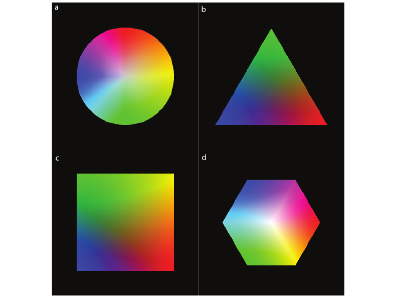
monitor phosphors. Figure 4.16 shows how hue and saturation can be laid out in two dimen-
sions, with hue on one axis and saturation on the other, based on the HSV transformation of
monitor primaries. As Figure 4.15(b) shows, HSV creates only the crudest approximation to per-
ceptually equal-saturation contours. Value is the name given to the black–white axis. Some color
specification interfaces based on HSV allow the user to control hue, saturation, and value vari-
ables with three sliders.
Color theory suggests that, in a computer interface for selecting colors, there are good reasons
for separating a luminance (or lightness) dimension from the chromatic dimensions. A common
method is to provide a single slider control for the black–white dimension and to lay out the two
opponent color dimensions on a chromatic plane. The idea of laying out colors on a plane has
a long history; for example, a color circle is a feature of a color textbook created for artists by
Color 119
ARE4 1/20/04 5:00 PM Page 119
Rood (1897). With the invention of computer graphics, it has become far simpler to create and
control colors, and many ways of laying out colors are now available. Figure 4.17 illustrates a
sampling of four different geometric color layouts, each of them embodying the idea of a chro-
matic plane.
Figure 4.17(a) shows a color circle with red, green, yellow, and blue defining opposing axes.
Many such color circles have been devised over the past century. They differ mainly in the spacing
of colors around the periphery.
Figure 4.17(b) shows a color triangle with the monitor primaries, red, green, and blue, at
the corners. This color layout is convenient because it has the property that mixtures of two
colors will lie on a line between them (assuming proper calibration).
Figure 4.17(c) shows a color square with the opponent color primaries, red, yellow, green,
and blue, at the corners (Ware and Cowan, 1990).
Figure 4.17(d) shows a color hexagon with the colors red, yellow, green, cyan, blue, and
magenta at the corners. This represents a plane through the single-hexcone color model (Smith,
1978). The hexagon representation has the advantage that it gives both the monitor primaries,
red, green, and blue, and the print primaries, cyan, magenta, and yellow, prominent positions
around the circumference.
To create a color interface using one of these color planes, it is necessary to allow the user
to pick a sample from the color plane and adjust its lightness with a luminance slider. In some
interfaces, when the luminance slider is moved, the entire plane of colors becomes lighter and
darker according to the currently selected level. For those interested in implementing color inter-
faces, Foley et al. (1990) provide algorithms for a number of color geometries.
120 INFORMATION VISUALIZATION: PERCEPTION FOR DESIGN
Figure 4.16 This plot shows hue and saturation, based on Smith’s transformation (1978) of the monitor primaries.
ARE4 1/20/04 5:00 PM Page 120
The problem of the best color selection interface is by no means resolved. Experimental
studies have failed to show that one way of controlling color is substantially better than another
(Schwarz et al., 1987; Douglas and Kirkpatrick, 1996). However, Douglas and Kirkpatrick have
provided evidence that good feedback about the location of the color being adjusted in color
space can help in the process.
Color Naming
The facts that there are so few widely agreed-upon color names and that color memory is so
poor suggest that choosing colors by name will not be useful except for the simplest applica-
tions. People agree on red, green, yellow, blue, black, and white as labels, but not much more.
Nevertheless, it is possible to remember a rather large number of color names and use them accu-
rately under controlled conditions. Displays in paint stores generally have a standard illuminant
Color 121
Figure 4.17 There are a number of simple transformations of the RGB monitor primaries to provide a color plane with
an orthogonal lightness axis. Four of these are illustrated here: (a) Circle. (b) Triangle. (c) Square.
(d) Hexagon.
ARE4 1/20/04 5:00 PM Page 121
and standard background for sample strips containing several hundred samples. Under these
circumstances, the specialist can remember and use as many as 1000 color names. But many
of the names are idiosyncratic; the colors corresponding to “taupe,” “fiesta red,” and “prim-
rose” are imprecisely defined for most of us. In addition, as soon as these colors are removed
from the standard booth, they will change their appearance because of adaptation and contrast
effects.
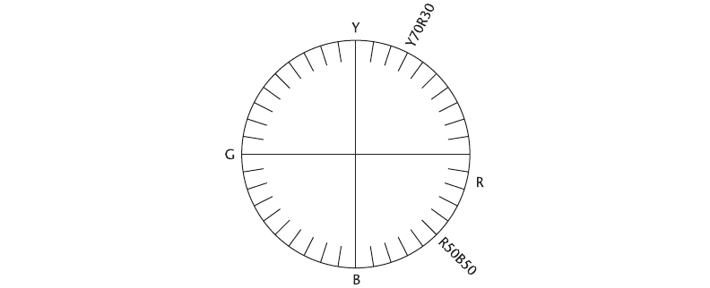
A standardized color naming system called the Natural Color System (NCS) has been devel-
oped based on Hering’s opponent color theory (1920). NCS was developed in Sweden and is
widely used in England and other European countries. In NCS, colors are characterized by the
amounts of redness, greenness, yellowness, blueness, blackness, and whiteness that they contain.
As shown in Figure 4.18, red, green, yellow, and blue lie at the ends of two orthogonal axes.
Intervening “pure” colors lie on the circle circumference, and these are given numbers by sharing
out 100 arbitrary units. Thus, a yellowish orange might be given the value Y70R30, meaning 70
parts yellow and 30 parts red. Colors are also given independent values on a black–white axis
by allocating a blackness value between 0 and 100. A third color attribute, intensity (roughly
corresponding to saturation), describes the distance from the gray-scale axis. For example, in
NCS, the color “spring nymph” becomes 0030-G80Y20, which expands to blackness 00, inten-
sity 30, green 80, and yellow 20 (Jackson et al., 1994). The NCS system combines some of the
advantages of a color geometry with a reasonably intuitive and precise naming system.
In North America, other systems are more popular than NCS. The Pantone system is widely
used in the printing industry, and the Munsell system is an important reference for surface
colors. The Munsell system is useful because it provides a set of standard color chips designed
122 INFORMATION VISUALIZATION: PERCEPTION FOR DESIGN
Figure 4.18 The Natural Color System (NCS) circle, defined midway between black and white. Two example color
names are shown in addition to the “pure” opponent color primaries. One is an orange yellow and the
other is purple.
ARE4 1/20/04 5:00 PM Page 122
to represent equal perceptual spacing in a three-dimensional mesh. (Munsell color chips and
viewing booths are available commercially, as are Pantone products.) The NCS, Pantone, and
Munsell systems were originally designed to be used with carefully printed paper samples
providing the reference colors, but computer-based interfaces to these systems have been devel-
oped as part of illustration and design packages. Rhodes and Luo (1996) describe a software
package that enables transformations between the different systems using the CIE as an inter-
mediate standard.
Color Palette
When the user wishes to use only a small set of standardized colors, providing a color palette is
a good solution to the color selection problem. Often, color selection palettes are laid out in a
regular order according to one of the color geometries defined previously. It is useful to provide
a facility for the user to develop a personal palette. This allows for consistency in color style
across a number of visualization displays. Another valuable addition to a color user interface is
a method for showing a color sample on differently colored backgrounds. This allows the designer
to understand how contrast effects can affect the appearance of particular color samples.
Sometimes a color palette is based on one of the standard color sets used by the fabric indus-
try or the paint industry. If this is the case, the monitor must be calibrated so that colors actu-
ally appear as specified. In addition, the lighting surrounding the monitor must be taken into
account, as discussed in Chapter 3. Ideally, the monitor should be set up carefully with a stan-
dard surround and little or no ambient light falling directly on the screen. This includes having
a room light such that the standard white in the set of color samples on the screen closely matches
the appearance of a standard white in the room environment.
Application 2: Color for Labeling
The technical name for labeling an object is nominal information coding. A nominal code does
not have to be orderable; it simply must be remembered and recognized. Color can be extremely
effective as a nominal code. When we wish to make it easy for someone to classify visual objects
into separate categories, giving the objects distinctive colors is often the best solution. One of
the reasons that color is considered effective is that the alternatives are generally worse. For
example, if we try to create gray-scale codes that are easily remembered and unlikely to be con-
fused, we find that four is about the limit: white, light gray, dark gray, and black. Given that
white will probably be used for the background and black is likely to be used for text, this leaves
only two. In addition, using the gray scale as a nominal code may interfere with shape or detail
perception. Chromatic coding can often be employed in a way that only minimally interferes
with data presented on the luminance channel.
There are many perceptual factors to be considered in choosing a set of color labels.
1. Distinctness: A uniform color space, such as CIEluv, can be used to determine the degree
of perceived difference between two colors that are placed close together. However, when
Color 123
ARE4 1/20/04 5:00 PM Page 123