Ware C. Information Visualization: Perception for Design
Подождите немного. Документ загружается.

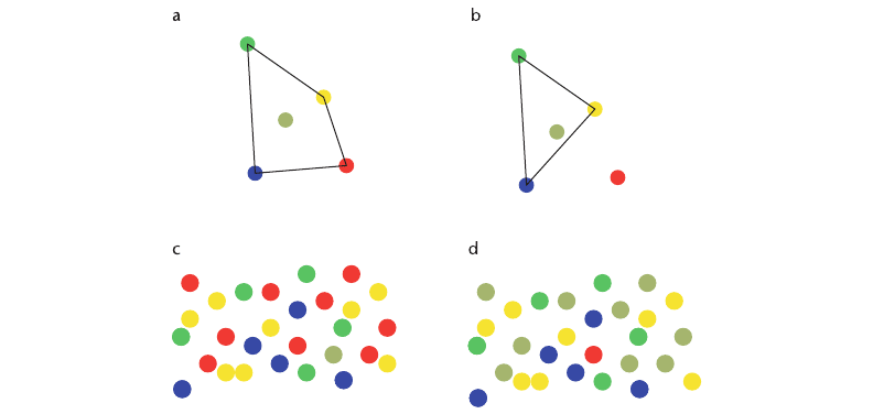
we are concerned with the ability to distinguish a color rapidly from a set of other colors,
different rules may apply. Bauer et al. (1996) showed that the target color should lie
outside the convex hull of the surrounding colors in the CIE color space. This concept is
illustrated in Figure 4.19. The issues related to coding for rapid target identification are
discussed further in Chapter 5.
2. Unique hues: The unique hues—red, green, yellow, and blue, as well as black and white—
are special in terms of the opponent process model. These colors are also special in the
color vocabularies of languages worldwide. Clearly, these colors provide natural choices
when a small set of color codes is required. In addition, work on color confusion suggests
that no two colors should be chosen from the same category, even though they may be
relatively far apart in color space. We should avoid using multiple shades of green as
codes, for example.
3. Contrast with background: In many displays, color-coded objects can be expected to
appear on a variety of backgrounds. Simultaneous contrast with background colors can
dramatically alter color appearance, making one color look like another. This is one
reason why it is advisable to have only a small set of color codes. A method for reducing
contrast effects is to place a thin white or black border around the color-coded object.
This device is commonly used with signal lights; for example, train signals are displayed
124 INFORMATION VISUALIZATION: PERCEPTION FOR DESIGN
Figure 4.19 The convex hull of a set of colors is defined as the area within a rubber band that is stretched around the
colors when they are defined in CIE tristimulus space. Although illustrated in two dimensions here, the
concept can easily be extended to three dimensions. (a) Gray is within the convex hull of red, green,
yellow, and blue. (b) Red lies outside the convex hull of green, blue, yellow, and gray. (c) The gray dot is
difficult to find in a set of red, green, yellow, and blue dots. (d) The red dot is easy to find in a set of
green, blue, yellow, and gray dots.
ARE4 1/20/04 5:00 PM Page 124
on large black background discs. In addition, we should never display codes using purely
chromatic differences with the background. There should be a significant luminance
difference in addition to the color difference.
4. Color blindness: Because there is a substantial color-blind population, it may be desirable
to use colors that can be distinguished even by people who are color blind. Recall that the
majority of color-blind people cannot distinguish colors that differ in a red–green
direction. Almost everyone can distinguish colors that vary in a yellow–blue direction, as
shown in Figure 4.8. Unfortunately, this drastically reduces the design choices that are
available.
5. Number: Although color coding is an excellent way to display category information, only
a small number of codes can be rapidly perceived. Estimates vary between about five and
ten codes (Healey, 1996).
6. Field size: Color-coded objects should not be very small; especially if the color differences
are in a yellow–blue direction, at least half a degree of visual angle is probably a
minimum size. Very small color-coded areas should not be used, to avoid the small-field
color blindness illustrated in Figure 4.9. In general, the larger the area that is color-coded,
the more easily colors can be distinguished. Small objects that are color-coded should have
strong, highly saturated colors for maximum discrimination. When large areas of color
coding are used, for example, with map regions, the colors should be of low saturation
and differ only slightly from one another. This enables small, vivid color-coded targets to
be perceived against background regions. When colors are used to highlight regions of
black text, they should be light (minimum luminance contrast with the white paper) and
also of low saturation (see Figure 4.20). This will minimize interference with the text.
7. Conventions: Color-coding conventions must sometimes be taken into account. Some
common conventions are red = hot, red = danger, blue = cold, green = life, green = go.
However, it is important to keep in mind that these conventions do not necessarily cross
cultural borders. In China, for example, red means life and good fortune, and green
means death.
The following is a list of 12 colors recommended for use in coding. They are illustrated in
Figure 4.21.
1. Red 7. Pink
2. Green 8. Cyan
3. Yellow 9. Gray
4. Blue 10. Orange
5. Black 11. Brown
6. White 12. Purple
Color 125
ARE4 1/20/04 5:00 PM Page 125
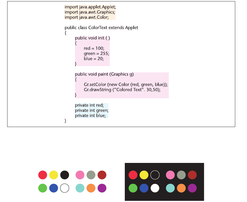
These colors have widely agreed-upon category names and are reasonably far apart in color space.
The first four colors, together with black and white, are chosen because they are the unique colors
that mark the ends of the opponent color axes. The entire set corresponds to the 11 color names
found to be the most common in the cross-cultural study carried out by Berlin and Kay, with the
addition of cyan. The colors in the first set of six would normally be used before choosing any
from the second set of six.
126 INFORMATION VISUALIZATION: PERCEPTION FOR DESIGN
Figure 4.20 When large areas are color-coded, low-saturation light colors can be used on a white background. This
interferes much less with detailed information in the text.
Figure 4.21 A set of 12 colors for use in labeling. The same colors are shown on a white and a black
background.
ARE4 1/20/04 5:00 PM Page 126
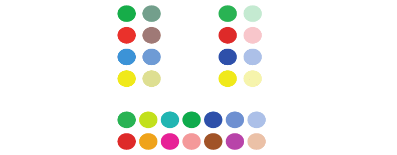
Sometimes it is useful to generate codes into families. This can be done by using hue as
a primary attribute denoting family membership, with secondary values mapped to a com-
bination of saturation and lightness. Figure 4.22 illustrates. Generally, we cannot expect to
get away with more than two different color steps in each family. The canonical red, green,
yellow, and blue hues make good categories for defining families. Family members then
can be distinguished from one another by saturation, as in Figure 4.22(a), or even better, by
saturation and lightness, as in Figure 4.22(b). Interior designers often consider a family
of warm colors (nearer to red in color space) to be distinct from a family of cool colors
(nearer to blue and green in color space), although the psychological validity of this is
questionable.
Application 3: Color Sequences for Data Maps
Pseudocoloring is the technique of representing continuously varying map values using a
sequence of colors. Pseudocoloring is used widely for astronomical radiation charts, medical
imaging, and many other scientific applications. Geographers use a well-defined color sequence
to display height above sea level—lowlands are always colored green, which evokes vege-
tation, and the scale continues upward, through brown, to white at the peaks of mountains.
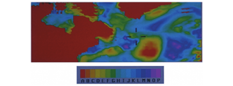
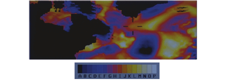
Figure 4.23 shows a map of gravitational variations over the North Atlantic, displayed
with high-gravitation areas coded red and low-gravitation areas coded purple. Interme-
diate values are coded with a sequence of colors that roughly approximates the visible-light
spectrum.
Color 127
Warm
Cool
ab
c
Figure 4.22 Families of colors. (a) Pairs related by hue, family members differ in saturation. (b) Pairs related by
hue, family members differ in saturation and lightness. (c) A family of warm hues and a family of cool
hues.
ARE4 1/20/04 5:00 PM Page 127
The most common coding scheme used by physicists is a color sequence that approximates
the physical spectrum, like that shown in Figure 4.23. Although this sequence is widely used in
physics and other disciplines and has some useful properties, it is not a perceptual sequence. This
can be demonstrated by the following test. Give someone a series of gray paint chips and ask
them to place these in order. They will happily comply with either a dark-to-light ordering or a
light-to-dark ordering. Give the same person paint chips with the colors red, green, yellow, and
blue and ask them to place them in order, and the result will be varied. For most people, the
request will not seem particularly meaningful. They may even use an alphabetical ordering. This
demonstrates that the whole spectrum is not perceptually ordered, although short sections of
it are. For example, sections from red to yellow, yellow to green, and green to blue all vary
monotonically (they continuously increase or decrease) on both the red–green and yellow–blue
channels.
It is useful to consider the problem of selecting a pseudocoloring sequence in terms of
Stevens’s (1946) taxonomy of measurement scales into nominal, ordinal, interval, and ratio
categories.
Nominal Pseudocolor Sequences (Labeling Regions)
A nominal pseudocolor sequence is one designed to enable rapid visual classification of regions
where the values within the regions have no particular order (i.e., no “greater than” relationship
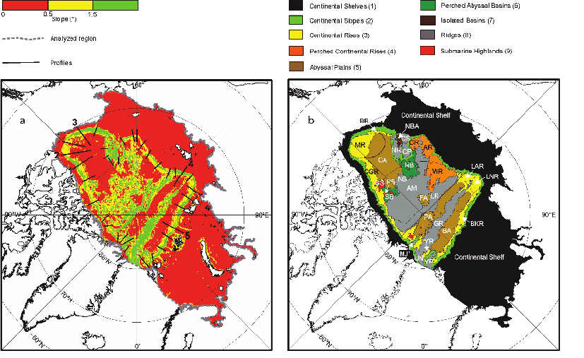
holds for the values). For example, Figure 4.24 gives two examples that classify the physiogra-
phy of the seabed of the Arctic Ocean. In 4.24(a) only three colors—red, yellow, and green—are
used to provide visual segmentation into three distinct regions. In 4.24(b), nine different regions
are labeled by color. The considerations in selecting colors for nominal sequences are the same
as for color labeling. The colors should be chosen to be visually distinct from one another. In
128 INFORMATION VISUALIZATION: PERCEPTION FOR DESIGN
Figure 4.23 Gravitational variation over the North Atlantic is revealed using a spectrum-approximation pseudocolor
sequence.
ARE4 1/20/04 5:00 PM Page 128
Color 129
general, a nominal set of colors should be custom designed based on the number of colors
required and on the need to display additional symbols on top of the colors. If the overlaid
symbols are to be black or dark, then the background color codes should be light, or vice versa,
to give luminance contrast. If the overlaid symbols are colored, then the colored areas of the
background should have low saturation.
Ordinal Pseudocolor Sequences
An ordinal pseudocolor sequence is one in which the monotonic ordering of data values in dif-
ferent parts of the display can be perceived. If value B lies between value A and value C, the
color codes should perceptually have the same ordering. For ordinal values to be correctly and
rapidly interpreted, it is important that the color sequence increases monotonically with respect
to one or more of the color opponent channels. Such a monotonic ordering can be obtained
straightforwardly by using a black-white, red-green, or yellow-blue sequence. But it can also be
obtained with a saturation sequence or with any relatively straight line through opponent color
space. If it is important to show detail in the data, then it is essential to have a sequence that
Figure 4.24 Color sequences designed for classification rather than the display of continuous variables. The
physiographic features of the Arctic seafloor are illustrated. Courtesy of Martin Jakobsson.
ARE4 1/20/04 5:00 PM Page 129

varies according to the luminance (black–white) channel because of the capacity of this channel
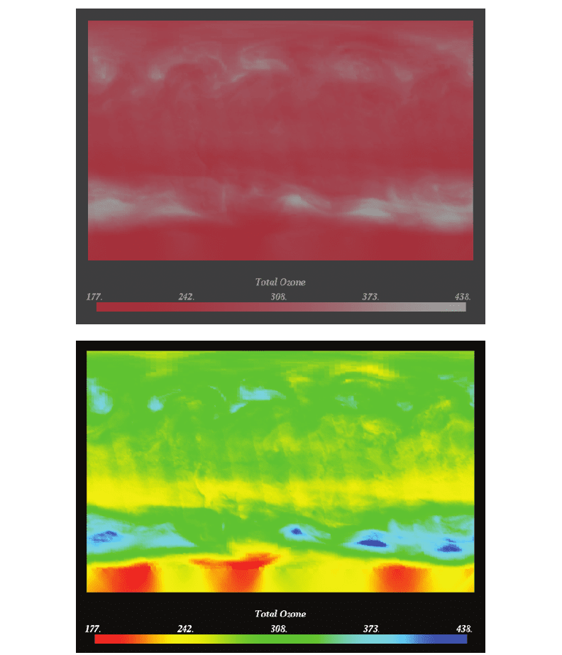
to convey high spatial frequency information (Ware, 1988; Rogowitz and Treinish, 1996). Figures
4.25(a) and (b) show ozone concentration data presented as a gray-scale sequence and as a color-
saturation sequence. The saturation shows far less detail. For comparison, Figure 4.25(c) shows
a spectrum approximation. (Images from Rheingans, 1999.) This is not perceptually ordinal but
clearly shows different regions of the data map. Sometimes a spectrum approximation sequence
can be effective, because the perceptual system tends to segment it into red, green, yellow, and
blue regions. As long as the boundaries match significant data classes, the result will be clear.
Sometimes we may wish to overlay pseudocolored information on a shaded surface. In this
case, an isoluminant color map should be employed to avoid distorting the perceived surface
shape through shape-from-shading information. There will be a loss of ability to show detail
through the pseudocoloring, but this cannot be avoided. Although it is often important to have
a color key in a visualization that allows values to be read back from the display, it should be
noted that the results are likely to be quite inaccurate due to simultaneous contrast between parts
of the display (Cleveland and McGill, 1983; Brewer, 1996b). We found that these errors could
be substantial: 20% of the scale on average when using gray scales and saturation scales (Ware,
1988). Using a spectrum sequence dramatically reduced contrast errors to less than half a step
130 INFORMATION VISUALIZATION: PERCEPTION FOR DESIGN
Figure 4.25 A map of ozone concentrations in the atmosphere is shown: (a) As a black–white sequence. (b) As a
saturation sequence. (c) As a spectrum-approximation sequence. Images courtesy of Penny Rheingans
(Rheingans, 1999).
a
ARE4 1/20/04 5:00 PM Page 130
Color 131
Figure 4.25 Continued
b
c
ARE4 1/20/04 5:00 PM Page 131
on average. This can be attributed to contrast effects in each opponent channel canceling when
a sequence zigzags with respect to the individual color channels.
Some authors have recommended that, for clarity, color sequences should constitute a
straight line through a perceptual color space, such as CIEluv or CIElab (Robertson and
O’Callaghan, 1988; Levkowitz and Herman, 1992). This would rule out the spectrum approxi-
mation sequence. Further, Spence et al. (1999) found that a color sequence combining variation
in brightness, saturation, and hue was the most effective in a task requiring the rapid detection
of low and high points in an image. It is possible to construct color sequences that combine the
advantages of monotonicity in luminance, so as to show detail, with a variety of colors, to reduce
contrast and enable accurate readings from a color key. The result is a kind of spiral in color
space that cycles through a variety of hues while continuously increasing in lightness (Ware,
1988). Figure 4.26 gives an example using the same gravity data displayed in Figure 4.23.
Interval Pseudocolor Sequences
An interval sequence is one in which each unit step of the sequence represents an equal change
in magnitude of the characteristic being displayed across the whole range of the sequence. In
terms of color, this suggests using a uniform color space in which equal perceptual steps corre-
spond to equal metric steps (Robertson and O’Callaghan, 1988). Another way to produce clearly
discernible intervals is to introduce steps deliberately in the color sequence (a banded color
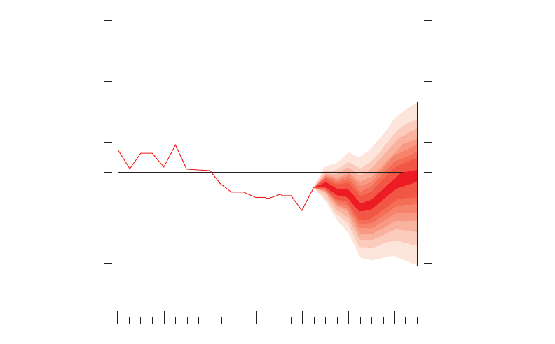
sequence). The example illustrated in Figure 4.27 is not a map but an economic forecast. Increas-
ing uncertainty in the prediction is shown by means of clearly visible color steps, each of which
represents a 5% increase in the uncertainty level.
The traditional way to display an interval sequence is through the use of isovalue contours.
Contour maps show the pattern of equal heights or other physical attributes with great precision,
but using them to understand the overall shape of a terrain or an energy field takes considerable
132 INFORMATION VISUALIZATION: PERCEPTION FOR DESIGN
Figure 4.26 The same data shown in Figure 4.23, pseudocolored with a sequence that provides a kind of upward
spiral in color space; each color is lighter than the preceding one.
ARE4 1/20/04 5:00 PM Page 132
skill and experience. To support unskilled map readers, contours can be usefully combined with
pseudocoloring, as shown in Figure 4.28. A well-designed pseudocolor sequence or artificially
shaded height map is usually much better for the nonexpert than an unenhanced set of contours.
It may also be better for the expert when rapid decision making or data fusion is required.
Ratio Pseudocolors
A ratio sequence is an interval sequence that has a true zero and all that this implies: the sign of
a value is significant; one value can be twice as large as another. Expressing this in a color
sequence is a tall order. No known visualization technique is capable of accurately conveying
ratios with any precision. However, a sequence can be designed that effectively expresses a zero
point and numbers above and below zero. Brewer (1996a) calls such sequences diverging
sequences, whereas Spence and Efendov (2001) call them bipolar sequences.
Such sequences typically use a neutral value on one or more opponent channels to represent
zero, and diverging colors (on one or more channels) to represent positive and negative quanti-
ties, respectively. For example, gray may be used to represent zero, increasing redness to
represent positive quantities, and increasing blueness to represent negative quantities. In a target-
detection study, Spence and Efendof (2001) found that a red–green sequence was most effective,
Color 133
1997 98 99 2000 01 02 03
Percentage increase in prices from a year earlier
5
4
3
2.5
2
1
0
Figure 4.27 An economic forecast with estimated uncertainty. Color steps each show a 5% increase in uncertainty.
ARE4 1/20/04 5:00 PM Page 133