Tidwell J. Designing Interfaces (Second Edition)
Подождите немного. Документ загружается.


The Patterns 383
In other libraries
http://quince.infragistics.com/Patterns/Drop%20Down%20Chooser.aspx
You could also look online for specific types of
Dropdown Choosers, such as color pickers,
date pickers or calendars, font pickers, or numeric sliders.
List Builder
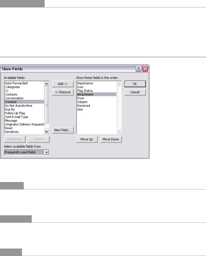
Figure 8-31.
A dialog box from Microsoft Outlook
What
Show both the “source” and the “destination” lists on the same page; let the user move
items between them, via buttons or drag-and-drop.
Use when
You’re asking the user to create a list of items by choosing them from another list. The
source list may be long—too long to easily show as a set of checkboxes, for instance.
Why
The key to this pattern is to show both lists on the same page. The user can see what’s
what—she doesn’t have to jump to and from a modal chooser dialog box, for instance.
A simpler alternative to
List Builder might be a single list of checkbox items. Both solve the
“select a subset” problem. But if you have a very large source list (such as an entire filesystem),
a list of checkboxes doesn’t scale—the user can’t easily see what’s been checked off, and
thus may not get a clear picture of what she selected. She has to keep scrolling up and
down to see it all.

384 Chapter 8: Getting Input from Users: Forms and Controls
How
Put the source list and the destination list next to each other, either left to right or top
to bottom. Between the two lists, put Add and Remove buttons (unless your users find
drag-and-drop to be obvious, not requiring explanation). You could label the buttons with
words, arrows, or both.
This pattern provides room for other buttons, too. If the destination list is ordered, use
Move Up and Move Down buttons, as shown in Figure 8-31. (They could have arrow
icons too, instead of or in addition to the words.)
Depending on what kind of items you deal with, you could either move the items liter-
ally from the source to the destination—so the source list “loses” the item—or maintain
a source list that doesn’t change. A listing of files in a filesystem shouldn’t change; users
would find it bizarre if it did, since they see such a list as a model of the underlying file-
system, and the files aren’t actually deleted. But the list of “Available fields” in the Outlook
example in Figure 8-31 does lose the items. That’s a judgment call.
Give the lists multiple-selection semantics instead of single-selection, so users can move
large numbers of items from list to list.
Examples
Most modern implementations of this pattern depend upon drag-and-drop to move
items between areas; if those items are visual, all the better. Flickr, shown in Figure 8-32,
demonstrates a more contemporary approach to a
List Builder: you can drag items from a
potentially long list of source images into a “batch” group in order to perform operations
on all batched images at once. Large text tells the user what to do at critical moments in
the interaction, such as starting a new batch or removing an image from the batch.
Figure 8-32.
Flickr
In other libraries
http://www.welie.com/patterns/showPattern.php?patternID=parts-selector

The Patterns 385
Good Defaults
Figure 8-33.
Kayak
What
Wherever appropriate, prefill form fields with your best guesses at the values the user
wants.
Use when
Your UI asks the user any questions requiring form-like input (such as text fields or radio
buttons), and you want to reduce the amount of work that users have to do. Perhaps most
users will answer in a certain way, or the user has already provided enough contextual in-
formation for the UI to make an accurate guess. For technical or semirelevant questions,
maybe he can’t be expected to know or care about the answer, and “whatever the system
decides” is OK.
But supplying defaults is not always wise when answers might be sensitive or politically
charged, such as passwords, gender, or citizenship. Making assumptions like that, or pre-
filling fields with data you should be careful with, can make users uncomfortable or angry.
(And for the love of all that is good in the world, don’t leave “Please send me advertising
email” checkboxes checked by default!)

386 Chapter 8: Getting Input from Users: Forms and Controls
Why
By providing reasonable default answers to questions, you save the users work. It’s really
that simple. You spare the user the effort of thinking about, or typing, the answer. Filling
in forms is never fun, but if having default answers provided halves the time it takes the
user to work through the form, he’ll be grateful.
Even if the default isn’t what the user wants, at least you offered an example of what kind
of answer is asked for. That alone can save him a few seconds of thought—or, worse, an
error message.
Sometimes you may run into an unintended consequence of
Good Defaults. If a user can
skip over a field, that question may not “register” mentally with him. He may forget that
it was asked; he may not understand the implications of the question, or of the default
value. The act of typing an answer, selecting a value, or clicking a button forces the user to
address the issue consciously, and that can be important if you want the user to learn the
application effectively.
How
Prefill the text fields, combo boxes, and other controls with a reasonable default value.
You could do this when you show the page to the user for the first time, or you could use
the information the user supplies early in the application to dynamically set later default
values. (For instance, if someone supplies a U.S. zip code, you can infer the state, country,
and municipality from just that number.)
Don’t choose a default value just because you think you shouldn’t leave any blank controls.
Do so only when you’re reasonably sure that most users, most of the time, won’t change
it—otherwise, you will create extra work for everybody. Know your users!
Occasional-use interfaces such as software installers deserve a special note. You should
ask users for some technical information, such as the location of the install, in case they
want to customize it. But 90% of users probably won’t. And they won’t care where you
install it, either—it’s just not important to them. So it’s perfectly reasonable to supply a
default location.

The Patterns 387
Examples
Kayak (Figure 8-33) supplies default values when a user begins a search for flights. Most
are quite reasonable: a round-trip economy flight with one traveler is common, and the
“From” city can be derived from either the user’s geographic location or the user’s previ-
ous searches. (The departure and arrival dates seem arbitrary, however.) The effect of
having all these defaults is that the user spends less time thinking about those parts of the
form, and she gets a quicker path to her immediate goal—the search results.
When an image canvas is resized in Photoshop, the dialog box shown in Figure 8-34 ap-
pears. The original image was 476 × 306, as shown. These dimensions become the default
Width and Height, which is very convenient for several use cases. If I want to put a thin
frame around the image, I can start with the existing dimensions and increase them by
just two pixels each; if I want to make the image canvas wider but not taller, I only need to
change the Width field; or I could just click OK now and nothing changes.
Figure 8-34.
A dialog from Photoshop
In other libraries
http://patternry.com/p=good-defaults/
http://ui-patterns.com/patterns/GoodDefaults

388 Chapter 8: Getting Input from Users: Forms and Controls
Same-Page Error Messages
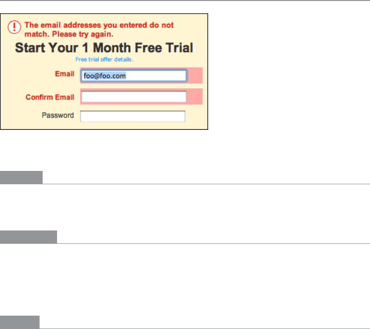
Figure 8-35.
Netflix registration box
What
Place form error messages directly on the page with the form itself; mark the top of the
page with an error message, and if possible, put indicators next to the originating controls.
Use when
Users might enter form information that somehow isn’t acceptable. They may skip re-
quired fields, enter numbers that cannot be parsed, or type invalid email addresses, for
instance. You want to encourage them to try again. You want to point out typos before
they become a problem, and help puzzled users understand what is asked for.
Why
Traditionally, applications have reported error messages to users via modal dialog boxes.
Those messages could be very helpful, pointing out what the problem was and how you
could fix it. The problem is that you had to click away the modal dialog box to fix the error.
And with the dialog box gone, you couldn’t read the error message anymore! (Maybe you
were supposed to memorize the message.)
Then, when web forms came along, error messages often were reported on a separately
loaded page, shown after you clicked the Submit button. Again, you can read the message,
but you have to click the Back button to fix the problem; once you do that, the message is
gone. Then you need to scan the form to find the field with the error, which takes effort
and is error-prone.
Most web forms now place the error message on the form itself. By keeping both messages
and controls together on the same page, you allow the user to read the message and make
the form corrections easily, with no jumping around or error-prone memorization.

The Patterns 389
Even better, some web forms put error messages physically next to the controls where the
errors were made. Now the user can see at a glance where the problems were—no need to
hunt down the offending field based just on its name—and the instructions for fixing it
are right there, easily visible.
How
First, design the form to prevent certain kinds of errors. Use drop downs instead of open
text fields, if the choices are limited and not easy to type. For text fields, offer
Input Hints,
Input Prompts, Forgiving Format, Autocompletion, and Good Defaults to support text entry.
Clearly mark all the required fields as required (with asterisks), and don’t ask for too many
required fields in the first place.
When errors do happen, you should show some kind of error message on top of the form,
even if you put the detailed messages next to the controls. The top is the first thing people
see. (It’s also good for visually impaired users—the top of the form is read to them first,
so they know immediately that the form has an error.) Put an attention-getting graphic
there, and use text that’s stronger than the body text: make it red and bold, for instance.
Now mark the form fields that caused the errors. Put specific messages next to them, if
you can—this will require extra space beside, above, or below the fields—but at the least,
use color and/or a small graphic to mark the field, as shown in Figure 8-35.Users com-
monly associate red with errors in this context. Use it freely, but since so many people are
colorblind with respect to red, use other cues, too: language, bold text (not huge), and
graphics.
If you’re designing for the Web or some other client/server system, try to do as much vali-
dation as you can on the client side. It’s much quicker. Put the error messages on the page
that’s already loaded, if possible, to avoid a page-load wait.
A tutorial on error-message writing is beyond the scope of this pattern, but here are some
quick guidelines:
• Make them short, but detailed enough to explain both which field it is and what went
wrong: “You haven’t given us your address” versus “Not enough information.”
• Use ordinary language, not computerese: “Is that a letter in your zip code?” versus
“Numeric validation error.”
• Be polite: “Sorry, but something went wrong! Please click ‘Go’ again” versus “JavaScript
Error 693” or “This form contains no data.”
Examples
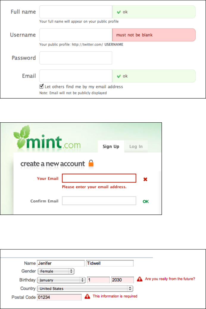
Twitter’s and Mint’s registration pages (Figures 8-36 and 8-37, respectively) show either
an error message or an “OK” message. This can help for short forms.

390 Chapter 8: Getting Input from Users: Forms and Controls
Figure 8-36.
Twitter registration page
Figure 8-37.
Mint registration page
Yahoo! uses humor in some of its error messages, while others are straight (see Figure 8-38).
Figure 8-38.
Yahoo! registration page

The Patterns 391
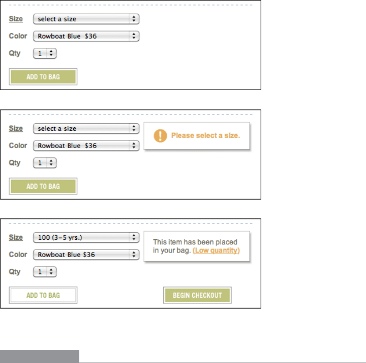
When you add a not fully specified item to your cart at Hanna Andersson’s site, it uses
a gentle message to remind you to fill in missing information, as shown in Figure 8-39.
(The
Input Prompt makes it too easy to overlook this field on the form, actually.) Once you
do add it, the same space might be used for an additional message of interest. Note also
that once the form detects that enough information is present, it puts the Begin Checkout
button on the form.
Figure 8-39.
Hanna Andersson’s purchase form
In other libraries
http://ui-patterns.com/patterns/InputFeedback
http://www.welie.com/patterns/showPattern.php?patternID=input-error
These two patterns are named “Input Feedback” and “Input Error Message.” You can
search for similar variations on the pattern name.
