Caers J. Modeling Uncertainty in the Earth Sciences
Подождите немного. Документ загружается.

P1: OTA/XYZ P2: ABC
JWST061-04 JWST061-Caers March 29, 2011 9:9 Printer Name: Yet to Come
4.2 MAKING DECISIONS 61
objectives. “Values” are general in nature; for example, values could be “be popular,”
“support UNICEF,” “be healthy,” “make money,” while objectives are specific and could
be of the form “maximize this” or “minimize that.” Distinguish between fundamental ob-
jectives that identify the basic reasons why a decision is important and means objectives,
which are ways of achieving a fundamental objective. Fundamental objectives should be
independent and can be organized in a hierarchy. For example, “maximize profit” can
be divided into “minimize cost” and “maximize revenue”. Means objectives are not the
fundamental reason for making a decision, a means objective could be, for example, to
“create a clean environment” or to “have welfare programs”. Indeed, welfare programs
and a clean environment are only a means to population happiness.
The tree in Figure 4.2 could be used as a template for the local government in our
example case.
The next step is to measure the achievement of an objective. For certain objectives,
there will be a natural scale, either in dollars or ppm or rates. For other, more descriptive
objectives a scale needs to be constructed, usually through numerical or other “levels”
(high, medium, low). In our example of Figure 4.2 some objective, such as “Minimize
Tax” has a natural scale in dollars, while others need a constructed scale. For example,
“Maximize population safety” can be measured as
1 = no safety
2 = some safety but existing violent crime such as homicide
3 = no violent crime but excessive theft and burglary
4 = minor petty theft and vandalism
5 = no crime.
4.2.4 Modeling the Decision
The goal of this phase is to reach a preliminary decision based upon the alternatives that
have been identified, the objectives that have been set, and the preferences for the relative
importance of those objectives. Generally three steps are identified at this stage:
1 Estimate payoff: Make an assessment of the extent to which each alternative helps to
achieve each objective (its payoff). The goal of this step is to make a relative com-
parison of the specific (not high level as discussed before but actual) value of the
alternatives toward achieving objectives. This is done through the development of a
payoff or consequence matrix (that quantifies how well each alternative score on the
objective attribute scales). The second is to determine how much value is derived from
these scores.

P1: OTA/XYZ P2: ABC
JWST061-04 JWST061-Caers March 29, 2011 9:9 Printer Name: Yet to Come
62 CH 4 ENGINEERING THE EARTH: MAKING DECISIONS UNDER UNCERTAINTY
2 Evaluate preference: Determine the relative priority or preference for the objective.
“Preference” in this context is used to describe the relative desirability between differ-
ent objectives.
3 Combine the performance against each objective into an overall score for each
alternative.
4.2.4.1 Payoffs and Value Functions
Recall that a payoff is the extent to which an objective is met after the decision is
made and the outcomes of any uncertain events have been resolved. Therefore, pay-
offs are not known in advance and must be forecast or estimated. This may require a
substantial amount of modeling and many such modeling techniques are covered in sub-
sequent chapters.
Consider the value tree of Figure 4.2 and the decision alternatives whether to “clean
up” or “not clean up”. Assume that neither alternative will impact safety (cleaning up
or not will not affect crime), then Figure 4.3 could be an example of a payoff matrix
for this case. Tax collection will be impacted by such clean up because of its cost (say
$10 million), which affects the local budget; however, ecosystem protection will increase
(a constructed scale) while industrial pollution (in ppm) will be small (some pollutants
may be left in the ground). In the case of not cleaning up, the tax collection also increases
because of the requirement to import “clean” water to meet the needs of the population,
assuming that the government would have to pay for this (suppose the contamination was
made by a government research laboratory for example). This number is a little more
difficult to establish. Indeed, the lawsuit will occur when the geology is unfavorable,
causing the pollution to leak to the drinking well. But since the subsurface is unknown (it
is not known whether there are channels or not, and what the orientation is), the number
listed here is an expected payoff. To obtain this number, it is necessary to do some 3D
modeling of the subsurface geology as well as simulate the flow of contaminants in the
subsurface and figure out the chances of contamination from these simulations. These are
topics treated in the rest of the book, so assume for now, that this expected payoff has
been established.
Clean up Do not
clean up
Tax collecon (million $) 1810
Industrial polluon (ppm/area) 50030
Ecosystem protecon (1–5)
14
Populaon health (1–5)
25
Economic interrupon (days) 0365
alternaves
Objecves
Figure 4.3 Example of a payoff matrix.
P1: OTA/XYZ P2: ABC
JWST061-04 JWST061-Caers March 29, 2011 9:9 Printer Name: Yet to Come
4.2 MAKING DECISIONS 63
PolluonTax
HealthEcosystem
ppm
$
score
score
100
0
100
0
100
0
100
15
Economic
Interrupon
days
0
100
9
25
20
Figure 4.4 Example of value functions.
In a payoff matrix, it makes sense to only include objectives that distinguish among
alternatives. Any other objective should be removed, such as population safety in this
case. Also, in a payoff matrix, one works across the rows of the payoff matrix rather than
down its columns.
The next evident question is how to incorporate our preference into a single attribute
scale and combine payoffs measured on different scales. This is addressed by means of
value functions. Value functions transform attributes to a common scale, say from 0 to
100. The value function expresses how an increase in the score translates into an increase
in value. A linear value function (Figure 4.4) therefore states that such increase is pro-
portional, such as for health, or inversely proportional, such as for pollution. A nonlinear
function, such as for taxes in Figure 4.4, states that an increase in the amount collected
results in a smaller decrease in actual value (high value if less taxes are collected). This
means that if tax becomes larger, then any increase in tax will leave the population not
necessarily equally more displeased (low value); they are already displeased with such
high taxes! For the ecosystem, an opposite attitude could be argued for: more pollution
will eventually completely ruin the ecosystem, while a small increase can possibly be
tolerable. Such nonlinearity in the function can therefore be interpreted as the attitude to-
wards “risk” that one may have about certain outcomes. For example, the attitude toward
safety may be different than the attitude toward income. The preference may be to risk
more when money is involved (tax) than with the environment, as such effects are often
irrevocable (although governmental attitudes around the world may substantially vary in
this aspect).
4.2.4.2 Weighting
Different objectives may carry different weights. This allows the decision maker to
inject his/her preferences of one objective over another. For example, preference in

P1: OTA/XYZ P2: ABC
JWST061-04 JWST061-Caers March 29, 2011 9:9 Printer Name: Yet to Come
64 CH 4 ENGINEERING THE EARTH: MAKING DECISIONS UNDER UNCERTAINTY
environmental protection may supersede preference in being displeased with increased
taxes. Note that preference is used here to compare various objectives, which is different
from the previous sections where preference was used to describe “risk” towards various
outcomes within a single objective. It may be tempting to use a simple relative weighting
by (1) ranking the various objectives, (2) assigning a number on scale 0–100, and (3)
normalizing and standardizong the score to unity.
Such an approach does not account for the payoffs of the alternatives. For example,
a specific objective may be ranked high but may not have much effect on the various
alternatives formulated. A direct weighting method therefore does not account for the
ultimate purpose, that is, to decide among various alternatives. In practice, the problem
can be overcome by using swing weighting, which does take account of the relative mag-
nitudes of the payoffs. In that case the objectives are first ranked by considering two
hypothetical alternatives: one consisting of the worst possible payoffs on all objectives
(in terms of score, not value) and one consisting of the best possible payoffs. The objec-
tive whose best score represents the greatest percentage gain over its worst score is given
the highest rank, and the methodology is repeated for the remaining objectives until all
are ranked.
Since in our example case we are dealing with a binary decision, the weighting prob-
lem does not present itself (there is always a best and worst). To illustrate the swing
weighting, consider a slightly modified example where two more alternatives are added:
(1) a detailed clean up that is more costly but removes more contaminant, therefore
protecting health and environment; and (2) to clean up half, that is, leave some pol-
lutant behind with a decreased risk, but nonetheless risk of drinking water contamina-
tion. Figure 4.5 shows how swing weighting works. Firstly, the best and worst scores
for each objective are taken, then the relative differences are ranked, with one be-
ing the largest relative difference. Clearly the tax impact is least discriminating among
the alternative and therefore gets the highest rank (and smallest weight, as shown in
Figure 4.6).
Detailed
clean up
Paral
clean up clean up
Clean up
Do not
Tax collecon
(million $)
1881012
Industrial polluon
(ppm/area)
5002003025
Ecosystem protecon
(1–5)
1245
Populaon health
(1–5)
2255
500
Economic interrupon
(days)
050365
alternaves
Objecves
WorstBest
188
50025
15
25
0500
Swing
rank
5
2
3
4
1
Figure 4.5 Example of swing weighting.
P1: OTA/XYZ P2: ABC
JWST061-04 JWST061-Caers March 29, 2011 9:9 Printer Name: Yet to Come
4.2 MAKING DECISIONS 65
Objecves rank weight Detailed
clean up
Clean up Paral
clean up
Do not
clean up
Tax collecon
5 0.07 30 20 100 0
Industrial polluon
2 0.27 100 99 40 0
Ecosystem protecon
3 0.20 100 75 25 0
Populaon health
4 0.13 100 100 0 0
Economic interrupon
1 0.33 0 33 90 100
Total: 62.1 67.0 52.5 33.0
Figure 4.6 Scoring each alternative.
After weights and attributes are known, scores on each objective can be combined
to determine an overall value for each alternative. This is achieved by calculating the
weighted sum of each column in the value payoff matrix
v
j
=
N
j
i=1
w
i
v
ij
with w
i
the weights calculated for each objective and v
ij
the payoff of the j-th alternative
for the i-th objective. This is done in Figure 4.6 where attributes are now turned into values
using some arbitrary value functions (not shown). Therefore, in summary, the clean up
alternative is the one that is logically consistent with maximizing the value of the decision,
for given alternatives, objectives, weights, payoff predictions and preferences expressed
in value functions.
4.2.4.3 Trade-Offs
Conflicting objectives can make decisions hard. In our case the minimization of tax bur-
den is opposite the cost of maintaining a clean environment. Increasing returns (money)
may come at the expense of increasing risks (health, safety, environment). A term called
“the efficient frontier” may help us investigate what kind of trade-offs we are making
and possibly change our decision based on this insight. This is very common in portfolio
management (choice of equities (shares in stocks of companies) and bonds). Portfolio
management utilizes historical data on return of equities to form the basis for assessment
or risk and return and use the past performance as a proxy for future performance.
To study trade-offs, two categories are made: one for the risks and one for the returns
(or cost/benefit). Overall weighted scores are then calculated for each subset, in a similar
fashion to above, as given
v
risk
j
=
N
risk
i=1
w
i
v
ij
v
return
j
=
N
return
k=1
w
k
v
kj

P1: OTA/XYZ P2: ABC
JWST061-04 JWST061-Caers March 29, 2011 9:9 Printer Name: Yet to Come
66 CH 4 ENGINEERING THE EARTH: MAKING DECISIONS UNDER UNCERTAINTY
Detailed weightrankObjecves
clean up
Clean up Paral
clean up
Do not
clean up
Tax collecon
010020300.075
Economic interrupon
100903300.331
Industrial polluon
040991000.272
Ecosystem protecon
025751000.203
Populaon health
001001000.134
Detailed Objecves
clean up
Clean up Paral
clean up
Do not
clean up
Return
3336.712.32.1
Risk
015.854.760
Figure 4.7 Obtaining trade-offs from a payoff matrix.
where N
risk
is the number of objectives classified as “risk” and N
return
the number classi-
fied as “return” (Figure 4.7).
It is possible to plot the risk/return or cost/benefit in a plot such as Figure 4.8. From
this plot some obvious alternatives can be eliminated as follows. Consider the alternative
“partial clean up.” The alternative “do not clean” up is clearly dominated by the alternative
“partial clean up.” Indeed, “partial clean up” has both more return and less risk. Therefore,
the alternative “do not clean up” can be eliminated because it lies below the efficient
frontier and results in taking on more risk relative to the return. “Do not clean up” is the
only alternative that can be eliminated as such; other alternatives trade-off either risk or
return with each other. The curve connecting these points is the efficient frontier. The
efficient frontier can be seen as the best set of trade-offs between risk and return for
the current alternatives. Recall that a decision can only be as good as the alternatives
formulated. Therefore, pushing the efficient frontier upwards (i.e., up and towards the
right in Figure 4.8) would require different alternatives leading to a better set of trade-
offs. Such alternatives are only as good as the imagination of those creating them.
Figure 4.8 allows the question to be asked “Am I willing to trade-off more risk for more
return between any two alternatives.” For example, is the decrease of about five units of
risk, worth the decrease in about ten units of return when going from “clean up” to “de-
tailed clean-up”? If all attributes were in dollar values than these would be actual dollar
trade-offs, in our case these are only indicative trade-offs, basically forming a scale from
“less preferred” to “more preferred” in terms of trade-off. Note that in this discussion
it is assumed that the scores are deterministic quantities (or some representative aver-
age value). Defining dominance is not quite so straightforward because of uncertainty. In
P1: OTA/XYZ P2: ABC
JWST061-04 JWST061-Caers March 29, 2011 9:9 Printer Name: Yet to Come
4.2 MAKING DECISIONS 67
detailed
clean up
clean up
paral clean up
Do not clean up
0
10
20
30
40
50
60
70
4035302520151050
more risk
more return
Efficient froner
Figure 4.8 Assessing trade-offs between conflicting objectives.
this case, stochastic (or probabilistic) dominance can be used; this is discussed in more
advanced books.
4.2.4.4 Sensitivity Analysis
Sensitivity analysis is an important topic in this book; the concept is revisited in various
chapters. In a general sense, a sensitivity analysis aims to evaluate the impact of varying
some “input parameters” on some “output response” (Figure 4.9). In decision analysis,
Input
Parameters
Determinisc
Modeling
Funcon
Output
Response
Example parameters
Variogram
Random numbers
Boundary condion
Inial condion
Example funcons
Flow simulaon
GCM
Stochasc simulaon
Decision model
Example response
Decision
Earth Temperature
Reservoir pressure
Earth model
Δ input Δ
output
Figure 4.9 General depiction of a sensitivity analysis (GCM = Global Circulation Model).
P1: OTA/XYZ P2: ABC
JWST061-04 JWST061-Caers March 29, 2011 9:9 Printer Name: Yet to Come
68 CH 4 ENGINEERING THE EARTH: MAKING DECISIONS UNDER UNCERTAINTY
the output response could be the decision made or the value of a payoff. The relationship
between input and output is modeled through a deterministic function, that is, once the
input is known, the output is also uniquely known. Note that even a “stochastic simula-
tor” such as Monte Carlo simulation falls in this category, in that case the deterministic
function is the probability distribution, the inputs are the parameters of the probability
distribution and the random number generated for a given random seed.
In modeling uncertainty as well as in decision analysis, the exact numbers obtained
through the analysis and modeling, such as payoffs, probabilities or scores, are often less
important than the impact a change in these values have on either the decision made
or the model of uncertainty. Indeed, why care about being obsessed with determining
a payoff exactly when even a large change of such payoff will not affect the ultimate
decision? A sensitivity analysis, even a simple one, allows what matters and what does
not to be figured out and can lead to a more focused modeling of the uncertainty about the
Earth. This is important, since any modeling of uncertainty requires a context, as such,
the actual modeling becomes much simpler when targeted than just modeling uncertainty
for the sake of uncertainty.
4.2.4.4.1 Tornado Charts Tornado charts are used for assessing the sensitivity of a
single output variable to each input variable. This entails varying one input variable while
leaving all other input variables constant. Varying one input variable one at a time is
called “one-way sensitivity.” We will cover “multi-way sensitivity” where multiple input
variables are varied simultaneously in later chapters.
Tornado charts are visual tools for ranking input parameters based on their sensitivity
to a certain response or decision. The input variables are changed one at a time (the others
remain fixed) by a given amount on the plus and minus side and the change in response,
such as a payoff, are recorded. Often a change of +/− 10% is used; alternatively, the
change is made in terms of quantiles, such as given by the interquartile range of the
variable. Next, the input variables are ranked in order of decreasing impact on response,
in terms of absolute value difference in response for the +/−. Using the initial (prior to
sensitivity analysis) value of the payoff as a center point, the changes are plotted on a bar
chart in descending order of impact, forming a tornado-like shape. An example is shown
in Figure 4.10. Note how the length of the bars need not be symmetric on either side. The
color indicates positive or negative correlation; a blue bar on the left and red bar on the
right indicates that an increase of the input parameter leads to an increase in response.
The opposite color bar combination indicates a decrease in response to an increase in the
input parameter.
4.2.4.4.2 Sensitivity Analysis in the Presence of Multiple Objectives In the case
of multiple, possibly competing, objectives it may be important to assess the impact
of changing the weights, such as in Figure 4.11, on the decision made. Again one can
change one weight at a time, possibly starting with the largest weight. However, in doing
so, one must also change the other weights such that the sum equals unity. This can be
done as follows, consider as largest weight, in our case w
5
given to objective “minimize

P1: OTA/XYZ P2: ABC
JWST061-04 JWST061-Caers March 29, 2011 9:9 Printer Name: Yet to Come
4.2 MAKING DECISIONS 69
Drinking water produced
million gallons/yr
–5
+50
Aquifer volume
Proporon shale
Depth water table
Orientaon sand channels
Grain size
Figure 4.10 Example of a tornado chart.
economic interruption,” if this is changed to w
new
5
then the other weights can be changed
as follows:
w
new
1
= (1 − w
new
5
) ×
w
1
w
1
+ w
2
+ w
3
+ w
4
,w
new
2
= (1 − w
new
5
) ×
w
2
w
1
+ w
2
+ w
3
+ w
4
, etc.
Each weight is pro-rated according to its contribution to the remaining weights.
The impact of changing w
5
on the score values given to each alternative is shown in
Figure 4.11. The base case is w
5
= 0.33, a change in best score is seen when w
5
drops
0
10
20
30
40
50
60
70
80
90
100
10.80.60.40.20
Detailed Clean up
Clean up
paral clean up
no clean up
Weight of objecve “minimize economic interrupon”
Score for each alternave
Figure 4.11 Sensitivity of scores on changing the weight on “economic interruption”.
P1: OTA/XYZ P2: ABC
JWST061-04 JWST061-Caers March 29, 2011 9:9 Printer Name: Yet to Come
70 CH 4 ENGINEERING THE EARTH: MAKING DECISIONS UNDER UNCERTAINTY
to 0.21 when “detailed clean up” becomes the best alternative, and when w
5
increases to
0.46 when no clean becomes the best alternative. An absolute change of 0.13 in weight
w
5
on either side can therefore be tolerated to achieve the same decision.
4.3 Tools for Structuring Decision Problems
4.3.1 Decision Trees
In previous sections a broad outline for making decisions was summarized. Here the
decision tree as a tool to make this more quantitative and to introduce the language of
probability into the actual numerical calculations is discussed. The tree is a visual means
for understanding the decision problem as well as organizing the calculations for making
an optimal decision.
A fictional but realistic example is considered throughout to illustrate the building
of the decision tree. Consider the following scenario (although simplified from the real
situation for educational purposes).
Farming near the California coast has led to depletion of the groundwater table and the
intrusion of saltwater into the aquifer system, jeopardizing farming activities. A solution
is to inject water (recharge) into the subsurface at targeted locations to keep groundwater
levels high and hence saltwater intrusion at a minimum. There are two ways of inject-
ing water: either via ponds that filtrate water slowly into the subsurface or through wells
stimulating directly the aquifer. Ponds are less expensive but require space, while injec-
tion wells can be drilled at virtually any location. Two such recharge locations have been
identified (note that it is assumed this is known). At location A, either a well can be drilled
or a pond is available, at location B only a well can be drilled. The “value” here consists
of two parts: the cost associated with doing a recharge operation (or not doing one since
it may not matter or benefit) and the cost of losing farming land due to the lack of proper
irrigation water. The subsurface consists of alluvial channels, this is known, but at some
locations the orientation of these channels is uncertain, either they run north-west or they
run north-east. The decision question is which recharge location to pick or to have no
recharge at all. How can we structure and visualize this decision problem?
4.3.2 Building Decision Trees
A decision tree represents the main elements of a decision problem as described in the
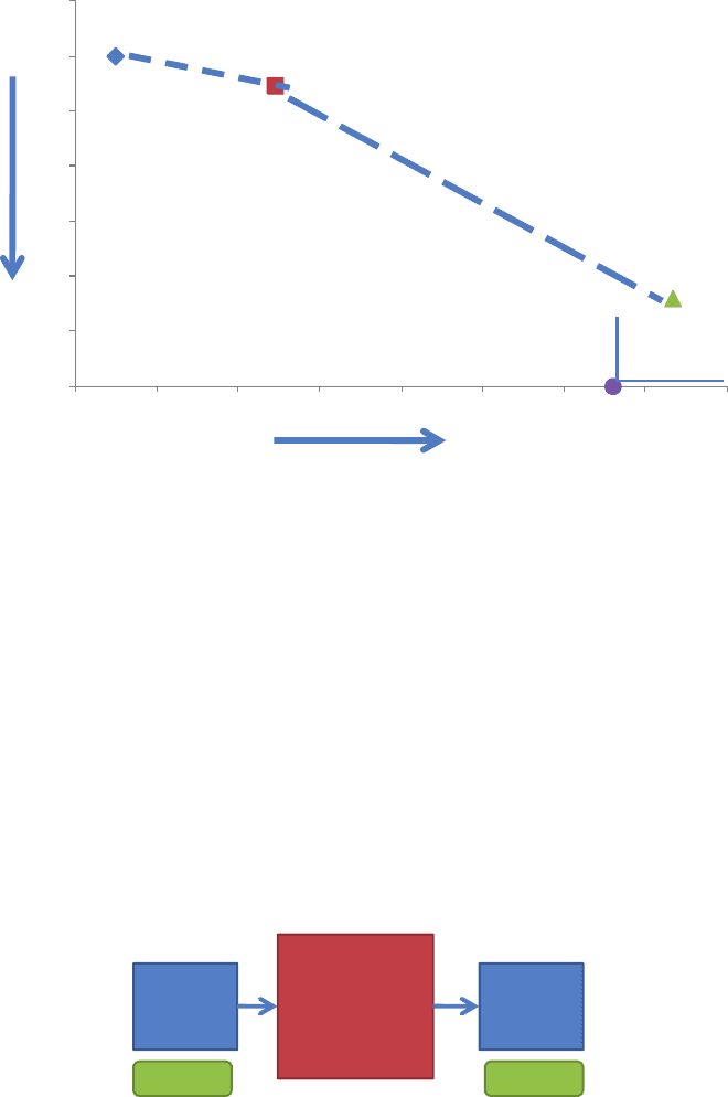
sections above. The various decision tree elements are described in Figure 4.12:
r
Squares represent decision nodes with labeled branches listing the various alternatives.
r
Circles represent uncertainty nodes with branches representing possible outcomes (dis-
crete) and their associated probabilities.
r
Triangles represent payoffs with values written at the end.