Kortum P. (ed.) HCI Beyond the GUI. Design for Haptic, Speech, Olfactory, and Other Nontraditional Interfaces
Подождите немного. Документ загружается.


that it does not allow the device under test to be held as it was designed to be held
(although the example in Figure 10.17 does attempt to approximate it), and it
places the camera in the direct view of the participant, which can be annoying
or get in the way of the participant’s view. A further disadvantage for mobile
phones is that the camera can get in the way of placing phone calls, if that is
one of the tasks under test.
10.5.3 Screen Replication Utility
If the device supports it, a screen replication utility can provide a detailed and clear
view of the small screen on a larger computer monitor. Once on a computer moni-
tor, numerous screen-recording utilities can be used to record what is happening
on the screen for later viewing. However, this option requires support by the
small-screen device. There are several utilities that can serve this purpose for
Windows Mobile Smart phones and PocketPCs, as well as Nokia Series 60 devices
and select Sony Ericsson phones. The advantage to this option is that it provides
an unobstructed view of the screen without having to remind a participant to put
it in a certain position and without having to attach a camera to the device. However,
the disadvantage is that it is dependent on support by the device under test, and it
cannot show the participant’s fingers.
10.5.4 Usability Laboratories
Many usability tests occur in a usability laboratory. Usability laboratories often uti-
lize two rooms: a participant room and an observer room. A one-way mirror often
separates the two rooms and enables the observers to see into the participant
room, but prevents the participants from seeing into the observer room. Micro-
phones can be mounted in various locations within the participant room to enable
the observers to hear conversations, and cameras can be mounted in various loca-
tions to enable video recordings of the events.
10.5.5 Testing without a Laboratory
Usability testing does not require an elaborate laboratory, however. Many times,
usability tests can be run just as effectively in conference rooms with minimal
equipment. This guideline is just as true for usability testing of small-screen inter-
faces (see Figure 10.16). The techniques described above can be used in any confer-
ence room: The camera can be a camcorder (unless the document camera is used),
and the microphone can be directly connected to the camcorder (or can be the cam-
corder’s microphone itself). In fact, much of the equipment described above has
options for the use of inexpensive equipment. The main point is that usability test-
ing can be run on any equipment budget. It is just important that it is run.
10 Small-Screen Interfaces
342

10.6
DESIGN GUIDELINES
The fundamentals of software design remain constant across various implementa-
tions whether they are small-screen, web, or traditional PC applications. The focus
of this section will be on design guidelines that are unique or important to small-
screen design. All design principles must be adapted to the strengths and limita-
tions of the implementation medium.
As with all interface design projects, user interface design for small displays
should follow the user-centered design (UCD) process. This means involving users
in each step of the requirements-gathering and design process, plus performing
iterative design with usability testing. A full discussion of the UCD process is out-
side the scope of this chapter; see Lewis and Reiman (1993) for a detailed explora-
tion of the subject.
As demonstrated in Section 10.4, the size of the visual display of small-screen
devices is a primary restriction to interface design. However, other factors must
also be considered, such as the imperfection of current input technologies and the
often limited attention of the user in a mobile setting. With those restraints in mind,
several overarching design principles emerge: Design for simplicity, design with
the small screen in mind, provide useful feedback, maintain interaction design
standards, and respect the user’s physical and mental effort.
10.6.1 Design for Simplicity
As discussed in Section 10.3, small-screen devices tend toward two extremes: the
“does-everything” mobile PC replacement and the “does-one-thing-well” informa-
tion appliance. In both cases, the underlying technology is usually complex and
the interface must strive toward the principal goal of simplicity. In his classic book,
The Design of Everyday Things
, Donald Norman defines the paradox of technol-
ogy as follows: “Whenever the number of functions and required operations
exceeds the number of controls, the design becomes arbitrary, unnatural and
complicated” (1998:29). The hardware design trend toward more complicated
and feature-filled devices makes the guideline of keeping things simple a very
difficult task indeed.
Relate Visual Precedence to Task Importance
Understanding what the user wants the device to do should be the first step in the
simplification process. Many interface design projects have gone wrong by
making uninformed assumptions about user needs (Nielsen, 1993). The overarch-
ing need for simple design makes understanding both the primary tasks and their
priority of use absolutely critical to good design. Once tasks and task priority are
understood, the design of the interface can be organized accordingly. The most
frequently used tasks and those that are used by the majority of users should be
10.6 Design Guidelines
343
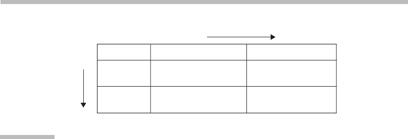
the most visible in the interface (Isaacs & Walendowski, 2002). Figure 10.18 shows
the suggested visibility of tasks based on their usage.
Reduce Functionality
Strongly consider removing functionality that falls into the “Occasional by few”
category in the figure. In fact, the designer should agonize over the addition of
each individual feature to the design no matter where it falls on the frequency
of use scale (37signals, 2006). Bear in mind that each additional feature makes
the overall product more complex and more difficult to use.
Keep Navigation Narrow and Shallow
Small-screen devices are generally used in settings where the user’s attention is at
a premium, such as making a call on a busy bus or making a meal in the micro-
wave. In these cases, users do no want to choose from a dozen options; they want
to complete their primary task as quickly as possible. Task efficiency is an
extremely important design goal and often helps enforce the principle of simplic-
ity. This implies that the information hierarchy of the interface should be kept
both narrow (fewer choices at each level) and shallow (fewer levels of choice to
the bottom of the hierarchy). As discussed in Section 10.4, if the number of
options must exceed a narrow and shallow hierarchy, then it is more efficient to
design a deeper structure than a wider one.
Avoid Extraneous Information on Each Screen
The principle of simplicity extends not only to the overall ease of use of the device
but also to the complexity of each individual screen. Note the limited number of
controls, interface widgets, and text used in the Now Playing view of the Apple
iPod shown in Figure 10.19.
The Now Playing screen could show other potentially useful data items, such
as detailed music metadata, next and previous track information, track ratings,
repeat/shuffle status, and playlist name, among others. However, the designer
More
clicks
Frequent
By many
Frequent by many
Visible, few clicks
Occasional by many
Suggested, more clicks
Frequent by few
Suggested, few clicks
Occasional by few
Hidden, more clicks
By few
Occasional
Less visible
FIGURE
10.18
Visibility tasks based on usage.
The tasks in the interface are based on the amount of usage and the
number of users.
Source:
From Isaacs and Walendowski (2002).
10 Small-Screen Interfaces
344
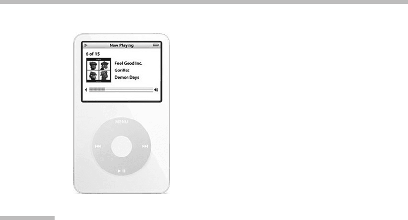
has intentionally shown only the information critical to the user’s primary task.
Note also the simple iPod hardware controls: Each hardkey on the device serves
a dedicated and important purpose within each context, and there are no extrane-
ous controls.
Reduce or Remove Preferences
Advanced customization is a standard aspect of traditional application design that
is not suited to the small screen. Many traditional applications allow the user to
customize the user experience through complex (and often unused) controls such
as preference dialogs. While keeping the user in control of the interface is impor-
tant, providing many different ways to customize the way the application works
incorporates too much complexity into a small-screen interface. Typically,
small-screen applications are simpler than traditional applications; thus customi-
zation is less important even to advanced users. The exception to this rule is
potentially annoying features such as warning messages that often pop up. In
these cases, a simpler customization, such as allowing the user to permanently
dismiss the dialog, can be useful because it simplifies the entire experience.
Use Progressive Disclosure
Perhaps the most powerful tool in interface simplification is progressive dis-
closure. Progressive disclosure involves breaking down complex tasks into separate
understandable parts. Each step in the task is split into screens that lead the users
toward their goal. Many interface guidelines have their basis in progressive
FIGURE
10.19
Now Playing view of Apple’s iPod.
This view demonstrates how each screen of the interface can be made both simple
and useful at the same time.
Source:
From Apple.com, 2007; courtesy Apple Inc.
10.6 Design Guidelines
345

disclosure; perhaps the best example is the hierarchical navigation found in nearly
every modern interface. Instead of giving the user 50 different options to choose
from, those choices are broken up into meaningful groups and subgroups. On
the surface, progressive disclosure appears to break the guideline of efficiency;
however, in practice, progressive disclosure actually improves the user’s speed
in completing tasks (Buyukkokten, Garcia-Molina, & Paepcke, 2001).
With a flat list of options, the user is forced to decide between myriad
(often ambiguous) options. It takes time for the user to decide which option to
choose and, if the chosen option is incorrect, the user must scan the long list
and choose again. As discussed in Section 10.4, a properly designed progressive
disclosure employs mutually exclusive (orthogonal) choices at each step to ensure
that the user is always progressing forward toward her goal. On a small-screen
device, progressive disclosure is even more important than in traditional applica-
tions because of the limited screen space available to display information.
10.6.2 Design with the Small Screen in Mind
Minimize User Input
As discussed in Section 10.2, user input is an even more difficult design challenge
than visual output for small-screen devices. This impediment implies that the
designer must be thoughtful whenever adding user input widgets to the interface.
If possible, avoid user input all together. For example, if the device is giving feed-
back to the user that is noncritical, it may make sense to use a transient dialog box
and have the dialog automatically dismiss itself after a short period of time.
In cases where user input is required, keep the required user effort to a mini-
mum. If a particular screen requires the user to enter his city (say to determine time
zone on a mobile phone), do not present a free-form text entry field. While free-form
entry might be fairly easy for a user with a full-sized QWERTY keyboard, using the
DTMF keypad found on a typical mobile phone to enter a long city name will require
a great deal of effort and time. Widgets that use the cognitive principle of recognition
(such as radio buttons, drop-downs, and checkboxes), rather than recall (such as free-
form entry fields), are much more effective. In the previous example, using a drop-
down menu that displays city names or a field that enables ZIP/postal code entry
(and performs a lookup to determine city name) would be much more appropriate.
Minimize Vertical Scrolling and Avoid Horizontal Scrolling
Ideally screens should be designed so that there is no need for scrolling of any kind.
In large-screen applications and on the Web, applications are often heavy with
instructional or informational text. The small-screen designer does not have this
luxury and instructional text should be less necessary since functionality is nor-
mally simpler on the small screen. A design that requires lengthy textual instruc-
tions is an indication that the interface is too complex and should be revised.
10 Small-Screen Interfaces
346

In some more complicated applications, it is unavoidable to present a scrol-
ling screen. In these cases it’s important to use vertical rather than horizontal
scrolling. The proliferation of the Web has made vertical scrolling a well-under-
stood interface paradigm for the majority of users. Western users read from top
to bottom and from left to right, so vertical scrolling maps translate well to the
real-world task of reading a book. Horizontal scrolling is far less understood by
users and breaks both the metaphor of book reading and the perceptual process
of visual scanning. In some cases, horizontal scrolling is unavoidable (e.g., when
scrolling around a map or an image too large to fit on the screen). In these cases,
use a scrolling border (as discussed in Section 10.4).
Use Hyperlinking Effectively
In many cases, it is difficult to provide enough information to the user inside a sin-
gle small screen (e.g., some error messages require detailed textual advice). In
these situations, hyperlinking can be used. The beauty of the hyperlink is its abil-
ity to hide details while still making them available to those who want more infor-
mation. Hyperlinking is especially useful in cases where users may see the same
text many times (e.g., a common error message). In these cases, the user may
need detailed information the first time the message is displayed, but does not
want to be forced to scroll through the same long text every time the error occurs.
Of course, if an error is so common that the user is seeing it all the time, this is a
good indication that the design is flawed. Always strive for a design that minimizes
the number of possible user-initiated errors.
Provide Useful Error Messages
Simplified content can sometimes lead to confusion if taken to an extreme. Error
messages need to be helpful even on the small screen. Ideally an error message
contains three distinct parts: (1) a unique error identifier, (2) a description of
the problem, and (3) possible solutions. Item 1 is important in the case where
the user is unable to quickly figure out a solution. A unique identifier allows users
to easily seek help about their specific problem from an external source (e.g., a
website or customer service). Items 2 and 3 need to be written without technical
jargon and in a language that the user can understand. Properly written error mes-
sages can make a significant difference in the usability of a complicated system.
Prioritize Information on Each Screen
Even minimal content can be confusing to a user if it is not presented in a mean-
ingful way. As mentioned earlier, display the most important information first and
largest on the screen (always based on your knowledge of the user’s primary
tasks). If no priority can be given to the information, order the data in a logical
manner (e.g., alphabetically or chronologically) to reduce the user’s memory load
and increase task efficiency. Similarly, grouping like data elements together
makes visually scanning items faster.
10.6 Design Guidelines
347

10.6.3 Provide Useful Feedback
Visual, auditory, and sensory feedback to the user is one of the most critical
aspects of the interaction design of a small-screen device. Providing just the right
amount of feedback without overwhelming the user can be a tricky task.
Identify Critical Feedback
Another guideline based on the limited attention that users typically provide their
small-screen devices is that user feedback must be very strong. Users need to be
made continually aware of what the system is doing while they interact with the
device. Identify the information that is critical to the user’s needs and present
only that information to the user. For the relatively simple example of a micro-
wave display, it is important that users know the heat setting of the microwave
and the remaining time left in the heating process. Removing or obscuring either
of those two critical items from the screen to display other information will
confuse and frustrate users.
Employ Alternative Feedback Modalities Intelligently
The use of alternative forms of feedback can be very powerful on small-screen
devices (often in contrast to traditional computer applications). Using sound
and tactile feedback is a standard technique on many small-screen devices
because the user’s attention is rarely focused exclusively on the device. Imagine
how useless a mobile phone would be if it only presented visual feedback of an
incoming call! However, the decision to use alternative feedback should not be
made lightly. Users do not want their attention diverted unless an important event
has occurred. The guideline here is to use alternative feedback intelligently and
sparingly.
Ensure Quick System Response Time
Related to task efficiency is the amount of time that it takes the interface itself to
respond to the user. There are very few tasks that are technically complex enough
that the user should have to wait for the interface to respond. The
BlackBerry
Style Guide
states, “user interface response time should be, at worst, 200 ms
(1/5 of a second) or better. If an operation is expected to take a long time (e.g.,
a text search or a database query), then it should be executed in the background”
(Research in Motion, 2003). If for some reason a long task cannot be performed
in the background and the user is forced to wait, ensure that detailed feedback
is presented. Ideally such feedback includes an estimate of the amount of time
the process will take to finish. The progress bar widget is an ideal feedback control
for such situations since it gives the user an indication of how long the process will
take and provides feedback that the process is still moving forward. For any
10 Small-Screen Interfaces
348

process that forces the user to wait, even with strong feedback, ensure that you
provide a way to cancel the task.
10.6.4 Maintain Interaction Design Standards
Across the wide range of small-screen devices, many different user interface styles
are used. However, standards do exist and in some cases they are very well devel-
oped and documented. Where standards do not exist, using concepts that users
already understand can dramatically improve the usability of a complex interaction.
Use Existing Standards
When designing for the small screen, as with any other type of interface design,
the design should begin with existing standards. Many of the more advanced
small-screen devices (such as the Windows Mobile platform) have detailed inter-
face guideline documents that are created to ensure consistency across all plat-
form applications. Less complex devices also have standards, but they are often
implicit and rarely written down. For example, users have an expectation that
pressing a button on a watch will cause some action to occur in the watch display.
This may seem obvious, but many watches break this basic standard by including
(often unlabeled) buttons that only work in certain contexts.
It is important to explore the presentation, widget, and interaction standards
of the device before design begins. Avoiding these fundamental building blocks
of the interface can cause significant rework when user testing uncovers problems
with the nonstandard design. Similarly, existing device visual-design standards
should only be broken in the most extreme cases, such as when the existing
framework simply will not support the task you are trying to achieve.
Use Real-World Metaphors
Existing real-world metaphors that translate into the world of software are some of
the most powerful user interface paradigms. Take for example the play, pause, track
forward, and back buttons found on almost all digital music players (Figure 10.19).
These controls have been carried forward since stand-alone tape players were first
released. Making the decision to break a well-understood metaphor will take the
interface into unknown waters; the designer will have no idea whether the new
interface will work effectively until user testing is performed. The same goes for
control widgets. Making a decision to create or modify an existing, well-understood
widget is extremely dangerous to the usability of the device. In his famous book
Tog
on Interface
, Apple Macintosh GUI designer Bruce Tognazzini (1992) chronicles his
experience trying to create a hybrid checkbox/radio button widget. After many
frustrating iterations of design and testing, he completely abandoned the seemingly
simple control because users could never figure out how the new widget worked.
10.6 Design Guidelines
349

10.6.5 Respect Both Mental and Physical Effort
Due to the limited amount of attention users give to their small-screen devices, it
is important to respect the amount of both mental and physical effort the user
must employ to interact with the interface. Instead of forcing the user to do the
work, a good design will make the user’s tasks almost effortless. For example,
several cameras provide panorama modes that aid the user in the creation of
panoramic pictures by showing the side of the previous picture on the screen to
help the user line up the next picture in the series (Isaacs & Walendowski, 2002).
Use Wizards to Simplify Complex Interactions
The software wizard is a potent navigation paradigm that embodies the guideline
of progressive disclosure and reduces the user’s memory load by splitting up com-
plex tasks into multiple steps. A well-designed wizard includes the ability to move
forward and back through the various steps and also keeps the users informed
about where they are in the wizard process. The key with small-screen wizard
design is to eliminate as many input fields as possible through simplification by
putting the onus on the system software to do as much of the work as possible.
For example, if the interface is capturing an address, ask for the ZIP/postal code
first, then prepopulate the city and state fields with the appropriate data to reduce
user input.
Use Multitasking Operating Systems Effectively
Many modern small-screen operating systems natively support multitasking.
While multitasking is a terrific boon to software design, care must be taken in
its interface implementation. Due to fact that users have limited attention for their
devices, it is not a good idea to force a user to multitask to complete a task. When
using a small-screen device, users typically have a single task in mind and they
want to complete that task as quickly as possible. Multitasking is a powerful tool,
but it should be used primarily by the system and not by the user. For example,
system tasks that cannot be resolved in a timely manner should be performed
in the background so that they do not interfere with the user’s continued use of
the device.
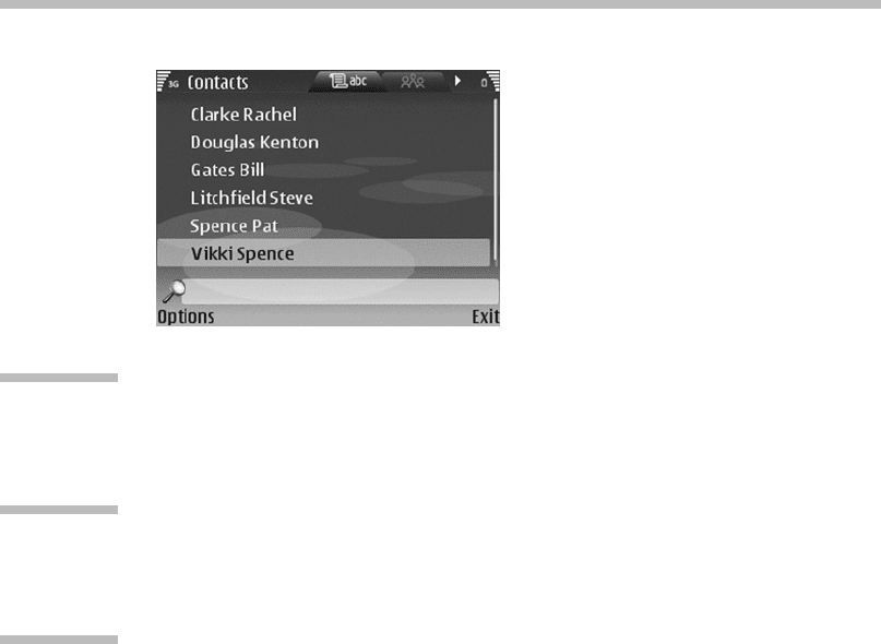
Design for Efficiency
The Nokia Series 60 Contacts application shown in Figure 10.20 is a strong exam-
ple of efficient and simple small-screen design. The user is able to scroll vertically
through the list of alphabetized contacts. However, if the user has a large number
of contacts, the list gets too long to scroll through. In this case the designers have
included an alphabetical filter that works with the keypad. Pressing the letter
M
will filter the entire list to show only those names that have an
M
beginning
the first or last name. This technique is surprisingly effective at improving task-
completion time and is intuitive to learn even by novice users.
10 Small-Screen Interfaces
350
10.7
CASE STUDY
A case study of a small-screen interface can be found at
www.beyondthegui.com
.
10.8
FUTURE TRENDS
As discussed in Section 10.3 of this chapter, there are several trends that will con-
tinue into the future of small-screen devices. The most prevalent one affects all
technological fields: increased capability of both software and hardware. When
making purchase decisions, users often buy based on the feature list of the device
(Sarker & Wells, 2003). This trend encourages hardware manufacturers to inte-
grate additional functionality into their small-screen devices. High-end smart
phones and hybrid devices are constantly incorporating functionality previously
found only in dedicated devices, such as location-based services, high-resolution
cameras, multimedia messaging, and improved text input. Technologies formerly
found solely in traditional personal computers will also continue to be integrated
into small-screen devices: multimedia editing, increased wireless data bandwidth,
larger device memory, and open software architectures.
The opposite trend will also continue in the future: simple dedicated informa-
tion appliances that perform a limited number of functionalities but do so in a
flexible, feature-rich, and usable manner. While those on the cutting edge will con-
tinue to purchase leading-edge devices, the average consumer wants less sophisti-
cated and easier-to-use technology. The maturing world of multimedia involves
the blending of several complex technologies, making the consumer’s learning
curve steep. Media center systems will continue to present straightforward,
uncomplicated interfaces hiding the intricate media playback, wireless networking,
FIGURE
10.20
Nokia Series 60 Contacts application.
The field with the magnifying glass allows the user to quickly find a contact using
filtering.
Source:
From allaboutsymbian.com, 2007.
10.7 Case Study
351