Kortum P. (ed.) HCI Beyond the GUI. Design for Haptic, Speech, Olfactory, and Other Nontraditional Interfaces
Подождите немного. Документ загружается.


F According to magnitude (small, medium, large)
F Consistently (if items appear in multiple places, keep the order the same)
F Categorically
F According to frequency of use (place the most frequently accessed items
at the top)
Frequency of use is often the preferred choice. Organizing menus items in this
way can save time and errors, as items located deep within a menu structure
are often difficult to find. In our experience from viewing hundreds of users navi-
gating menus, users will often select the first category that could contain the item
for which they are looking. Thus, ordering items according to frequency of use
will aid this search technique, as well as provide a more efficient interface for
continued use.
This guideline can be adapted if the items have a natural order to them (such
as temporal or magnitude), or to maintain consistency with other menus. For
example, if Save commonly appears above Delete in other menus in the interface,
then even in a menu in which Delete may be more frequently chosen, it may be
best to again place Save above Delete from a consistency standpoint. Use alpha-
betical ordering only if those particular items are often presented in this way
(e.g., a list of states).
Menu Enhancements
One promising approach to enhancing menus is to enable keyword entry. Lee and
Raymond (1993) note two factors that cause difficulty for users of menu systems:
F A disproportionate number of errors occur at the top menu levels.
F Menu systems can be tedious, inefficient, and boring for expert users.
Menu keywords can assist in both situations. These systems associate a keyword
with each menu, enabling expert users to bypass the problematic upper levels and
reduce keystrokes to immediately access lower levels. Lee and Raymond (1993)
present a series of studies showing a reduction in search time, failures, and number
of frames accessed, with a marked improvement in user preferences.
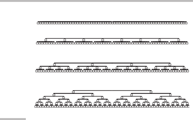
Menu Depth versus Menu Breadth
Menus can be
broad
, with many options per menu category, or
narrow
, with few
options per category. They can also be
deep,
with many levels of subcategories,
or
shallow
, with few levels of subcategories (Figure 10.15). For a given set of
features, the following question is often raised: Is it better to have a broad and
shallow menu hierarchy, or a narrow and deep menu hierarchy?
This question has been heavily studied in the literature. Early studies on desk-
top computer menus show that broad hierarchies are usually the most efficient for
users, especially when the options are unambiguous. Broad hierarchies also seem
10 Small-Screen Interfaces
332
best for expert users. However, if errors are costly or the number of errors is high,
a narrow hierarchy that funnels users into a choice can be best. (A summary of
these studies can be found in Bernard, 2002a, and Geven et al., 2006.)
The majority of studies conducted on this issue, however, have focused pri-
marily on evaluating structures of relatively constant shapes (the same number
of items per level). Few have examined the shape of the structure. Norman and
Chin (1988) and Bernard (2002b) examined differently shaped structures, includ-
ing a constant breadth (same number of items per level), a decreasing structure
(more items in upper levels than in lower levels), an increasing structure (more
items in lower levels than in upper levels), a concave structure (more items in
top and bottom levels, fewer items in middle levels), and a convex structure
(more items in middle levels, fewer items in top and bottom levels). Both studies
found that concave structures are more navigationally efficient than relatively
constant shapes of the same size and depth. Thus, they assert that broad menus
at the middle levels will increase menu selection errors.
The majority of the above studies were performed on desktop computers
where more information can be presented on the screen. If all items cannot be
displayed on the screen at a time, the depth-versus-breadth trade-off shifts. Geven
et al. (2006) re-evaluated this issue with menus on mobile phones and PDAs. They
found that with mobile phones and PDAs, the most effective hierarchy has only
four to eight items per level, and if a large number of items are needed, it is better
to increase the number of levels than to increase the number of items per level.
Narrow structure: 6 levels, 2 items each (2 2 2 2 2 2) – 64 items total
Structure: 3 levels, 4 items each (4 4 4) – 64 items total
Structure: 2 levels, 8 items each (8 8) – 64 items total
Broad structure: 1 level, 64 items (1 64) − 64 items total
FIGURE
10.15
Breadth versus depth.
Examples of broad, narrow, deep, and shallow menu structures.
10.4 Human Factors Design of the Interface
333

Thus, a deeper hierarchy is more effective for users of products with small
screens than a broad hierarchy, for expert users and novice users alike.
Icons
Icons are often used in menu design, particularly at the top levels of a hierarchy.
Research into the value of the icons, however, is mixed. MacGregor (1992) found
that when icons show an example of an item in that category, they reduce errors
by 40 to 50 percent. The generalizability of this result, however, is dependent on
the icon design and its success at unambiguously representing a category mem-
ber. Icons are also useful in menus as a means for achieving incidental learning
for later use in toolbars or other isolated conditions (Dix, 1995).
Baecker and colleagues (1991) asserted that the meaning of an icon should be
obvious to experienced users and self-evident to novice users. They declare that
many icons do not meet the former criterion, and most do not meet the latter.
As a result, they evaluated the impact of animated icons in reducing this problem,
and found that animated icons were useful and helpful. In every case in their
study where a static icon was not understood, the animated icon was successful.
Again, the generalizability of this result is dependent on the animated icon design.
The overall value of icons, however, is still debated. Some believe their great-
est value is in visual entertainment, adding some interest to an otherwise dull
piece of equipment, and that in terms of usability, they are at best irrelevant
and at worst distracting (Jones & Marsden, 2006).
Menu Alternatives
Menus are a definitive improvement over command line interfaces or function
key–based interfaces (e.g., pressing the FCN key simultaneously with another
key to see the phonebook, a common early interaction with cell phones). How-
ever, can they be improved? Jones and Marsden (2006) proposed an alternative
method for mobile phones—a structure inspired by BþTree interfaces used in
databases. This structure involves enabling users of mobile phones to begin enter-
ing the name of the function they wish to access and then to select that function
from the best-match list. For example, if users wanted to access Call Divert, they
would start spelling the function name using the keypad (in this case, pressing the
2 key for a
C
and pressing it again for an
A
). The system would then display a
scrollable list of all possible choices, such as Call Divert, Call Identification, Call
Barring, Banner, Backlight, and so on. The users could continue spelling to reduce
the number of matches, or select the desired option from the list at any time.
Users can also move through the entire list using the scroll keys without attempt-
ing to spell anything first. Thus, this design supports the novice user’s desire to
explore every function, as well as the expert user’s need to rapidly choose a
known function.
Using the Nokia 5110 mobile phone as a test case, they found that users in
their study required an average of 9.54 keystrokes to complete their tasks in the
10 Small-Screen Interfaces
334

BþTree-inspired structure, compared to 16.52 keystrokes on the Nokia 5110, and
that the mean task time was reduced from 42.02 seconds to 33.42 seconds.
Menu Design Guidelines
Based on the research discussed above and other known principles for menu
design, the following comprise a few best-practice guidelines for menu design:
1. Organize menu items into orthogonal categories that follow the target users’
perceived organization. Unfortunately, being realistic, at times this can be
impossible to fully achieve. Often, through careful consideration, repeated
attempts, and with the help of user studies, near orthogonal categories can be
created. It is at this stage that the user studies will further aid menu design
because menu items that could appear under multiple categories can be
assigned to the category to which most of the users in the study perceived it to
belong. For example, should Ring Volume for a mobile phone appear under
Ringtones or Sound Settings? Valid arguments could be made either way, but if
the majority of users in a study placed it under Sound Settings, then that is
where is should go. Of course, this problem only occurs when categories are not
orthogonal, so when possible, identifying orthogonal categories is always the
best solution for issues like this.
2. Create menu titles that are clearly worded and accurately convey their contents.
Utilize user data in creating the menu titles.
3. Use simple action verbs to describe menu options.
4. For submenus, title the top of each menu (perhaps in the header) with the
name of the menu item previously selected. This will aid users in knowing
their location within the menu hierarchy as well as confirm their selection.
5. When using looped menus, ensure that the users know when the menu has
looped and returned to the first item. One way to accomplish this is to place
the first menu item only at the top of the screen, even if it is scrolled to by
pressing the down arrow key. Thus, the first menu item will never appear at
any position on the screen but the top position. This will result in a jump of
the highlight from the bottom of the screen to the top when the user presses
the down button from the last menu item to the first menu item. This jump
will cause the user to take note that something different has happened and
signify that the user is now looking at the first item in the list.
6. Make it very easy for users to navigate upward in the menu hierarchy. Doing
so will enable users to recover from a mistake if they realize the item they are
looking for is not in the category they selected.
7. Provide a way for the user to exit the menu without making a selection. Doing
so will also enable the users to recover from a mistake if they realize the item
they are looking for is not in the menu at all.
10.4 Human Factors Design of the Interface
335

10.4.4 Reading and Comprehension
on Small Screens
Research into reading and comprehension on small screens has found that
reading will be only slightly slower on small screens and that the experience is
not dramatically different from reading on a large screen. Duchnicky and Kolers
(1983) studied the readability and comprehension of text when varying screen
size. When varying screen height (1, 2, 4, and 20 lines), they found that when only
1 to 2 lines were displayed, performance was significantly poorer than when 4 or
20 lines of text were visible, and that there was no difference between 4 and 20
lines. Although the difference was statistically significant, the magnitude of the
performance decrement was not large. They found that reading was only 9 per-
cent slower than when display height was increased from 1 to 20 lines, and there
was no difference in comprehension. Varying screen width, however, had a larger
impact. The full-width and
2
3
-width displays read 25 percent faster than the
1
3
-width display. Elkerton and Williges (1984) also studied the impact of
varying screen height and found a significant performance decrem ent with
screens of one line of text. Based on these results, if displays will be used
heavily for reading, preserve as much of the width of the display for reading
as possible. Thi s also implies placing navigational controls, menu bars, and
so on, in the vertical plane.
Even if there is little performance degradation in reading and comprehension
on small screens, experience has taught us that users prefer not to read on small
screens. Marshall and Ruotolo (2002) provided two classrooms of students the
same class materials in e-book format on Pocket PCs and other electronic and
paper formats and examined how students used the Pocket PCs. They found that
the students employed them primarily for reading secondary materials, excerpts,
and shorter readings. They used them when portability was important, such as
waiting in line, in the classroom, when traveling, when waiting for the bus, and
so on. They found that on the Pocket PC, users rarely read linearly; instead they
tended to skim to particular spots and then read short passages. Finally, the study
found that search was a key function for finding familiar materials and for navigat-
ing within the document. This study gives some insight into how people will use
small screens to read when such materials are in competition with other sources
of the same material. This confirms the belief that the true strength of small-
screen reading is in casual, opportunistic reading.
10.4.5 Use of Common GUI Elements
User interface designs that build on people’s previous experie nces are often
quicker to learn through transfer of training and increased initial familiarity.
It is often wise when designing a user interface to examine the background
knowledge a nd experiences of the tar get user group and determine whet her
10 Small-Screen Interfaces
336

there are opport unities to benefit from this transfer of training. In many mar-
kets around the world, the target user groupofsmall-screenGUIsoftenhas
experience with desktop computer GUIs. Thus, the common desktop G UI ele-
mentscanoftenbeutilizedinsmall-screendesigntoenablequickerlearning.
However, some of the common elements in their current implementation for
desktop GUIs require adaptation to the small screen. This section will present
some of the valuable adaptations of common GUI elements that can be used
in small-screen GUIs.
Windows
In their implementation on desktop GUIs, windows are resizable and movable. On
small screens, the screen size is generally limited and the ability to move and
resize is less valuable. In addition, these activities often require two hands, which
is also not ideal for handheld small-screen devices. Thus, generally speaking, it is
wise to avoid movable and resizable windows.
Tabs
Tabs are an element often found in desktop GUIs. They can be similarly valuable
in small screens; however, tabs with two or three rows may require too much
screen real estate and should be avoided.
Pull-Down and Pop-Up Menus
Pull-down and pop-up menus are established widgets in small-screen design. For
touch screen interfaces, pop-up menus are often preferred over pull-down menus
because the hand will not cover the menu. It is best to avoid scrolling menus if
possible because they require a great deal of manual skill from the user, particu-
larly for touch screens (Zwick et al., 2005).
Dialog Boxes
Dialog boxes are often used in small screens and are easily transferred from desk-
top GUIs. They can be used for persistent system notes (“You have a new text
message”), for queries (“Please enter your PIN” or “Delete this message?”), for list
selection (call Jane’s mobile number, work number, or home number), and for
many other purposes. Mobile phones introduce a new type of dialog box, typically
called a transient. Transients are pop-up dialog boxes that are automatically dis-
missed after a specified period of time. They are used to convey system status
changes such as “File saved” or “Messages deleted.” Transients are valuable addi-
tions to the mobile phone user interface because they are able to provide impor-
tant but noncritical information to the user without requiring specific user
action to dismiss. However, they should only be used when it is not essential that
the user sees the information they convey because it is possible that the user will
miss the transient.
10.4 Human Factors Design of the Interface
337

Lists
Lists are a primary interaction method for small-screen GUIs. Lists are often used
for menus, single selection of an item from a list, multiple selection of items, and
in forms.
Scroll Bars
Scroll bars can be effectively used in small-screen design to indicate to the user that
scrolling is possible. However, there is a tendency to shrink their size to a point
where they are difficult to notice. As a result, secondary indicators of the ability
to scroll can be helpful (such as presenting a partial line of text at the bottom of
the screen). Combining vertical scrolling with horizontal scrolling, however, is dif-
ficult for users, particularly on small screens, and should be avoided if possible. If
avoiding is not possible, Zwick et al. (2005) recommend using a navigation border
that runs all the way around a screen to enable the content to be moved freely in
any direction. Scrolling on small screens will be discussed in more detail later in
this chapter.
Zoom
Zoom is a technique that holds promise for small screens in some applications
provided that the hardware can perform this function smoothly. It involves pre-
senting an overview of a large space and enabling the user to “zoom” into an area
of interest. Zooming is able to create a logical link between an overview and
detailed content and is therefore beneficial in presenting large amounts of infor-
mation in limited space (Zwick et al., 2005).
Dynamic Organization of Space
One heavily researched area involves techniques for displaying websites on
small screens, most no tably PDAs. No dominant design has emerged to date,
as many of t hese techniques are still under investigation. A quick l ook into a
few of these techniques, though, can provide unique and inventive ideas for
presenting large amounts of information on small screens and provide a means
for users to interact with it.
Some of the most researched techniques provide users with an overview visu-
alization of the larger web page while allowing them to rapidly zoom in on tiles of
relevant content. The overview visualization allows users to get an understanding
of their context within the web page and zooming allows the user to view sections
of the page at a readable size. Different techniques utilize different approaches for
zooming. The collapse-to-zoom technique (Baudish et al., 2004) allows users to
select areas of the web page that are irrelevant, such as banner advertisements
or menus, and remove them, thereby enabling the relevant content to utilize
more screen space. The collapse-to-zoom technique uses gestures for collapsing
and expanding content.
10 Small-Screen Interfaces
338

Another technique, summary thumbnails (Lam & Baudish, 2005), is essen-
tially thumbnail views that are enhanced with readable text fragments. The read-
able text within the thumbnail is intended to enable users to more quickly identify
the area of interest without having to zoom in and out of the page. A zooming
capability is still provided, allowing users access to the full, readable text. Other
techniques include WebThumb (Wobbrock et al., 2002) and fisheye, zoom, or pan-
ning techniques (Gutwin & Fedak, 2004).
10.5
TECHNIQUES FOR TESTING THE INTERFACE
Usability testing of small-screen devices is an important step in the user-centered
design process. The methods and processes for testing small-screen interface
designs are similar to those for other products. Test preparation, protocol develop-
ment, participant selection and recruiting, conducting of the test itself, and analy-
sis of results are the same for usability testing of small screens as they are for
usability testing of any other user interface. Since these items are covered in
depth in a number of sources, a full discussion here is beyond the scope of this
chapter (see instead Dumas & Redish, 1994, and Rubin, 1994). However, the
adaptations and variations of equipment setup needed to evaluate small-screen
devices are specialized. As a result, the current section will focus on this aspect
of testing.
One of the most challenging aspects of usability testing of small-screen
devicesisenablingthemoderatortosee what is happening on the screen and
video-record it. There are many possible solutions to this challenge, but three
solutions that have proven successful in the past i nvolve the use of an over-the-
shoulder camera, a documen t camera, or a software utility that will replicate
the screen of a device on a c omputer. There are several such utilities for some
models of mobile phones, for example. This section will discuss each of these
techniques in some detail.
10.5.1 Over-the-Shoulder Camera
With the over-the-shoulder camera option, typically the camera is mounted on a
tripod behind the participant’s shoulder and raised to a height where it can be
focused on the screen. In a laboratory where small screens are often tested, this
camera can be mounted on the wall or ceiling instead of on a tripod. With a cam-
era capable of high zoom (e.g., in the range of 16), a clear and close picture of
the device’s screen can be obtained.
If the moderator wishes to sit in the room with the participant, the video out-
put from this camera can be split and run to the recording device as well as to a
television or monitor. This monitor can be placed in the participant room to
enable the moderator to see the participant’s screen on the monitor without
10.5 Techniques for Testing the Interface
339
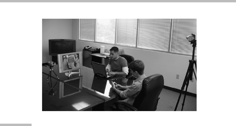
having to crowd the participant by trying to view his/her screen directly (see
Figure 10.16).
The additional challenge for handheld small-screen devices that an over-the-
shoulder camera must solve is that the device can be moved out of the focus of
the camera as the participant naturally moves to adjust posture and so on. One
approach to mitigate this issue is to place a marker on the table in front of the par-
ticipant (with instructions to try to hold the device over the marker) and also to
orient the moderator’s monitor so both the participant and the moderator can
view it. Orienting the monitor in this way enables the participant to better under-
stand the need to hold the device over the marker and eases any thoughts she
may have as to where that camera is focused. To achieve a picture-in-picture view
of the screen and the participant’s face, a camera can be located across the room
focused on the participant (Figure 10.16).
Lighting is another item to consider and control. The screens on the devices
can reflect an overhead light or other light source. Test the lighting of the partici-
pant’s location by sitting down at that location while watching the camera image
on the monitor. Check to ensure that the image is glare-free and not washed out.
A disadvantage of the over-the-shoulder camera is that despite the marker and
the monitor facing the participant, users will still move out of the designed areas
at times and need to be reminded to keep the device in the focus of the camera.
The advantage of this setup is that the user is able to hold the device naturally
without anything attached to it or in front of it, and a view of the fingers pressing
the keys can also be captured by the camera.
FIGURE
10.16
Example setup of an over-the-shoulder camera.
The camera is mounted on a tripod in a conference room with an in-room
moderator.
10 Small-Screen Interfaces
340
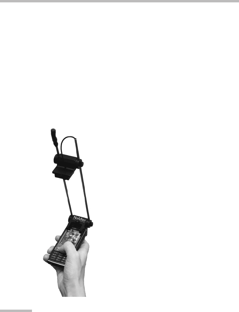
10.5.2 Document Camera
A document camera (Figure 10.17) can be used instead of the over-the-shoulder
camera. There are multiple possibilities for this camera, ranging from a lightweight
wireless camera that can be attached to the device itself, to placing the device in a
fixed holder (e.g., a vise) and utilizing a stationary camera. In fact, it is even possible
to design and develop a custom version of this equipment to suit specific needs
(Schusteritsch et al., 2007). Any of these options, and other variations of these
options, will give a very good view of the device’s screen and, depending on the
camera angle, the fingers as well. They can also be used in testing setups similar
to that described previously with an in-room monitor for an in-room moderator to
view, and another camera for capturing video of the participant’s expressions.
The advantage of the document camera is that the camera will move with the
participant, always staying in focus on the device and screen. The disadvantage is
FIGURE
10.17
Document camera.
This is a wireless mobile device camera by Noldus (2007). (Courtesy Noldus
Information Technology.)
10.5 Techniques for Testing the Interface
341