Tanenbaum A. Computer Networks
Подождите немного. Документ загружается.


three strings and their corresponding boxes will appear on the same line, but on a 1024 x 768
screen they might be split over two lines. In the worst scenario, the word ''Country'' is at the
end of one line and its box is at the beginning of the next line.
The next line asks for the credit card number and expiration date. Transmitting credit card
numbers over the Internet should only be done when adequate security measures have been
taken. We will discuss some of these in
Chap. 8.
Following the expiration date we encounter a new feature: radio buttons. These are used when
a choice must be made among two or more alternatives. The intellectual model here is a car
radio with half a dozen buttons for choosing stations. The browser displays these boxes in a
form that allows the user to select and deselect them by clicking on them (or using the
keyboard). Clicking on one of them turns off all the other ones in the same group. The visual
presentation is up to the browser. Widget size also uses two radio buttons. The two groups are
distinguished by their
name field, not by static scoping using something like <radiobutton> ...
</radiobutton>.
The
value parameters are used to indicate which radio button was pushed. Depending on
which of the credit card options the user has chosen, the variable
cc will be set to either the
string ''mastercard'' or the string ''visacard''.
After the two sets of radio buttons, we come to the shipping option, represented by a box of
type
checkbox. It can be either on or off. Unlike radio buttons, where exactly one out of the
set must be chosen, each box of type
checkbox can be on or off, independently of all the
others. For example, when ordering a pizza via Electropizza's Web page, the user can choose
sardines
and onions and pineapple (if she can stand it), but she cannot choose small and
medium
and large for the same pizza. The pizza toppings would be represented by three
separate boxes of type
checkbox, whereas the pizza size would be a set of radio buttons.
As an aside, for very long lists from which a choice must be made, radio buttons are somewhat
inconvenient. Therefore, the
<select> and </select> tags are provided to bracket a list of
alternatives, but with the semantics of radio buttons (unless the
multiple parameter is given,
in which case the semantics are those of checkable boxes). Some browsers render the items
located between
<select> and </select> as a drop-down menu.
We have now seen two of the built-in types for the <input> tag:
radio and checkbox. In fact,
we have already seen a third one as well:
text. Because this type is the default, we did not
bother to include the parameter
type = text, but we could have. Two other types are password
and
textarea. A password box is the same as a text box, except that the characters are not
displayed as they are typed. A
textarea box is also the same as a text box, except that it can
contain multiple lines.
Getting back to the example of
Fig. 7-29, we now come across an example of a submit button.
When this is clicked, the user information on the form is sent back to the machine that
provided the form. Like all the other types,
submit is a reserved word that the browser
understands. The
value string here is the label on the button and is displayed. All boxes can
have values; only here we needed that feature. For
text boxes, the contents of the value field
are displayed along with the form, but the user can edit or erase it.
checkbox and radio boxes
can also be initialized, but with a field called
checked (because value just gives the text, but
does not indicate a preferred choice).
When the user clicks the
submit button, the browser packages the collected information into a
single long line and sends it back to the server for processing. The & is used to separate fields
and + is used to represent space. For our example form, the line might look like the contents
of
Fig. 7-30 (broken into three lines here because the page is not wide enough):
491
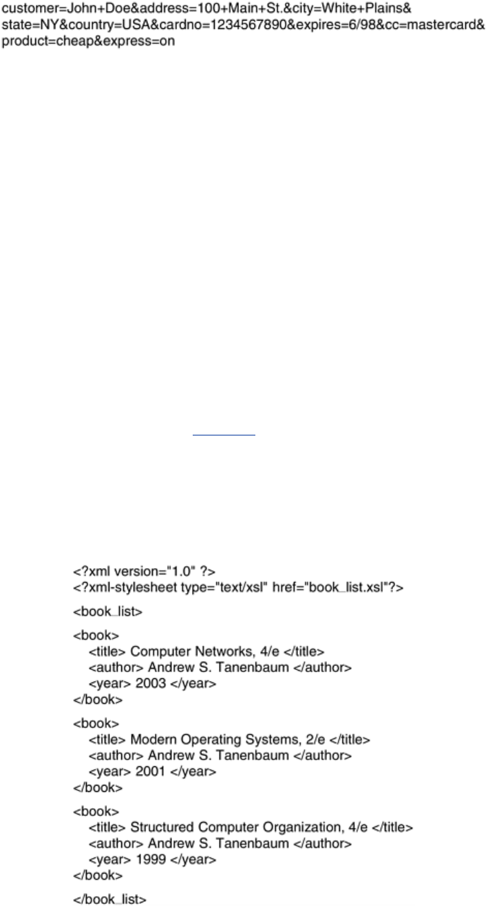
Figure 7-30. A possible response from the browser to the server with
information
The string would be sent back to the server as one line, not three. If a
checkbox is not
selected, it is omitted from the string. It is up to the server to make sense of this string. We
will discuss how this could be done later in this chapter.
XML and XSL
HTML, with or without forms, does not provide any structure to Web pages. It also mixes the
content with the formatting. As e-commerce and other applications become more common,
there is an increasing need for structuring Web pages and separating the content from the
formatting. For example, a program that searches the Web for the best price for some book or
CD needs to analyze many Web pages looking for the item's title and price. With Web pages in
HTML, it is very difficult for a program to figure out where the title is and where the price is.
For this reason, the W3C has developed an enhancement to HTML to allow Web pages to be
structured for automated processing. Two new languages have been developed for this
purpose. First,
XML (eXtensible Markup Language) describes Web content in a structured
way and second,
XSL (eXtensible Style Language) describes the formatting independently
of the content. Both of these are large and complicated topics, so our brief introduction below
just scratches the surface, but it should give an idea of how they work.
Consider the example XML document of
Fig. 7-31. It defines a structure called book_list,
which is a list of
books. Each book has three fields, the title, author, and year of publication.
These structures are extremely simple. It is permitted to have structures with repeated fields
(e.g., multiple authors), optional fields (e.g., title of included CD-ROM), and alternative fields
(e.g., URL of a bookstore if it is in print or URL of an auction site if it is out of print).
Figure 7-31. A simple Web page in XML.
492
In this example, each of the three fields is an indivisible entity, but it is also permitted to
further subdivide the fields. For example, the author field could have been done as follows to
give a finer-grained control over searching and formatting:
<author>
<first_name> Andrew </first_name>
<last_name> Tanenbaum </last_name>
</author>
Each field can be subdivided into subfields and subsubfields arbitrarily deep.
All the file of
Fig. 7-31 does is define a book list containing three books. It says nothing about
how to display the Web page on the screen. To provide the formatting information, we need a
second file,
book_list.xsl, containing the XSL definition. This file is a style sheet that tells how
to display the page. (There are alternatives to style sheets, such as a way to convert XML into
HTML, but these alternatives are beyond the scope of this book.)
A sample XSL file for formatting
Fig. 7-31 is given in Fig. 7-32. After some necessary
declarations, including the URL of the XSL standard, the file contains tags starting with
<html>
and
<body>. These define the start of the Web page, as
Figure 7-32. A style sheet in XSL.
usual. Then comes a table definition, including the headings for the three columns. Note that in
addition to the
<th> tags there are </th> tags as well, something we did not bother with so
far. The XML and XSL specifications are much stricter than HTML specification. They state that
rejecting syntactically incorrect files is mandatory, even if the browser can determine what the
Web designer meant. A browser that accepts a syntactically incorrect XML or XSL file and
repairs the errors itself is not conformant and will be rejected in a conformance test. Browsers
are allowed to pinpoint the error, however. This somewhat draconian measure is needed to
deal with the immense number of sloppy Web pages currently out there.
493
The statement
<xsl:for-each select="book_list/book">
is analogous to a
for statement in C. It causes the browser to iterate the loop body (ended by
<xsl:for-each>) one iteration for each book. Each iteration outputs five lines: <tr>, the title,
author, and year, and
</tr>. After the loop, the closing tags </body> and </html> are output.
The result of the browser's interpreting this style sheet is the same as if the Web page
contained the table in-line. However, in this
format, programs can analyze the XML file and easily find books published after 2000, for
example. It is worth emphasizing that even though our XSL file contained a kind of a loop,
Web pages in XML and XSL are still static since they simply contain instructions to the browser
about how to display the page, just as HTML pages do. Of course, to use XML and XSL, the
browser has to be able to interpret XML and XSL, but most of them already have this
capability. It is not yet clear whether XSL will take over from traditional style sheets.
We have not shown how to do this, but XML allows the Web site designer to make up definition
files in which the structures are defined in advance. These definition files can be included,
making it possible to use them to build complex Web pages. For additional information on this
and the many other features of XML and XSL, see one of the many books on the subject. Two
examples are (Livingston, 2002; and Williamson, 2001).
Before ending our discussion of XML and XSL, it is worth commenting on a ideological battle
going on within the WWW consortium and the Web designer community. The original goal of
HTML was to specify the
structure of the document, not its appearance. For example,
<h1> Deborah's Photos </h1>
instructs the browser to emphasize the heading, but does not say anything about the typeface,
point size, or color. That was left up to the browser, which knows the properties of the display
(e.g., how many pixels it has). However, many Web page designers wanted absolute control
over how their pages appeared, so new tags were added to HTML to control appearance, such
as
<font face="helvetica" size="24" color="red"> Deborah's Photos </font>
Also, ways were added to control positioning on the screen accurately. The trouble with this
approach is that it is not portable. Although a page may render perfectly with the browser it is
developed on, with another browser or another release of the same browser or a different
screen resolution, it may be a complete mess. XML was in part an attempt to go back to the
original goal of specifying just the structure, not the appearance of a document. However, XSL
is also provided to manage the appearance. Both formats can be misused, however. You can
count on it.
XML can be used for purposes other than describing Web pages. One growing use of it is as a
language for communication between application programs. In particular,
SOAP (Simple
Object Access Protocol
) is a way for performing RPCs between applications in a language-
and system-independent way. The client constructs the request as an XML message and sends
it to the server, using the HTTP protocol (described below). The server sends back a reply as
an XML formatted message. In this way, applications on heterogeneous platforms can
communicate.
XHTML—The eXtended HyperText Markup Language
494

HTML keeps evolving to meet new demands. Many people in the industry feel that in the
future, the majority of Web-enabled devices will not be PCs, but wireless, handheld PDA-type
devices. These devices have limited memory for large browsers full of heuristics that try to
somehow deal with syntactically incorrect Web pages. Thus, the next step after HTML 4 is a
language that is Very Picky. It is called
XHTML (eXtended HyperText Markup Language)
rather than HTML 5 because it is essentially HTML 4 reformulated in XML. By this we mean that
tags such as
<h1> have no intrinsic meaning. To get the HTML 4 effect, a definition is needed
in the XSL file. XHTML is the new Web standard and should be used for all new Web pages to
achieve maximum portability across platforms and browsers.
There are six major differences and a variety of minor differences between XHTML and HTML
4, Let us now go over the major differences. First, XHTML pages and browsers must strictly
conform to the standard. No more shoddy Web pages. This property was inherited from XML.
Second, all tags and attributes must be in lower case. Tags like
<HTML> are not valid in XHTML.
The use of tags like
<html> is now mandatory. Similarly, <img SRC="pic001.jpg"> is also
forbidden because it contains an upper-case attribute.
Third, closing tags are required, even for
</p>. For tags that have no natural closing tag, such
as
<br>, <hr>, and <img>, a slash must precede the closing ''>,'' for example
<img src="pic001.jpg" />
Fourth, attributes must be contained within quotation marks. For example,
<img SRC="pic001.jpg" height=500 />
is no longer allowed. The 500 has to be enclosed in quotation marks, just like the name of the
JPEG file, even though 500 is just a number.
Fifth, tags must nest properly. In the past, proper nesting was not required as long as the final
state achieved was correct. For example,
<center> <b> Vacation Pictures </center> </b>
used to be legal. In XHTML it is not. Tags must be closed in the inverse order that they were
opened.
Sixth, every document must specify its document type. We saw this in
Fig. 7-32, for example.
For a discussion of all the changes, major and minor, see
www.w3.org.
7.3.3 Dynamic Web Documents
So far, the model we have used is that of Fig. 6-6: the client sends a file name to the server,
which then returns the file. In the early days of the Web, all content was, in fact, static like
this (just files). However, in recent years, more and more content has become dynamic, that
is, generated on demand, rather than stored on disk. Content generation can take place either
on the server side or on the client side. Let us now examine each of these cases in turn.
Server-Side Dynamic Web Page Generation
To see why server-side content generation is needed, consider the use of forms, as described
earlier. When a user fills in a form and clicks on the
submit button, a message is sent to the
server indicating that it contains the contents of a form, along with the fields the user filled in.
This message is not the name of a file to return. What is needed is that the message is given
495
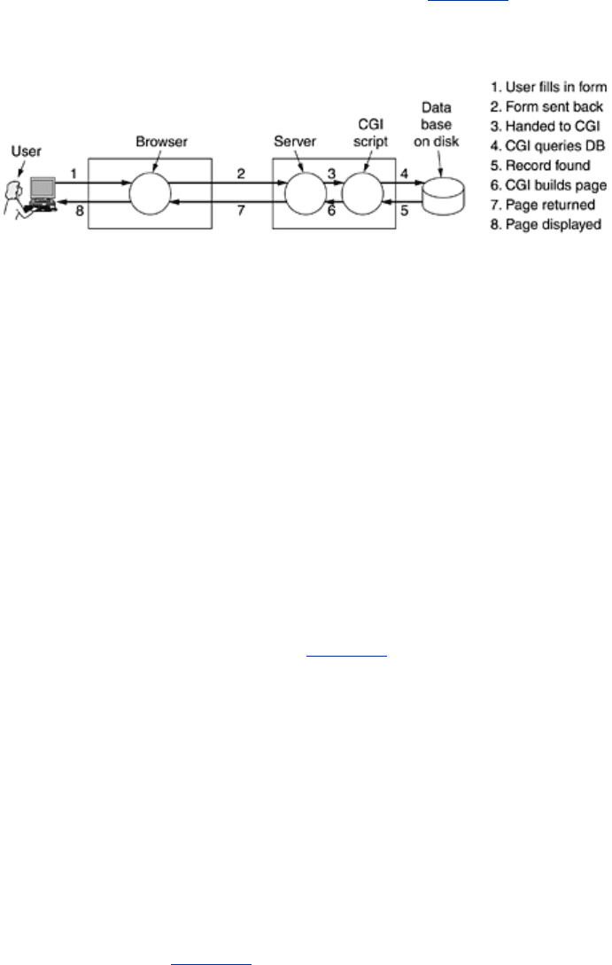
to a program or script to process. Usually, the processing involves using the user-supplied
information to look up a record in a database on the server's disk and generate a custom HTML
page to send back to the client. For example, in an e-commerce application, after the user
clicks on
PROCEED TO CHECKOUT, the browser returns the cookie containing the contents of
the shopping cart, but some program or script on the server has to be invoked to process the
cookie and generate an HTML page in response. The HTML page might display a form
containing the list of items in the cart and the user's last-known shipping address along with a
request to verify the information and to specify the method of payment. The steps required to
process the information from an HTML form are illustrated in
Fig. 7-33.
Figure 7-33. Steps in processing the information from an HTML form.
The traditional way to handle forms and other interactive Web pages is a system called the
CGI (Common Gateway Interface). It is a standardized interface to allow Web servers to
talk to back-end programs and scripts that can accept input (e.g., from forms) and generate
HTML pages in response. Usually, these back-ends are scripts written in the Perl scripting
language because Perl scripts are easier and faster to write than programs (at least, if you
know how to program in Perl). By convention, they live in a directory called
cgi-bin, which is
visible in the URL. Sometimes another scripting language, Python, is used instead of Perl.
As an example of how CGI often works, consider the case of a product from the Truly Great
Products Company that comes without a warranty registration card. Instead, the customer is
told to go to
www.tgpc.com to register on-line. On that page, there is a hyperlink that says
Click here to register your product
This link points to a Perl script, say,
www.tgpc.com/cgi-bin/reg.perl. When this script is
invoked with no parameters, it sends back an HTML page containing the registration form.
When the user fills in the form and clicks on
submit, a message is sent back to this script
containing the values filled in using the style of
Fig. 7-30. The Perl script then parses the
parameters, makes an entry in the database for the new customer, and sends back an HTML
page providing a registration number and a telephone number for the help desk. This is not
the only way to handle forms, but it is a common way. There are many books about making
CGI scripts and programming in Perl. A few examples are (Hanegan, 2001; Lash, 2002; and
Meltzer and Michalski, 2001).
CGI scripts are not the only way to generate dynamic content on the server side. Another
common way is to embed little scripts inside HTML pages and have them be executed by the
server itself to generate the page. A popular language for writing these scripts is
PHP (PHP:
Hypertext Preprocessor
). To use it, the server has to understand PHP (just as a browser has
to understand XML to interpret Web pages written in XML). Usually, servers expect Web pages
containing PHP to have file extension
php rather than html or htm.
A tiny PHP script is illustrated in
Fig. 7-34; it should work with any server that has PHP
installed. It contains normal HTML, except for the PHP script inside the
<?php ... ?> tag.
What it does is generate a Web page telling what it knows about the browser invoking it.
Browsers normally send over some information along with their request (and any applicable
cookies) and this information is put in the variable
HTTP_USER_AGENT. When this listing is put
496
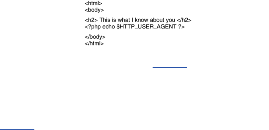
in a file test.php in the WWW directory at the ABCD company, then typing the URL
www.abcd.com/test.php will produce a Web page telling the user what browser, language, and
operating system he is using.
Figure 7-34. A sample HTML page with embedded PHP.
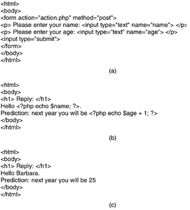
PHP is especially good at handling forms and is simpler than using a CGI script. As an example
of how it works with forms, consider the example of
Fig. 7-35(a). This figure contains a normal
HTML page with a form in it. The only unusual thing about it is the first line, which specifies
that the file
action.php is to be invoked to handle the parameters after the user has filled in
and submitted the form. The page displays two text boxes, one with a request for a name and
one with a request for an age. After the two boxes have been filled in and the form submitted,
the server parses the
Fig. 7-30-type string sent back, putting the name in the name variable
and the age in the
age variable. It then starts to process the action.php file, shown in Fig. 7-
35(b) as a reply. During the processing of this file, the PHP commands are executed. If the
user filled in ''Barbara'' and ''24'' in the boxes, the HTML file sent back will be the one given in
Fig. 7-35(c). Thus, handling forms becomes extremely simple using PHP.
Figure 7-35. (a) A Web page containing a form. (b) A PHP script for
handling the output of the form. (c) Output from the PHP script when
the inputs are ''Barbara'' and 24, respectively.
497
Although PHP is easy to use, it is actually a powerful programming language oriented toward
interfacing between the Web and a server database. It has variables, strings, arrays, and most
of the control structures found in C, but much more powerful I/O than just
printf. PHP is open
source code and freely available. It was designed specifically to work well with Apache, which
is also open source and is the world's most widely used Web server. For more information
about PHP, see (Valade, 2002).
We have now seen two different ways to generate dynamic HTML pages: CGI scripts and
embedded PHP. There is also a third technique, called
JSP (JavaServer Pages), which is
similar to PHP, except that the dynamic part is written in the Java programming language
instead of in PHP. Pages using this technique have the file extension
jsp. A fourth technique,
ASP (Active Server Pages), is Microsoft's version of PHP and JavaServer Pages. It uses
Microsoft's proprietary scripting language, Visual Basic Script, for generating the dynamic
content. Pages using this technique have extension
asp. The choice among PHP, JSP, and ASP
usually has more to do with politics (open source vs. Sun vs. Microsoft) than with technology,
since the three languages are roughly comparable.
The collection of technologies for generating content on the fly is sometimes called
dynamic
HTML
.
Client-Side Dynamic Web Page Generation
CGI, PHP, JSP, and ASP scripts solve the problem of handling forms and interactions with
databases on the server. They can all accept incoming information from forms, look up
information in one or more databases, and generate HTML pages with the results. What none
of them can do is respond to mouse movements or interact with users directly. For this
purpose, it is necessary to have scripts embedded in HTML pages that are executed on the
client machine rather than the server machine. Starting with HTML 4.0, such scripts are
498
permitted using the tag <script>. The most popular scripting language for the client side is
JavaScript, so we will now take a quick look at it.
JavaScript is a scripting language,
very loosely inspired by some ideas from the Java
programming language. It is definitely not Java. Like other scripting languages, it is a very
high level language. For example, in a single line of JavaScript it is possible to pop up a dialog
box, wait for text input, and store the resulting string in a variable. High-level features like this
make JavaScript ideal for designing interactive Web pages. On the other hand, the fact that it
is not standardized and is mutating faster than a fruit fly trapped in an X-ray machine makes it
extremely difficult to write JavaScript programs that work on all platforms, but maybe some
day it will stabilize.
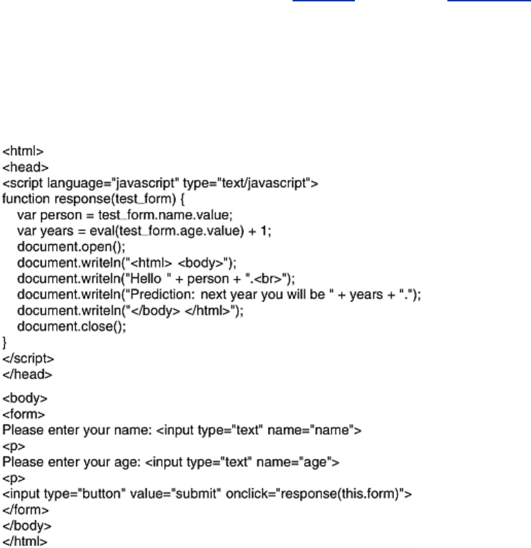
As an example of a program in JavaScript, consider that of
Fig. 7-36. Like that of Fig. 7-35(a),
it displays a form asking for a name and age, and then predicts how old the person will be next
year. The body is almost the same as the PHP example, the main difference being the
declaration of the submit button and the assignment statement in it. This assignment
statement tells the browser to invoke the
response script on a button click and pass it the form
as a parameter.
Figure 7-36. Use of JavaScript for processing a form.
What is completely new here is the declaration of the JavaScript function
response in the head
of the HTML file, an area normally reserved for titles, background colors, and so on. This
function extracts the value of the
name field from the form and stores it in the variable person
as a string. It also extracts the value of the
age field, converts it to an integer by using the
eval function, adds 1 to it, and stores the result in years. Then it opens a document for output,
does four writes to it using the
writeln method, and closes the document. The document is an
HTML file, as can be seen from the various HTML tags in it. The browser then displays the
document on the screen.
499
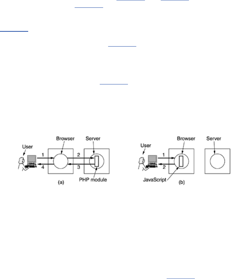
It is very important to understand that while Fig. 7-35 and Fig. 7-36 look similar, they are
processed totally differently. In
Fig. 7-35, after the user has clicked on the submit button, the
browser collects the information into a long string of the
style of
Fig. 7-30 and sends it off to the server that sent the page. The server sees the name
of the PHP file and executes it. The PHP script produces a new HTML page and that page is
sent back to the browser for display. With
Fig. 7-36, when the submit button is clicked the
browser interprets a JavaScript function contained on the page. All the work is done locally,
inside the browser. There is no contact with the server. As a consequence, the result is
displayed virtually instantaneously, whereas with PHP, there can be a delay of several seconds
before the resulting HTML arrives at the client. The difference between server-side scripting
and client-side scripting is illustrated in
Fig. 7-37, including the steps involved. In both cases,
the numbered steps start after the form has been displayed. Step 1 consists of accepting the
user input. Then comes the processing of the input, which differs in the two cases.
Figure 7-37. (a) Server-side scripting with PHP. (b) Client-side
scripting with JavaScript.
This difference does not mean that JavaScript is better than PHP. Their uses are completely
different. PHP (and, by implication, JSP and ASP) are used when interaction with a remote
database is needed. JavaScript is used when the interaction is with the user at the client
computer. It is certainly possible (and common) to have HTML pages that use both PHP and
JavaScript, although they cannot do the same work or own the same button, of course.
JavaScript is a full-blown programming language, with all the power of C or Java. It has
variables, strings, arrays, objects, functions, and all the usual control structures. It also has a
large number of facilities specific for Web pages, including the ability to manage windows and
frames, set and get cookies, deal with forms, and handle hyperlinks. An example of a
JavaScript program that uses a recursive function is given in
Fig. 7-38.
Figure 7-38. A JavaScript program for computing and printing
factorials.
500