Whitbread D. The Design Manual (анг.яз.)
Подождите немного. Документ загружается.

Images can be square-cut, free-form or soft-edged. Text
can be display text such as titles and featured type; body copy,
which is the bulk of the textual content; or short text bursts
such as headings, captions and pull-quotes. Space can be
placed in bands, e.g. margins around the perimeter of the
page, gutters that run between columns, or text drops
where an invisible line runs across the layout from which
text is hung. Space can also be free-form.
You make decisions at each step of the way about
specific placement and details such as colour, weight and
size. But it can be a bit hit and miss. The quick way to make
these sorts of decisions—to work every time—is to look
underneath it all, behind the actual to the implied. There is
an invisible layout structure that enables some layouts to
succeed better than others.
Many people are too concerned with getting the obvious
correct, concentrating on text details such as punctuation,
the positioning of picture credits and colour balance in
images. But these do not of themselves create a good layout.
The details need to be correct but not at the expense of the
success of the piece—after all, if people don’t notice the
piece, they don’t get the opportunity to admire the detail!
The relationship between certain elements should be
maintained throughout a layout. For example, you should
treat and place captions in the same way throughout and
keep spacing around headings constant. This consistency
will help readers to decode the message without distraction.
Hanging your text from a chosen line—like washing—also
achieves this. It is better that the relationships between
elements (that you have decided will best suit the reader’s
requirements) are maintained, than that the columns fall to
the same depth, for example.
Layout 121
DOING IT SMARTER
Design file
Keep a file of interesting design
approaches and techniques that you
have photocopied from advertise-
ments, magazines and books. Refer
to the file when you know you need
to achieve a particular result but
have either run out of time or
momentarily lost your inspiration.
DOING IT CHEAPER
Don’t bleed
When ink prints off the side of a
sheet of paper it is said to ‘bleed’.
This means the sheet of paper that is
printed needs to be bigger to
accommodate the image that
continues off the page, and the space
around that image that is necessary
for the printer to get the page
through the printing press. This
produces waste and means you have
to purchase a larger and therefore
more expensive sheet than you need.
Create a design that fits
comfortably inside the border with
10 mm of blank space—that is, no
ink—on the same edge on both sides
of the sheet of paper. This is called
the gripper edge. On the other three
edges, 5 mm clearance is sufficient.
The subtle distortions of the text
blocks in this layout reiterate the
shapes of the illustrations, creating a
relationship between the text and
images that brings unity and logic to
the composition.
Client: University of Virginia
Publication: Art from the Land: Dialogues
with the Kluge–Ruhe Collection of
Austrlaian Aboriginal Art edited by Howard
Morphy and Margo Smith Boles
Designer: Maureen MacKenzie-Taylor
Studio: Msquared Research Assisted Design
DWD-DM05 4/5/01 4:08 PM Page 121
And don’t forget the underlying layer—the layout is the
abstract composition that is the aesthetic basis of your
design. There are potential distractions in this ‘invisible’
layer, too.
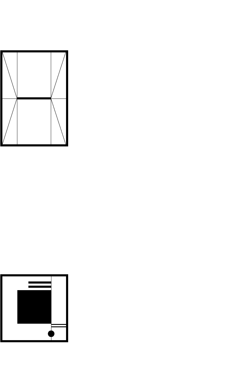
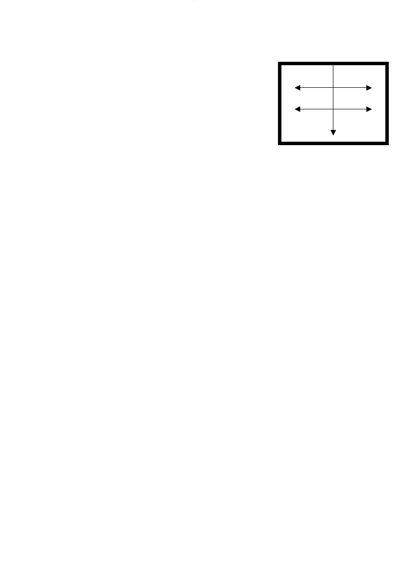
To demonstrate the implications of even simple
decisions, take a blank A4 sheet of paper and type a line of
text in the centre of the page. This line of text creates a
number of implied or invisible lines and shapes within
the page:
r An invisible line runs through the text horizontally and
continues from the beginning of the text to the left-hand
edge of the page and similarly from the end of the text to
the right-hand edge of the page, dividing the page into
two segments.
r Those two segments are two implied rectangles.
r At the beginning of the text is an implied vertical line
connecting the first letter of the text to the top and
bottom edges of the page.
r Similarly, at the end of the text there is another implied
vertical, which connects the top and bottom edges of the
page through the last letter.
r These verticals further divide the page area into invisible
shapes—you now have six rectangles implied.
Part of the reason that these verticals and horizontals are
so strong is that the edges of the page create vertical and
horizontal stress or at least conform to it; in a different
shape, the implications may be different. There is an even
more subtle tension that can be a further complication to
exploit in your layout—the diagonals connecting the
beginning and end points of the text line to the two corners
closest to them.
So the placement of one line of text can create this
amount of clutter! Can you see why playing about with
many elements becomes so difficult?
One way to ease the resulting angst is to limit the
numbers of implied lines and shapes, by using the same
ones many times, instead of creating new ones at each
introduction of a new element. This strengthens the layout.
The secret formula to successful layout—particularly in
poster and cover design—is to limit the number of vertical
and horizontal divisions of the space. Let the same line do a
few jobs. It could:
r be the edge of the title block
r be a picture’s border
122 Production
One vertical division can■
perform many roles
DWD-DM05 4/5/01 4:08 PM Page 122
r be where the author’s name runs from
r point to the publisher’s logo at the foot of the page.
The last point here also introduces the concept of
implied direction. Lines can be said to direct us or ‘move’ to
the right and down, due to our understanding of standard
eye flow.
Eye flow
It may seem obvious, but we sometimes forget that we read
from top to bottom and from left to right. Therefore, at
whatever point we enter a layout, we automatically continue
to the right and down. It is a contrary movement to go
‘backwards’, either reading up from the bottom to the top or
backwards from the right to the left. This is why captions
are expected to be at the bottom or the right of photographs
or illustrations.
That is not to say that our eyes are not tempted back to
those other areas of the layout. But be careful to avoid too
many ‘backward’ moves in a layout.
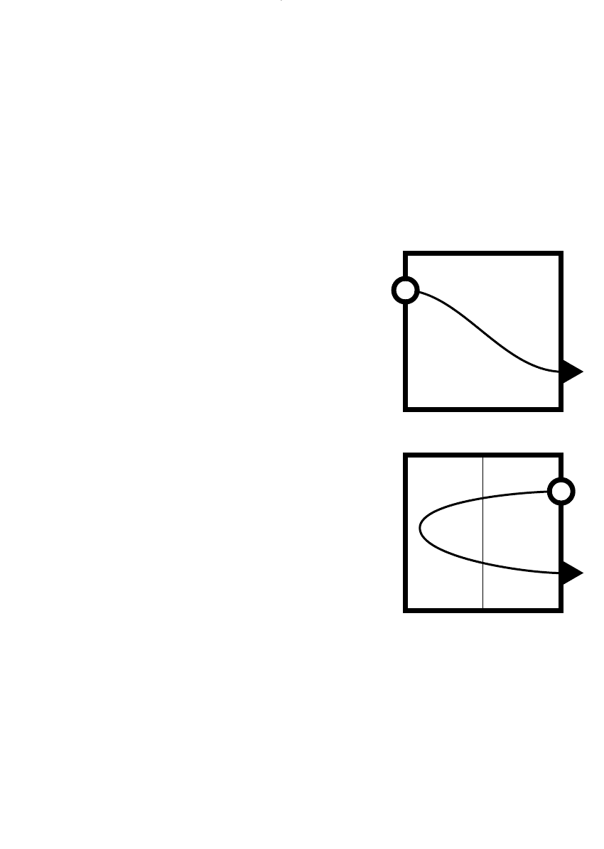
In double-page spreads, it is understood that the eye
travels in a parabolic arc from the top right-hand corner
(where the eye follows the double page as revealed by the
turning action), across to the far left and back to the exit
point at the bottom right. It is suggested, then, that there
should be something on the left-hand page that drags your
eye fully across the spread. In many magazine feature
stories, the left-hand page is a full-page illustration and the
title, and the start of the story is on the right-hand page.
This follows the standard understanding of hierarchy—the
large picture has the most attraction value and, from there,
eye flow leads into the headline. It also explains the
marketing wisdom that insists that advertisers pay the
premium for right-hand page advertising space in maga-
zines and newspapers, because the reader’s attention may
never get to the left page!
READ MORE ABOUT IT
Colin Wheildon, Type and layout: How typography and design can get your
message across—or get in the way, Strathmoor Press, Berkeley, 1995,
ISBN 0 9624891 5 8.
Layout 123
Parabolic curve of entry/exit ■
for double-page spread
DWD-DM05 4/5/01 4:08 PM Page 123
Backwards movement
How often do you read backwards? That is, how often do
your eyes travel against the assumed eye flow from top left
to bottom right? All the time. As layout designers, harness-
ing eye flow and understanding how each layout decision
you make will affect it is actually what layout ‘is’, the
positioning of elements within a space for impact and
effective communication in order.
Understanding that backwards movement is natural but
contrary to the standard flow enables you to use it more
effectively. It is recommended that you limit the amount of
backwards movement required in a layout, because too
much will confuse readers and they’ll leave the layout
without finishing it, missing the communication your client
expects them to receive.
On a printout of a layout, draw a line of the journey the
reader’s eye will make around it. Watch people’s eyes as
they are reading your work and get an idea where they are
looking. Note down the pattern of their glances and see if
you can reconstruct it when you are back at your desk with
the layout.
Jumping through a layout, the eye goes in order through
the pictures from largest to smallest, from most colourful to
least colourful, and eventually to the text. You can help this
landing on the text by leading the eye in a simple curve—if
eye movement continues in the same trajectory it will hit
the start of the text once it has left the smallest image.
Of course, the eye gets interested in an image as well
and takes a stroll through the focal points and textures
within it. It leaps from flashes of intense colour to a brief
exploration of shadow areas, so understanding the interest
areas within an image is also necessary. A number of
introductory art books will deconstruct an image and the
eye flow through it in a discussion of its composition.
The skimming of the reader continues through a layout
from element to element in a hierarchy and a path. If you
are in doubt as you get further down the hierarchy, assume
the eye flow from any point to be to the right and down.
This phenomenon is how text can be lost or hidden in
plain view. Particular placements can mean the eye will
simply not get back to the areas of the layout that are called
the ‘fallow’ areas, unless something extreme is done to
attract them there.
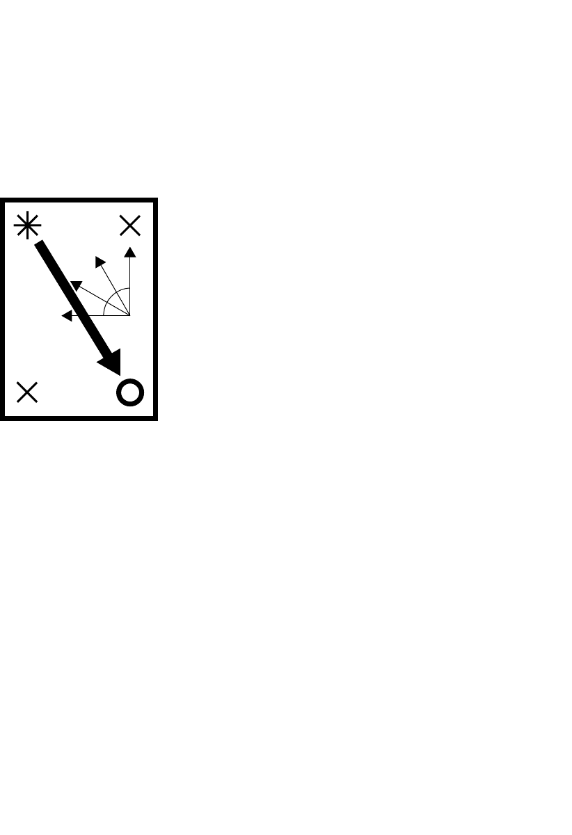
124 Production
The Gutenberg diagram ■
Based on the diagram devised by
Edmund Arnold, a US typographer,
who described the basic eye flow
(shown by the solid arrow) as the
Axis of Orientation. The entry point
is coded as the Primary Optical Area
and the exit point as the Terminal
Anchor. Arnold identified two fallow
corners with crosses as being dead
spots in a layout. Fine arrows in an
arc represent the angles within the
page that are considered to be
backward movements that the
eye avoids.
POA
TA
DWD-DM05 4/5/01 4:08 PM Page 124
Eye flow is one of the difficulties for layered image/text
techniques because the eye is not only reading through the
imagery, but also reading foreground and background. In
many cases, the eye is expected to wander over the same
area twice, focusing differently to catch the juxtaposed
message (because the image will register first).
If you need to correct eye flow, change the size relation-
ships of your images and alter their alignment. If there is a
lot of backwards reading, sometimes a mirror image of the
layout will correct it—in the same placement relationships,
just swap everything on the right to the left.
Dominance
Some layout elements are dominant, some assume
dominance and some have dominance thrust upon them.
Pictures dominate a layout—and coloured pictures
assume more importance than black-and-white ones. If
there is a picture in a layout, readers will look at it first.
So that’s where they land in your layout and their ‘eye flow’
starts. If it is on a right-hand page, you may have just lost
the left-hand page, unless you somehow drag the reader’s
attention back to the left (in a backwards motion). Be aware
of the eye’s movement through your design: What will it see
first and where on the page is it? Does it move logically—
using standard eye flow—to the next place or is the eye
rushing around higgledy-piggledy? Does the eye have a
resting spot or somewhere to concentrate for an extended
period? Has the eye moved around the page so much that it
longs to get out? Has it stopped at all the information
points? Does the reader remember what the major pieces
of information were? Is the reader enjoying the contrast of
details and the overall form?
There are very few examples of designs where pictures
do not overpower type. This is the reasoning behind the
classic advertising format: a picture at the top, a headline
underneath, followed by the body copy, and usually finished
with a logo or coupon in the bottom right-hand corner. If
the headline was placed above the picture, it may not be
noticed because the reader’s attention is already further
down the page (on the picture).
Layout 125
DOING IT SMARTER
Faces
People pictures are most important.
Faces are even more important. And
the eyes have it! Think of mass
market magazine covers—usually a
face with text crowded around it. In
extreme closeups, the eyes are the
most beguiling features of the cover.
Even implied faces have
attraction. Think about your car: the
headlights are the eyes, the grille is a
nose and the bumper bar is the
mouth. Does your car smile at you? In
layout terms, this subliminal smiling
‘face’ creation can make strong
designs.
Reading on screen ■
Readers scan a screen, reading down
the centre with a left–right scanning
motion. In this way, they can quickly
access needed information from short
paragraphs, dot point lists, headings,
links and graphics.
DWD-DM05 4/5/01 4:08 PM Page 125
Simplicity
The value of a ‘simple’ layout is its strength. This is often a
comparative value, because a majority of layouts do not
have this simplicity and absolute logic that is achieved
through both vertical and horizontal simplicity in the
layout. For example, extensive indenting can have the effect
of complicating your layout vertically. Review your indents
and limit them. The persistence of any element—even a
5 mm paragraph indent—quickly establishes another
‘invisible’ vertical line, complicating your layout. Each tab
has the same effect.
In newsletters, the layout is often complicated horizon-
tally where stories finish at different depths in different
columns. Try to have fewer of these ‘invisible’ lines or
breaks running across your layout.
The most striking layouts also tend to rely on recogni-
tion of basic shapes, such as square, triangle, circle… These
basic shapes need not be obvious. Disguise them through
an understanding of implied line and shape. Strengthen the
layout by using the standard or pure geometric shapes:
circles rather than ovals; squares rather than rectangles or
rhombuses; equilateral rather than isosceles triangles.
There is another consideration here. The audience will
perceive curves and rounded shapes as friendlier than sharp
points and crisp lines, which can be seen as harsh. And
curves turning upwards at both ends are ‘subliminal’
happy faces.
Let’s go back to our previous example, the placement of
one line of text on an A4 page. If you now place that line
about one-third of the way down the page, you create an
implied rectangle above the line and an implied square
below the line. This is a stronger layout option, because the
square is a more pure shape than a rectangle.
Then if you placed a logo like the Commonwealth
Bank’s diamond centred about a two-thirds of the way down
the page, you would create an implied triangle where the
logo is connected by invisible threads to the beginning and
end of the line of text below. If you then work the spacing
between the two elements to create an implied equilateral
triangle, you create a stronger layout statement. The
diamond-shaped logo would also give you the point of the
triangle—super-strength!
126 Production
DWD-DM05 4/5/01 4:08 PM Page 126
But the structural lines within a layout do not have to
be parallel only—or even straight! Many successful layouts
use irregular shapes and curves, using fewer structural
lines and placing elements in harmony with existing curves.
Usually, this recognition that you can use an existing
structural line instead of creating a new one will improve
a layout.
There are meanings implied by design decisions that are
purely visually communicated. If you use a design tech-
nique thinking it’s simply good to look at without
understanding the visual conventions you have used and
what they are saying, you may be communicating incorrect
meanings to the reader.
For example, if you bleed something off the page or crop
in close to something, you are implying that the image is
moving off the page or too large to be contained by the
‘frame’. This can be very dynamic.
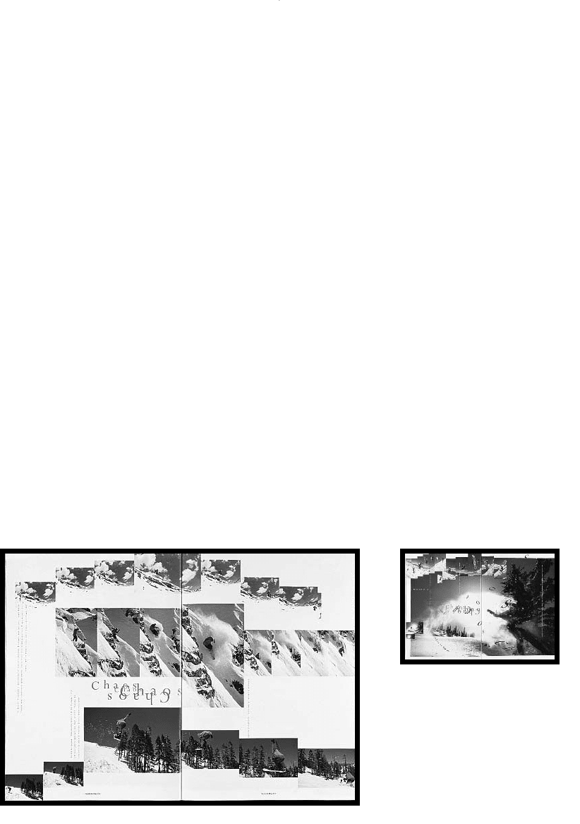
Graphing conventions used in picture layout will imply
the simultaneity of events, creating a hybrid visual form of a
graphed storyboard. This technique is used in the layouts
for Snowboarder magazine to capture some of the spirit and
dynamism of snowboarding, effectively capturing the fourth
dimension (time) in the two-dimensional space of a page.
Layout 127
DOING IT SMARTER
Dummy text
For rough layouts, use actual
headings and possibly the first words
in an opening paragraph, but replace
the real text with ‘dummy’ text.
Dummy text is just gobbledegook
that looks like text, but it encourages
clients to consider the design effect
of the type without being distracted
by the content. Your client or boss
will then focus on the design and not
the minutiae of spelling and
proofreading detail.
Snowboarder magazine uses
graphing and storyboarding
techniques to capture the dynamism
of snowboarding in a layout style
they call a ‘sequence pictorial’.
Publisher: Morrison Media Services
Publication: Snowboarder
Art director: Graeme Murdoch
DWD-DM05 4/5/01 4:08 PM Page 127
Type over an image limits its ability to be perceived as a
window showing reality. The type anchors the image into
the book, limiting its effectiveness. However, you can
balance this ‘con’ with the ‘pro’ that type over an image also
gives greater penetration to the text message.
If type starts small and gets larger and darker through-
out a line of text, it is akin to musical notation, and the
effect is that of a crescendo (getting louder). The opposite is
also true—if type gets smaller and dies away it is mimick-
ing a diminuendo. This can be a volume thing or a 3-D
thing—the type could also be seen to be advancing or
receding into the distance.
Size and colour also have an impact on where in the
visual space we see type and images. There are three
dimensions in visual space, and so we see foreground,
middleground and background. If something is smaller,
muted or paler, it recedes. If something is larger or brighter,
it advances. Anything that overlaps something else implies
it is ‘forward’.
READ MORE ABOUT IT
Robin Williams, The non-designer’s design book: Design and typographic
principles for the visual novice, Peachpit Press, Berkeley, 1994,
ISBN 1 56609 159 4.
Lori Siebert and Lisa Ballard, Making a good layout, North Light Books,
Cincinnati, 1992, ISBN 0 89134 423 3.
John Bowers, Introduction to two-dimensional design: Understanding form and
function, John Wiley & Sons, New York, 1999, ISBN 0 471 29224 9.
Bryan L. Peterson, Using design basics to get creative results, North Light Books,
Cincinnati, 1996, ISBN 0 89134 651 1.
Alistair Campbell, The designers lexicon: The essential illustrated dictionary of
design, print, and computer terms, Cassell & Co., London, 2000,
ISBN 0 304 35505 4.
Roger C. Parker, The makeover book: 101 design solutions for desktop
publishing, Ventana Press, Chapel Hill, North Carolina, 1989,
ISBN 0 940087 20 0.
Roger C. Parker, Looking good in print, 4th edn, Coriolis, Scottsdale, Arizona,
1998, ISBN 1 56604 856 7.
Marcelle Lapow Toor, Graphic design on the desktop: A guide for the non-
designer, 2nd edn, John Wiley & Sons, New York, 1998, ISBN 0 471 29307 5.
128 Production
L
R
E
D
U
O
a
f
e
d
c
b
DWD-DM05 4/5/01 4:08 PM Page 128
Unity
Embracing diversity in design techniques and styling has
created a visual palette of infinite variety. This very diversity
makes it difficult to select the most appropriate form that
a message should take because we also recognise that the
visual menu reflects the tastes of a diverse human popu-
lation of message receivers. This has resulted in the current
situation where often disparate design styles exist side
by side.
Irrelevant arguments about what is good and what is bad
are aired in design magazines and public forums, irrelevant
because it’s all good and it’s all bad, depending on where
you stand in the diverse marketplace.
But one of the design principles that most seems to be
missing is that of unity between elements. Due to the
fractured marketplace—and the fractured design field that
reflects that fractured marketplace—unity in a design sense
has been lost somewhere.
But what is ‘unity’ in graphic design terms? Unity is in
the details. For example, when choosing rules to place
between lines of text or to surround photographs, there is a
good technique that subtly brings unity to a design. If you
choose the stroke thickness of the crossbar of a capital A in
the typeface that appears closest to the rules, it means your
underlines or photo borders relate to the typeface they are
seen with, bringing a ‘unity’ to those elements. Consistency
in captioning style, heading style and text placement in
relation to images all help to create a harmonious layout, a
comfortable logic system.
Unity is in type selection. You can save time by using a
few typefaces consistently—and, by doing so, also achieve
unity. They look like they belong together because you set
up the expectation that they will recur. In multipage layouts
in brochures and feature articles, this type consistency
means establishing the fonts throughout the piece, not just
using them once. The title face may come back in pull-
quotes or drop capitals or photo captions, but it doesn’t have
to come back in the same weight. It might just come back
in the italic version or the bold version or small capitals.
Unity is in image editing. Crop photographs in a range
of similar sizes (say, only three: a square, a vertical rectangle
and a horizontal rectangle) so there is a visual rhythm
created in the layout or the whole publication that also
reinforces that the photographs belong. There might be
Layout 129
‘All visual form is made up of three
categories of components: elements,
characteristics and interactions.
Visual elements are dots, lines,
planes and volumes, and each
element possesses characteristics of
size, shape, texture and color. These
elements and characteristics are
directed by principles of visual
interaction, which are position,
direction and space.’
John Bowers in
Introduction to Two-dimensional
Design: Understanding Form
and Function
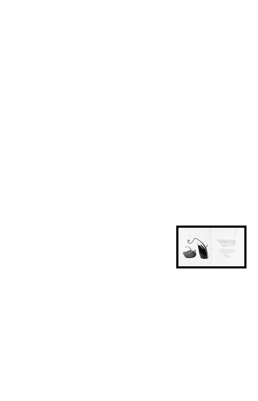
Unity is achieved in this catalogue
through repetition in the text block
shape of curves taken from the
images.
Client: Australian Exhibitions Touring Agency
Publication: Contemporary Silversmithing:
Connections across National Boundaries
Designer: Maureen MacKenzie-Taylor
Studio: Msquared Research Assisted Design
DWD-DM05 4/5/01 4:08 PM Page 129

a photographic attitude too: photojournalism, studio set-
ups, detail photography—these styles might create sets
of images that imply a consistent image selection and
editing approach.
Unity is in space. ‘White’ space can have a unifying
effect on disparate elements. Of course, space does not
need to be white—it can be any area of colour that doesn’t
have a pattern, image or text in it. Similarity in the way you
choose to structure space into your layouts can bring unity
to a multipage project. Do you normally put space around
the edges or just at the bottom of the layout?
Unity is in colour selection. There can be a colour
‘attitude’ to a piece, where you try to achieve a colour
balance between the images and the text. In book covers
and posters, where there is a colour photograph, it is often a
unifying decision to select colours for the type, background,
border and any symbols or single colour graphics that come
from somewhere in the image, thereby unifying image and
type. Subliminally, we feel the text and layout elements
belong with the photograph. In photo selection, discard
photographs that do not have a similar colour palette to
your main photograph and instead use photographs that
complement its colours.
Unity is in proximity or alignment. When you align
elements of a layout, the grouping that results may operate
as a single entity. So the positioning of four square-cut
photographs, in an aligned stack of two on two, creates a
larger square within the layout. Even with a group of
different sized and shaped elements, close proximity can
generate a ‘group shape’ that may become the foreground
element in your layout. Viewers will find connections and
assume connections when objects are aligned, juxtaposed or
positioned in close proximity.
While it does not have to be too rigid, remember there
are benefits to unity. In magazines, the benefit is that you
can find the articles between the advertisements. In feature
articles or an ad campaign, the identification of like
characteristics signals the continuation of the story. In
corporate identity programs, the similarities signal a unified
organisation and enable you to rely on a level of branding
that means you are jumping off with the new story—a
whole slew of information is already known about the
organisation and doesn’t need repeating.
130 Production
CHECK LIST
Design dynamics
to vary your layouts
q Balance:
– symmetry/centring
– asymmetry
q Line (and implied line)
q Shape (including the shape of
text)
q Colour and tone (dark/light
values)
q Scale (relative size of elements)
q Contrast (big/small, dark/light)
q Texture, pattern and repetition
q Unity and alignment
q Space
In Using Design Basics to Get
Creative Results, Bryan L. Peterson
discusses design dynamics in this set:
q Format
q Elements
– line
– type
– shape
– texture
q Structure
– balance
– contrast
– unity
– value (tone)
– colour
DWD-DM05 4/5/01 4:08 PM Page 130