Whitbread D. The Design Manual (анг.яз.)
Подождите немного. Документ загружается.

So embrace diversity but appreciate the value of a
unified front for some tasks. There are times when unity
achieves more.
Graphic detailing
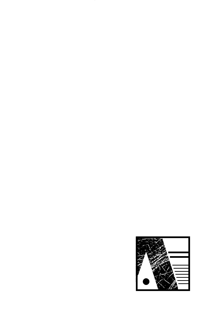
A visual logic system can operate in a design that makes it
an ‘entity’. This logic system involves consistent application
of styling and appropriate decision making on text and
image hierarchies and font selection, but also an individual-
ising—and unifying—component that could be termed
‘graphic detailing’.
You will need to create a unified design entity for each
client and often for each project. If your project is a Web
site, a publication, an advertisement, a corporate identity or
a film title, creating a unique visual system will help it
achieve a stand-out quality, and make it harder for your
competitors to duplicate. It is creating a ‘house style’ for
layout and design decision making that reflects the
uniqueness of that project.
Graphic detailing entails using visual references to
unique characteristics of your project. It also involves subtle
repetition of those references. It is seeing a chance for
individualisation in the smallest details or seemingly most
mundane aspects of a design. It saves time because you do
not need to create new graphic devices to enliven your
layout; simply use the ones you already have. But more
importantly, it gives an inner strength to your layout
because of the resonances that subtle reiteration can have.
You will be surprised how effective this technique can
be. It is often a design ingredient that you don’t actually
notice until it’s pointed out, but you respond to the design
and wonder why some designs don’t work as ‘logically’.
Finding the ‘unique’ characteristics of the job can be as
simple as looking at the letters in the title. If you choose
one of the more interesting letterforms in the title and then
convert your chosen letterform to paths in your illustration
package, select maybe just a curve or angle from the top or
bottom of the character. Depending on how you then scale
that feature and where you place it in the layout, it might
give you a path to which you can snap a title or headline. It
could give you a unique shape with which you could crop a
photograph. It could become a curved or angled margin
that your column of text could contour down. It could
become the dividing line between two fields of colour in the
Layout 131
DOING IT FASTER
Dingbats
If you want a circle, equilateral
triangle or square, consider using the
Zapf Dingbats font instead of the
drawing tools in your program.
Because they operate as a font, you
must be sure you have removed
general font variations such as
baseline shift, italicising or horizontal
scaling because they will affect the
draw of the character. (Hint: You can
use horizontal scaling to create an
oval out of a circle dingbat, an acute-
angled triangle out of an equilateral
triangle dingbat, and a rectangle out
of a square dingbat. You can then
italicise them for fun—and even
rotate the text block.)
In many cases, it is faster to
resize a typeface than to redraw,
enlarge or reduce a drawn element.
You can alter the position of dingbats
minutely because they operate as a
font, so alignment can be fine-tuned
using leading, baseline shift, tracking
and kerning controls.
A
A letterform might be■
used as the basis for a layout
DWD-DM05 4/5/01 4:08 PM Page 131
background. You could step and repeat it, and then colour
between each, to create a pattern of coloured stripes down
your page. All of these possibilities can arise simply from a
feature of a letterform from the title!
The fact that a tiny detail like this can provide a rich
variety of graphic options means you do not need to create
new graphic devices. Simply recognise and use the ones
you’ve already chosen.
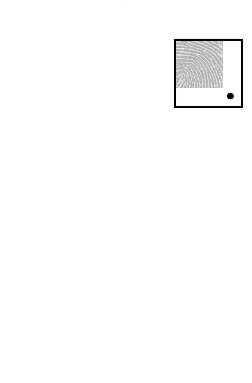
Within images, too, there are details that can be
recropped and featured elsewhere or used for backgrounds.
They might be ghosted to provide a pale but related
background for the layout. They might be repeated and
distorted into a pattern or texture. You might use the
negative version. There are colours that can be duplicated
for display text. There are infinite possibilities.
But let’s assume you decided that all the photographs in
your report would be cropped into squares. The square
becomes a graphic device within that layout as a result of
that decision. So reiterate it. How? Use squares instead of
bullets in dot-point lists. You could also put all pull-quotes
or chapter headings into a square. Your folios could be
contained in a fine ruled square placed equidistant from the
top and outer trim, creating an even more subtle square of
blank space. In bar charts, the bars could be a stack of
square boxes instead of a rectangle. Your colour codings
would have square samples of colour in the key. You could
justify your text and fill square text blocks. In a sans serif
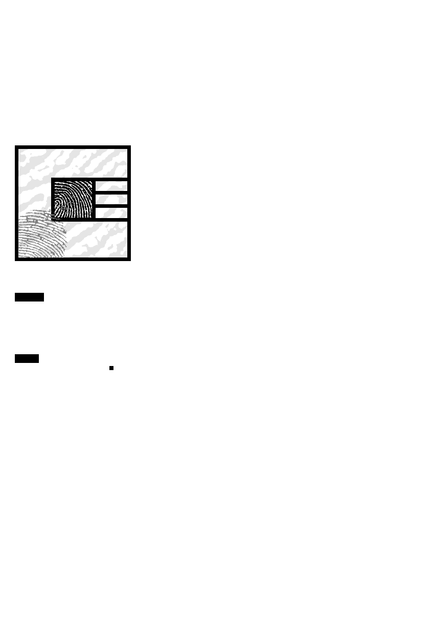
title, you could customise the letter i by replacing its
circular dot with a little square. Okay, these really are the
details—but they have resonance.
Part of effective corporate identity design involves this
type of detailing, using pieces of your existing corporate
symbols, logos and colour palette. Maybe you can use
stripes that mimic a diagonal line in your symbol to fill
borders and strips of colour in the backgrounds of brochure
covers and other corporate paraphernalia. In a series of
report covers, you could use enlargements of details taken
from the symbol to create the base layout.
It can be as simple as a slight colour variation in the
background that subtly reinforces the symbol. This
reinforcing is the layout secret. If you then incorporate a
band of, for example, diagonal stripes that reinforce the
diagonal from the symbol, you are creating a design ground
that is ‘exclusive’ to your organisation. Another client could
132 Production
detail
BEFORE
detail
AFTER
Subtle refinements like a dot on the i
can reiterate a chosen theme: in this
case, the use of squares. Also note
the altered alignment.
DWD-DM05 4/5/01 4:08 PM Page 132
use those same graphic devices (diagonals and subtle
details) because they are not, of themselves, exclusive. But
their use elsewhere will not have the same resonance that
they will have if you use them. Worse still, if accidentally
used by a competitor, their material may be perceived as
emanating from your organisation.
Balance
Balance is achieved when the elements in a layout are
comfortably related to one another and the different weight
of the elements has been distributed evenly across the area
of the page. Imagine an adult and a child on a seesaw. For
balance to be achieved, you must place the adult and the
child carefully in different positions.
An element’s size, shape, colour and tone determine
weight in a layout.
A symmetrical layout will always be balanced unless you
add a rogue element. In asymmetrical layouts, balance is
much more complicated and you use other dynamics to
achieve it.
Symmetry
Designed around a central axis, symmetry will always
balance, but it can be too predictable. For ‘predictable’, read
‘boring’. This traditional Western design style always creates
a balanced design because the elements are reflected
around a central axis, meaning the ‘weight’ of each element
is evenly balanced on either side of the centre line. The
symmetrical layout is static. It will always look neat—and is
a good default design if you’re running short of time—but
is just a bit boring or bland. This is the result of the main
structural interest being a downward centre line.
Vertical centring
Try to remember to lift the elements to ‘optical centre’—
which is slightly above physical centre. This is achieved
easily by putting a larger margin measurement at the
bottom of the layout than at the top. It avoids the feeling
that the text block or print area might have ‘slipped’ down
the page. This is also the reason that title pages normally
have the title placed in the top half of the page.
Layout 133
Optical centre■
Physical centre■
DOING IT SMARTER
Edge detail
Fine trimming and registration
slows the job on press and finishing
processes—avoid complexity and
detail on the trim edges of your
designs. Avoid lines, rules or borders
that run parallel and very close to
the trim edges, because if the trim
is slightly out, the parallels will
look wrong.
DWD-DM05 4/5/01 4:08 PM Page 133
Asymmetry
Asymmetry is inspired by Eastern design traditions.
Asymmetrical layouts are much more involving for the
viewer than symmetrical ones. The response to an asym-
metrical design is a physiological response as well as an
aesthetic one. Asymmetrical designs are interesting designs
for your eyes. Your eye responds by travelling to and fro
across the layout. This eye movement is a physical involve-
ment and is part of our perception of increased dynamism
within these layouts.
For balance within asymmetrical arrangement, the
Japanese have developed a modular approach to layout in
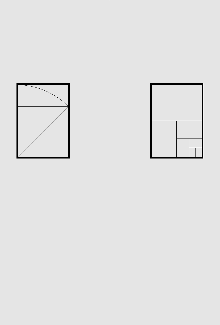
architecture with their arrangement of tatami mats, which
is also used in screens for room division. The tatami mat
is a rectangle created from two squares. In combination,
tatami mats will create balanced patterns that are not
necessarily symmetrical.
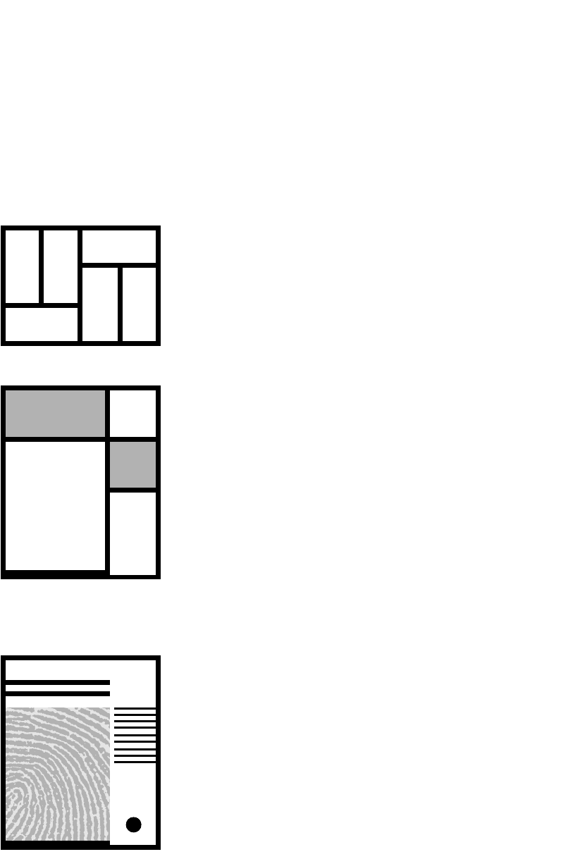
Asymmetry fascinated Piet Mondrian (among others) in
the early 20th century. Using the methods explored by
Mondrian can create a strong interrelated layout.
Balance is complicated in asymmetrical layouts because
the relationships between the elements are dynamic. There
is ‘tension and movement’ created by positioning. For
example, a large black-and-white photograph at the top left
of a page might be balanced by a small red logo at the
bottom right of the page. The weight distribution here is
not only to do with size but also to do with the comparative
‘weight’ of the elements’ attraction value—the red has
stronger attraction value and is therefore ‘heavier’ than its
size alone indicates.
Freestyle layout
‘Organic’ or ‘free-form’ layout is mostly used on posters,
packaging and advertisements. Often you’ll sketch a layout
and keep sketching until you can see the completed design
in the scribbles you have made. Then, sitting at the
keyboard with trusty mouse at the ready, you convert the
scribbles into your final piece. This is the ideal working
method—establish what you want each element of the
design to achieve and then translate that, massaging text
and image to fit your idea. Details, of course, are not
worked out so much in the sketching phase.
Free-form design might answer a particular project more
effectively than the often rigid grid structure that many
134 Production
Piet Mondrian‘s work with areas ■
of flat colour (above) demonstrates
clear techniques for creating
balanced layouts (below).
DWD-DM05 4/5/01 4:08 PM Page 134
designers adopt. For brochures, pamphlets, handbills,
packaging, stationery, covers and posters, consider using
freestyle or free-form design.
With freestyle, you can size and place images and text
according to their level of importance and their image
quality, and interrelate them by juxtaposition or layering.
Remember that the viewer or audience will need to get
some information from your design, so don’t disguise the
information or hide it. Help the viewer to understand.
Having the maximum flexibility that free-form offers
allows you to place pictures directly where the text refers
to them. You also have the ultimate in flexibility for text
massaging. You can vary line lengths and leading according
to what is most readable for your chosen typefaces, without
the limiting structures of modules or grid-based column
widths. Pictures, too, can be whatever size is most logical
or interesting for the image without having to conform
to column widths or modules. Free-form implies an
asymmetrical layout.
In most designs, there are places where small changes
could be made to improve the accurate retrieval of infor-
mation. With free-form design, there is the flexibility to do
some fine-tuning of type and image sizing and placement,
all the while maintaining an interesting design that follows
the logical flow of information, rather than a pre-ordained
presentation system like a grid.
There are drawbacks to free-form design. It is so flexible
that some people find it hard to start. And you don’t want to
make decisions that allow yourself or others to procrastinate
any longer. That flexibility can also make it hard to stop
(there is always a little more tweaking you could do).
Unfortunately, computers encourage this, regardless of the
layout style you choose.
In order to use this technique successfully, you need to
have decision and experimentation time—and sometimes
that is just too hard to find.
Free-form layout can work in publication design but is
rarely used. Grids are faster for production of multipage
documents and usually make it easier to control the layout
for consistency and general flow through the document.
Magazines, however, sometimes use free-form layout in a
feature section.
Layout 135
A small element can dominate ■
or balance a larger element in
asymmetrical layout.
DOING IT SMARTER
Layout practice
Using a group of elements such as a
picture, some text and a heading,
create a series of designs that
explore the interrelationships of
those elements. Create a layout that
is image-dominant where the image
is probably larger. Can you make an
image-dominant layout where the
image is smaller? Try a text-dominant
layout as well. These are often
difficult, but a hint is to keep the
image minute and the headline huge
and use interesting type selection.
Try varying the text size (a larger
point size will fill more page area)
and varying the number of columns,
and their width. Columns on the
same page do not have to be the
same width. Also try to make the text
and the image each have exactly the
same area in the layout.
You could try a space-dominant
layout where your elements float in
space. Then try to give a particular
character to the layout: jolly,
traditional, sophisticated, modern,
lively, restrained, even boring! (If
you can make a design intentionally
boring, presumably you can avoid
it later!)
DWD-DM05 4/5/01 4:08 PM Page 135
Grids
To bind elements within a layout and to achieve a visual
consistency over a series of layouts, designers often use a
grid. A grid is an invisible structure that underlies a layout.
Elements such as pictures, text, headings and logos are
positioned in the layout in relation to the grid. Nearly all
publications, and many advertisements, use a grid.
There are sound financial reasons for using a grid
scheme, because the grid simplifies a number of produc-
tion decisions and controls the production. This is why it is
important to develop a grid that enables, rather than a grid
that disables. You need a grid that will give you the
flexibility of application that you will need in future
applications of that grid, not just the initial task.
At its simplest, a grid can just be the four margins
surrounding a text area. Don’t forget that the bottom
margin should be larger than the top margin to accommo-
date the optical centre.
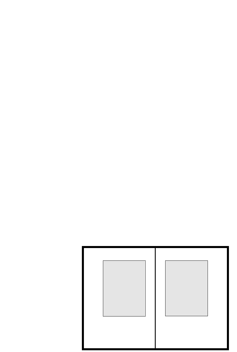
Pages are designed to be read together, so always create
a double-page grid. The page layout will usually be reflected
on the spine, though left-hand and right-hand page layouts
can differ according to the type of publication.
Avoid numerous indents, as each indent creates a new
text element. In multicolumn setting, try to align material
in blocks horizontally—across the page—so the horizontal
layout will remain strong. This can be done with a series of
standardised cross-rules on your grid or even a grid that is
broken into modules—they will streamline layout decisions.
A grid system strives to achieve unity. However, we have
become so used to breaking the grid that we often break it
before it’s been established. This will often weaken a
publication.
Some grid systems actually work against unity because
they are too flexible. The grid systems that allow 2-, 3-, 4-, 6-
or 8-column widths on any page tend to make it difficult to
establish unity within all but the largest publications where
there is a chance that the diversity will be appreciated.
Grid systems often are created by determining column
possibilities across the page size. However, to further
enhance the structure and bring greater unity to the publi-
cation, a series of horizontal page divisions is often created.
These give particular points on the page for pictures,
captions or headings to hang from. They bring a strength to
the publication. They are sometimes called ‘flow lines’.
136 Production
According to André Jute in Grids: The
Structure of Graphic Design, there are
three purposes of a grid:
r Repeatability, particularly
important in:
– multipage documents
– a series of documents
– corporate identity
r Composition
– to blend linear text with
illustration
– to arrange size, shape and
balance of elements
r Communication
– finding given elements in the
same place
– as a guide to important
elements.
DOING IT SMARTER
Breaking a grid
Grids need not be followed slavishly.
Indeed, it can be very dynamic to
‘break the grid’. It is important to
remember that you are breaking
something, so it needs to be
established before a break can have
its full impact.
You can break a grid by bleeding
a picture—it is said to ‘bleed’ if it
continues off the page—or having a
contoured picture break into a
margin. You can also break a grid by
contouring type around an
illustration, creating a runaround.
Give a comfortable zone around the
illustration (in most cases, 3–5 mm is
‘comfortable’) so the type does not
limit the illustration.
DWD-DM05 4/5/01 4:08 PM Page 136
At their simplest, they can be a mathematical division of
the column depth, a series of cross-rules placed at regular
intervals. This option tends to be used for newsletters and
newspapers where the variety of material is wide.
They can be modular for ease of placement of photo-
graphs, diagrams, logos and text. Headings can be devised
to work in a particular size of module. Then it is simply a
case of playing with a jigsaw—fit all the pieces into the page
using leftover space for alignment.
For brochures and books, though, the cross-rules are
often customised for the particular publication, and there
may only be a few well-placed cross-rules that perform
specific tasks in the publication.
Layout 137
DOING IT SMARTER
Picture box and rule sizing in
unjustified text setting
When your text is unjustified it has
an optical width narrower than the
maximum text width. To take account
of this in picture layouts, the column
width of picture boxes is narrower by
5–7 mm in order for the picture to
sit more comfortably in the unjust-
ified text.
Similarly, if you are placing rules
below or above headings or captions
in unjustified text, use the optical
column width for the width of the
rule, not the full column width. Rules
will also be 5–7 mm shorter.
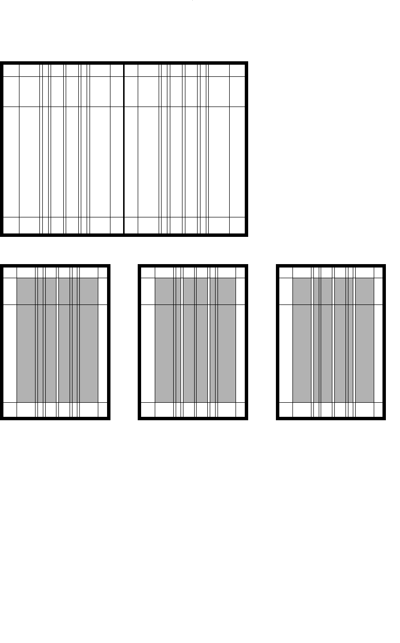
Mixed column grids
On the same template, this grid will
accommodate 2-, 3- and 4-columns.
DWD-DM05 4/5/01 4:08 PM Page 137
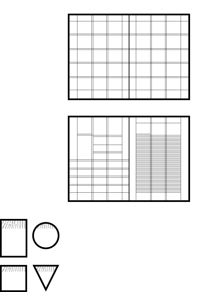
A modular grid ■
created by regular mathematical subdivisions of the columns
138 Production
Customised divisions ■
designed to accommodate publication-specific content blocks
READ MORE ABOUT IT
Allen Hurlburt, The grid: A modular system for the design and production of
newspapers, magazines and books, Van Nostrand Reinhold, New York, 1978,
ISBN 0 422 23598 4.
Allen Hurlburt, Layout: The design of the printed page, Watson-Guptill
Publications, New York, 1977, ISBN 0 214 20674 2.
André Jute, Grids: The structure of graphic design, RotoVision SA, Crans-Pres-
Celigny, Switzerland, 1996, ISBN 2 88046 277 0.
DOING IT SMARTER
Corporate grid relationships
You might decide that, for your
corporate identification to be
consistent across all materials, a
coloured band will appear in the top
quarter of any shape. So whether it
is a badge, the Web site or the
letterhead, the top quarter of each
shape will be coloured and contain
the corporate identification.
Further from this, alignment of
logos or symbols is often detailed by
measurements taken from the symbol
itself. Usually this ensures that the
logo is not crammed into spaces that
are too small for it. Often it is a
placement issue where a particular
measure, which could be half its
width, is placed above and to the left
of the symbol. A quarter of its width
might be placed to its right before
any type is set.
Using relationships with your
elements like this can create a
coherence that is simple to maintain
across varying sizes, formats and
requirements.
DWD-DM05 4/5/01 4:08 PM Page 138
International sizes A, B and C series, DL
2A0 1682 × 118 9 m m
A0 1189 × 841 mm B0 1414 × 1000 mm C0 1297 × 917 mm
A1 841 × 594 mm B1 1000 × 707 mm C1 917 × 648 mm
A2 594 × 420 mm B2 707 × 500 mm C2 648 × 458 mm
A3 420 × 297 mm B3 500 × 353 mm C3 458 × 324 mm
A4 297 × 210 mm B4 353 × 250 mm C4 324 × 229 mm
A5 210 × 148 mm B5 250 × 176 mm C5 229 × 162 mm
A6 148 × 105 mm B6 176 × 125 mm C6 162 × 114 mm
1/3 A4 210 × 99 mm
DL 110 × 220 mm
Other stationery and publication measures Other product measures
Foolscap 337 × 206 mm CD jewel cases
Quarto 260 × 206 mm Back cover 118 × 149
American quarto 279 × 216 mm i.e. 137 mm + 12 mm for 2 spines
American foolscap 330 × 216 mm Booklet 121 × 121 mm
Magazines 270 × 207 mm Floppy disk labels 70 × 70 mm
Paperbacks 198 × 128 mm Video covers 115 × 196 mm
178 × 110 mm Spine 28 mm
Large format
234 × 153 mm Movie posters
Business cards 55 × 85 mm Single sheet 1008 × 688 mm
50 × 90 mm Day bills 650 × 330 mm
Bus shelter posters 1.8
× 1.2 m
Custom sizes can be created for any of the above.
A1
A0
A2
A3
A4
A5
Formats
International paper sizes
are based on the ratio 1:√2 or
about 1:1.4 (left).
There are three series, called the
A, B and C series.
The base sheet for the A series is
A0 which has a total area equal to
one square metre.
The sheets divide proportionally
into their smaller sizes (right).
Layout 139
DWD-DM05 4/5/01 4:08 PM Page 139
140 Production
Measurement preferences
Page measurements, margins, picture boxes and text area
are now often expressed in millimetres. Text area always
used to be expressed in picas and points. A pica is 12 points
or approximately 3.5 mm. This option is still usually
available to you in your ‘preferences’ set-up. But because of
the advent of computers and desktop publishing, page
divisions are now often expressed in millimetres. However,
type measurements, leading and the space measurements
within a text block are still expressed in points. Text indents
and tabs though, which were previously specified in picas or
points, are now often expressed in millimetres, in order to
fit with the page divisions.
Margins
Generous margins make a book feel easy to read.
Traditionally, the inside margin (called the back margin in
traditional book terminology) is about the same as the top
margin (the head); the outside margin (the fore edge) is
slightly larger; and the bottom margin (the foot) is the largest.
The inner margins are smaller than the outer margins
so the text areas in a double-page spread are seen to be
more evenly spaced. If they are specified as half the outer
margin, the inner margins create a band of space equal to
the outer margin. But there is an optical illusion created by
the folding of paper at the spine, so the inner margins are
usually two-thirds to three-quarters the specification of the
outer margin. Of course, inner margins will need to be
larger to accommodate binding techniques like ring-
binding, side stapling and perfect binding.
INNER
BACK
OUTER
HEAD
FOOT
FORE EDGE
TOP
BOTTOM
DOING IT FASTER
Formats
Reuse icons, style sheets and
templates. If you have created icons
for one document, keep them in a
library or drag them between
documents. Do not recreate them
each time you need them.
Likewise, if you have created a
new template for a page size
different from your usual, save it
somewhere (on a floppy or even your
hard disk if it’s likely to become a
regular project format) where you
can access the template when you
need it again.
Saving just a short period of
time, such as that used to create the
page margins and column guides, can
speed your production. You’ve done it
once, don’t waste it.
You may find it handy to have an
A4 landscape page and an A4
portrait page at the ready…and a
few other standard sizes:
q a six-panel, 1/3 A4 pamphlet
template;
q a four-page, three-column,
A4 newsletter template;
q a template for correspondence;
q invoice;
q orders; and
q other regularly used forms.
DWD-DM05 4/5/01 4:08 PM Page 140