Whitbread D. The Design Manual (анг.яз.)
Подождите немного. Документ загружается.

Typography 181
A sans serif type family
ABCDE abcdefg 12345
Frutiger light Adrian Frutiger 1975
ABCDE abcdefg 12345
Frutiger light italic Adrian Frutiger 1975
ABCDE abcdefg 12345
Frutiger roman Adrian Frutiger 1975
ABCDE abcdefg 12345
Frutiger italic Adrian Frutiger 1975
ABCDE abcdef 12345
Frutiger bold Adrian Frutiger 1975
ABCDE abcdef 12345
Frutiger bold italic Adrian Frutiger 1975
ABCDE abcdef 12345
Frutiger black Adrian Frutiger 1975
ABCDE abcdef 12345
Frutiger black italic Adrian Frutiger 1975
ABCD abcde 12345
Frutiger ultrablack Adrian Frutiger 1975
ABCDEF abcdefghijk 12345
Frutiger light condensed Adrian Frutiger 1975
ABCDEF abcdefghijk 12345
Frutiger condensed Adrian Frutiger 1975
ABCDE abcdefghi 12345
Frutiger bold condensed Adrian Frutiger 1975
ABCDE abcdefghi 12345
Frutiger black condensed Adrian Frutiger 1975
A serif type family
Roman
Times new roman
Italic
Times italic
Bold
Times bold
Bold italic
Times bold italic
DWD-DM06 7/5/01 12:56 PM Page 181
182 Production
When you first start to use type, the safest thing to do is
to stick with a good strong type family. Usually a text
typeface will have a set of four variants, i.e. the type nuclear
family—the original typeface, the bold, the italic and the
bold italic. With this basic family, you can create cohesive
type layouts because the letterforms will work comfortably
together because of their similar design attributes.
When type was made of little metal characters that were
placed together in lines by hand, each size of the typeface
had to be cast in metal—so ‘font’ described one set of
characters at a specified size. Unlimited, digital sizings
were not available: only sets or ‘fonts’ of 6, 8, 10, 12, 18
and 24 point sizes and a limited range of larger sizes were
available. Now, due to digital scaling, size is not an issue,
so a font has come to mean the particular collection of
characters that makes up a type family member.
Type nomenclature
Agl
ascender
cap height
x-height
baseline
body
descender
Ampersands
&
Times new roman
&
Goudy
&
Scala italic
!
Palatino italic
DWD-DM06 7/5/01 12:56 PM Page 182
Typography 183
Type size
Type sizes are described in points (abbreviated as pt).
There are 72 Anglo–American points to an inch or roughly
3.5 Anglo–American points to a millimetre. In Australia,
the French–European Didot point system is not used to
measure type.
The ‘point size’ is the body size of the type measured
from the top of the ascender to the bottom of the descender.
In some typefaces there is a distinct difference between the
height of the ascender and the usually smaller cap height,
so type is mostly measured from the ascender line rather
than the cap height.
Most people can comfortably read text type in sizes from
9 point to 12 point, with the most popular being 10 point
and 11 point. For children’s books or material for the aged,
text size should be larger and start at about 14 point.
points
0
12
24
36
48
60
72
84
96
10 8
120
13 2
144
156
168
180
19 2
204
216
228
240
252
264
276
288
0
millimetres
10
20
30
40
50
60
70
80
90
100
0
centimetres
1
2
3
4
5
6
7
8
9
10
picas
0
1
2
3
4
5
6
7
8
9
10
11
12
13
14
15
16
17
18
19
20
21
22
23
24
inches
0
0.5
1
1. 5
2
2.5
3
3.5
4
Measurement systems
DWD-DM06 7/5/01 12:56 PM Page 183
184 Production
Usually, a sans serif font can be set a point size smaller
than a serif font. It is all to do with the x-height (the height
of the lower-case x) and its relation to the ascending and
descending characters that surround it. A serif x will mostly
be smaller than a corresponding sans serif x.
On a narrow measure, 9 point might be necessary, but
on a wide measure, it is best to increase the size to 12 point.
These choices will determine the number of characters on
the line.
All other type decisions are made following text font
selection and the text size and text leading decisions.
Type selection
One of the safest ways to produce a cohesive text treatment
is to select a type family and use its variants exclusively.
One family member—usually the original version—is
chosen to be the basic font. Its designer determined that
this font is best for text setting. It usually is.
All decisions on text width, leading, spacing, indenting
and headings are made based on that selection. It should be
legible and easy to read, which often means it is free from
decoration and unusual letterforms.
Often an organisation will choose a typeface that
becomes its ‘corporate’ typeface—all materials produced by
the organisation are effectively identified by the use of that
type family.
There are even families designed with matching sans
serif and serif typefaces. Using such extended families gives
a ‘corporate’ cohesion to text and, because of the similarity
in curves, weight and stroke thickness, removes the
difficulty of finding compatible typefaces.
DOING IT SMARTER
Type selection
Develop your typography skills
by excluding illustration (or
photography) from your design.
Illustration has such a dominant
effect in a design that it can be a
crutch for a poor designer. Take
away the illustration to extend
your typographic skills.
x-height comparison
Each x is from the
48 point font
x
Times new roman
x-height comparison
Each x is from the
48 point font
x
Transit
x-height comparison
Each x is from the
48 point font
x
NuptialScript
The Stone family includes:
Sans
Stone sans Sumner Stone 1987
Informal
Stone informal Sumner Stone 1987
Serif
Stone serif Sumner Stone 1987
DWD-DM06 7/5/01 12:56 PM Page 184
Typography 185
Compatible typefaces
To avoid the ‘ordinary’ or ‘boring’ look of a single typeface
used through a publication, you can add interest by adding
a second ‘special’ typeface. It works best when the second
face is used sparingly. This retains the interest in it on the
occasions when it is used, possibly for headings, running
heads, pull-quotes or captions.
Think of one face as the ‘special’ and the other—
probably the text typeface—as the working face. You can
then use the variants of both families for various tasks
within the text.
The secret of successful combination of typefaces seems
to be the ability to maintain several contrasts between them.
It is best to use at least two of those contrasts when
selecting your ‘special’ and your ‘worker’. The stronger the
contrast, the more effective the combination will be. You
can contrast:
r their form—serif, sans serif, script or decorative
r their weight or typecolour—reversed, bold, medium
or light
r their scale—large or small
r their spacing—wide or narrow
r their direction—roman or italic
r their shape—condensed, normal or expanded
r their case—capitals or lower case.
Another guide here is to choose typefaces from different
type categories, with no more than one face from any one
category on a page. Use their variants, but maintain a
minimum of two contrasts between each combination. This
gives not only compatibility but also flexibility.
But there are also times when the contrast might be too
great or the differences may be in conflict. For example, it is
often unwise to use an italic serif font with a script typeface
because their letterforms will clash. Also consider the effect
that one typeface—and its associations—will have on
another. For example, contemporary script faces are often
too ‘casual’ to sit comfortably with traditional serif typefaces
because their associations are different and there is a lack of
logic in their proximity to each other. It is a very special
elderly relative who will sit comfortably in a group of
loutish youths.
CHECK LIST
Type compatibility
The most successful technique for
selecting two types that will
complement each other is to use at
least two contrasts between them:
q Form
SERIF vs SANS SERIF
Decorative vs Normal
q Weight
LIGHT vs BOLD vs REVERSE
q Size
LARGE vs SMALL
q Spacing
W I D E vs NARROW
q Direction
Italic vs Roman
q Shape
CONDENSED
vs NORMAL vs
EXPANDED
q Case
CAPITALS/UPPER CASE vs lower case
DWD-DM06 7/5/01 12:56 PM Page 185

Legibility and readability
We read best what we are used to reading. It’s best to avoid
idiosyncratic typographic features, because they can be
unwelcome distractions to a reader. Don’t make long text
documents harder to read—it’s difficult enough as it is to
get people to read them.
Because people have a finite amount of time to spend
reading, there is an emphasis on the speed and accuracy of
their comprehension. This puts great importance on the
ability to achieve clarity of letterforms and to maintain
correct emphasis within the text. What you do with your
chosen typeface to enable the reader to find and understand
the material being presented is paramount.
A major inhibitor to smooth reading is inconsistency. Be
consistent in:
r headings, once you have established an appropriate
hierarchy
r the style for references and cross-references
r spelling
r punctuation
r the structure of information.
READ MORE ABOUT IT
Rolf Rehe, Typography: How to make it most legible, Design Research
International, Carmel, Indiana, 1984.
Colin Wheildon, Communicating or just making pretty shapes, 3rd edn,
Newspaper Advertising Bureau of Australia, Sydney, 1990.
Line length
Optimum line length is generally considered to be between
1.5 and 3 alphabets or, given the alphabet contains
26 letters, 39–78 characters (which is sometimes rounded
up to 40–80 characters) or, for people who prefer a single
figure to a range, 60 characters. It largely depends on
which publications you read.
The range is more useful than the absolute. The number
of characters per line in various typefaces and formats will
change, so you will not be able to achieve the absolute of 60
in every setting, and that does not necessarily mean that
your readability is compromised. A range also implies that,
if you go beyond the range, you are entering potentially
difficult areas.
In any case, line lengths that are near the upper limit
will need more leading than those near the lower. This
enables readers’ eyes to accurately and consistently drop to
186 Production
DOING IT FASTER
Measuring optimum
line length
In order to quickly decide how wide
your columns could be without
counting, find a type catalogue that
presents settings of the lower-case
alphabet of each font in different
sizes. Simply measure the setting of
the lower-case alphabet in the size
you intend using and multiply it from
1.5 to 3 times to determine the range
for optimum line length. Then
consider whether your format or
grid allows a line length within
that range.
DOING IT SMARTER
A personalised type
catalogue
Create your own type catalogue by
typing up the alphabet in all caps and
then in lower case, a set of numbers
and punctuation marks. Caption it
with font and size information.
Duplicate it numerous times,
selecting the size options you are
most likely to use, remembering to
revise the caption. Print it out. Then
select the whole page and allocate a
different typeface and print it out,
too. Do this for all the typefaces you
have and generate new pages when
you invest in a new face.
DWD-DM06 7/5/01 12:56 PM Page 186

the starting point of the next line without doubling (where
you read the same line twice or even three times).
In narrow columns, there are a few standard techniques
to increase the number of characters to a comfortable
reading level:
r reduce the point size of your type
r select a condensed or narrow typeface
r use the italic font, which will mostly set narrower.
Another consideration is the written style of the text. If
the manuscript has many long words, such as a scientific or
technical paper, and long sentences and paragraphs, it does
not lend itself to narrow, multicolumn setting; if it has short
paragraphs and lists, or dot points with short entries, it will.
Leading
When printers used metal type, they inserted thin strips of
lead between the lines of type to separate them. The term
leading (pronounced ‘ledding’) refers to the space between
lines of type. This space is generally measured from the
baseline of one line to the baseline of the next, so it is
nearly always larger than the point size of the typeface.
If there is no leading between the lines, the text is ‘set
solid’. Solid setting has the potential for the descenders of
one line to touch the ascenders of the next, which upsets
the word shape and inhibits readability. You need some
leading in all cases where readability is paramount,
particularly in text setting.
Auto-leading refers to a default setting that places an
extra 20% of space between the lines—if your text is set in
10 point Times Roman, the auto-leading is 12 points (which
means there are 12 points from one baseline to the next).
It often helps to imagine how this was achieved with
metal type. Type is measured from the top of the ascending
characters—like d, h and k—to the bottom of the descend-
ing characters—like g, y and j. Using the same example,
you would have a line of Times that was 10 points deep
with a 2 point wide piece of lead between it and the next
line of 10 point Times.
Leading is now measured in points from baseline to
baseline (which is the sum of the body size of the type and
the width of the imaginary lead strip between the lines).
It is then expressed as the size of the body ‘on’ the measure-
ment from baseline to baseline.
Typography 187
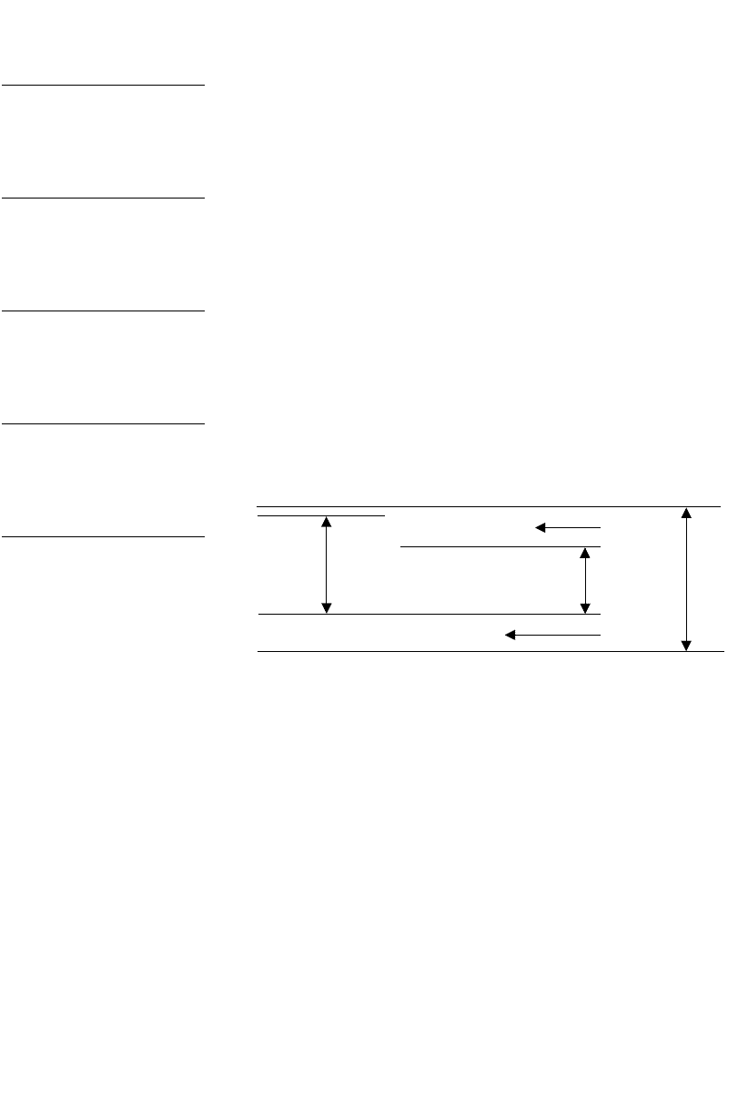
Leading between
lines of type
LEAD
DWD-DM06 7/5/01 12:56 PM Page 187
188 Production
The amount of leading required is determined by the
interrelationship between the x-height and the number of
characters that fit in the measure. The longer the line, the
more leading it will require. Conversely, with short lines,
less leading will be required.
Sans serif type usually requires more leading than serif
type. This is related to the x-height of the letterforms—
usually sans serif typefaces have a larger x-height than
serif typefaces.
As a rule of thumb, you should be able to fit a minimum
of an x-and-a-half space between your x-heights.
With a serif face, the minimum recommended leading is
one extra point on the size of the face. For example, 10
point Times with 1 point of space between the lines is called
‘10 on 11 point Times’ and written as ‘10/11 pt Times’. The
leading is entered as ‘11 points’ even though, in the past, it
would have been a 1-point lead strip placed between the
lines. As a rule, leading for a serif font will be between 1
and 4 points on the size of the font—using 4 on a long line
length. Using the same example, if you had 60 characters
in a line, the appropriate specification might be 10/13 pt
Times. If closer to 80 characters, it may be 10/14 pt Times.
With a sans serif face, the minimum recommended
leading is 2 extra points on the size of the face. Leading for
sans serif will vary from 2 to 6 extra points on the size of
the font, again using more on a longer line.
If you do not feel confident enough to make leading
decisions, auto-leading is a good guide, but not infallible,
as it is also mostly based on the appropriate leading for a
serif face.
As a further example, if you set 10 point Times Roman
with 12 point leading and then changed the typeface to the
sans serif Helvetica, you could alter the size to 9 point
Helvetica but keep the 12 point leading (which is greater
than the auto-leading for 9 point, at a comparative leading
of 133%).
If you apply leading more generously, you create a
lighter looking text block which can be a useful technique
to remember for varying the tonal arrangement within
a layout.
x
x
x
Minimum
leading
Minimum leading
As a general guide, the minimum
requirement is an x-and-a-half
between lines of x-height in both
serif and sans serif type—or
2.5 times the height of an x.
DWD-DM06 7/5/01 12:56 PM Page 188
Typography 189
Extreme leading
You might leave a line space or more between lines,
e.g. ‘10/24 pt Times’. As a display setting style for advertise-
ments or annual reports, it can be quite effective. Some
designers interweave headings, footnotes, even other
paragraphs or a second column of text through the
wide linespacing.
It can be a most effective technique but has drawbacks;
it relies on a reader being able to identify the typeface
variation. Maximising the contrast seems to be the easiest
way to ensure that both levels of information are read.
This is best done with colour, weight of font, or an entirely
different typeface.
Negative leading
In display lines that are set in capitals, a negative leading
is often allocated, i.e. leading that is smaller than the body
size of the type, e.g. ‘10/8 pt Times caps’. This is done to
avoid the distance that occurs when there are no descenders
to fill the gap. Without the descenders, the space between
the lines can separate the lines too much, particularly if
the second line is a continuation of the first and not a
separate heading.
In extreme cases, you may want the lines of capitals
to touch. Trial and error is the best way to determine the
amount of negative leading for this. Make sure your laser
printer gives you an accurate depiction; sometimes what
looks accurate on a laser printer will not look so accurate
when produced from an imagesetter.
You can use this technique to make a cohesive
heading shape with lower case as well. It is often used
when centring two- or three-line headings in an oval shape.
Ensure that descenders from above don’t crash into
ascenders from below. You may need to massage the line
breaks in order to avoid a crash or even use optional
characters (the dotless i [ı] is sometimes useful to avoid a
descender from the line above). You might also ‘interpret’
your centring, creating a more asymmetrical arrangement
of the lines to avoid any clashes.
When using extreme leading,
you may offset headings and other
text elements like footnotes, cross-
references or links by placing them
between the lines of the main text.
Extreme
leading
creates
cross-readings
THE
DAY’S
END
THE
DAY’S
END
BEFORE
AFTER
Capitals set solid in 18/18 pt Scala are
changed to 18/15 pt Scala to better
shape the three-line title.
DWD-DM06 7/5/01 12:56 PM Page 189
190 Production
Uneven leading within a heading
In a multiple-line heading set in lower case, such as those
that sometimes appear on narrow pamphlets, you will need
to alter the leading for each line of the heading so that it
will look optically even. The optical distortion usually occurs
when there is a line that has no descenders. The space
between it and the next line will often look inordinately
large, so you need to move the next line up a few points
until it looks even.
For this to work, make sure that each line break is
established with a line return, otherwise any leading change
will flow through the entire heading.
Letterspacing
Letterspacing is usually achieved by a combination of
optical and mechanical spacing. Optical spacing achieves
the look of there being similar space between characters but
takes account of the letterforms and their counter spaces.
You can use a combination of techniques to achieve this.
For instance, imagine a number of jellybeans that neatly
fit between each letter so the blank area or white space
takes the same number of jellybeans, despite their odd
distribution around some lettershapes. Another technique
is to determine the optical edge of the letterforms and
then mechanically space them.
Mechanical spacing puts exactly the same amount of
space between letters, but it is measured from the right of
the first letter to the left of the following letter, regardless of
the letterform. This means some letter combinations will
look further away than others.
Letterspacing controls are at your fingertips in most
page layout programs, and the terms most often used to
describe letterspacing techniques are tracking and kerning.
They are not interchangeable terms—in most programs you
will encounter both because they have different functions.
Kerning
Letters are usually spaced so there is the appearance of even
space between them, but in some combinations of letters,
the spacing remains awkward. Kerning is the respacing of
specific pairs of letters that are causing uneven spacing
within a word. Although this does not usually need to be
used in text setting, it is often worth the trouble for titles,
logotypes and headings. Kerning is usually required in
setting where there are capitals such as T, A, V, W and L.
DOING IT FASTER
Kerning
Don’t fiddle with kerning at rough or
draft stage—if at all.
The
Day’s
End
The
Day’s
End
BEFORE
AFTER
A title set solid in 18/18 pt Scala
looks uneven in this three-line setting
due to the descending y, capital E
and ascending d that fill the second
linespace—creating an optical
illusion of those lines being closer.
While the second line has a capital D,
the first line has no descending
characters so the leading between
the first and second lines was
reduced by 2 points to 18/16 pt Scala
to optically correct the title.
DWD-DM06 7/5/01 12:56 PM Page 190