Whitbread D. The Design Manual (анг.яз.)
Подождите немного. Документ загружается.


Traditional and modern layouts
Most text designs will fall into either the traditional (Italian
Renaissance) or modern categories. ‘Modern’ in this sense
is not ‘fashionable’, ‘trendy’ or even ‘contemporary’, but a
specific styling from the mid-20th century. Greatly influ-
enced by the Russian Constructivist and the Dutch De Stijl
designers early in the century, Bauhaus teachers taught it
and it was refined by the Swiss. It became the dominant
international corporate style.
For ‘traditional’, read ‘classical’, as it is the style based on
Italian book and type design from the Renaissance. It has
been the dominant styling used for books since and can
lend an olde worlde atmosphere to advertising and posters.
Both styles are used for annual reports because they
give particular visual clues to how an organisation wishes
to be seen.
The modern style says an organisation is forward
thinking, at the cutting edge, a bit of a risk-taker, even
casual or brash. But it can sometimes be stark and harsh.
Most manuals, magazines and reports, all forms and
nearly all corporate identity programs are based on the
modern format.
The traditional style, by contrast, implies the organ-
isation has roots and a solid foundation, it values where it
has been and can be trusted and respected. Be careful to
avoid being seen as pompous or, worse, backward. Most
books, some manuals and nearly all wedding invitations
are based on the traditional format.
Although it seems bizarre to say designs fall into these
two categories, you will find that they are fairly easy to spot
once you know the styles. But to create a uniquely flavoured
design, substitute ingredients: mix in serifs or scripts where
sans serifs are specified; or add more line rules and type-
faces to spice up the layout. Contemporary designers do not
follow these styles as rigid rules, more as guides. They
usually create a distinct hybrid.
READ MORE ABOUT IT
Suzanne West, Working with style, Watson-Guptill Publications, New York, 1990,
ISBN 0 8230 5872 7.
Layout 161
DWD-DM05 4/5/01 4:08 PM Page 161
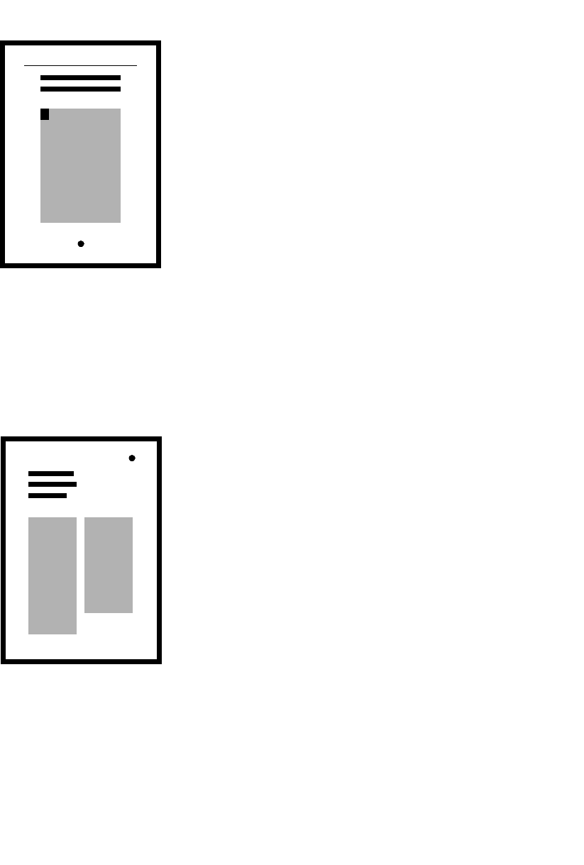
Traditional layout
Create substantial margins that relate to each other, from smallest to largest:
the top, the inside, the outside and the bottom margin. The margins should look
generous. The page number should be centred on the text block and roughly
central in this bottom margin.
Choose a good, strong serif typeface (Bembo, Garamond, Times, Baskerville,
Palatino or another classic font), and prepare your text with italics for stress
when necessary. Loose-tracked small capitals can be used occasionally for stress
or headings within the text. Indent paragraphs by about 5 mm, with no extra
space between them.
Justify the type, leading it generously, and centre the capital letter
headings. Headings might need a little tracking as well.
Initial drop capitals on chapter opening pages and printer’s flowers or
dingbats centred at the end of the chapter will add a traditional feel. A few fine
line rules and lots of capital letters for headings and first lines will also help. If
you can get ligatured character pairs and swash characters, which are
sometimes available in a ‘specialist’ or ‘alternative’ font, it will add to the
traditional detailing.
Place the text in your page layout to fill each page to a constant page
depth—the bottom line as defined by your bottom margin. Put some extra space
around your headings. Remember that more space above a heading than below
it will keep the heading with its text.
Images, in the classic form, are on separate pages with centred captions in
tracked small capitals below the image.
Modern layout
Create light margins, keeping the top margin and side margins much the same.
The bottom margin should be slightly larger. Then divide the text block into two
or three even columns, each separated by a narrow gutter.
Prepare your text in a sans serif typeface with an extensive font family
(Helvetica, Univers, Frutiger, Gill Sans or Futura will have the range of light,
medium, bold, extrabold and italics that are required). Type should be formatted
flush left unjustified, avoiding hyphenation as far as possible, and leaded
generously to separate the sans serif lines for easy readability.
Use blocked paragraphs—not indented—and separate them with half to
one line space. (This is now usually reinterpreted to be 5 mm indented
paragraphs with no indent in the first line after a heading.)
Be creative with your headings, carefully avoiding the use of capitals, but
being generous with the use of different point sizes and weights. Headings
often hang from the top margin line and are separated from the text by a space,
which creates a text drop line further down the page. The headings will mostly
be bolder than the text and italics are usually avoided, except for stress within
text. Sometimes you might use the occasional line rule or bar in association
with a heading, often taking it to optical column measure and placing it above
the heading.
Fill each column comfortably to a logical paragraph break, but don’t fill to
the bottom, just let the text hang.
Images should also hang from the text drop line. Images will probably
conform to one- or two-column standard scalings and might be positioned
according to a strict grid for placement. Captions are often in italics the same
size and leading as the text.
162 Production
DWD-DM05 4/5/01 4:08 PM Page 162

There are times when your design—like your hair—simply
looks dull, boring and lifeless. On such design bad-hair-
days, don’t throw out all that work and start again. Do a bit
of judicious design teasing and moussing. Look at the
design with a new set of eyes. Imagine someone else did
the design and you have the job of fixing it up.
There are four good techniques for fixing an ailing
design, which are relatively quick and work wonders.
But note that if you are working on a publication and it’s
looking boring, you don’t have to enliven every page—
occasional breaks in a publication are sufficient. Every page
does not have to be dynamic and new.
Increase tonal contrast
A design that looks grey can be very boring. Text blocks
reduce to grey tone if you squint at them. The ‘squint test’
is the clincher—if it is boring to squint at, then it’s boring
to look at. What the squint test shows you is the interaction
of the tones on the page.
Fix your tonal contrast. Get some dark and light areas
happening in that grey base. For dark, choose a darker
typeface for some headings (such as an extrabold). Perhaps
use a reverse—where the type is white on a black block.
Use a dark stripe somewhere (bleeding off the side of the
page or down the side of photographs). Then add some
light—some large white type can be reversed out of a
photograph, or a logo could be reversed out of a dark stripe,
or simply keep a larger area of white space below the main
heading or create bigger margins.
Redistribute space
Many people are scared of leaving a blank area in a design,
fearing that it makes them look inept because they couldn’t
fill the page neatly and their layout looks like something’s
missing. On the contrary—this area is called space or white
space (even if it’s black) and can have a wonderful effect on
163
Four ways to save a
failing design
DWD-DM05 4/5/01 4:08 PM Page 163

the liveliness and vibrance of a layout, partly because space
has the effect of increasing the tonal variety, but also
because it becomes a layout element that interacts with
picture blocks and text blocks. So manipulate space.
Space can be added to a margin to increase the layout’s
feeling of space. This can be done by hanging type and
pictures from an invisible line across the top part of the
page and letting the columns fall to a natural length,
leaving the space at the foot of the page. Alternatively, you
can put a slab of horizontal space across the page by having
an area at the top where headings sit and then a drop before
text can start. In a multicolumn format, you might leave
one of the columns blank for vertical space.
If the page is full and it looks like there is no space to
redistribute, try altering the setting from justified to
unjustified—it will immediately open up the page. Also,
you can reduce the size of the pictures to get some space.
You can reduce a heading size but keep the space around it
the same, giving the illusion of more space.
Alter scale relationships
One of the best fixes is to alter scale (the size relationships
within the layout). Basically, the contrast of little with big is
dynamic and visually interesting.
If there are three pictures in a layout, make one picture
big and the others very little. Not just little—very little. The
one that is big might be so big it bleeds off all four sides,
forcing you to place the little ones somewhere on top of it.
Don’t forget that type can work that way, too. What about
an enormous title that has little tiny pictures floating in it?
What about large body copy (the main body of text) with a
tiny heading? (It can work, but it’s tricky.)
Repeat something
You can enliven a layout simply by repeating some of its
existing elements—logos, images, even type. When you
repeat them, you can create a pattern. Or you can alter their
sizes and use scale variation. This works well with logos
and photographs, particularly if you use a technique called
ghosting where you fade the logo or image until it’s like a
shadow. It can then float behind the text or the solid version
of itself. This effect of different layers gives dimension to
the design, which is why it works as a fix.
164 Production
DWD-DM05 4/5/01 4:08 PM Page 164

Typography
Handling type is the special skill of the typographer. It is
sensitivity to the forms of the alphabet and numerals that
other mortals use carelessly every day in handwritten
memos and even in electronic mail. It is a tradition that
goes back to the scribes who were the official carers for
our fledgling letterforms.
The difference between a good piece of design and a
great one is often the level of expertise in the selection and
use of type. Type must be appropriate to its subject, its
message and the illustrations that surround it—and the
reader’s experience of type.
Typefaces can have many associations for a reader.
There are typefaces we read as a child; those that recall a
bygone era; those that feel traditional and others that feel
modern; type that says, ‘This is news’; type that is romantic;
faces that are quirky and others that are serious. The
‘personality’ of a typeface can be related to historical or
emotional associations, or simply a reflection of our
experience of type.
One of the exciting things about the personal computer
and desktop publishing (DTP) is the discovery that there is
a whole new world of ‘typography’ out there—something
experienced from our earliest years, so often taken for
granted, but also misunderstood. Although it is exciting, it
is also a concern because we soon find that using type is
not as easy or as intuitive as we expect.
Using type on a personal computer is very different
from using a typewriter. Typesetting, or the simulation of
it we call DTP, uses different formatting techniques to
achieve similar but superior results. Even when an original
typed manuscript was re-keyed by a typesetter, typing for
publication has always had more refinements than simply
keying-in the text, because typeface designers had many
more characters available to them in a type case or on a
computer than would fit on the typewriter keyboard.
165
‘Type is about much more than
questions of legibility or readability.
Fashions and technological change
are just part of the backdrop. What
makes typography fascinating, and
an essential enquiry for anybody
involved in design, is that this activity
is a manifestation of our search for
greater efficiency and greater power
in the written word. It reveals
personalities, politics, and economic
factors, along with advances in
science. It is a celebration of
humanity, and a vital and subtle
indicator of values.’
Lewis Blackwell in
20th Century Type: Remix
DWD-DM06 7/5/01 12:56 PM Page 165

Typography immediately says that the information
presented is more important than handwriting or type-
writing because only something that needed to be seen as
complete was set in type. This is why people are so much
more critical of draft text and letters in a ‘typeset’ form—
an error becomes magnified. If a politician handwrote, or
typed in the Courier typeface, a letter that had a spelling
mistake, no one would mind. In Times Roman, that same
mistake simply confirms our suspicions and demonstrates
the sender’s incompetence. And if they’re this incompetent
just getting a letter right, how much more incompetence is
hidden from our view? Don’t throw away that Courier font
just yet—it can save you.
If the text has the appearance of typesetting, it should
exhibit all the other hallmarks of typesetting. If it doesn’t,
readers may perceive it as unprofessional and sloppy.
There are a number of areas where you can establish a
professional styling within text:
r punctuation styling is different between typing
and typesetting
r italics are used for stress within text instead of
underlining
r heading handling is different because with typesetting
and DTP there are options which were not available
in typing
r by using columns, rules, colour, boxes, variable spacing
and other graphic elements.
With the vast capabilities many word-processing and
DTP programs contain, many users are tempted to use a
number of techniques that were previously used sparingly.
Now it is so easy to click on the menu or key-in the
command that some users are no longer considering the
wisdom of using techniques such as drop-shadows, type set
around a circle, outlined type, contoured text, boxed text
and even justification.
All these capabilities are needed on occasion, but
not as regularly as they are being used. It is just like the
smorgasbord of typefaces that are available which are
there to give variety and flexibility to typography. They
were never intended to be used in the same document
at the same time.
166 Production
Mechanical
spacing &
constant
character
width
Typewriting
Mechanical spacing and constant
character width are aspects of
typewriter fonts like Courier.
DOING IT SMARTER
Spell-checks and
proofreading
Use spell-checks regularly,
particularly as you are typing and
before you transfer the text file into a
page layout program. But don’t
forget to fully proofread the final
text. A spell-check is better than
nothing, but it is not as accurate as a
good proofread.
DOING IT FASTER
Keyboard shortcuts
Use as many keyboard (and extended
keyboard) shortcuts as you can
remember. Selecting from a menu
every time is time-consuming. Using
rulers and toolboxes also helps, but
the keyboard shortcuts really
streamline document production.
DWD-DM06 7/5/01 12:56 PM Page 166

READ MORE ABOUT IT
Robin Williams, The Mac is not a
typewriter, Peachpit Press,
Berkeley, 1990,
ISBN 0 938151 31 2.
Robin Williams, Beyond the Mac is
not a typewriter, Peachpit Press,
Berkeley, 1996,
ISBN 1 201 88598 0.
Erik Spiekermann and E.M. Ginger,
Stop stealing sheep: And find out
how type works, Adobe Press,
Mountain View, California, 1993,
ISBN 0 672 48543 5.
Jeff Bellantoni and Matt Woolman,
Type in motion: Innovations in
digital graphics, Thames &
Hudson, London, 1999,
ISBN 0 500 01914 2.
Stefan Rögener, Albert-Jan Pool,
Ursula Packhäuser and
E.M. Ginger (eds), Branding with
type: How type sells, Adobe
Press, Mountain View, California,
1995, ISBN 1 56830 248 7.
John Miles, Design for desktop
publishing: A guide to layout and
typography on the personal
computer, Imprint Publishers,
Sydney, 1987, ISBN 1 875132 00 7.
Jan V. White, Graphic design for
the electronic age: The manual
for traditional and desktop
publishing, Xerox Press,
Watson-Guptill Publications,
New York, 1988,
ISBN 0 8230 2122 X.
Jill Yelland, Typo survival kit: For all
type emergencies, 2nd edn,
Press for Success, Perth, 2000,
ISBN 0 646 28070 8.
Kate Clair, A typographic workbook:
A primer to history, techniques,
and artistry, John Wiley & Sons,
New York, 1999,
ISBN 0 471 29237 0.
Robin Williams, The non-designer’s
type book: Insights and
techniques for creating
professional-level type, Peachpit
Press, Berkeley, 1998,
ISBN 0 201 35367 9.
Typography 167
Creating text interest
Subheadings
For people who scan to quickly find
what they need
Columns
To make the information look easier
to approach—smaller blocks of text;
more accessible paragraphs
Space
To give the reader a place to rest
Pictures
To stimulate, and to break the text
Colour
To stimulate the eye and to add
depth to the text—this can also be
achieved with tones and tints of
black
Boxes and rules
To separate text and to arrange it
into more manageable blocks—this
also guides the reader through
material
References, links and footnotes
Streamline the text for readers who
do not want to read ‘irrelevant’
material; but also provide for readers
who want more information
Various type sizes and treatments
To indicate the relative importance of
the information as determined by the
author or editor; to make the visual
presentation more attractive
Considering the manuscript
How will the document be used?
Will it be scanned or read
continuously? Is the reader tired or
alert, relaxed or stressed?
Does the reader want to read it?
Is the reader motivated or reluctant?
Is it information?
Are there enough headings to
indicate specific areas of interest?
Is it instruction?
Can it be read in order and followed
clearly? Will it be translated into
multiple languages? Is there enough
room for the increased text area of
many other languages? What
production requirements does its use
imply? (For example, you may need a
printed surface that can be wiped
clean in a kitchen or a garage.)
Is it reference material?
Are specific areas of interest clearly
labelled and logically ordered?
Is it entertainment?
Will the reader be unnecessarily
distracted from a sustained read?
Is it familiar?
Has it a recognisable form to
streamline usability like that of a
dictionary, a TV guide or a novel?
DWD-DM06 7/5/01 12:56 PM Page 167

Type categories
It helps to have an appropriate language to talk about type.
Type falls into five main categories: serif type, sans serif
type, scripts, specialty or display typefaces, and symbol or
picture fonts.
READ MORE ABOUT IT
Christopher Perfect, The complete typographer: A manual for designing with
type, Quarto Publishing, London, 1992, ISBN 0 316 90326 4.
Gordon Rookledge and Christopher Perfect (rev. Phil Baines), Rookledge’s
international typefinder: The essential handbook of typeface recognition
and selection, 2nd edn, PBC International, Glen Cove, New York, 1998,
ISBN 1 870758 03 X.
Philip B. Meggs and Roy McKelvey, Revival of the fittest: Digital versions of
classic typefaces, RC Publications, New York, 2000, ISBN 1 883915 08 2.
Ken Garland, Illustrated graphics glossary: Of terms used in printing, publishing,
photography and other fields of interest to graphic designers, their clients
and their suppliers, Barrie and Jenkins, London, 1980, ISBN 0 09 141511 X.
Stanley Morison, A tally of types, Cambridge University Press, Cambridge, 1973,
ISBN 0 521 20043 1.
Eric Gill, An essay on typography, 5th edn, Lund Humphries, London, 1988,
ISBN 085331 509 4.
Jan Tschichold (trans. Ruari McLean), The new typography: The first English
translation of the revolutionary 1928 document, University of California
Press, Los Angeles, 1998, ISBN 0 520 07147 6.
Alexander Lawson, Anatomy of a typeface, Hamish Hamilton, London, 1990,
ISBN 0 241 13267 3.
Hermann Zapf, About alphabets: some marginal notes on type design, The MIT
Press, Cambridge, Mass., 1970, ISBN 0 262 24010 6.
Allan Haley, Alphabet: The history, evolution and design of the letters we use
today, Thames & Hudson, London, 1995, ISBN 0 500 27835 0.
Allan Haley, Typographic milestones, Van Nostrand Reinhold, New York, 1992,
ISBN 0 442 23642 5.
Friedrich Friedl, Nicolaus Ott and Bernard Stein, Typography: When, who, how,
Könemann Verlagsgesellschaft mbH, Cologne, 1998, ISBN 3 89508 473 5.
Allan Haley, Type: Hot designers make cool fonts, Rockport, Gloucester, Mass.,
1998, ISBN 1 56496 317 9.
Sebastian Carter, Twentieth century type designers, Trefoil, London, 1987,
ISBN 0 86294 076 1.
Lewis Blackwell, 20th century type: Remix, Laurence King Publishing, London,
1998, ISBN 1 85669 116 0.
Spencer Drate and Jütka Salavetz, Extreme fonts: Digital faces of the future,
Madison Square Press, New York, 1999, ISBN 0 942604 74 1.
Rob Carter, American typography today, Van Nostrand Reinhold, New York,
1989, ISBN 0 442 22106 1.
Steven Heller and Louise Fili, Typology: Type design from the Victorian era to the
digital age, Chronicle Books, San Francisco, 1999, ISBN 0 8118 2308 3.
Wolfgang Weingart, My way to typography: Retrospective in ten sections, Lars
Müller Publishers, Baden, 2000, ISBN 3 907044 86 X.
168 Production
DWD-DM06 7/5/01 12:56 PM Page 168

Serif typefaces
Serif type has ‘little feet’, like the type you’re reading at the
moment. If you were drawing the letters by hand, the
individual movements of a calligraphy pen that make up a
letterform are called strokes. Serifs are the flicks—mostly
small horizontal strokes—at the start or the end of each
character stroke.
Serif type is believed to be the most readable type for
continuous text, which is why many magazines, books and
newspapers use serif type for body copy. For extended
reading, it is more comfortable which explains why fiction
paperbacks—motivated, narrative reading with few
headings or other interruptions—are always in a serif
typeface.
Serif typefaces are often associated with tradition and
can lend an air of authority to text. Many of the ‘big name’
classical serifs like Bembo, Times, Baskerville and
Garamond have been around for centuries and immediately
conjure up a feeling of tradition, which is exactly what
many companies want to project, particularly at annual
report time in a recession.
Serif types usually have strokes of different widths.
Look at a capital A—the left stroke is thin, the right stroke
is thick and the crossbar is thin. This is because typeface
designs were based on the writing of scribes which was
produced with nibbed pens.
The problem with variable stroke thickness is that it
can make small type and reversed type a problem. The fine
lines might drop away when they are printed. Avoid using
serif typefaces on gloss paper, in reverse, or at very small
sizes because their serifs and thin strokes can disappear.
Note: Slab serif typefaces can usually be used in a
manner similar to the use of sans serif typefaces, because of
their apparently even stroke thickness—even their serifs are
as thick as the strokes.
Typography 169
Variable stroke thickness
A
Times new roman
DWD-DM06 7/5/01 12:56 PM Page 169

Optical correction of a font
means that capital letters are
different measured heights even
though they appear the same height.
An O or a W are actually taller by
measuring than an H. An A is
somewhere between the two.
This is to do with the alignment of
characters on the baseline where,
for example the points of a W
actually sit below the line to ensure
that the letterform appears to sit
comfortably. Similarly the curve of
the O sits below the line. The H,
having no curves or points, sits on
the exact baseline.
Incidentally, this is why, when
people use Letraset or other rubdown
lettering systems, they often end up
with wobbly lines—unless they use
the Esselte Letraset alignment system
that takes account of it.
But in font design, there is
also optical correction of stroke
thicknesses. Particularly in S, but
also surprisingly in I, and any straight
strokes, the actual shape of the
stroke is full of nuance. Rarely, even
in the most deceptively geometrically
constructed sans serif font, is there
a straight line, due to optical cor-
rection. Most straights are, in fact,
subtle curves that come in at the
waist of the straight stroke and fan
out at the top and bottom.
The mistake made by many font
redrawers was to trust their eyes!
So you will miss the nuance, but
who cares as long as it looks okay?
And it probably will look okay at text
sizes up to about 12 point. But when
won’t it look okay?
This is where the digital font
revolution has really made an impact.
All those original nuances become
obvious in enlargement. But so do
any of the font redrawers’ short cuts.
If you’ve tried to enlarge a poor font,
you will know the problem—it looks
ugly, ungainly and lumpy. Points are
often not sharp and smooth curves
can have an unsightly kink in them.
Original fonts
Why spend money on original fonts?
Why not use the many lookalike font
clones that are available in cheap
font sets? This is not font piracy
(where you copy a font that someone
else has paid for). This is where a
new font is released and becomes so
popular that other font companies
create lookalike fonts in order to
keep their customers from changing
to a new supplier. But they don’t pay
the original font designer or buy the
original drawings from the original
font producer—they redraw their
own version. It happened with
Helvetica, which is available as
Megaron, Helvetia and Geneva.
It happened with Palatino, which
is available as Palatio, Palladium
and Andover.
It’s happening still, although
there is a new twist in the legal
definition. In a 1998 US case, it was
upheld that although the designer
still can’t copyright the font design
itself, the software program that
defines the font can be copyrighted.
But what’s wrong with it, aside
from dubious ethics and dodgy
principles? Why is it worth the
money to get the original?
Most designers would
acknowledge that the original font
contains nuances that most redraw
copyists appear to have been
unaware of or ignore. This nuance
is most often found in optical
correction. The designer of a font
will often draw a geometrically and
measurement-correct letterform only
to find through tests and close
observation that, when our eyes
see that character, we perceive it
incorrectly. We may thicken one part
of it or see an oval where a circle
is desired.
170 Production
This is often an indicator that they
were scanned and redrawn from a
printed character that had gained
thickness due to inking in the printing
process. It also means that the
originally finely tuned contrast
between the medium and bold
versions of a face can also be lost.
The other testing that an
original font designer will do is to do
with how particular character pairs
set and the overall texture of the
new font in text setting. This is all to
do with interletter spacing and
character kerning.
The redrawer will not have
spent the same amount of time as
the originator in the detailing of
those combinations and the testing
of the setting, so often uneven
setting results with a redrawn font.
This is okay if you are prepared to do
the kerning and letterspacing
yourself, but how much actually
gets done that should?
Originators of a font will
also spend more time creating the
full font requirements for high-end
publishing—they will often create an
expert set and sometimes foreign
language font sets to match.
DWD-DM06 7/5/01 12:56 PM Page 170