Whitbread D. The Design Manual (анг.яз.)
Подождите немного. Документ загружается.

Typography 171
Serif typefaces
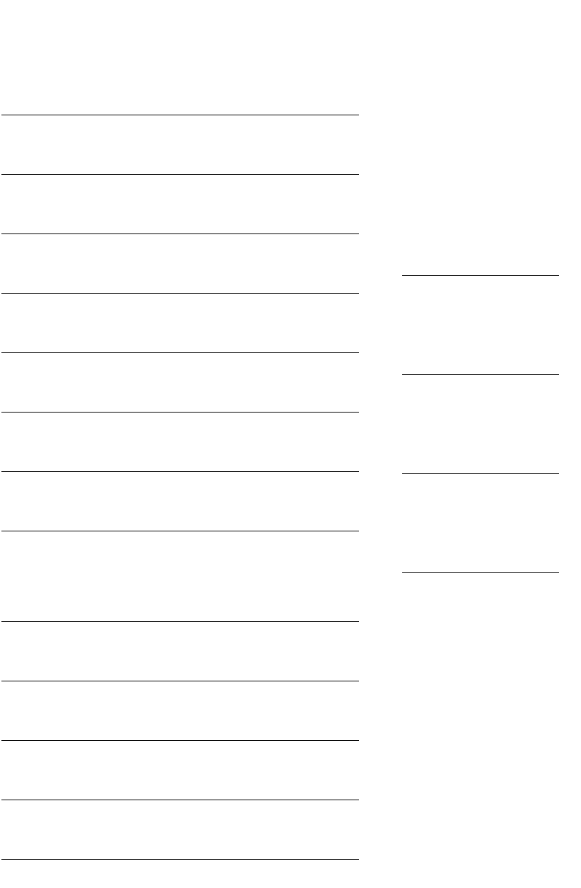
ABCDE abcdefg 12345
Century schoolbook Morris Fuller Benton 1924
ABCDE abcdefg 12345
Garamond Claude Garamond 1530
ABCDEFGHIJ 12345
Trajan Carol Twombly 1989
ABCDE abcdefg 12345
Baskerville John Baskerville 1754
ABCDE abcdefg 12345
Goudy old style Frederic Goudy 1915
ABCDE abcdefg 12345
Times new roman Stanley Morison 1931
ABCDE abcdefg 12345
Bodoni Giambattista Bodoni 1798
!"#$%&'()*+,-&./012
Palatino Hermann Zapf 1949
Optional names for Palatino: Palladium, Elegante, Andover,
Paladio, Patina, Malibu
ABCDE abcdefgh 12345
Bembo Francesco Griffo 1495
ABCDE abcdefg 12345
Galliard Matthew Carter 1978
ABCDE abcdefg 12345
Cheltenham Bertram Goodhue 1896
ABCDEFGH abcdefgh 12345
Matrix Zuzana Licko 1986
Serifs
Bracketed serif
I
Times new roman
Modern serif
I
Modern no. 20
Slab serif
I
Rockwell
All typeface examples are shown
in 18 point.
DWD-DM06 7/5/01 12:56 PM Page 171

Slab serif typefaces
ABCDE abcdefg 12345
Rockwell Inland Typefoundry 1910
Optional names for Rockwell: Stymie, Memphis, Cairo
ABCDE abcdef 12345
Clarendon English Fann Street Foundry 1845
ABCDE abcdefgh 12345
Italia Colin Brignall 1975
Sans serif typefaces
‘Sans serif’ is a French term, which means ‘without serif’.
Sans serif types used to be called ‘grotesques’ and that’s the
way some people prefer to think of them.
Though sans serif type is considered to be less readable
than serif type, it is the most legible type. When you learn
the alphabet, you are taught sans serif shapes because they
are the basic or ‘pure’ forms of the symbols, and therefore
the most legible or easiest to recognise letterforms. You
were probably taught to read using sans serif type.
Its greater legibility is one of the reasons that sans serif
type is used for headlines, billboard advertising and
numberplates, and for signage on highways, at hospitals,
in airport terminals and car parks.
However, as typefaces for text setting, they are consid-
ered ‘modern’, like the architecture of Le Corbusier. If you
want a futuristic or contemporary look, sans serif type can
help. This is probably because the ‘big name’ sans serifs
like Futura, Helvetica and Univers were developed in the
mid-twentieth century and sat comfortably with Art Deco’s
geometric designs and its development into streamlining
and, later, the international style.
Sans serif can look more informal or ‘friendly’ than serif
type, although some perceive the ‘clarity’ of a geometric
sans serif to be ‘clinical’ or ‘distant’.
Sans serif type also has the appearance of constant
stroke thickness. If you look at the capital A, all strokes
appear to be the same width. Because of this, they work at
very small sizes and in reverse—good news for people who
need to put photographers’ credits up the sides of photos,
write ‘Registered trade mark’ under a logo, or use any
other fine print.
172 Production
This is Rod.
This is Janette.
See Rod and
Janette run.
Futura
DOING IT SMARTER
Tiny type
Sans serif type remains quite
readable at even 3 or 4 point. You
should use wider letterspacing at
such small sizes.
Constant stroke thickness
A
Transit
DWD-DM06 7/5/01 12:56 PM Page 172

Sans serif typefaces
ABCDE abcdefg 12345
Helvetica Max Miedinger 1957
Optional names for Helvetica: Newton, Triumvirate, Helios, Swiss,
Geneva, Megaron, Claro, Vega
ABCDE abcdefg 12345
Univers Adrian Frutiger 1957
ABCDE abcdefg 12345
Frutiger Adrian Frutiger 1975
ABCDE abcdefgh 12345
Meta Erik Spiekermann 1991
ABCDEF abcdefgh 12345
Gill sans Eric Gill 1929
ABCDE abcdefg 12345
Optima Hermann Zapf 1958
Optional names for Optima: Chelmsford, Optimist, Musica, Oracle, Zenith
ABCDEFGHIJ 12345
Lithos Carol Twombley 1989
ABCDE abcdefgh 1234
Franklin Gothic Morris Fuller Benton 1905
ABCDE abcdefg 12345
Friz quadrata Ernst Friz 1965 (a hybrid serif font, used as sans serif)
ABCDE abcdefg 12345
Futura Paul Renner 1927
ABCDE abcdefgh 12345
Template gothic Barry Deck 1990
ABCDEFGHIJKL 12345
Avant garde Herb Lubalin 1970 CAPS ONLY
Typography 173
DWD-DM06 7/5/01 12:56 PM Page 173

Serif versus sans serif
Arguments rage about which style of type is superior.
Some people like to quote readability tests and all sorts of
statistics to back up their claims. But the fault with much of
the testing is that it starts from the assumption that serif
and sans serif types are interchangeable—that you can set
up your type specifications (which include the size of type,
the leading and the length of each line) and simply change
the typeface and run the test again. But you don’t specify
a holiday based on your car’s limitations, and then change
to an airline booking, without altering your schedule
and costing.
Each typeface category has tasks it performs well—
and there will be some tasks it will not perform well.
It is not usually the typeface at fault, but more what the
user does with it.
Scripts
Script typefaces tend to mimic handdrawn or calligraphic
type. The letters are often linked to each other, hence the
self-explanatory subdivisions of script called connecting
scripts and non-connecting scripts. There is also a subset
called blackletter based on Gothic pen letterforms which
was the form of the movable type Johannes Gutenberg
invented for his Bible published in 1455.
In nearly every case, script typefaces should be used only
in lower case with initial capital letters.
A mistake often made with wedding invitations and
other traditional uses of script faces is to choose a swirling
copperplate script typeface, which is often difficult to read.
Script typefaces can be used effectively but usually need to
be larger than 14 point and used for titles, and headings
such as ‘The Wedding of Jennifer and Matthew’, ‘The
Signing of the Register’, ‘The Exchange of Rings’. But when
it comes to readability, consider pairing them with a
classical serif which often works well with the traditional
scripts and blackletter fonts associated with weddings.
Contemporary scripts and casual scripts usually work
better with sans serif typefaces.
174 Production
Compare a serif typeface
with a sans serif
Notice the serifs at the end of the
stroke and compare the thickness
and stress of the strokes.
So
Times new roman
So
Transit
DWD-DM06 7/5/01 12:56 PM Page 174
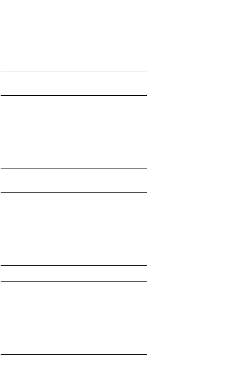
Script typefaces
ABCDEFG abcdefghi 12345
Zapf chancery Hermann Zapf 1974
ABCDE abcdefgh 12345
Snell roundhand Matthew Carter 1965
ABCDEFG abcdefghij 12345
Kaufmann Max R. Kaufmann 1936
ABCDE abcde 12345
Brush script Robert E. Smith 1942
ABCDE abcdefg 12345
Mistral Roger Excoffon 1955
ABCDE abcdefg 12345
Sassoon primary Rosemary Sassoon 1990
ABC abcde 1234
American uncial Eisner and Flake
ABCDEFGHI abcdefghijklmno 123456
Erikrighthand Erik van Blokland 1991
ABCDEFGH abcdefghijklm 12345
Justlefthand Just van Rossum 1991
Blackletter typefaces
!"#$%&'()*+,-.&/0123
Old English Morris Fuller Benton 1901
ABCDE abcdef 12345
Fette fraktur Wagner and Schmidt 1875
ABCDEFG abcdefghijk 12345
Wilhelm Klingspor gotisch Rudolf Koch 1925
Typography 175
DWD-DM06 7/5/01 12:56 PM Page 175

Specialty and display typefaces
Specialty typefaces can have letterforms that have been
adorned in some way. They are usually relegated to titling
and can lend atmosphere to a piece of text.
Avoid clichéd typeface choices in this category, such as
using letterforms with icicles on them for refrigeration
contractors and flame letterforms for ‘red hot’ sales—the
novelty has worn off and is less than successful.
Many decorative typefaces do not have a complete font
set. They may have only capitals, numbers and selected
punctuation marks. Often they aren’t extended into a family,
so you will rarely find an italic or a bold.
Symbol and picture fonts
There have always been dingbat fonts. They haven’t always
been called that, because it’s the American word used to
describe a font of symbols. Europeans used to call them pi
fonts (after the mathematical symbol pi—π), symbol fonts or
fleurons (or, in England, printer’s flowers). But what do they
do? Whatever you call them, they come in handy for:
r dressing up a pull-quote
r setting mathematical equations or formulae
r creating a border
r making some interesting bullets for a series of
dot points
r decorating a title page
r producing a piece of feature typography.
On forms, tick boxes are outlined squares. On business
cards and in Yellow Pages advertisements, instead of using
the word ‘telephone’, telephone symbols are often used. On
coupons, the scissors along the broken line are found in
dingbat fonts. There are many pointing tools (hands,
arrows, aeroplanes) that are used on pamphlets to highlight
product features and prices. In magazine and newsletter
pull-quotes, chunky opening and closing quotes are
sometimes dingbats.
There are some other uses you can put them to—
particularly as they are now installed on your computer and
can be used as you would use any other font. They can be
italicised, outlined, reversed, tracked and kerned, enlarged
or reduced, overlapped (horizontally by tracking, vertically
by changing leading, or, with even greater freedom, by
layering different text blocks), condensed or expanded
(using horizontal scaling), and their baseline can shift.
176 Production
DWD-DM06 7/5/01 12:56 PM Page 176
Specialty or display typefaces, symbol or picture fonts
!"#$%&'()*%+,-.
Broadway engraved Morris Fuller Benton 1929
ABCDEFGHIJ abcdefghijklmn 12345
Playbill R. Harling 1938
abcdefgHIJK 12345
Neuland Rudolf Koch 1923
ABCD abcd 1234
Copperplate gothic Frederic Goudy 1901
ABCDE abcdefg 12345
Typeface six Neville Brody 1986
ABCDE abcdefg 12345
Typeface seven Neville Brody 1986
ABCDE abcdefg 12345
Fur extra rounded Paul Sahre 1993
ABCDEFGHIJ abcdefghijklmnopqrs 12345890
Industria inline Neville Brody 1990
Beowolf 23 Erik van Blokland and Just van Rossum 1990
This random font will construct a slightly different letterform each time.
Typography 177
DWD-DM06 7/5/01 12:56 PM Page 177
Specialty or display typefaces, symbol or picture fonts
abcdefgHIJ 12345
Osprey Stephen Farrell 1993
!"#$%&'()*+,&-./01
Verdana Matthew Carter 1996
This font was developed as a free-to-air font for the World Wide Web.
★✯➣♠♥♣●■▲☛❦✈✂
Zapf Dingbats Hermann Zapf
ΑΒΧ∆Ε αβχδεφγ ≤°∞ℑ♠
Symbol font
Decorated initials
178 Production
DWD-DM06 7/5/01 12:56 PM Page 178

DOING IT SMARTER
Type families
Develop your awareness of the
capabilities of a type family by using
only one typeface and its variants.
That is, don’t rely on different faces
to create a hierarchy of information.
Insist that only one typeface (and its
family members) be used.
DOING IT SMARTER
Readable text type
Develop awareness of readability
requirements for text setting by
setting short pieces of fiction. Effort
is not expended on selecting heading
attributes, but focuses on the details
of creating good text—type
selection, leading, tracking,
justification, line length, etc.
If you need an angled oval, you can condense a circle by
slimming it down with horizontal scale, then italicising it
and, if necessary, rotating the text block to the desired
angle. However, it’s quicker and easier to do that with a
drawing tool.
Picture fonts have been released by some font producers
and are able to be distorted with type commands in the
same way. Picture fonts compete with clip art.
With these symbols and pictures available as a font, they
have the attributes of any computerised font—they are
much more flexible than dingbats used to be.
Typefaces, families and fonts
The naming conventions of typefaces are similar to how we
name one another—there is a family name and given
names to distinguish each of the family members. In type
nomenclature, the family name comes first. That is the
name of the typeface—Helvetica, Palatino, Garamond,
Frutiger. This is followed by the name of the family
member or font (or the English preference, fount)—bold,
medium, light, italic, etc. A ‘font’ is one set of capitals,
lower case, numbers, punctuation marks, symbols and
special characters.
Often, many fonts will exist within one typeface design.
The typeface is developed like a family—there is a set of
characteristics (based on the genetic make-up or the type
equivalent of the DNA of the originally drawn version) that
the resulting family members share. It might be a geomet-
ric detail, a particular shape of serif, a particular method of
generating a stroke or a more complex curve that recurs.
Each of the fonts is then given a name that describes its
difference from the original. If it leans to the right, it is
called italic or oblique. If it is slimmed down, it is called
condensed or narrow or compressed. If it gets wider, it is called
expanded. If its strokes get thicker and it looks darker, it is
called bold. If the strokes get even thicker, it is called
extrabold or black. If its strokes get thinner, it is called light.
If its strokes get even thinner, it is called extralight or thin or
fine. There are other variants, often self-explanatory, such as
outline, inline and shadow.
With all these variants taking the family name as well,
the original face is often given a font title—it could be
called medium or roman. If there is a font drawn between
the medium and the bold, it might be called demi or book.
Typography 179
DWD-DM06 7/5/01 12:56 PM Page 179

A font
Scala Martin Majoor 1990–98
ABCDEFGHIJKLMNOPQ
RSTUVWXYZ
Capitals/upper case/majuscules
abcdefghijklmnopqrstuv
wxyz
Lower case/minuscules
abcdefghijklmnopqrst
uvwxyz
Small capitals
1234567890 1234567890
Oldstyle/text/non-lining numbers Lining/display numbers
-–—•&#
Hyphen En rule Em rule Bullet Ampersand Hash
180 Production
Expanded font sets
A specialist set or expert set will
mostly include:
q small capitals that are slightly
thicker and stockier than the
capitals so that they are the
same optical weight and spacing
as the lower-case characters
q titling capitals that are slightly
slimmer and narrower than the
normal capitals
q an oldstyle number set as an
alternative to the normal
aligning numbers
q full set of diacritical marks for
foreign language setting
q more ligatured character
combinations
q ‘true’ fractions
q optional swash capitals for
display setting
q optional ampersands
q a selection of dingbats in the
style of the font.
Æ æ Œ œfiflß $ ¢ £ ¥ e
Dipthongs Ligatures Eszett Dollar Cent Pound Yen Euro
ç ñ åäâáà˘¯˙ ı @ ©®™
Diacritical marks/accents (L–R: cedilla, tilde, ring, Dotless i Commercial Copyright Registered Trade
umlaut, circumflex, acute, grave, breve, macron, dot) ‘at’ mark mark mark
+=<>–÷≠√ .- %° π∑Ω∆µ
Mathematical symbols Fractions Per cent Degree Pi Greek symbols
:;?¿!¡\⁄/
Colon Semicolon Question Opening Exclamation Opening Backslash Fraction bar Solidus/
question exclamation slash
,.…*†‡§¶||
Comma Full stop/ Ellipsis Asterisk Dagger Double Section Paragraph Parallel
period (US) dagger marker marker lines
‘’ “” ‹› «» „ '" () [] {}
Single Double Single Double Base Foot Parentheses Square Braces
quotes quotes guillemets guillemets quotes and inch brackets
DWD-DM06 7/5/01 12:56 PM Page 180