Griffiths D. Head First Statistics
Подождите немного. Документ загружается.

you are here 4 41
visualizing information
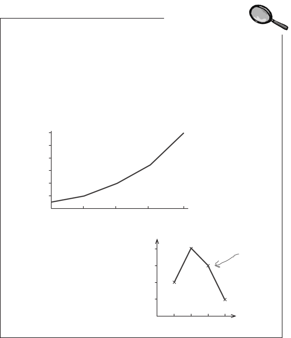
Line Charts Up Close
Line charts are good at showing trends in your data. For each set of data, you plot your
points and then join them together with lines. You can easily show multiple sets of data
on the same chart without it getting too cluttered. Just make sure it’s clear which line is
which.
As with other sorts of charts, you have a choice of showing frequency or percentages on
the vertical axis. The scale you use all depends on what key facts you want to draw out.
Line charts are often used to show time measurements. Time always goes on the
horizontal axis, and frequency on the vertical. You can read off the frequency for any
period of time by choosing the time value on the horizontal axis, and reading off the
corresponding frequency for that point on the line.
Line charts should be used for numerical data
only, and not categorical. This is because it
makes sense to compare different categories,
but not to draw a trend line. Only use a line
chart if you’re comparing categories over some
numerical unit such as time, and in that case
you’d use a separate line for each category.
This trend line isn’t meaningful.
What would happen if you
rearranged the categories?
Profit in dollars
Year
400
0
600
500
200
100
300
Profit (thousands)
2003 2004 2005 2006 2007
Eye Color
4
2
1
3
Frequency
Blue Brown Green Red
42 Chapter 1
Cumulative frequency is the total frequency up to a
particular value. It’s a running total of the frequencies.
Use a cumulative frequency graph to plot the upper limit
of each group of data against cumulative frequency.
Use a line chart if you want to show trends, for example
over time.
You can show more than one set of data on a line chart.
Use one line for each set of data, and make sure it’s
clear which line is which.
You can use line charts to make basic predictions as it’s
easy to see the shape of the trend. Just extend the trend
line, trying to keep the same basic shape.
Don’t use line charts to show categorical data unless
you’re showing trends for each category, for example
over time. If you do this, draw one line per category.
Q:
Are line charts the same thing as
time series charts? I think I’ve heard that
name used before.
A: A time series chart is really a line chart
that focuses on time intervals, just like the
examples we used. A line chart doesn’t have
to focus on just time, though.
Q:
Are there any special varieties of
line charts?
A: Yes. In fact, you’ve encountered one
of them already. The cumulative frequency
graph is a type of line chart that shows the
total frequency up to a certain value
.
Q:
Can line charts show categorical
data as well as data that’s numeric?
A: Line charts should only be used to
show categorical data if you’re showing
trends for each category, and use a separate
line for each category.
What you shouldn’t do is use a line chart to
draw lines from category to category.
Q:
So line charts are better for
showing overarching trends, and bar
charts are better for comparing values or
categories?
A: That’s right. Which chart you use really
comes down to what message you want to
put across, and what key facts you want to
minimize.
Q:
Now that I know how to create
charts properly, can I use charting
software to do the heavy lifting?
A: Absolutely! Charting software can save
you a lot of time and hard work, and the
results can be excellent.
The key thing with using software to produce
your charts is to remember that the software
can’t think for you. You still have to decide
which chart best represents your key facts,
and you have to check that the software
produces exactly what you expect it to.
bullet points and no dumb questions

you are here 4 43
visualizing information
Manic Mango conquered the games market!
You’ve helped produce some killer charts for Manic Mango, and thanks to you,
the keynote was a huge success. Manic Mango has gained tons of extra publicity
for their games, and money from sponsorship and advertising is rolling in. The
only thing left for you to do is think about all the things you could do and the
places you could go with your well-earned bonus.
You’ve had your first taste of how statistics can help you and what you can achieve
by understanding what’s really going on. Keep reading and we’ll show you more
things you can do with statistics, and really start to flex those statistics muscles.
Nice work with those
charts! We’ve got investors
lining up outside the office.
Take a long vacation, on me!
this is a new chapter 45
measuring central tendency
2
The Middle Way
Sometimes you just need to get to the heart of the matter.
It can be difficult to see patterns and trends in a big pile of figures, and finding the
average is often the first step towards seeing the bigger picture. With averages at
your disposal, you’ll be able to quickly find the most representative values in your
data and draw important conclusions. In this chapter, we’ll look at several ways to
calculate one of the most important statistics in town—mean, median, and mode—
and you’ll start to see how to effectively summarize data as concisely and usefully
as possible.
People say I’m just an
average golfer, but I’ll
show them I’m really mean.

46 Chapter 2
Welcome to the Health Club
The Statsville Health Club prides itself on its ability to find
the perfect class for everyone. Whether you want to learn
how to swim, practice martial arts, or get your body into
shape, they have just the right class for you.
The staff at the health club have noticed that their
customers seem happiest when they’re in a class with
people their own age, and happy customers always come
back for more. It seems that the key to success for the health
club is to work out what a typical age is for each of their
classes, and one way of doing this is to calculate the
average. The average gives a representative age for each
class, which the health club can use to help their customers
pick the right class.
Here are the current attendees of the Power Workout class:
Age 19
Age 21
Age 20
Age 20
Age 20
How do we work out the average age of the Power Workout class?
statsville health club uses averages

you are here 4 47
measuring central tendency
A common measure of average is the mean
It’s likely that you’ve been asked to work out averages before. One way to find the
average of a bunch of numbers is to add all the numbers together, and then divide
by how many numbers there are.
In statistics, this is called the mean.
What’s wrong with just calling
it the average? It’s what I’m
used to.
Because there’s more than one sort of average.
You have to know what to call each average, so you can easily
communicate which one you’re referring to. It’s a bit like going to your
local grocery store and asking for a loaf of bread. The chances are
you’ll be asked what sort of bread you’re after: white, whole-grain, etc.
So if you’re writing up your sociology research findings, for example,
you’ll be expected to specify exactly what kinds of average calculations
you did.
Likewise, if someone tells you what the average of a set of data is,
knowing what sort of average it is gives you a better understanding of
what’s really going on with the data. It can give you vital clues about
what information is being conveyed—or, in some cases, concealed.
We’ll be looking at other types of averages, besides the mean, later in
this chapter.

48 Chapter 2
Mean math
If you want to really excel with statistics, you’ll need to
become comfortable with some common stats notation. It
may look a little strange at first, but you’ll soon get used to it.
Letters and numbers
Almost every statistical calculation involves adding a bunch of
numbers together. As an example, if we want to find the mean of
the Power Workout class, we first have to add the ages of all the
class attendees together.
The problem statisticians have is how to generalize this. We don’t
necessarily know in advance how many numbers we’re dealing with,
or what they are. We currently know how many people are in the
Power Workout class and what their ages are, but what if someone
else joins the class? If we could only generalize this, we’d have a
way of showing the calculation without rewriting it every time the
class changes.
Statisticians get around this problem by using letters to represent
numbers. As an example, they might use the letter x to represent
ages in the Power Workout class like this:
Specific ages of class attendees
19 20 20 20 21
General ages of class attendees
x
1
x
2
x
3
x
4
x
5
Each x represents the age of a separate person in the class. It’s a
bit like labeling each person with a particular number x.
Each x represents one
of the class ages.
We use x
1
as a general way of
representing this particular girl’s
age. She’s 19 at the moment, but
when she becomes 20, we’ll still
know her age as x
1
. We won’t have
to rewrite any of our calculations.
x
1
Now that we have a general way of writing
ages, we can use our x’s to represent them in
calculations. We can write the sum of the 5 ages
in the class as
Sum = x
1
+ x
2
+ x
3
+ x
4
+ x
5
But what if we don’t know how
many numbers we have to sum?
What if we don’t know how many
people are in the class?
statistics notation

you are here 4 49
measuring central tendency
Dealing with unknowns
Statisticians use letters to represent unknown numbers. But what if we don’t
know how many numbers we might have to add together? Not a problem—
we’ll just call the number of values n. If we didn’t know how many people were
in the Power Workout class, we’d just say that there were n of them, and write
the sum of all the ages as:
Sum = x
1
+ x
2
+ x
3
+ x
4
+ x
5
+ ... + x
n
In this case, x
n
represents the age of the nth person in the class. If there were 18
people in the class, this would be x
18
, the age of the 18th person.
We can take another shortcut.
Writing x
1
+ x
2
+ x
3
+ x
4
+ ... + x
n
is a bit like saying “add age
1 to age 2, then add age 3, then add age 4, and keep on adding
ages up to age n.” In day-to-day conversation it’s unlikely we’d
phrase it like this. We’re far more likely to say “add together all
of the ages.” It’s quicker, simpler, and to the point.
We can do something similar in math notation by using the
summation symbol Σ, which is the Greek letter Sigma. We can
use Σx (pronounced “sigma x”) as a quick way of saying “add
together the values of all the x’s.”
The “...” is a quick way of
saying “and so on.” In other
words, just keep on adding x’s.
x
1
+ x
2
+ x
3
+ x
4
+ x
5
+ ... + x
n
= Σx
Do you see how much quicker and simpler this is? It’s just
a mathematical way of saying “add your values together”
without having to explicitly say what each value is.
Now that we know some handy math shortcuts, let’s see how
we can apply this to the mean.
It all adds
up now...
Writing out all
those x’s looks like it
could get arduous...
50 Chapter 2
I’m mean. Some people
say I’m average, but
deep down, I’m mean.
Back to the mean
We can use math notation to represent the mean.
To find the mean of a group of numbers, we add them all together,
and then divide by how many there are. We’ve already seen how to
write summations, and we’ve also seen how statisticians refer to the
total count of a set of numbers as n.
If we put these together, we can write the mean as:
Σx
n
Add all the numbers
together...
...then divide by however
many there are.
In other words, this is just a math shorthand way of saying “add
together all of the numbers, and then divide by how many
numbers there are.”
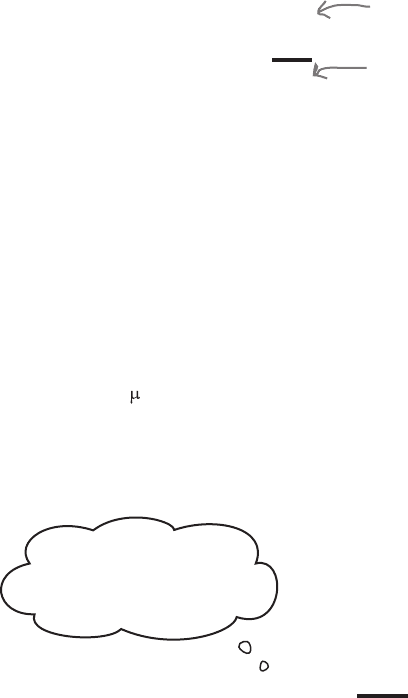
The mean has its own symbol
The mean is one of the most commonly used statistics around,
and statisticians use it so frequently that they’ve given it a symbol
all of its own: . This is the Greek letter mu (pronounced “mew”).
Remember, it’s just a quick way of representing the mean.
μ =
Σx
n
The mean is one of
the most frequently
used statistics. It
can be represented
with the symbol μ.
mean formulas