Tidwell J. Designing Interfaces (Second Edition)
Подождите немного. Документ загружается.


The Patterns 143
All other pages or windows should also share the following, as appropriate:
• “You are here” signposts, such as titles, logos,
Breadcrumb trails, global navigation
with indicators of the current page, and
Module Tabs
• Navigational devices, including global and utility navigation, OK/Cancel buttons,
Back buttons, Quit or Exit buttons, and navigational patterns such as
Sequence Map
and
Breadcrumbs (all in Chapter 3)
• Techniques used to define
Titled Sections
• Spacing and alignment, including page margins, line spacing, the gaps between labels
and their associated controls, and text and label justification
• Overall layout, or the placement of things on the page, in columns and/or rows, tak-
ing into account the margins and spacing issues listed previously
If you’re familiar with graphic design concepts, you may recognize some of these tech-
niques as comprising a layout grid. A layout grid is a structural template for a set of pages
or layouts. Each individual page is different, but all use specified margins and align their
contents along invisible gridlines. A good
Visual Framework does indeed include a layout
grid, but it also includes other aspects of look-and-feel such as colors, visual details, and
writing style.
Implementation of a
Visual Framework should force you to separate stylistic aspects of the
UI from the content. This isn’t a bad thing. If you define the framework in only one
place—such as a CSS stylesheet or a Java class—it lets you change the framework inde-
pendently from the content, which means you can tweak it and get it right more easily. (It’s
also good software engineering practice.)
Examples
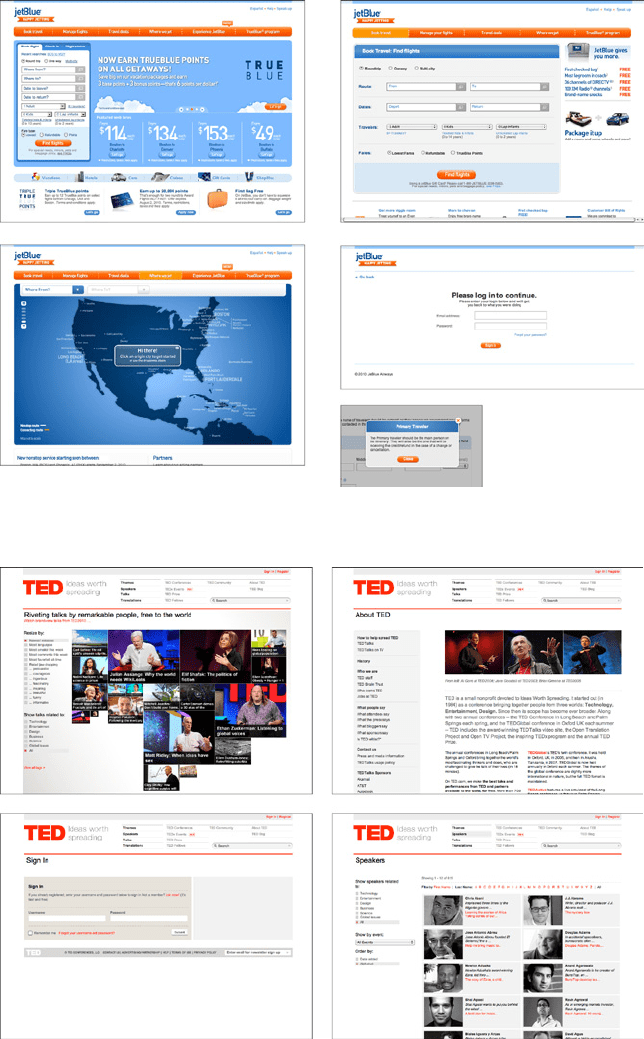
JetBlue’s site employs a restricted color palette, a strong header, and consistent use of fonts
and curved rectangles in its
Visual Framework (see Figure 4-16). Even the login page and
modal dialogs use these elements; they don’t look out of place.
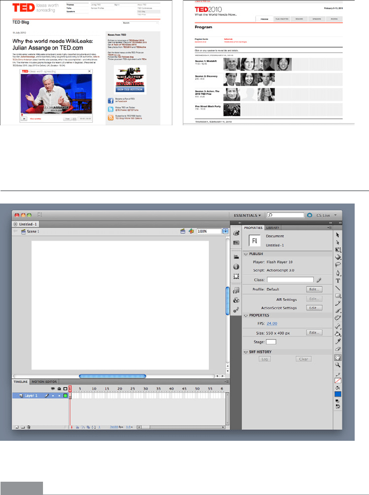
In the same way, TED’s site uses limited color and a layout grid to maintain consistency
(see Figure 4-17). It has an interesting problem that’s more common than it might appear:
its subsidiary or related sites (such as its blog and its conference site) must look somewhat
like the main TED site, but still have distinct visual identities. In this case, the two related
sites share most of their framework elements with the TED site, with some key differences
(see Figure 4-18).
144 Chapter 4: Organizing the Page: Layout of Page Elements
Figure 4-16.
JetBlue website
Figure 4-17.
TED website
The Patterns 145
Figure 4-18.
TED-associated websites, with related but slightly different visual frameworks
Center Stage
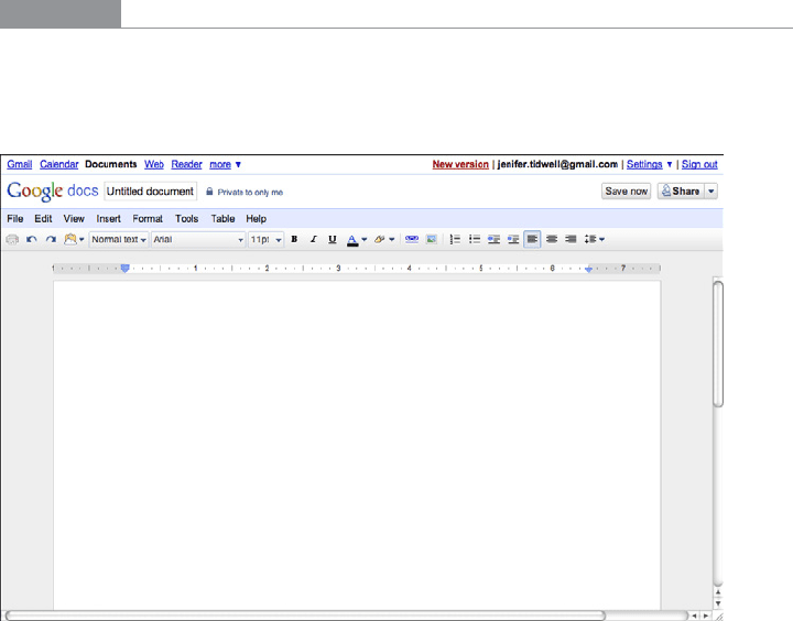
Figure 4-19.
Flash editor
What
Put the most important part of the UI into the largest subsection of the page or window;
cluster secondary tools and content around it in smaller panels.

146 Chapter 4: Organizing the Page: Layout of Page Elements
Use when
The page’s primary job is to show a single unit of coherent information to the user, let him
edit a document, or enable him to perform a certain task. Other content and functions
are secondary to this one. Many types of interfaces can use a
Center Stage—tables and
spreadsheets, forms, and graphical editors all qualify. So do web pages that show single
articles, images, or features.
Why
The design should guide the user’s eyes immediately to the start of the most important
information (or task) rather than have them wandering over the page in confusion. An
unambiguous central entity anchors the user’s attention. Just as the lead sentence in a
news article establishes the subject matter and purpose of the article, so the entity in
Center Stage establishes the purpose of the UI.
Once that’s done, the user will assess the items in the periphery in terms of how they relate
to what’s in the center. This is easier for the user than repeatedly scanning the page, trying
to figure it out. What comes first? What’s second? How does this relate to that? And so on.
How
Establish a visual hierarchy with the primary content or document dominating every-
thing else. See the chapter introduction for a discussion of visual hierarchy. When design-
ing a
Center Stage, consider these particular factors, though none of them are absolutely
required:
Size
The
Center Stage content should be at least twice as wide as whatever’s in its side
margins, and twice as tall as its top and bottom margins. (The user may change its
size in some UIs, but this is how it should be when the user first sees it.) Keep the
fold in mind—when a small screen is used, where does the content get cut off at the
bottom? Make sure the
Center Stage still takes up more of the above-the-fold space
than anything else.
Color
Use a color that contrasts with the items in the margins. In desktop UIs, white works
well against Windows gray, especially for tables and trees. As it happens, white often
works in web pages too, since ads and navigation bars usually use other colors as their
backgrounds; also, web users have been “trained” by convention to look for the plain
text on a white background.
Headlines
Big headlines are focal points, and can draw the user’s eye to the top of the
Center
Stage
. That happens in print media too, of course. See the chapter introduction and
Titled Sections for more.
The Patterns 147
Context
What does the user expect to see when she opens up the page? A graphic editor? A long
text article? A map? A filesystem tree? Work with her preconceptions; put that in
Center
Stage
and make it recognizable. The user will look for it—this trumps all other rules
about visual perception. (But it doesn’t mean you can frustrate her by hiding what she’s
looking for! Some websites put their main content so far down the page that it’s below the
fold in short windows, requiring the user to scroll down to find it. That’s just sadistic.)
Notice that I didn’t mention one traditional layout variable: position. It doesn’t much matter
where you put the
Center Stage—top, left, right, bottom, center, any can be made to work. If
it’s big enough, it ends up more or less in the center anyway. Note that well-established genres
have conventions about what goes into which margins, such as toolbars on top of graphic
editors, or navigation bars on the left sides of web pages. Be creative, but with your eyes open.
If you’re in doubt, take a screenshot of the layout, shrink it, blur it, and ask someone where
he thinks the main content should start. Again, see the chapter introduction for an example.
Examples
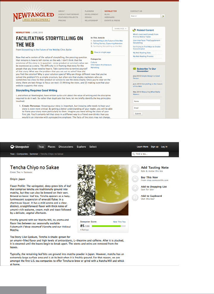
The Google Docs text editor devotes almost all of its horizontal space to the document
being edited; so does its spreadsheet editor. Even the tools at the top of the page don’t take
up a huge amount of space. The result is a clean and balanced look (see Figure 4-20).
Figure 4-20.
Google Docs text editor
Text-based content such as blog articles is often crowded with too many items in the
margins. The sites for Newfangled (Figure 4-21) and Steepster (Figure 4-22) give their
main content enough space to compete with the navigation and other peripheral features.
148 Chapter 4: Organizing the Page: Layout of Page Elements
Notice the percentage of space devoted to the main article for both of these sites, and how
high on the page the article starts.
Figure 4-21.
Newfangled article
Figure 4-22.
Steepster article
In other libraries
http://www.welie.com/patterns/showPattern.php?patternID=center-stage
The Patterns 149
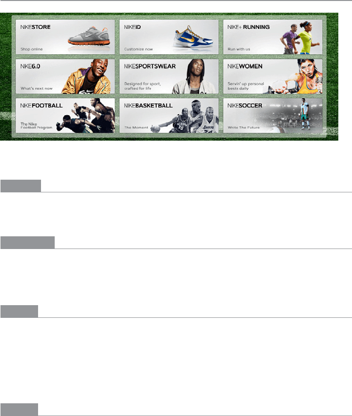
Grid of Equals
Figure 4-23.
Nike
What
Arrange content items in a grid or matrix. Each item should follow a common template,
and each item’s visual weight should be similar. Link to jump pages as necessary.
Use when
The page contains many content items that have similar style and importance, such as
news articles, blog posts, products, or subject areas. You want to present the viewer with
rich opportunities to preview and select these items.
Why
A grid that gives each item equal space announces that they have equal importance. The
common template for items within the grid tells the user that the items are similar to each
other. Together, these techniques establish a powerful visual hierarchy that should match
the semantics of your content.
Grids look neat, ordered, and calming. That may suit the style of your site or app.
How
Figure out how to lay out each item in the grid. Do they have thumbnail images or graph-
ics? Headlines, subheads, summary text? Links to jump pages (e.g., a page with the full
story)? Render them with more than just blocks of body text: make headlines of differ-
ent colors, be creative with whitespace, and use images if you can do so evenly across all
items. Experiment with ways to fit all the right information into a relatively small space—
tall, wide, or square—and apply that template to the items you need to display.
150 Chapter 4: Organizing the Page: Layout of Page Elements
Now arrange the items in a grid. You could use a single row, or a matrix that’s two, three,
or more items wide. Consider page width as you do this design work—what will your de-
sign look like in a narrow window? Will most of your users have large browser windows?
What happens on tiny mobile devices?
You may choose to highlight grid items, either statically (to emphasize one item over oth-
ers) or dynamically, as a user hovers over those grid items. Use color and other stylistic
changes, but don’t change the positions, sizes, or other structural elements of the grid
items—you don’t want content jumping around as the user hovers over different items!
A related pattern is
Thumbnail Grid, in Chapter 5. This is a way of rendering a list in a 2D
matrix of small pictures, perhaps with a small amount of text with each one. See also the
Thumbnail-and-Text List pattern for mobile design (Chapter 10). It’s about a single column,
not a grid, but the idea is the same: use a consistent, richly styled template for all the items
in a list.
Examples
Hulu (Figure 4-24), CNN (Figure 4-25), and Nike (Figure 4-23, shown at the top of the
pattern) use a rigid template for each item. The overall effect is rhythmic and calming.
Note how each site uses a different balance of text and imagery.
Figure 4-24.
Hulu
Do wnl oa d fr om W ow! e Bo ok < ww w.w ow eb oo k. co m>
The Patterns 151
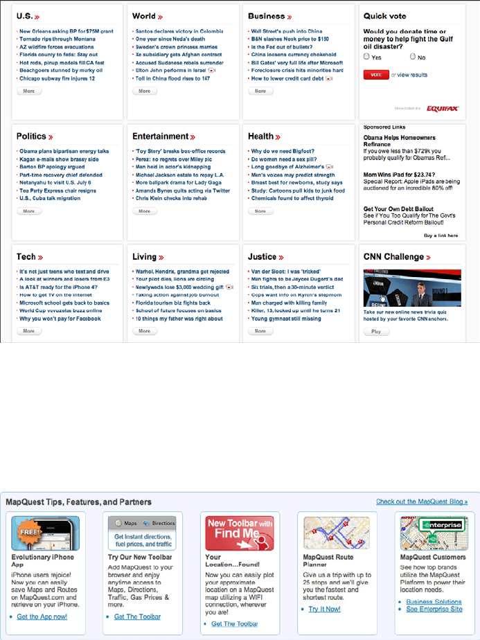
Figure 4-25.
CNN
The examples from MapQuest (Figure 4-26) and IBM (Figure 4-27) show how to do this
with only a single row of items. (Technically it’s still a “grid.”) The consistent visual treat-
ment marks these items as peers of each other. Each item ends with one or more links—
and that’s true of the Hulu and CNN examples, too. Most of the examples I’ve seen of this
pattern use it to showcase linked content.
Figure 4-26.
MapQuest
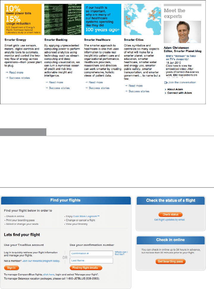
152 Chapter 4: Organizing the Page: Layout of Page Elements
Figure 4-27.
An inner page at IBM’s website
In other libraries
For some wonderful examples, see “15 Tips for Designing Terrific Tables,” by Joshua
Johnson:
http://designshack.co.uk/articles/css/15-tips-for-designing-terrific-tables
Titled Sections
Figure 4-28.
JetBlue’s titled sections