Tidwell J. Designing Interfaces (Second Edition)
Подождите немного. Документ загружается.

The Patterns 173
In other libraries
http://quince.infragistics.com/Patterns/Movable%20Panels.aspx
http://www.welie.com/patterns/showPattern.php?patternID=customization-window
http://patternry.com/p=drag-and-drop-modules/
http://developer.yahoo.com/ypatterns/richinteraction/dragdrop/modules.html
In developer-oriented references, the term portlet is commonly used to describe the actual
components that go into
Movable Panels and thus compose a portal page.
Right/Left Alignment
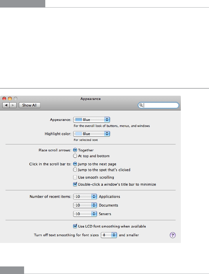
Figure 4-49.
Mac OS system preferences
What
When designing a two-column form or table, right-align the labels on the left and left-
align the items on the right.

174 Chapter 4: Organizing the Page: Layout of Page Elements
Use when
You’re laying out a form or any other set of items that have text labels in front of them.
This could also apply to the internal structure of tables, or any other two-column structure
in which the rows should be read left to right.
The labels come in many lengths—some are short, some long, some line-wrapped. Left-
aligning the labels would put some of them too far away from their associated fields,
leaving a gap too large for users’ eyes to span easily.
Why
When you put text right next to the thing it labels, you form a strong perceptual grouping
of that pair—much more so than if they were separated by a large amount of space. If you
align variable-length labels along their left sides, the short labels won’t be close enough
to their controls, and the side-to-side grouping is broken. (This is the Gestalt principle of
proximity at work.) In short, people will more easily connect each label to its associated
control when the UI uses right/left alignment.
Meanwhile, you should always left-align the controls themselves. When combined with
the right-aligned labels and a uniform spacing between them, they help form a nice strong
double edge down the middle of the whole thing (taking advantage of continuity, another
Gestalt principle). This powerful edge guides the viewer’s eyes smoothly down the page,
supporting a good visual flow.
There are several cases in which you would not want right-aligned labels. For instance,
there is good evidence that reading right-aligned labels is harder than reading left-aligned
labels (which makes sense, because the eye has to work harder to find the beginning of
the line). If your labels are long and need to be carefully read, consider left-aligning them
instead.
If the labels will be localized into different languages, they’ll become different lengths.
Layout becomes awkward when labels sit to the left of the controls—put them on top
instead. (This is harder to read, and makes the page longer.)
In some layouts, right-aligning the labels just doesn’t look good. There might be a column
of items just to the left of the labels, or perhaps the left-aligned titles separate the form’s
sections—all of these, and more, can ruin a right/left alignment. Go with what works.
How
Instead of left-aligning each text label, right-align it. Bring it right up close to its control,
separated by only a few pixels. The net effect will probably be a ragged (unaligned) left
edge—that’s usually OK. If some labels are too long to make this work, try breaking them
into multiple lines, or resort to putting the labels above the control, in which case this
pattern becomes irrelevant.
The Patterns 175
Then left-align the controls against an imaginary line a few pixels away from the right
edges of the labels. Make them precisely aligned, pixel-perfect—if they’re not, the con-
trols will look messy. (The human visual system is really good at picking out slight
misalignments!)
Again, the other edge of the control column may be ragged. That’s not so good if you’re
dealing with text fields, combo boxes, and other visually “heavy” objects, as in Figure
4-49. Try to stretch them so that their right edges are aligned too, to whatever extent you
can. You can try to align the short ones with one another, and the long ones with one
another.
Examples
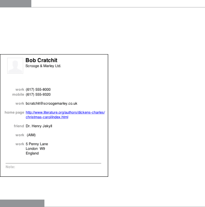
Right/Left Alignment also works with layouts that have no input controls at all. The Mac
OS address book entry shown in Figure 4-50 has very little whitespace between the two
columns, but the difference in color helps to separate them visually. Notice that the label
“home page” is much longer than the others; this would have made a lefthand label align-
ment less pleasing to the eye and harder to read.
Figure 4-50.
Mac OS address book entry
In other libraries
http://quince.infragistics.com/Patterns/Right%20Aligned%20Labels.aspx
http://www.uxmatters.com/mt/archives/2006/07/label-placement-in-forms.php
176 Chapter 4: Organizing the Page: Layout of Page Elements
Diagonal Balance
Figure 4-51.
Windows 7 control panel
What
Arrange page elements in an asymmetric fashion, but balance it by putting visual weight
into both the upper-left and lower-right corners.
Use when
You’re laying out a page or dialog box that has a title or header at the top, and some links
or action buttons—such as OK and Cancel, or Submit, or Back and Next—at the bottom.
The page is short enough to fit on the screen without scrolling.
Why
Visually prominent features such as titles, tabs, and buttons should contribute to a bal-
anced composition on the screen. They’re already at opposite ends of the page; when you
put them on opposite sides, too, they often balance one another out. (Think of them as
weights—the bigger or more “contrasty” the features are, the heavier they are; the closer to
the edge they get, the more you need to put on the other side to compensate.)

The Patterns 177
Besides being nicer to look at, a diagonal balance also sets up the page so that the user’s eye
moves easily from the top left to the bottom right—an ideal visual flow for users who speak
left-to-right languages. (See the chapter introduction for a discussion of visual flow.) The rest
of the page should support this visual flow, too. The eye finally comes to rest on elements
representing actions that the user might do next, such as close this UI or go somewhere else.
How
Place the title, tabs, or some other strong element at the upper left of the page; place the
button(s) at the lower right. Content of any width goes in between. If the content itself
contributes to the balance of the page, so much the better—don’t put too much whitespace
on only one side, for instance.
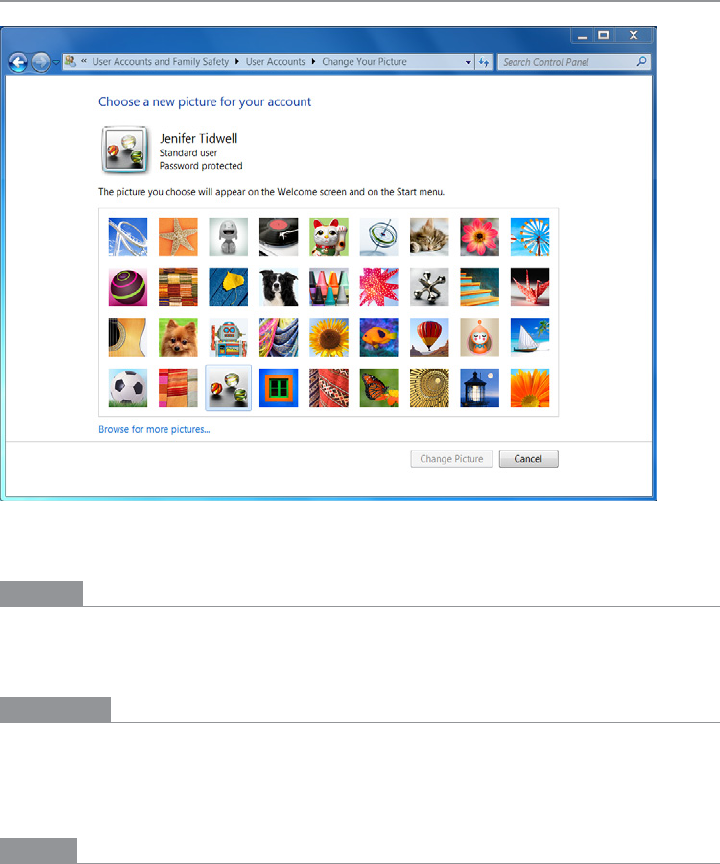
Consider what the color dialog box in Figure 4-51 would look like if you placed the OK
and Cancel buttons to the left edge instead of the right edge. The whole dialog would feel
left-weighted and precarious.
In Windows, the placement of the title in the upper left and the conventional placement
of buttons in the lower right do this for you automatically. In Mac OS, elements such as title
bars, tabs, and action buttons are centered, so
Diagonal Balance is much less common there.
Kevin Mullet and Darrell Sano’s classic pre-Web book Designing Visual Interfaces (Sun
Microsystems) describes the ideas of diagonal balance:
Symmetrical layouts provide…visual equilibrium automatically. Asymmetrical lay-
outs can achieve equilibrium as well, but their tenser, more dramatic form of balance,
depends on careful manipulation to compensate visually for differences in the size,
position, and value of major elements.
The following are examples of how you can achieve this balance.
Examples
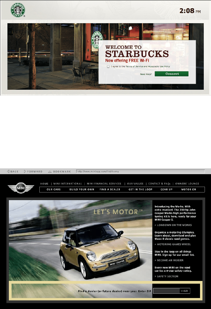
The simple screen shown in Figure 4-52 directs the viewer’s attention to the lower right,
where the call to action sits.
Do wnl oa d fr om W ow! e Bo ok < ww w.w ow eb oo k. co m>
178 Chapter 4: Organizing the Page: Layout of Page Elements
Figure 4-52.
Starbucks WiFi screen
The focal points in the site shown in Figure 4-53 are the logo, the moving car, the “Let’s
Motor” tag line, and the dealer-locator text field at bottom right—all in a diagonal line
(approximately). The motion of the photograph pushes the eye down and right even more
forcefully than the other examples. Undoubtedly, the designers of the site wanted to en-
courage people to use the text field. If it were at the bottom left instead, the page would
lose much of its punch, and the text field might get lost in the page.
Figure 4-53.
Mini Cooper website from 2005
The Patterns 179
Responsive Disclosure
Figure 4-54.
AutoTrader
What
Starting with a very minimal UI, guide a user through a series of steps by showing more
of the UI as he completes each step.
Use when
The user should be walked through a complex task step by step, perhaps because the task
is novel, rarely done, or outside the user’s domain knowledge. But you don’t want to force
the user to go page by page at each step—you’d rather keep the whole interface on one
single page.
Alternatively, the task may be branched, with different types of information required
“downstream” depending on a user’s earlier choices.
Why
In this pattern, the interface actually appears to be “created” in front of the user, one step
at a time. At first, the user sees only those elements that are necessary for the first step.
When the user takes that step, the next set of elements is displayed in addition to the first
ones, then the next, and so on.
As the user sees the task unfolding directly in front of him via a dynamically growing
UI, he can form a correct mental model of the task more quickly and easily. None of the
awkward context switches that separate wizard screens impose exist here: when a user is
yanked out of his workflow into a rigid set of modal screens shown one at a time, it feels
like more of an imposition than if the UI had stayed within the user’s working context.

180 Chapter 4: Organizing the Page: Layout of Page Elements
Furthermore, since the UI is kept together on one page, the user can easily go back and
change his mind about earlier choices. As each step is redone, he immediately sees the
effect on subsequent steps. This is better than jumping from one content-starved wizard
screen to another.
For occasional tasks,
Responsive Disclosure can work better than presenting a complex and
interlinked set of controls all at once, because it’s always obvious what the first step is—
and the next, and the next. The user never has to think too hard.
How should you choose between this pattern and
Responsive Enabling? If you use Responsive
Enabling
, you will have to put all the controls for all choices on the UI—you’ll just disable
the irrelevant ones until they become relevant (again, in response to the user’s choices).
Sometimes that can make the UI too cluttered or complicated-looking. It’s a judgment
call: if you need to fit the UI into a very small space, or if you think too many controls on
the UI might look bad or make users nervous, use
Responsive Disclosure instead.
How
Start by showing the controls and text for only the first step. When the user completes that
step, show the controls for the next step, and so on. Leave the previous steps’ controls vis-
ible to let the user go backward if necessary. Keep it all on one page or dialog box so that
the user isn’t abruptly pushed into a separate “UI space.”
In many such step-by-step designs, the choices the user makes at one step alter the rest
of the task (i.e., the task is branched, not linear). For instance, an online order form asks
whether the billing address is the same as the shipping address. If the user says yes, the
UI doesn’t even bother showing entry fields for it. Otherwise, there’s one more step in the
process, and the UI shows the second set of entry fields when appropriate.
The concept of responsive disclosure isn’t new. It was used in 1981 in the first commer-
cial WIMP interface, the Xerox Star. Its designers considered “progressive disclosure,” a
more general concept that includes responsive disclosure, to be a major design principle:
“Progressive disclosure dictates that detail be hidden from users until they ask or need to
see it. Thus, Star not only provides default settings, it hides settings that users are unlikely
to change until users indicate that they want to change them.”
*
Indeed.
In the Star’s property sheets, for instance, blank space was reserved for controls that would
appear as needed, in response to user choices. When a user chose from a set of values
including the word Other, for instance, an extra text field would appear for the user to
enter a number.
* Johnson, J.A., et al. 1989. “The Xerox ‘Star’: A Retrospective.” IEEE Computer 22(9), 11–29. See also http://
www.digibarn.com/friends/curbow/star/retrospect/.
The Patterns 181
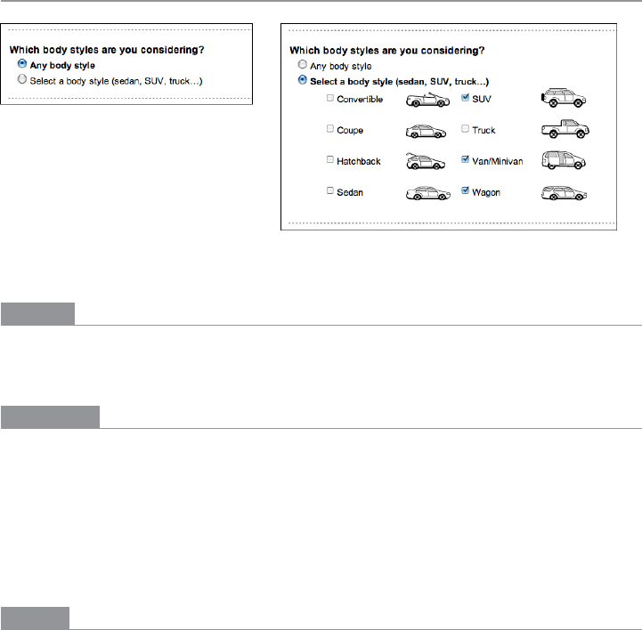
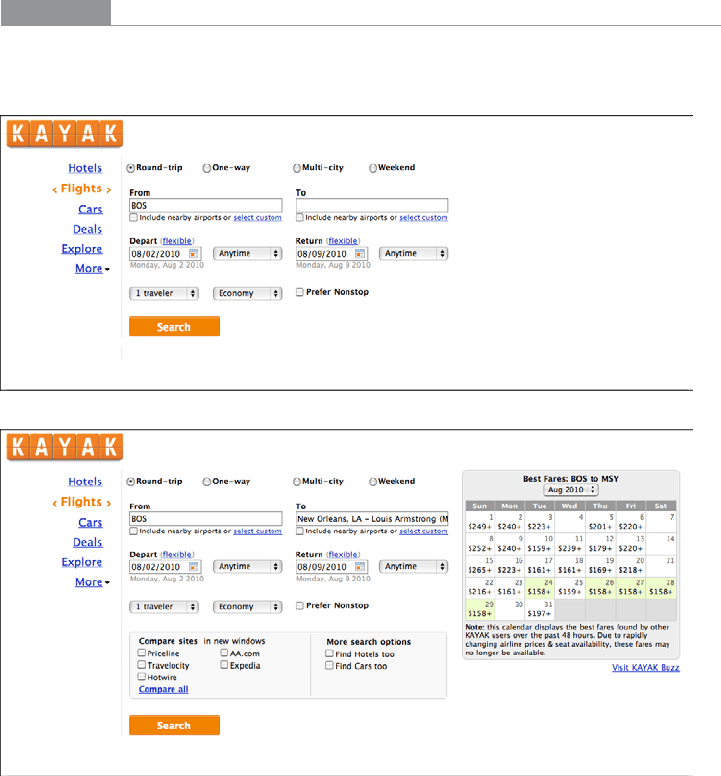
Examples
The Kayak example in Figure 4-55 hides the calendar and comparison box until the user
has filled out enough of the form. Once they appear, the user will shift attention to them.
Figure 4-55.
Kayak
Another way to use Responsive Disclosure is to swap out a piece of a UI depending on the
selection made in a drop-down or other limited-choice control. The examples in Figure
4-56, from Google Docs, do this: when the user changes the “Question Type” selection,
the follow-on questions change accordingly. (So does the AutoTrader example, at the top
of the pattern in Figure 4-54.)
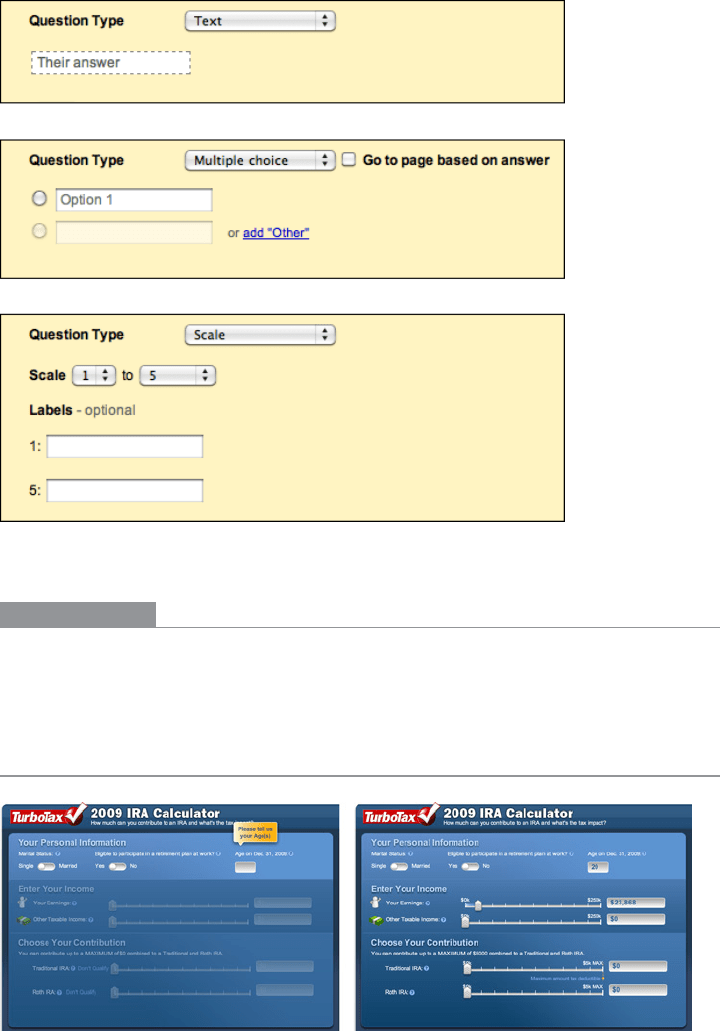
182 Chapter 4: Organizing the Page: Layout of Page Elements
Figure 4-56.
Google Docs form field creation
In other libraries
http://patternry.com/p=inline-input-adder/
http://quince.infragistics.com/Patterns/Responsive%20Disclosure.aspx
Responsive Enabling
Figure 4-57.
TurboTax