Tidwell J. Designing Interfaces (Second Edition)
Подождите немного. Документ загружается.

The Patterns 163
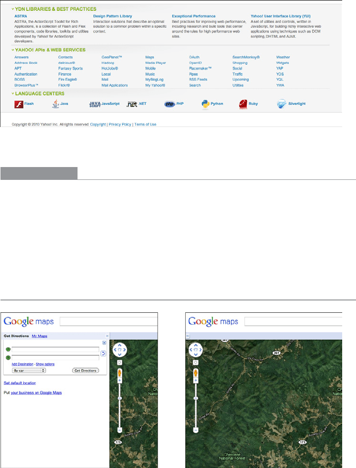
As shown in Figure 4-39, the Yahoo! Developer Network uses an Accordion in its footer to
let users hide and show sections that they care about (or don’t). Note the use of a
Sitemap
Footer
, described in Chapter 3.
Figure 4-39.
Yahoo! Developer Network page footer
In other libraries
http://developer.yahoo.com/ypatterns/navigation/accordion.html
http://ui-patterns.com/patterns/AccordionMenu
http://www.welie.com/patterns/showPattern.php?patternID=accordion
Designing Web Interfaces by Bill Scott and Theresa Neil (O’Reilly, http://oreilly.com/
catalog/9780596516253/) also describes an
Accordion pattern.
Collapsible Panels
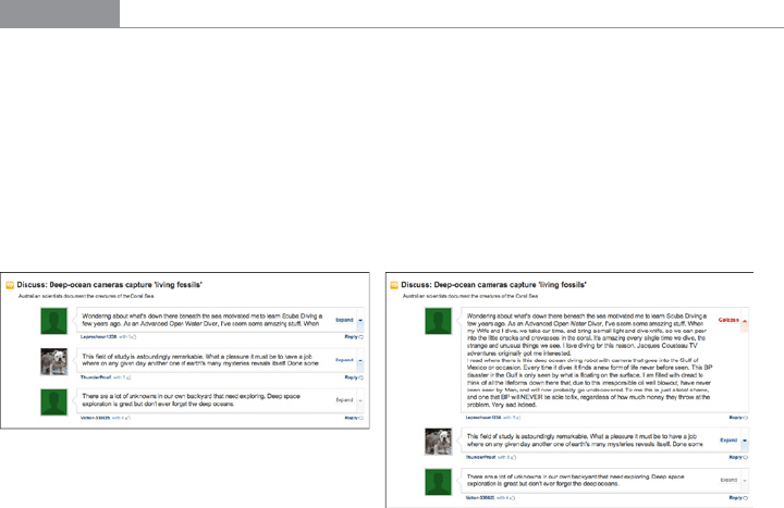
Figure 4-40.
Google Maps

164 Chapter 4: Organizing the Page: Layout of Page Elements
What
Put secondary or optional material into panels that can be opened and closed by the user.
Use when
You have a lot of heterogeneous content to show on the page, possibly including text
blocks, lists, buttons, form controls, or images. You don’t have room for everything. You
might, however, have
Center Stage content that needs to take visual priority.
Some of the page content comes in groups or modules (or can be sorted into coherent
groups). Those modules have the following characteristics:
• Their content annotates, modifies, explains, or otherwise supports the content in the
main part of the page.
• The modules may not be important enough for any of them to be open by default.
• Their value may vary a lot from user to user. Some will really want to see a particular
module, and others won’t care about it at all.
• Even for one user, a module may be useful sometimes, but not other times. When it’s
not open, its space is better used by the page’s main content.
• Users may want to open more than one module at the same time.
• The modules have very little to do with each other. When
Module Tabs or Accordions
are used, they group modules together, implying that they are somehow related;
Collapsible Panels do not group them.
Why
Hiding noncritical pieces of content helps to simplify the interface. When a user hides
a module that supports the main content, it simply collapses, giving its space back over
to the main content (or to whitespace). This is an example of the principle of progressive
disclosure—show hidden content “just in time,” when and where the user needs it.
In general, grouping and hiding chunks of content can be a very effective technique for
decluttering an interface.
Collapsible Panels are part of a toolkit that includes Module Tabs,
Accordions, Movable Panels, and Titled Sections to do so.
How
Put each supporting module into a panel that the user can open and close via a single
click. Label the button or link with the module’s name or simply “More,” and consider
using a chevron or rotating triangle to indicate that more content is hidden there. When
the user closes the panel, collapse the space used by that panel and devote it to other con-
tent (such as by moving up the content below it on the page).
The Patterns 165
Consider animating the panels as they open and close. It appears less dislocating when
they smoothly zip open and closed again.
If you have more than one module to hide in this way, you could either put the modules
together on one panel with
Module Tabs or an Accordion, or put them in separate places on
the main page.
If you find that most users are opening up a
Collapsible Panel that’s closed by default, switch
it to being open by default.
Examples
Google Maps, shown in Figure 4-40 at the top of the pattern, demonstrates how useful
it can be to collapse a panel that’s outlived its usefulness—the visible map area is signifi-
cantly bigger without the sidebar.
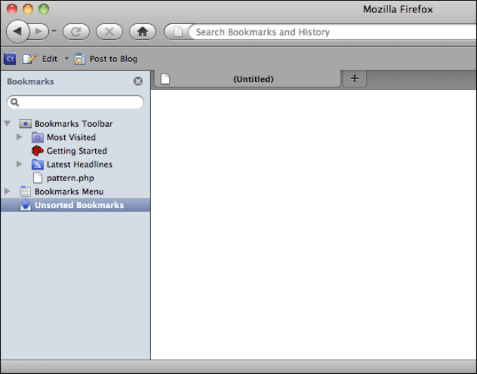
Some discussion forums, such as that shown in Figure 4-41, place long comments into
Collapsible Panels. A visitor can skim the page’s short and truncated comments to get a
sense of the discussion, and if a long comment attracts her attention, she can open the
truncated comment to read the whole thing.
Figure 4-41.
MSNBC article comments
Many applications show optional sidebars attached to their Center Stage windows.
Firefox’s sidebar, shown in Figure 4-42, is closed by a single click on the “X” button,
and a user can bring it back by selecting a menu item (or by using a keyboard shortcut).
Note the asymmetry—it’s much easier to hide it than to show it, at least until the user
memorizes the keyboard sequence! With a web page, or with an app that isn’t frequently
used, a visible button to bring back the panel would be a better choice.
166 Chapter 4: Organizing the Page: Layout of Page Elements
Figure 4-42.
Firefox bookmarks sidebar
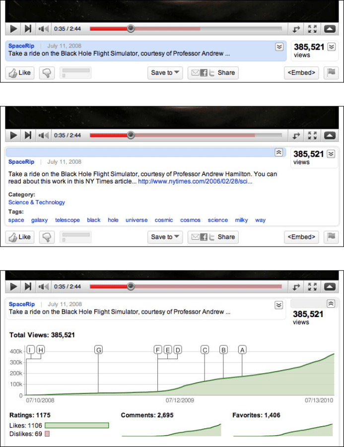
At the time of this writing, YouTube places many Collapsible Panels on a video’s page (see
Figure 4-43). They contain extra content such as the video description, viewing statistics,
and more videos from this poster (not shown in the figure). The page draws attention
to these expandable areas by highlighting them in blue on rollover. They’re all closed by
default, and they close themselves when the page is reloaded. The resultant page is less
cluttered than it would otherwise be, while still providing interesting information to users
inspired enough to open these panels.
The Patterns 167
Figure 4-43.
YouTube’s collapsible panels; three states are shown: neither panel open, video description
panel open, and statistics panel open (both cannot be open at once)
168 Chapter 4: Organizing the Page: Layout of Page Elements
In other libraries
http://www.welie.com/patterns/showPattern.php?patternID=collapsible-panels
http://www.welie.com/patterns/showPattern.php?patternID=details-on-demand
http://quince.infragistics.com/Patterns/Closable%20Panels.aspx
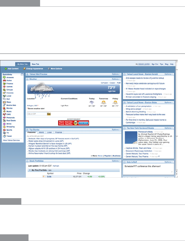
Movable Panels
Figure 4-44.
My Yahoo!
What
Put modules of content into boxes that can be opened and closed independently of each
other. Arrange the boxes freely on the page, and let the user move them around into a
custom configuration.
Use when
You’re designing either a desktop application, or a website that most users sign in to. News
portals,
Dashboards, and Canvas Plus Palette apps often use Movable Panels. You want users
to feel a sense of ownership of the software, or at least have fun playing with it.

The Patterns 169
The page in question is a major part of the app or site—something that users see often
or for long periods of time. You have a lot of heterogeneous content to show on the page,
possibly including text blocks, lists, buttons, form controls, or images. You don’t have
room for everything.
Some of the page content comes in groups or modules (or can be sorted into coherent
groups). Those modules have some of the following characteristics:
• Users will almost certainly want to see more than one module at a time.
• Their value may vary a lot from user to user. Some people want modules A, B, and C,
while others don’t need those at all and only want to see D, E, and F.
• The modules vary a lot in size.
• Their position on the page isn’t terribly important to you, but it might be to users. (By
contrast, a page of static
Titled Sections ought to be arranged with thought given to the
importance of page position; important things go to the top, for instance.)
• There are many modules—possibly so many that if all were shown at once, a viewer
would be overwhelmed. Either you or the user should pick and choose among them.
• You’re willing to let users hide some modules from view altogether (and offer a mech-
anism to bring them back).
• The modules may be part of a tool palette or some other coherent system of interac-
tive elements.
Why
Different users have different interests. Websites such as dashboards and portals are most
useful to people when they can choose the content they see.
When they’ll be working on something for a while in a desktop application, people like to
rearrange their environment to suit their working style. They can place needed tools close
to where they work; they can hide things they don’t need; they can use
Spatial Memory
(Chapter 1) to remember where they put things. Rationally speaking,
Movable Panels help
users get things done more efficiently and comfortably (in the long run—once they’ve
spent time rearranging their environment the way they like it!).
But this kind of personalization seems to appeal to people on some other level, too. They
may do this on infrequently visited websites that provide some kind of entertainment, for
instance. Personalization can increase engagement and buy-in.
Finally, a
Movable Panels design easily accommodates new modules introduced over time,
such as those contributed by third parties.

170 Chapter 4: Organizing the Page: Layout of Page Elements
How
Give each module a name, a title bar, and a default size, and arrange them on the page in
a reasonable default configuration. Let the user move modules around the page at will,
via drag-and-drop if possible. Permit each module to be opened and closed with a simple
gesture, such as a mouse click on a title bar button.
Depending upon the design you’ve chosen, you may want to give the user freedom to
place these pieces anywhere at all, even if they overlap. Or you may want a predefined lay-
out grid with “slots” where pieces can be dragged and dropped—this lets the page main-
tain alignment (and some sense of dignity!) without making the user spend too much
time fiddling with windows. Some designs use ghosting—big drop targets that appear dy-
namically; for example, dotted rectangles—to show where a dragged module would go
when dropped.
Consider letting users remove modules altogether. An “X” button in the title bar is the fa-
miliar way to remove one. Once a module is gone, how does a user bring it back? Let users
add modules—including brand-new ones, perhaps—from a list of available modules that
can be browsed and searched.
Modules may individually allow customization; they might offer
Settings Editors (Chapter
2) to adjust various parameters for content or viewing. (A weather widget might ask the
user to set a desired location, for instance.) Some designs make this available via another
button or drop-down menu on the module title bar.
When used in an application or when the user is signed in to a website,
Movable Panels
must preserve the state of opened and closed modules between sessions. People will ex-
pect that, and they will be startled if it doesn’t work. (You may also put a “revert to de-
faults” function somewhere, in case a user gets tangled up in the customization and wants
to start anew.)
Examples
iGoogle, shown in Figures 4-45 and 4-46, demonstrates the mechanics of dragging and
dropping a
Movable Panel around a page. A user grabs the title bar of a panel; at the be-
ginning of the drag operation, a dotted-line “ghost” shows the place where the panel had
been. As the panel is dragged near another drop zone between panels, another “ghost”
appears there—if the user lets go of the panel now, that’s where it will land.
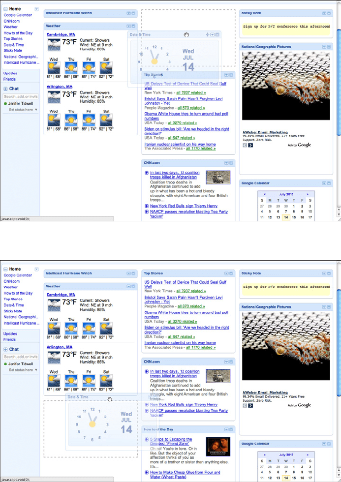
The Patterns 171
Figure 4-45.
iGoogle, after starting a panel drag
Figure 4-46.
iGoogle, about to finish a panel drag
172 Chapter 4: Organizing the Page: Layout of Page Elements
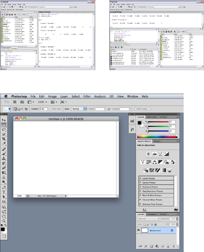
Desktop applications might use Movable Panels in a couple of ways: to show all the major
tool windows in a complex application such as MATLAB, or to arrange small palette win-
dows around a document, as Photoshop and other
Canvas Plus Palette applications do.
MATLAB (Figure 4-47) tiles the panels within one window, much like My Yahoo! and
iGoogle—but each panel can be set to a custom size. Photoshop (Figure 4-48) puts the
palette windows out on the desktop, where a user can freely move them, resize them, and
stack them in
Module Tabs.
Figure 4-47.
MATLAB desktop
Figure 4-48.
Photoshop desktop