Townsend C.R., Begon M., Harper J.L. Essentials of Ecology
Подождите немного. Документ загружается.


Even when generations overlap, if individuals can be marked early in their
life so that they can be recognized subsequently, it can be possible to follow the
fate of each year’s cohort separately. It is then possible to merge the cohorts from
the different years so as to derive a cohort life table that combines information
from the whole study period. An example is shown in Table 5.2: females from a
population of the yellow-bellied marmot, Marmota flaviventris, which was live-
trapped and marked individually from 1962 through to 1993 in the East River
Valley of Colorado.
The first column in each life table is a list of the age classes (or in some cases,
stages) of the organism’s life: 14–63-day periods for Phlox, years for the marmots.
The second column is then the raw data from each study, collected in the field.
It reports the number of individuals surviving to the beginning of each age class
(see Box 5.2).
Ecologists are typically interested not just in examining populations in isolation
but in comparing the dynamics of two or more perhaps rather different populations
(in the presence and absence of a pollutant, for instance). Hence, it is necessary
to standardize the raw data so that comparisons can be made. This is done in the
third column of the table, which is said to contain l
x
values, where l
x
is defined as
the proportion of the original cohort surviving to the start of age class. The first value
in the third column, l
0
(spoken: L zero), is therefore the proportion surviving to
the beginning of this original age class. Obviously, in Tables 5.1 and 5.2, and in
every life table, l
0
is 1.00 (the whole cohort is there at the start).
In the marmots, for example, there were 773 females observed in this youngest
age class. The l
x
values for subsequent age classes are then expressed as proportions
Chapter 5 Birth, death and movement
159
Table 5.1
A simplified cohort life table for the annual plant Phlox drummondii. The columns are explained in the text.
R
0
=∑l
x
m
x
= = 2.41.
∑ F
x
a
0
AFTER LEVERICH & LEVIN, 1979
PROPORTION OF SEEDS SEEDS PRODUCED SEEDS PRODUCED
AGE NUMBER ORIGINAL COHORT PRODUCED PER SURVIVING PER ORIGINAL
INTERVAL SURVIVING SURVIVING TO IN EACH INDIVIDUAL IN INDIVIDUAL IN
(DAYS) TO DAY X DAY X STAGE EACH STAGE EACH STAGE
x–x
′′
a
x
l
x
F
x
m
x
l
x
m
x
0–63 996 1.000 0.0 0.00 0.00
63–124 668 0.671 0.0 0.00 0.00
124–184 295 0.296 0.0 0.00 0.00
184–215 190 0.191 0.0 0.00 0.00
215–264 176 0.177 0.0 0.00 0.00
264–278 172 0.173 0.0 0.00 0.00
278–292 167 0.168 0.0 0.00 0.00
292–306 159 0.160 53.0 0.33 0.05
306–320 154 0.155 485.0 3.13 0.49
320–334 147 0.148 802.7 5.42 0.80
334–348 105 0.105 972.7 9.26 0.97
348–362 22 0.022 94.8 4.31 0.10
362– 0 0.000 0.0 0.00 0.00
Total 2408.2 2.41
a cohort life table for
marmots...
9781405156585_4_005.qxd 11/5/07 14:49 Page 159

of this number. Only 420 individuals survived to reach their second year (age
class 1: between 1 and 2 years of age). Thus, in Table 5.2, the second value in the
third column, l
1
, is the proportion 420/773 = 0.543 (that is, only 0.543 or 54.3%
of the original cohort survived this first step). In the next row, l
2
= 208/773 =
0.269, and so on. For Phlox (Table 5.1), l
1
= 668/996 = 0.671 = 67.1% survived
the first step.
In a full life table, subsequent columns would then use these same data to
calculate the proportion of the original cohort that died at each stage and also
the mortality rate for each stage, but for brevity these columns have been
omitted here.
Tables 5.1 and 5.2 also include fecundity schedules for Phlox and for the
marmots (columns 4 and 5). Column 4 in each case shows F
x
, the total number
of the youngest age class produced by each subsequent age class: this youngest
class being seeds for Phlox and, for the marmots, independent juveniles fend-
ing for themselves outside of their burrows. Thus, Phlox plants produced seed
between around day 300 and day 350 in the year; while marmots produced
young when they were between 2 and 10 years old.
The fifth column is then said to contain m
x
values, fecundity: the mean
number of the youngest age class produced per surviving individual of each sub-
sequent class. For Phlox, it is apparent that fecundity, m
x
, the mean number of
Part III Individuals, Populations, Communities and Ecosystems
160
Table 5.2
A simplified cohort life table for female yellow-bellied marmots, Marmota flaviventris, in Colorado. The columns are explained in the text.
R
0
=∑l
x
m
x
= = 0.67.
∑ F
x
a
0
AFTER SCHWARTZ ET AL., 1998
PROPORTION OF NUMBER OF NUMBER OF
NUMBER ORIGINAL COHORT NUMBER OF FEMALE YOUNG FEMALE YOUNG
ALIVE AT SURVIVING TO FEMALE YOUNG PRODUCED PER PRODUCED PER
AGE THE START THE START OF PRODUCED BY SURVIVING ORIGINAL
CLASS OF EACH EACH AGE EACH AGE INDIVIDUAL IN INDIVIDUAL IN
(YEARS) AGE CLASS CLASS CLASS EACH AGE CLASS EACH AGE CLASS
xa
x
l
x
F
x
m
x
l
x
m
x
0 773 1.000 0 0.000 0.000
1 420 0.543 0 0.000 0.000
2 208 0.269 95 0.457 0.123
3 139 0.180 102 0.734 0.132
4 106 0.137 106 1.000 0.137
5 67 0.087 75 1.122 0.098
6 44 0.057 45 1.020 0.058
7 31 0.040 34 1.093 0.044
8 22 0.029 37 1.680 0.049
9 12 0.016 16 1.336 0.021
10 7 0.009 9 1.286 0.012
11 3 0.004 0 0.000 0.000
12 2 0.003 0 0.000 0.000
13 2 0.003 0 0.000 0.000
14 2 0.003 0 0.000 0.000
15 1 0.001 0 0.000 0.000
Total 519 0.670
. . . and fecundity schedule...
9781405156585_4_005.qxd 11/5/07 14:49 Page 160

seeds produced per surviving adult plant, reached a peak around day 340. For the
marmots, fecundity was highest for 8-year-old females.
In the final column of a life table, the l
x
and m
x
columns are brought together
to express the overall extent to which a population increases or decreases over
time – reflecting the dependence of this on both the survival of individuals (the
l
x
column) and the reproduction of those survivors (the m
x
column). That is,
an age class contributes most to the next generation when a large proportion
of individuals have survived and they are highly fecund, and it contributes
least when few survive and/or they produce few (or no) offspring. The sum of all
the l
x
m
x
values, ∑ l
x
m
x
, where the symbol ∑ means ‘the sum of’, is therefore a
measure of the overall extent by which this population has increased or decreased
in a generation. We call this the basic reproductive rate and denote it by R.
For Phlox (Table 5.1), R = 2.41: this population set approximately 2.5 times
more seed at the end of the generation (the end of the season) than was present at
the beginning. For the marmots, R = 0.67: the population was declining to around
two-thirds its former size each generation. However, whereas for Phlox the length
of a generation is obvious, since, being an annual, there is one generation each
year, for the marmots the generation length must itself be calculated. The details
of that calculation are beyond our scope here, but its value, 4.5 years, matches
what we can observe ourselves in the life table: that a ‘typical’ period from an
individual’s birth to giving birth itself (i.e. a generation) is around 4.5 years. Thus,
Table 5.2 indicates that each generation, every 4.5 years, this particular marmot
population was declining to around two-thirds its former size.
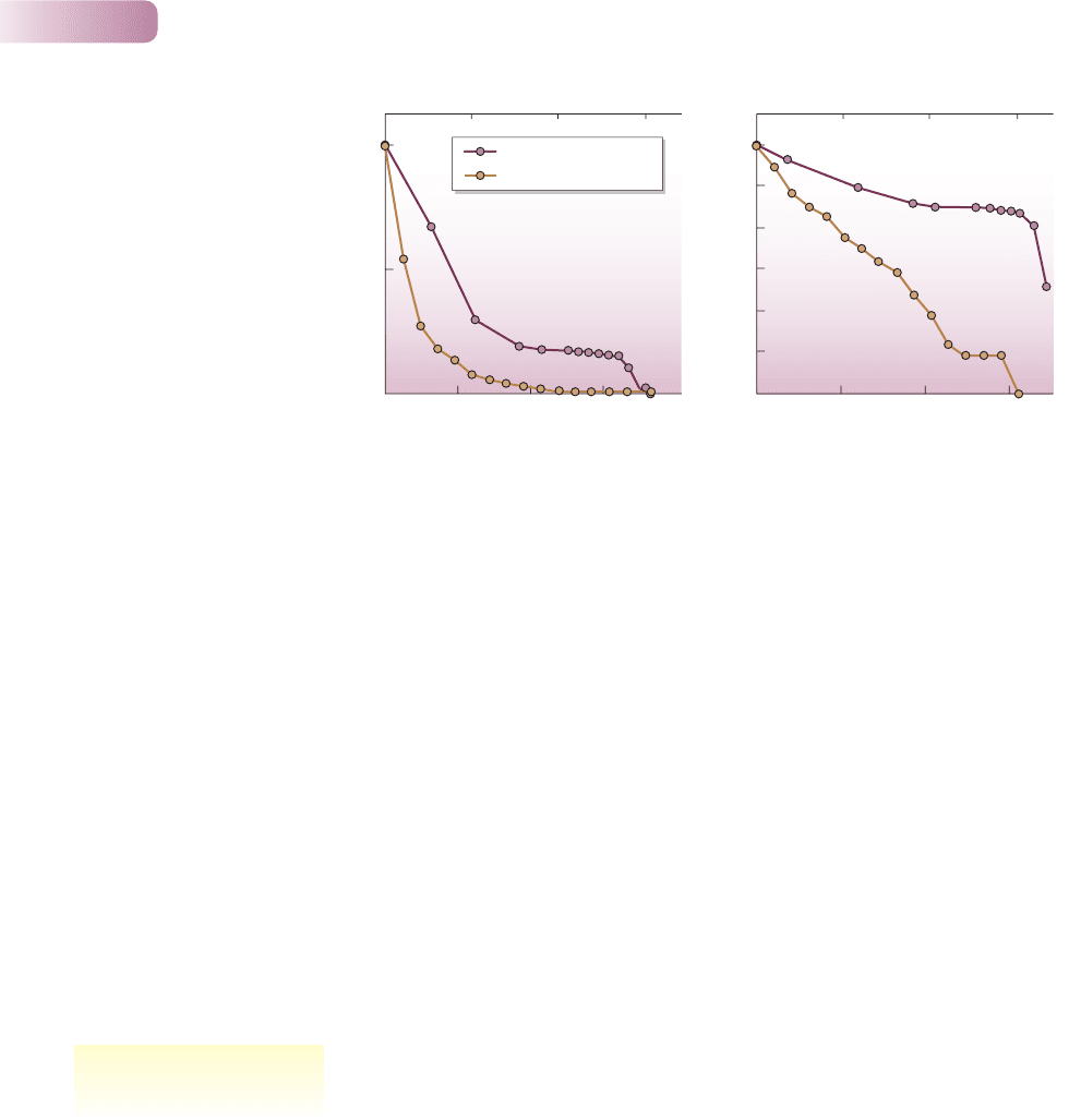
It is also possible to study the detailed pattern of decline in either the Phlox
cohort or a cohort of marmots. Figure 5.11a, for example, shows the numbers
surviving relative to the original population – the l
x
values – plotted against the
age of the cohort. However, this can be misleading. If the original population
is 1000 individuals, and it decreases by half to 500 in one time interval, then this
decrease looks more dramatic on a graph like Figure 5.11a than a decrease from
50 to 25 individuals later in the season. Yet the risk of death to individuals is
the same on both occasions. If, however, l
x
values are replaced by log(l
x
) values,
that is, the logarithms of the values, as in Figure 5.11b (or, effectively the same
thing, if l
x
values are plotted on a log scale), then it is a characteristic of logs that
the reduction of a population to half its original size will always look the same.
Survivorship curves are, therefore, conventionally plots of log(l
x
) values against
cohort age.
Figure 5.11b shows that there was a relatively rapid and constant decline in
the size of the Phlox cohort over the first 6 months, but that the death rate there-
after remained steady and rather low until the very end of the season, when the
survivors all died. For the marmots, Figure 5.11b shows an even more clearly
constant decline until around the 10th year of life (when breeding ceased),
followed by a brief period with effectively no mortality, after which the few
remaining survivors died.
It is possible to see, therefore, even from these two examples, how life tables
can be useful in characterizing the ‘health’ of a population – the extent to which it
is growing or declining – and in identifying which stage in the life cycle (whether
it is survival or birth) is apparently most instrumental in determining that rate of
increase or decline. Either or both of these may be vital in determining how best
to conserve an endangered species or control a pest.
Chapter 5 Birth, death and movement
161
. . . combined to give the basic
reproductive rate
logarithmic survivorship curves
9781405156585_4_005.qxd 11/5/07 14:49 Page 161
5.3.2 Life tables for populations with overlapping
generations
Many of the species for which we have important questions, and for which life
tables may provide an answer, have repeated breeding seasons like the marmots,
or continuous breeding as in the case of humans, but constructing life tables
here is complicated, largely because these populations have individuals of many
different ages living together. Building a cohort life table is sometimes possible,
as we have seen, but this is relatively uncommon. Apart from the mixing of
cohorts in the population, it can be difficult simply because of the longevity of
many species.
Another approach is to construct a ‘population snapshot’ in a static life table
(see Box 5.2). Superficially, the data look like a cohort life table: a series of dif-
ferent numbers of individuals in different age classes. But great care is required:
they can only be treated and interpreted in the same way if patterns of birth and
survival in the population have remained much the same since the birth of the
oldest individuals – and this will happen only rarely. Nonetheless, useful insights
can sometimes be gained by combining the data from a static life table (an age
structure: the numbers in different age classes) with corresponding background
information. This is illustrated by a study of two populations of the long-lived tree
Acacia burkittii in South Australia (Figure 5.12). Although differences in age
structure between the populations are obvious, the reasons are not. Fortunately,
background information provides important clues.
Part III Individuals, Populations, Communities and Ecosystems
162
(b)
–1
–2
–3
–0.5
–1.5
–2.5
0
100 200 300
(a)
1
0.5
0
Age of Phlox (days)
Age of marmots (years)
100 200 300
501015
Age of Phlox (days)
Age of marmots (years)
501015
l
x
Log
10
l
x
Phlox drummondii
Yellow-bellied marmot
Figure 5.11
Following the survival of a cohort of Phlox drummondii (maroon, Table 5.1) and of the yellow-bellied
marmot (yellow, Table 5.2). (a) When l
x
is plotted against cohort age, it is clear that most individuals are
lost relatively early in the lives of the cohorts, but there is no clear impression of the risk of mortality at
different ages. (b) By contrast, a survivorship curve plotting log(l
x
) against age shows, for Phlox, that
an initial 6 months of moderate survivorship was followed by an extended period of higher survivorship
(less risk of mortality) and then by very low survivorship in the final weeks of the annual cycle. For the
marmots, there was virtually constant mortality risk until around age 10, followed by a brief period
of low risk after which the remaining survivors died.
a static life table – useful if used
with caution
9781405156585_4_005.qxd 11/5/07 14:49 Page 162

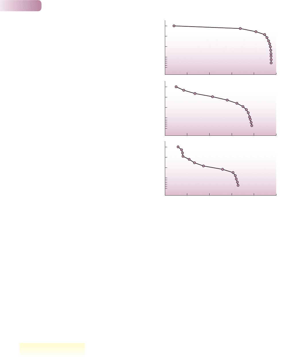
5.3.3 A classification of survivorship curves
Life tables provide a great deal of data on specific organisms. But ecologists search
for generalities: patterns of life and death that we can see repeated in the lives
of many species. Ecologists conventionally divide survivorship curves into three
types, in a scheme that goes back to 1928, generalizing what we know about the
way in which the risks of death are distributed through the lives of different
organisms (Figure 5.13).
l
In a type I survivorship curve, mortality is concentrated toward the end of
the maximum lifespan. It is perhaps most typical of humans in developed
countries and their carefully tended zoo animals and pets.
Chapter 5 Birth, death and movement
163
Frequency
30
20
10
30
20
10
1925 192518251875 1775 1875 17751725 1825 1725
Year of origin Year of origin
(a) South Lake Paddock (b) Reserve, Northern
Sheep grazing
starts
Rabbit grazing
starts
Grazing (sheep
and rabbits) starts
Fenced to exclude sheep
(though not rabbits)
AFTER CRISP & LANGE, 1976AFTER PEARL, 1928; DEEVEY, 1947
Figure 5.12
Age structures (and hence static life tables) of Acacia burkittii populations at two sites in South Australia.
South Lake Paddock populations had been grazed by sheep from 1865 to 1970 and by rabbits from
1885 to 1970, whereas the Reserve population had been fenced in 1925 to exclude sheep (but did not
exclude rabbits). With this information in hand, the effect of grazing from 1865 onward is evident in the
decreased numbers of new recruits to both populations. However, the effects of fencing after 1925 are
equally obvious in the Reserve population, where the proportion of new recruits increased dramatically.
The effects of rabbit grazing on recruitment after fencing in the Reserve population can, however, still
be detected, since, for example, the 1925–1940 age class was much smaller than the (pre-grazing)
1845–1860 class, even though the latter had survived an additional 75 years.
Risk of mortality
Age
Log
10
l
x
Type I Type II Type III
Figure 5.13
A classification of survivorship curves
plotting log(l
x
) against age, above, with
corresponding plots of the changing risk of
mortality with age, below. The three types
are discussed in the text.
9781405156585_4_005.qxd 11/5/07 14:49 Page 163
l
A type II survivorship curve is a straight line signifying a constant mortality
rate from birth to maximum age. It describes, for instance, the survival of
buried seeds in a seed bank.
l
In a type III survivorship curve there is extensive early mortality, but a high
rate of subsequent survival. This is typical of species that produce many
offspring. Few survive initially, but once individuals reach a critical size, their
risk of death remains low and more or less constant. This appears to be the
most common survivorship curve among animals and plants in nature.
These types of survivorship curve are useful generalizations, but in practice,
patterns of survival are usually more complex. Thus, in a population of Erophila
verna, a very short-lived annual plant inhabiting sand dunes, survival can follow
a type I curve when the plants grow at low densities; a type II curve, at least until
the last stages of life, at medium densities; and a type III curve in the early stages
of life at the highest densities (Figure 5.14).
5.4 Dispersal and migration
Birth is only the beginning. If we were to stop there in our studies, many crucial
ecological questions would remain unanswered. From their place of birth, all
Part III Individuals, Populations, Communities and Ecosystems
164
0 5 10 15 20 25
0 5 10 15 20 25
0 5 10 15 20 25
Plant age
Low density
Medium density
High density
1000
750
500
250
50
100
Survivorship (l
x
)Survivorship (l
x
)Survivorship (l
x
)
1000
750
500
250
50
100
1000
750
500
250
50
100
Figure 5. 14
Survivorship curves for the sand dune annual plant Erophila verna
monitored at three densities: high (initially 55 or more seedlings
per 0.01 m
2
plot), medium (15–30 seedlings per plot) and low
(1–2 seedlings per plot). The horizontal scale (plant age) is
standardized to take account of the fact that each curve is the
average of several cohorts, which lasted different lengths of time
(around 70 days on average).
AFTER SYMONIDES, 1983
patterns of distribution
9781405156585_4_005.qxd 11/5/07 14:49 Page 164
organisms move to locations where we eventually find them. Plants grow where
their seeds fall, but seeds may be moved by the wind, water, animals or shifting
soil. Animals move in search of food and safe havens, whether it is only to
move 1 cm along a leaf from where their egg was deposited, or to move half-
way around the globe. The effects of those movements are varied. In some cases
they aggregate members of a population into clumps; in others they continually
redistribute and shuffle them; and in still others they spread the individuals out.
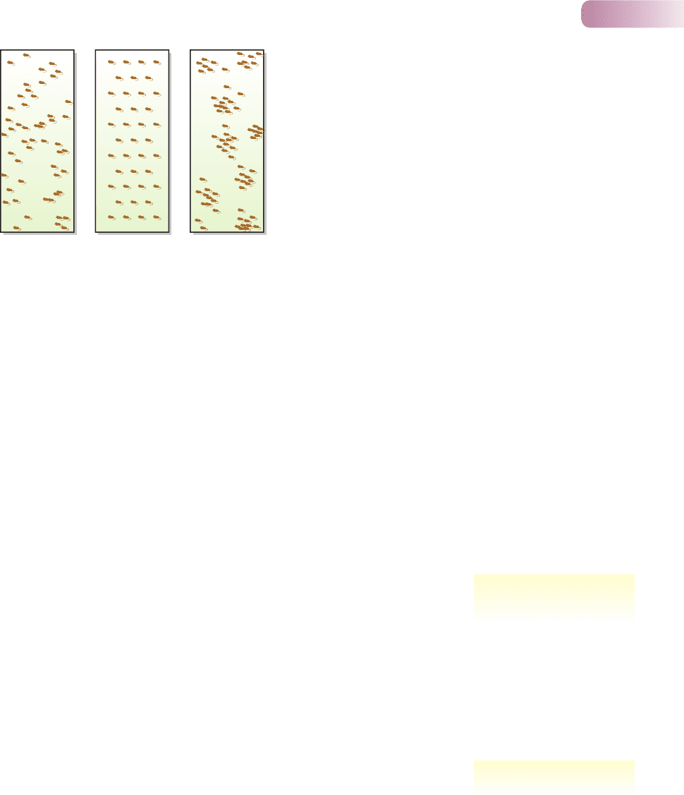
Three generalized spatial patterns that result from this movement – aggregated
(clumped), random and regular (evenly) spaced – are illustrated in Figure 5.15.
Clearly, movement and spatial distribution (the latter sometimes, confusingly,
called ‘dispersion’) are intimately related.
Technically, the term dispersal describes the way individuals spread away from
each other, such as when seeds are carried away from a parent plant or young
lions leave the pride in search of their own territory. Migration refers to the mass
directional movement of large numbers of a species from one location to another.
Migration therefore describes the movement of locust swarms but also includes
the smaller scale movements of intertidal organisms, back and forth twice a day,
as they follow their preferred level of immersion or exposure.
Our view of dispersal and migration, and of the resulting distributions, is
determined by the scale on which we are working. For example, consider the
distribution of an aphid living on a particular species of tree in a woodland. On
a large scale, the aphids appear to be aggregated in the woodlands and non-
existent in the open fields. If the samples we took were smaller, and taken only in
woodlands, the aphids would still appear to be aggregated, but now aggregated
on their host trees rather than on trees in general. However, if samples were
collected at an even smaller scale – the size of a leaf within a canopy – the aphids
might appear to be randomly distributed over the tree as a whole. And on the scale
experienced by the aphid itself (1 cm
2
), the distribution might appear regular as
individuals on a leaf spread out to avoid one another (Figure 5.16).
This example also illustrates the difference between the ‘average density’ and the
crowding experienced by individuals in a population. The average density is simply
the total number of individuals divided by the total size of the habitat – but it
depends very much on how we define the habitat. For the aphids, if it includes
everything, woodland and non-woodland, then average density will be low. It will
higher, but still quite low, if we include only woodland but every species of tree.
It will be much higher, however, if we include only the aphids’ host trees.
Chapter 5 Birth, death and movement
165
Random Regular Aggregated
Figure 5.15
Three generalized spatial patterns that
may be exhibited by organisms across
their habitat.
the perception of pattern
depends on the spatial scale
density and crowding
9781405156585_4_005.qxd 11/5/07 14:49 Page 165
The average density of individuals in the United States is about 75 persons km
−2
.
Yet there are vast areas of the United States – rural and wilderness areas – within
which the density is low, but also crowded cities and towns within which the
density is much higher. And because the majority of people live in urban and
suburban settings, the density actually experienced by people, on average, has
been calculated at 3630 persons km
−2
. There may be little impetus for dispersal,
or migration, at the relatively low population pressure of 75 persons km
−2
. At
3630 persons km
−2
, however, individuals are much more likely to find ways to
escape from their neighbors. Real measures of crowding as experienced by indi-
viduals are likely to be more important forces driving dispersal and migration
than some average value of population density.
5.4.1 Dispersal determining abundance
Compared to birth and death, relatively few studies have examined the role of
dispersal in determining the abundance of populations. However, studies that
have looked carefully at dispersal have tended to bear out its importance. In a
long-term and intensive investigation of a population of great tits, Parus major,
near Oxford, UK, it was observed that 57% of breeding birds were immigrants
rather than born in the population (Greenwood et al., 1978). And in a popula-
tion of the Colorado potato beetle, Leptinotarsa decemlineata, in Canada, the
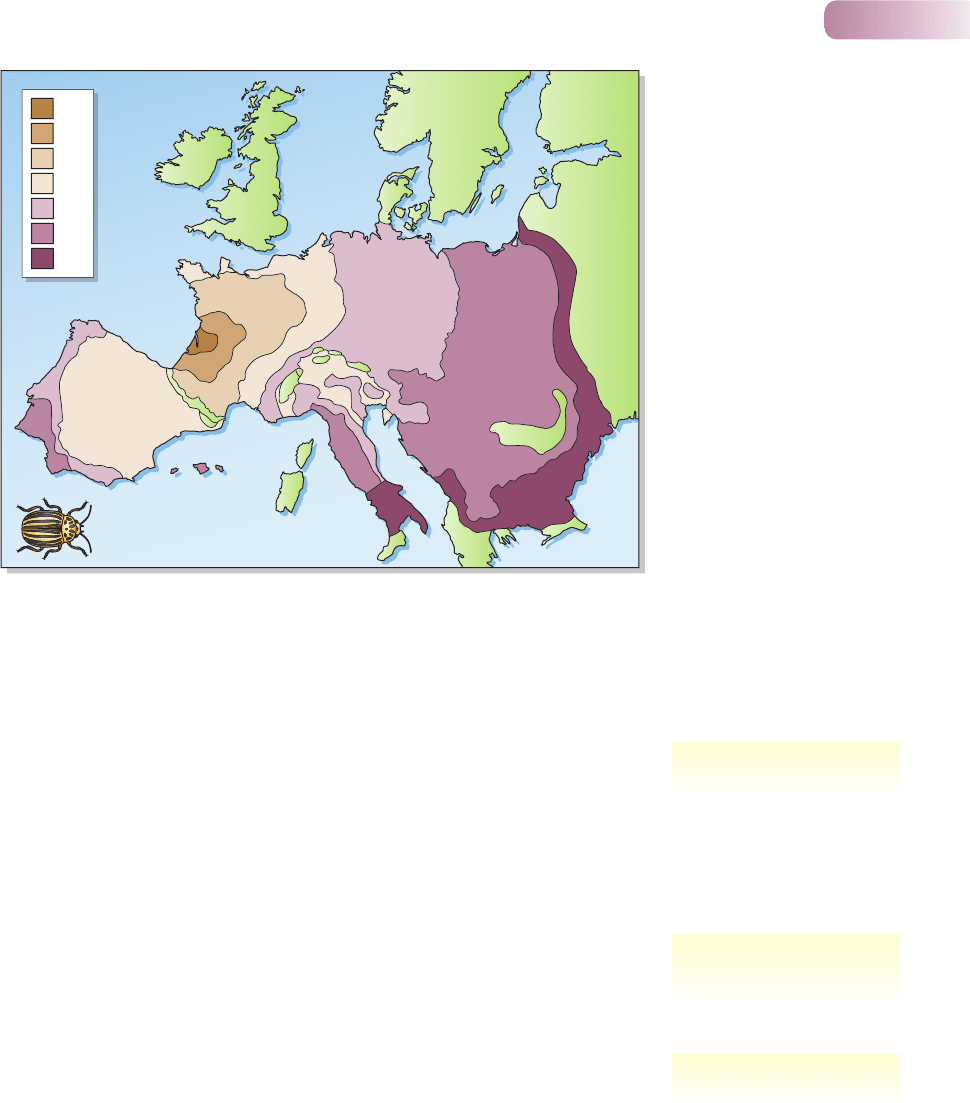
average emigration rate of newly emerged adults was 97% (Harcourt, 1971). This
makes the rapid spread of the beetle in Europe in the middle of the last century
Part III Individuals, Populations, Communities and Ecosystems
166
Aggregated
Aggregated
Regular
Random
Figure 5.16
Are aphids distributed evenly, randomly or in an
aggregated fashion? It all depends on the spatial
scale at which they are viewed.
dispersal: important but
frequently neglected
9781405156585_4_005.qxd 11/5/07 14:49 Page 166
easy to understand (Figure 5.17). Indeed, most populations are more affected
by immigration and emigration than is commonly imagined. Within the United
States, for example, over 40% of US residents, over 100 million people, can trace
their roots to the 12 million immigrants who entered the United States through
the Ellis Island port from 1870 to 1920.
In fact, often the most important role played by dispersal in a population is to
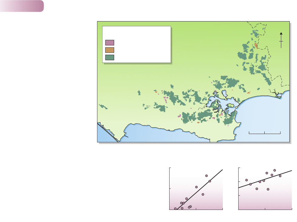
get the organisms there in the first place. For instance, the invasion of 116 patches
of lowland heath vegetation in southern England by scrub and tree species
was studied for the period from 1978 to 1987 (Figure 5.18). The most important
factors accounting for such invasions were those describing the abundance of
scrub and tree species in the vegetation bordering the heath patches. Invasions,
and thus the subsequent dynamics of patches, were being driven by initiating acts
of dispersal.
One key force provoking dispersal is the more intense competition suffered
by crowded individuals (see Section 3.5) and the direct interference between such
individuals even in the absence of a shortage of resources. We frequently observe,
therefore, that the highest rates of dispersal are away from the most crowded
patches (Figure 5.19): emigration dispersal is commonly density-dependent.
On the other hand, such density-dependent dispersal is by no means a general
rule, and in some cases the converse pattern is observed – most dispersal at the
lowest densities or inverse density dependence – a pattern often attributed to
the avoidance of inbreeding between closely related individuals (and the lowered
offspring fitness that would result), since on average, at low densities, a high
proportion of those you grow up with are likely to be your close relatives. Further-
more, immigrants and emigrants not only influence the numbers in a population,
they can also affect its composition. Dispersers are often the young, and males
Chapter 5 Birth, death and movement
167
1922
1930
1935
1945
1952
1960
1964
Figure 5.17
Spread of the Colorado beetle
(Leptinotarsa decemlineata) in
Europe, 1922–1964.
AFTER JOHNSON, 1967
dispersal as invasion
density-dependent dispersal –
and its converse
age- and sex-biased dispersal
9781405156585_4_005.qxd 11/5/07 14:49 Page 167
frequently do more moving about than females. In mammal dispersal, for instance,
age and sex biases, and the forces of inbreeding avoidance and competition avoid-
ance, may all be tied intimately together. Thus, in an experiment with gray-tailed
voles, Microtus canicaudus, 87% of juvenile males and 34% of juvenile females
dispersed within 4 weeks of initial capture at low densities, but only 16% and 12%,
respectively, dispersed at low densities (Wolff et al., 1997). There was massive
juvenile dispersal; this was particularly pronounced in males; and the especially
high rates at low densities argue in favor of inbreeding avoidance as a major force
shaping the pattern.
5.4.2 The role of migration
The mass movements of populations that we call migration are (rather like
density-dependent dispersal) almost always from regions where the food resource
is declining to regions where it is abundant (or where it will be abundant for the
progeny). By day, planktonic plants live in the upper layers of the water in lakes
where the light needed for photosynthesis is brightest. At night they migrate to
lower, nutrient-rich depths. Crabs migrate along the shore with the tides, follow-
ing the movement of their food supply as it is washed up in the waves. At longer
time scales, some shepherds still follow the ages-old practice of ‘transhumance’,
Part III Individuals, Populations, Communities and Ecosystems
168
0510
Sea
N
km
Decrease
No change
Increase
Change in cover of scrub and
tree species in a heathland patch
Figure 5.18
The invasion (i.e. increase in
abundance) of most of the
116 patches of lowland heath in
Dorset, UK by scrub and tree species
between 1978 and 1987. The
coastline is to the south and
the county boundary to the east.
AFTER BULLOCK ET AL., 2002
0
0
1
168
0.5
0
0
75
Number of pairs
20001000
50
Dispersal rate (log scale)
25
(a) Emigration (b) Observed dispersal
Natal dispersal (%)
Number of larvae per mm
2
Figure 5.19
Density-dependent dispersal. (a) The dispersal rates of newly
hatched blackfly, Simulium vittatum, larvae increased with
increasing density. (Data from Fonseca & Hart, 1996.) (b) The
percentage of juvenile male barnacle geese, Branta leucopsis,
dispersing from breeding colonies on islands in the Baltic Sea to
non-natal breeding locations increased as density increased.
(Data from van der Jeugd, 1999.)
AFTER SUTHERLAND ET AL., 2002
9781405156585_4_005.qxd 11/5/07 14:49 Page 168