Tidwell J. Designing Interfaces (Second Edition)
Подождите немного. Документ загружается.

Back to Information Architecture 193
Order
• Does the list have a natural order, such as alphabetical or by time?
• Would it make sense for a user to change the sorting order of the list? If so, what
would the user sort on?
• If you choose to put a list into an order, would it actually make more sense as a group-
ing scheme, or vice versa? As an example, think about a blog archive: the articles
are naturally ordered by time, and most blogs categorize them by month and year,
rather than offering a flat ordered list. Someone looking for a particular article might
remember that “it was before article X but after article Y,” but not remember exactly
which month it was published. A monthly grouping thus makes it hard to find that
article; a time-ordered flat list of titles might work better.
Grouping
• Do the items come in categories? Is it a natural categorization that users will immedi-
ately understand? If not, how can you explain it, either verbally or visually?
• Do these categories come in larger categories? More broadly, do the items fit into a
multi-level hierarchy, such as files in a filesystem?
• Are there several potential categorizations? Would they fit different use cases or user
personas? And can users create their own categories for their own purposes?
Item types
• What are the items like? Are they simple, or are they rich and complex? Are they
just stand-ins for larger things, such as headlines for articles or thumbnails for video
clips?
• Are the items in a list very different from each other (e.g., some are simple and some
are complex)? Or are they homogeneous?
• Does each item have an image or picture associated with it?
• Does each item have a strict field-like structure? Would it help the user to know that
structure, or possibly even sort the list based on different fields? (Email messages
typically have a strict and sortable structure—timestamp, from field, subject, and so
on—and this structure typically is shown in lists of messages.)
Interaction
• Should you show the whole item at once in the list, or can you just show a representa-
tion of the item (such as its name or the first few sentences) and hide the rest?
• What is the user supposed to do with those items? Should they be looked at? Should
they be selected for inspection, or for performing tasks on them? Or are they links or
buttons to be clicked on?
• Does it make sense for the user to select multiple items at a time?
194 Chapter 5: Lists of Things
Dynamic behavior
• How long does it take to load the whole list? Can it be more or less immediate, or will
there be a noticeable delay as the list is put together somewhere and finally shown to
the user?
• Will the list change on the fly? Should you show the updates as they happen? Does
this mean inserting new items at the top of the list automatically?
The answers to these questions may suggest a variety of design solutions to you. Of course,
a solution should also take into account the type of content (blogs should look different
from, say, contact lists), the surrounding page layout, and implementation constraints.
Some Solutions
The interaction questions listed in the preceding section set the tone for almost all the
other decisions. For instance, a fully interactive list—multiple selection, drag-and-drop,
editing items, and so on—tends to dominate the interface. You may be building a
Picture
Manager
, an email client, or some other full-fledged application that people use to manage
and enjoy content that they own.
In this and other types of interfaces, a common requirement is to show only item names
or thumbnails in a list—just a representation of each item—and then display the whole
item when the user selects one from the list. There are at least three ways to do this.
“When the user selects an item from a list, where should I show the details of that item?”
•
Two-Panel Selector shows the item details right next to the list. It supports the over-
view and browsing use cases quite well because everything’s visible at once; the sur-
rounding page stays the same, so there’s no awkward context switch or page reload.
•
List Inlay shows the item details embedded in the list itself. The details only open
up when the user requests them with a click or tap. This pattern supports the over-
view and browsing use cases, too—though an overview is harder if lots of items are
open—and searching on item contents can be done smoothly by automatically open-
ing matched items.
•
One-Window Drilldown replaces the list’s space with the item details. This is often
used for small spaces that cannot accommodate a
Two-Panel Selector, such as mobile
screens or small module panels. It does lead to “pogo sticking” between the list screen
and the item screen, though, so browsing and searching are not so easy.
Some Solutions 195
Now let’s shift our attention to the items themselves. How much detail should you show
with each item, assuming the user will click through to see the whole thing? Again, you
have three main use cases to serve: get a quick overview, browse the list, and find items
of interest. For really focused tasks, such as finding a person’s phone number in a long
contact list, all that’s needed is the item name. But for a broader, more browsing-oriented
experience—news articles on a web page, for instance—more information makes an item
more interesting (up to a point, anyway). And if you have visuals associated with each
item, show thumbnails!
“How can I show a list with heavy visuals?”
• Use fat rows. Instead of just one line per item, give each item row several lines’ worth
of text. Enhance it with a small graphic or image thumbnail, if available, and use rich
text formatting to express a miniature visual hierarchy within each row. See the
Grid
of Equals
pattern in Chapter 4 for the basis of this pattern.
•
Thumbnail-and-Text List, in Chapter 10, is a specialization of fat rows for a mobile
device.
•
Thumbnail Grid is a common pattern for pictorial objects. A 2D grid of small pictures
is visually powerful; it dominates the page and draws attention. Text data is often
shown with the thumbnails, but it tends to be small and less important than the pic-
tures. Again, see the
Grid of Equals pattern for a generalization.
•
Carousel is an alternative to Thumbnail Grid that can use less space on the page. It is
strictly linear, not 2D, and the user must actively scroll through it to see more than a
few objects. Depending on its design, a
Carousel implementation might actually give
you more space to show the selected or center object than a
Thumbnail Grid.
Highly structured, homogeneous sets of items work well in a table layout, with a column
for each field of interest to users. Such a table might offer sorting via a
Sortable Table, or a
“Sort by” drop down for a simpler implementation.
Row Striping can help a viewer’s eyes
travel across a single item’s row, from left to right and back again. Tables are lists, but
they’re also complex data graphics that can be filtered and visualized with sophisticated
tools. So for other table-related patterns, I refer you to Chapter 7.
Very long lists can be difficult to design, especially on web pages. Certainly there are
technical challenges around loading times and page length, but interaction design might
be even harder—how does a user browse and move through such a list? How can he find
something specific, especially if a text search doesn’t behave as desired? The following
techniques and patterns apply to all the previously listed ways to show a list and its items
(except maybe a
Carousel, which has tighter constraints):
Do wnl oa d fr om W ow! e Bo ok < ww w.w ow eb oo k. co m>
196 Chapter 5: Lists of Things
“How can I manage a very long list?”
• Pagination lets you load the list in sections, putting the onus on the user to load those
sections as needed. This is, of course, quite common in websites—it’s easy to design
and implement.
Pagination is most useful when the user is likely to find the desired
item(s) in the first page, since many people won’t bother going to subsequent pages
anyway. You could also resort to
Pagination when loading the whole list will result in
a ridiculously long page or take a ridiculously long time. A good
Pagination control
shows the user how many pages of items there are, as well as letting a user jump
among those pages.
•
Infinite List is a single-page alternative to Pagination. The first section of a long list
gets loaded, and at the bottom the user finds a button that loads and appends the
next section. The user stays on one page. Common in mobile designs, this pattern
can be found in Chapter 10. Don’t discount it for regular web pages, however! This
pattern is useful when you don’t actually know how long the list will be, or when it’s
“bottomless.”
• A variant on
Infinite List has the list automatically loading itself as the user scrolls
down. See the
Continuous Scrolling pattern at the following page:
http://ui-patterns.com/patterns/ContinuousScrolling
• When a very long alphabetized list is kept in a scrolled box, consider using an
Alphabet
Scroller.
Related to Annotated Scrollbar (Chapter 3), this device shows the alphabet ar-
rayed along the scrollbar itself; the user can then jump directly to a desired letter.
• Direct searching via a “Find” field may be critical for helping your users to find spe-
cific items. Also, filtering a list—screening out entire classes of items that don’t meet
certain criteria—can help shorten a list to a manageable size.
So far, this section has talked mostly about flat lists: those that have no categories, con-
tainment, or hierarchy. However a list might be rendered, you may still want to break it
up into categories for clarity.
“How can I show a list that’s organized into categories or hierarchies?”
•
Titled Sections (Chapter 4) work well for a single level of containment. Just separate
the list into sections with titles, and perhaps allow the user to sort the list within a
single section so as not to disrupt the categorization. If you only have a few sections,
try an
Accordion—this lets the user close list sections that she doesn’t need.
• For two or more levels of hierarchy, basic trees are the standby solution. These are
normally presented with indented hierarchy levels, and with icons such as pluses
and minuses (commonly found on Windows) or rotating triangles. The levels can be
closed and opened by the users or automatically by the interface as needed. Many UI
toolkits offer tree implementations.
The Patterns 197
• Cascading Lists take a tree’s vertically oriented hierarchy and turn it on its side,
with a series of columns that list all the possibilities at every level of the hierarchy.
Popularized by Mac OS, this pattern allows very effective browsing and overviews of
hierarchies at the cost of large amounts of space. (It does not work in a small window
or screen.)
• When the items are heavily structured and you want to present them in a table but
they come organized in a hierarchy, consider a
Tree Table. Literally, it combines a tree
with a table, and it’s exactly what it sounds like.
The Patterns
First are the three patterns that place item details next to, inside, or on a different page
from the list itself:
1.
Two-Panel Selector
2. One-Window Drilldown
3. List Inlay
The next few patterns cover ways to show lists of various sorts—image-based lists
(
Thumbnail Grid and Carousel), tables (Row Striping), long lists (Pagination, Jump to Item,
Alphabet Scroller), and hierarchies (Cascading Lists and Tree Table). If you’re using a table or
Tree Table, consider making it a Sortable Table (see Chapter 7).
4.
Thumbnail Grid
5. Carousel
6. Row Striping
7. Pagination
8. Jump to Item
9. Alphabet Scroller
10. Cascading Lists
11. Tree Table
Finally, New-Item Row lets a user add items to a list however that list may be rendered.
12.
New-Item Row
198 Chapter 5: Lists of Things
Two-Panel Selector
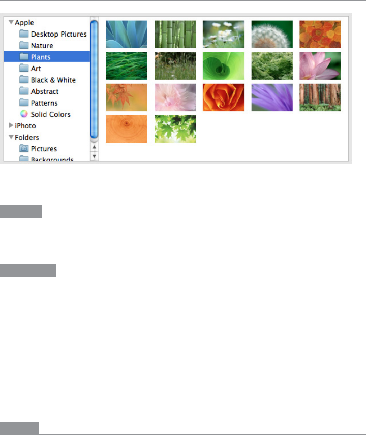
Figure 5-1.
Mac OS system preferences
What
Put two side-by-side panels on the interface. In the first one, show a list of items that the
user can select at will; in the second one, show the content of the selected item.
Use when
You have a list of items to show. Each item has interesting content associated with it, such
as the text of an email message, a long article, a full-sized image, contained items (if the
list is a set of categories or folders), or details about a file’s size or date.
You want the user to see the overall structure of the list and keep that list in view all the
time, but you also want him to be able to browse through the items easily and quickly.
People won’t need to see the details or content of more than one item at a time.
Physically, the display you’re working with is large enough to show two separate panels
at once. Very small cell phone displays cannot cope with this pattern, but many larger
mobile devices can.
Why
This is a learned convention, but it’s an extremely common and powerful one. People
quickly learn that they’re supposed to select an item in one panel to see its contents in the
other. They might learn it from their email clients, or from Windows Explorer, or from
websites; whatever the case, they apply the concept to other applications that look similar.

The Patterns 199
When both panels are visible side by side, users can quickly shift their attention back and
forth, looking now at the overall structure of the list (“How many more unread email mes-
sages do I have?”), and now at an object’s details (“What does this email say?”). This tight
integration has several advantages over other physical structures, such as two separate
windows or
One-Window Drilldown:
• It reduces physical effort. The user’s eyes don’t have to travel a long distance between
the panels, and he can change the selection with a single mouse click or key press
rather than first navigating between windows or pages (which can take an extra
mouse click).
• It reduces visual cognitive load. When a window pops to the top, or when a page’s
contents are completely changed (as happens with
One-Window Drilldown), the user
suddenly has to pay more attention to what he’s now looking at; when the window
stays mostly stable, as in a
Two-Panel Selector, the user can focus on the smaller area
that did change. There is no major “context switch” on the page.
• It reduces the user’s memory burden. Think about the email example again: when
the user is looking at just the text of an email message, there’s nothing on-screen to
remind him of where that message is in the context of his inbox. If he wants to know,
he has to remember, or navigate back to the list. But if the list is already on-screen,
he merely has to look, not remember. The list thus serves as a “You are here” signpost
(see Chapter 3 for an explanation of signposts).
• It’s faster than loading a new page for each item, as can happen with
One-Window
Drilldown
.
How
Place the selectable list on the top or left panel, and the details panel below it or to its right.
This takes advantage of the visual flow that most users who read left-to-right languages
will expect (so try reversing it for right-to-left language readers).
When the user selects an item, immediately show its contents or details in the second
panel. Selection should be done with a single click. But while you’re at it, give the user
a way to change his selection from the keyboard, particularly with the arrow keys—this
helps reduce both the physical effort and the time required for browsing, and contributes
to keyboard-only usability (see
Keyboard Only in Chapter 1).
Make the selected item visually obvious. Most GUI toolkits have a particular way of show-
ing selection (e.g., reversing the foreground and background of the selected list item). If
that doesn’t look good, or if you’re not using a GUI toolkit with this feature, try to make
the selected item a different color and brightness than the unselected ones—that helps it
stand out.
200 Chapter 5: Lists of Things
What should the selectable list look like? It depends—on the inherent structure of the
content, or perhaps on the task to be performed. For instance, most filesystem viewers
show the directory hierarchy, since that’s how filesystems are structured. Animation and
video editing software use interactive timelines. A GUI builder may simply use the layout
canvas itself; selected objects on it then show their properties in a property editor next to
the canvas.
A
Two-Panel Selector has identical semantics to tabs: one area for the selectors, and one
area next to it for the content of the selected thing. Likewise, a
List Inlay is like an Accordion
(Chapter 4), and
One-Window Drilldown is like a Menu Page (Chapter 3).
When the select-and-show concept is extended through multiple panels to facilitate navi-
gation through a hierarchical information architecture, you get the
Cascading Lists pattern.
Examples
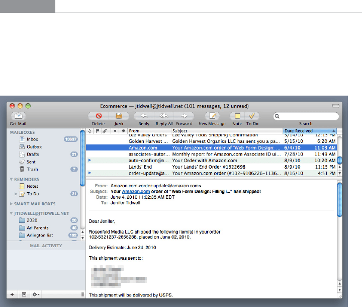
Many email clients use this pattern to show a list of email messages next to the currently
selected message (see Figure 5-2). Such listings benefit from being nearly as wide as the
whole window, so it makes sense to put the listing on top of the second panel, not to its
left. (Also, this example shows the use of a third selector panel on the left that lets the user
choose which mailbox to work in.)
Figure 5-2.
Mac Mail on a desktop
The Patterns 201
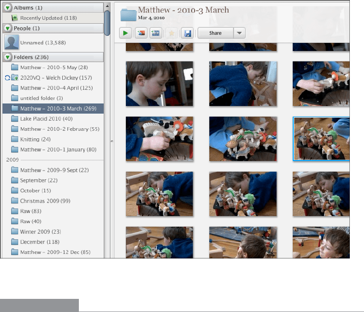
Like many other Picture Managers, Picasa (Figure 5-3) lists the various image folders and
categories in its
Two-Panel Selector. The result is a second list, of images. When the user
selects an image, the whole window is replaced; see
One-Window Drilldown.
Figure 5-3.
Picasa
In other libraries
http://quince.infragistics.com/Patterns/Two-Panel%20Selector.aspx
http://www.welie.com/patterns/showPattern.php?patternID=overview-detail
202 Chapter 5: Lists of Things
One-Window Drilldown
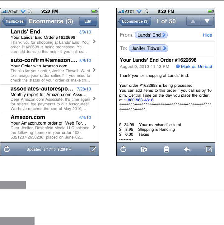
Figure 5-4.
Mac Mail on iPhone
What
Show a list or menu of items in a single window. When the user selects an item from the
list, show the details or contents of that item in the window, replacing the list.
Use when
You have a list of items to show. Each item has interesting content associated with it, such
as the text of an email message, a long article, a full-size image, or details about a file’s size
or date.
You have very little space to work with—not enough for a
Two-Panel Selector or a List Inlay.
For instance, the design might be intended for a very small mobile screen, or for a self-
contained web page sidebar or widget.
Alternatively, the list items and contents might just be large. You might need the entire
screen or window to show the list, and again to show the contents of an item. Online
forums tend to work this way, requiring the whole width of the page to list conversation
topics and a separate scrolled page to show the conversations themselves.