Tidwell J. Designing Interfaces (Second Edition)
Подождите немного. Документ загружается.


The Patterns 183
What
Starting with a UI that is mostly disabled, guide a user through a series of steps by en-
abling more of the UI as each step is done.
Use when
The user should be walked through a complex task step by step, perhaps because the user
is computer-naive or because the task is rarely done (as in a
Wizard). But you don’t want to
force the user to go page by page at each step—you’d like to keep the whole interface on
one page. Furthermore, you want to keep the interface stable; you’d rather not dynami-
cally reconfigure the page at each step, as you would with
Responsive Disclosure.
Why
Like Responsive Disclosure, this pattern takes advantage of the malleability of computer
displays to interactively guide the user through the interface. The user thus gets a chance
to form a correct mental model about cause and effect. The UI itself tells her the conse-
quences of some choices: if I turn this checkbox on, I have to fill in these four text fields
that just got enabled.
Furthermore, the user can’t do things that would get her into trouble, since the UI has
“locked out” those actions by disabling them. Unnecessary error messages are thus
avoided.
How
In some applications, most actions on the UI start off disabled—only the actions relevant
to the user’s first step are available. As the user makes choices and performs actions, more
disabled items should be enabled and brought into play. In this respect, it’s remarkably
like
Responsive Disclosure, in that the machine specifies a particular sequence through the
interface.
A similar, less sequence-based technique is much more common in desktop UIs. As the
user does things on the interface, certain actions or settings become irrelevant or impos-
sible, and those actions get disabled until the user does whatever is necessary to reenable
them. Overall sequence isn’t as important.
Whenever possible, put the disabled items in close proximity to whatever enables them.
That helps users find the magic enabling operation and understand the relationship be-
tween it and the disabled items. The examples in Figures 4-57 and 4-58 place that text
field (or checkbox, respectively) at the top or left of the disabled items, which follows the
natural top-to-bottom and left-to-right “flow” of the interface.
When you design an interface that uses
Responsive Enabling or Responsive Disclosure,
be sure to disable only things that really can’t or shouldn’t be used. Be wary of over-
constraining the user’s experience in an attempt to make the interface friendlier or easier
184 Chapter 4: Organizing the Page: Layout of Page Elements
to understand. When you decide what to disable, carefully consider each item. Is it being
disabled for a really good reason? Can that functionality be enabled all the time? As usual,
usability testing gives users a chance to tell you that you’ve done it wrong.
Another usability problem to avoid is what Bruce Tognazzini once called the “Mysteriously
Dimmed Menu Items”—when the design offers no clue as to why a given item is disabled.
Again, minimize the set of things that have to be disabled, especially when they’re far
away from whatever operation turns them on. Also, somewhere in the interface or its help
system, tell the user what causes a feature to be unavailable. Again, this whole problem
can be avoided more easily when the disabled controls aren’t menus on a menu bar, but
instead sit out on the main UI, collocated with whatever switches them on. Spatial prox-
imity is an important clue.
Examples
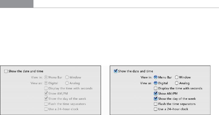
The Mac OS System Preferences, shown in Figure 4-58, provide a typical example of dis-
abling based on a binary choice: should the desktop show the date and time on the menu
bar, or not? If the user chooses to show it, she gets a panoply of choices about how it ought
to be shown. If not, the choices are irrelevant, so they’re disabled. This behavior (plus the
indenting of the options under the checkbox) tells the user that these choices affect the
date/time display which the checkbox toggled—and nothing else.
Figure 4-58.
Mac OS system preferences
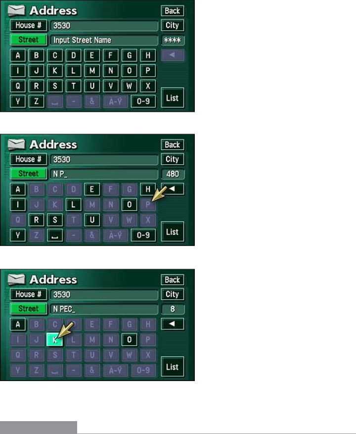
You can also reverse the sense of this pattern and do “responsive disabling.” The naviga-
tion system used in Toyota’s Prius and Lexus cars employs this technique when a user en-
ters a destination address (see Figure 4-59). Knowing what streets exist in a given search
area, the system narrows down the possible street names with each successive letter en-
tered by the user. It then disables the letters that can’t possibly follow the currently typed
string; the user has fewer buttons to think about, plus some assurance that the system
“knows” what she’s trying to type. Address entry is thus made easier and more pleasant.
(When only a few streets match, the system takes away the keyboard altogether and shows
the streets as a list of choices—see the
Autocompletion pattern in Chapter 8.)
The Patterns 185
Figure 4-59.
Lexus hybrid navigation system
In other libraries
http://quince.infragistics.com/Patterns/Responsive%20Enabling.aspx
186 Chapter 4: Organizing the Page: Layout of Page Elements
Liquid Layout
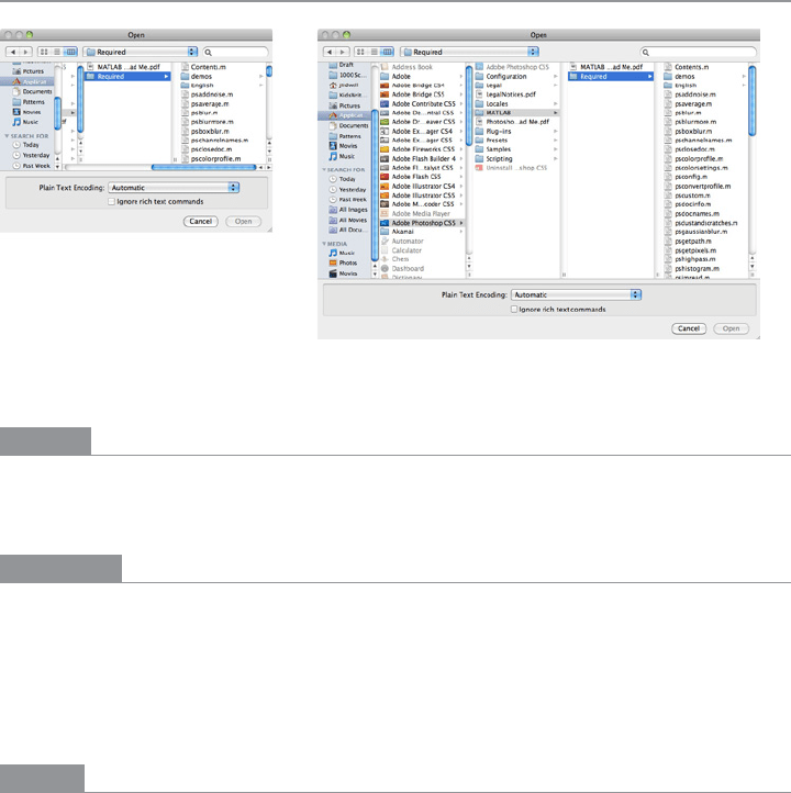
Figure 4-60.
Mac OS open dialog
What
As the user resizes the window, resize the page contents along with it so that the page is
constantly “filled.”
Use when
The user might want more space—or less—in which to show the content of a window,
dialog box, or page. This is likely to happen whenever a page contains a lot of text (as in
a web page), a high-information control such as a table or tree, or a graphic editor. This
pattern doesn’t work as well when the visual design requires a certain amount of screen
real estate, neither more nor less.
Why
Unless you’re designing a “closed” UI such as a kiosk or a full-screen video game, you can’t
predict the conditions under which users will view your UI. Screen size, font preferences,
other windows on the screen, or the importance of any particular page to the user—none
of this is under your control. How, then, can you decide the one optimal page size for all
users?
Giving the user a little control over the layout of the page makes your UI more flexible
under changing conditions. It may also make the user feel less antagonistic toward the UI,
since he can bend it to fit his immediate needs and contexts.

The Patterns 187
If you need more convincing, consider what happens to a fixed-layout “nonliquid” UI
when the language or font size changes. Do columns still line up? Do pages suddenly
become too wide or even clipped at the margins? If not, great; you have a simple and
therefore robust design. But pages engineered to work nicely with window size changes
generally also accommodate language or font size changes.
How
Make the page contents continuously “fill” the window as it changes size. Multiline text
should wrap at the right margin until it becomes 10 to 12 words wide (more on that later).
Text, trees, tables, graphs, and editors at “center stage” should enlarge generously while
their margins stay compact. If the page has anything form-like on it, horizontal stretch-
ing should cause text fields to elongate—users will appreciate this if they need to type in
anything longer than the text field’s normal length. Likewise, anything scrolled (such as
lists or tables) should lengthen, and possibly widen, too.
Web pages and similar UIs should allow the body content to fill the new space, while keep-
ing navigational devices and signposts anchored to the top and left margins. Background
colors and patterns should always fill the new space, even if the content itself cannot.
What happens when the window gets too small for its content? You could put scrollbars
around it. Otherwise, whitespace should shrink as necessary; outright clipping may occur
when the window gets really tiny, but the most important content should hang in there
to the end.
If the interface shows paragraphs of text, remember that they become nearly illegible
when they’re too wide. Graphic designers target an optimal line length for easy reading of
text; one metric is 10 to 12 average English words per line. Another metric is 30 to 35 em
widths—that is, the width of your font’s lowercase m. When your text gets much wider
than that, users’ eyes have to travel too far from the end of one line to the beginning of the
next one; if it gets narrower, it’s too choppy to read easily.
(That being said, there is evidence that text with a longer line length, such as 100 char-
acters per line, is faster to read than shorter lines, even though users prefer to read lines
fewer than 55 characters long.
*
)
Examples
Mac OS allows you to resize the standard Open dialog box, which uses a Liquid Layout.
This is good because the user can see as much of the filesystem hierarchy as he wants,
rather than being constrained to a tiny predetermined space. See Figure 4-60 at the top
of the pattern.
* “Use Reading Performance or User Preference,” from http://usability.gov/guidelines/.
188 Chapter 4: Organizing the Page: Layout of Page Elements
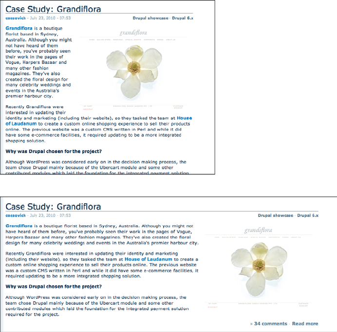
When a Liquid Layout is used on text in a browser, the floated elements should handle the
resize gracefully, as in the Drupal.org example shown in Figure 4-61. Note also that the
text in this article never gets so wide as to be unreadable, even when the window itself is
very wide.
Figure 4-61.
From Drupal.org
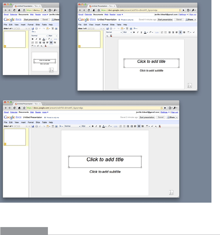
Google Docs allows the user to shrink the window to a very narrow size (see Figure 4-62).
Though it places long toolbars across the top of the document, those toolbars wrap around
and collapse gracefully as the window shrinks. (The user can’t resize it to be smaller than
the smallest size shown here.)
The Patterns 189
Figure 4-62.
Google Docs slideshow editor
In other libraries
http://www.welie.com/patterns/showPattern.php?patternID=liquid-layout
http://quince.infragistics.com/Patterns/Liquid%20Layout.aspx
http://www.designofsites.com/designing-effective-page-layouts/expanding-screen-width

Chapter 5
Lists of Things
This chapter covers only one topic: how to display lists of items in an interactive set-
ting. Just items. Actual data—complex and highly structured data sets—isn’t covered until
Chapter 7.
Why do lists merit their own chapter, you may ask?
Consider the many types of items that get shown in lists: articles, pages, photos, videos,
maps, books, games, movies, TV shows, songs, products, email messages, blog entries,
status updates, forum posts, comments, search results, people, events, files, documents,
apps, links, URLs, tools, modes, actions. (Add your own!)
Practically every moderately complex interface or website ever designed includes lists.
This chapter will help you think about them logically and clearly, understand different
design aspects, and make good trade-offs when designing interfaces that use lists.
Since so many other interface design topics overlap with this one, this chapter will often
refer to other chapters and patterns. Menus are handled in Chapter 6, complicated data in
Chapter 7, and links and other navigational mechanisms in Chapter 3. Mobile platforms
have very specific design constraints, so Chapter 10 will be referred to as well. But there’s
still a lot left over.
192 Chapter 5: Lists of Things
Use Cases for Lists
Before jumping into a design, it’s useful to analyze the use cases for a list. What will people
need to do with it? Which of these scenarios apply?
Getting an overview
What impression will someone get from the list as a whole? In some cases, a user
should be able to skim down the list and understand what it’s about. Sometimes that
requires more than just words; it may require images or careful visual organization to
convey that impression.
Browsing item by item
Will the user peruse items, either randomly or in order? Does he need to click on
items to open them? If so, it should be easy to go back to the list and find another
item, or move directly to the next one.
Searching for a specific item
Is the user looking for something in particular? He should be able to find it quickly,
with a minimum of clicks, scrolling, and back-and-forth.
Sorting and filtering
If someone is looking for an item or group of items with a specific characteristic (e.g.,
“anything with a date between X and Y”) or is looking for general insight into a set
of data, sorting and filtering functions might help. This is addressed in more detail
in Chapter 7.
Rearranging, adding, deleting, or recategorizing items
Consider a
Picture Manager containing the user’s photos: the user owns the list and the
items within it. Most apps and sites that show personal collections permit direct ma-
nipulation of those lists so that the user can drag items around into a desired order or
grouping scheme. He should also be able to select multiple items at a time for moving,
editing, or deleting; a design should either use the platform standards for multiple
selection (e.g., Shift-select), or supply checkboxes beside each item to permit the user
to select an arbitrary subset.
Back to Information Architecture
We discussed information architecture—the design of information, independent of its vi-
sual representation—in Chapter 2. Let’s return to it for a minute. If you have a list of things
to show in a page, what are the salient nonvisual characteristics of that list?
Length
• How long is the list? Can it fit in the space you’ve designed for it?
• Could the list sometimes be “bottomless”? For example, web search results often con-
stitute such a long list that the user will never reach the end; likewise for items taken
from a very large and deep archive.