Tidwell J. Designing Interfaces (Second Edition)
Подождите немного. Документ загружается.

The Patterns 213
Figure 5-12.
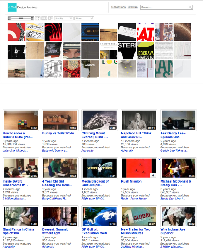
AIGA design archives
Figure 5-13.
YouTube
214 Chapter 5: Lists of Things
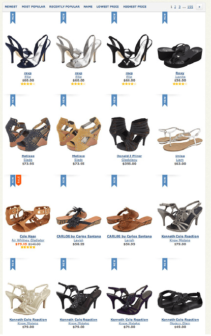
Zappos (Figure 5-14) and Hanna Andersson (Figure 5-10, at the top of the pattern) dem-
onstrate nicely designed
Thumbnail Grids for product galleries. Uniformity is beautiful
here—the similarities and differences between products show up with stunning clarity,
and a strong visual rhythm exists on the page.
Figure 5-14.
Zappos
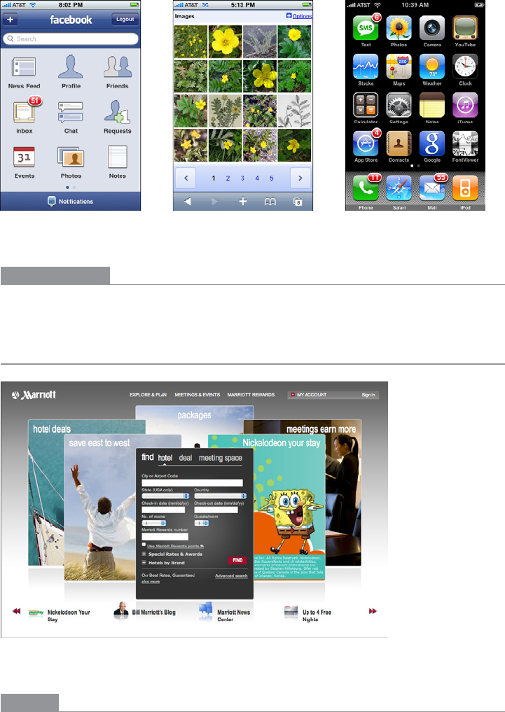
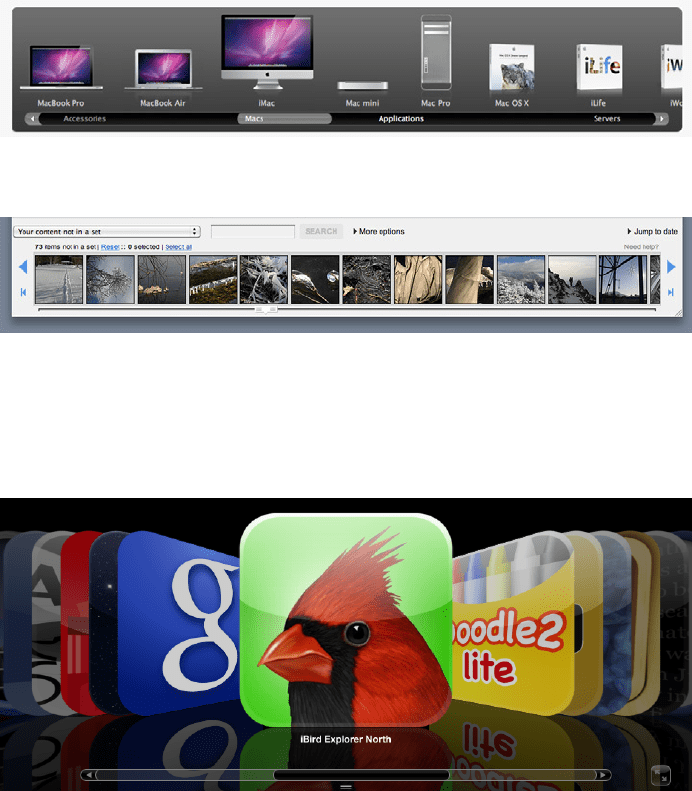
Mobile devices need Thumbnail Grids in many contexts: to show applications, features, and
images themselves. Note the relative sizes of the thumbnails in Figure 5-15; the Google
Images and iPhone home screen examples are just big enough to be touched easily by
human fingertips. The Facebook example is more relaxed, with more space around each
item.
The Patterns 215
Figure 5-15.
Thumbnail Grids on the iPhone: Facebook, Google Images, and the home screen
In other libraries
http://ui-patterns.com/patterns/Thumbnail
Carousel
Figure 5-16.
Marriott
What
Arrange a list of visually interesting items into a horizontal strip or arc, and let the user
scroll or swipe the image thumbnails back and forth to view them. Enlarge the center
item, if appropriate.

216 Chapter 5: Lists of Things
Use when
The list items have visual representations that uniquely identify them: images, logos,
screen captures, reduced photos, and so forth. These tend to be similar in size and style.
The list is flat (i.e., not divided into categories or containers).
You want to show a little bit of metadata (information about the item) with each one, such
as its name and date, but you don’t need to show a lot of that—the picture should take up
most of the space devoted to the item.
Each item is potentially of interest. Users will browse the items casually; they won’t nor-
mally search for a specific item, or need to get an overall look at the entire list at once.
If someone does look for a specific item, he won’t mind moving past many items before
finding the one he’s looking for. You may be able to order the items with the most interest-
ing ones first, or in chronological order.
You don’t have enough vertical space for a
Thumbnail Grid, and you may not have a lot of
horizontal space either, but you need to make this list look interesting and attractive.
Why
A Carousel offers an engaging interface for browsing visual items, encouraging the user
to inspect the items that are in view and to see what’s next. A user can’t easily jump to a
certain point deep in the list, so he has to scroll through everything—this pattern thus
encourages browsing and serendipity.
Carousels are compact vertically, so they may be a better solution than a Thumbnail Grid for
a small space. Horizontally, they can be either compact or spread out.
If a particular implementation focuses attention on a central item or selection, such as by
enlarging it, this pattern delivers “focus plus context”—users get a detailed view of one
item, while also seeing the ones immediately around it. See Chapter 7 for more discussion
of this principle.
How
First, create thumbnails for each item shown in the Carousel. See the Thumbnail Grid pat-
tern for issues related to thumbnail size and proportion (keeping in mind that
Carousels
impose even stricter restraints—thumbnails of different size or aspect ratio tend to look
more awkward in
Carousels than in Thumbnail Grids). Place the text metadata close to the
thumbnail, but in small print in order to maintain the thumbnail’s visual prominence.
In a horizontal scrolling widget, arrange the thumbnails horizontally, either randomly or
in an order that makes obvious sense to the user (such as by date). Show a small number
of them—fewer than 10—and hide the rest on either side. Put large arrows on the left and
right for paging through the
Carousel; each click on an arrow should move more than one
item. Animate this scrolling for extra visual interest.
The Patterns 217
If users will want to move quickly through a long list, as though they are looking for some-
thing in particular, put a scrollbar below the
Carousel in addition to the arrows. You may
find that users do this a lot; if so, consider restructuring the list as a more conventional
vertical list, and add a “find” capability.
You may choose to enlarge the central item in the
Carousel to draw attention to it. This
gives the
Carousel single-selection semantics—the enlarged item is clearly the selected
one, and you can then do dynamic things based on that selection, such as showing text
details about it, or offering video controls if the items are video thumbnails.
Some
Carousels are straight; some are curved or circular. These usually use the trick of a
3D perspective, in which items shrink and are partially obscured as they drift farther away
from the center.
In the mobile design space, the
Filmstrip pattern (Chapter 10) is a variant on a Carousel.
Only one item at a time is shown on the small screen, and the user swipes or scrolls back
and forth to see other items.
Examples
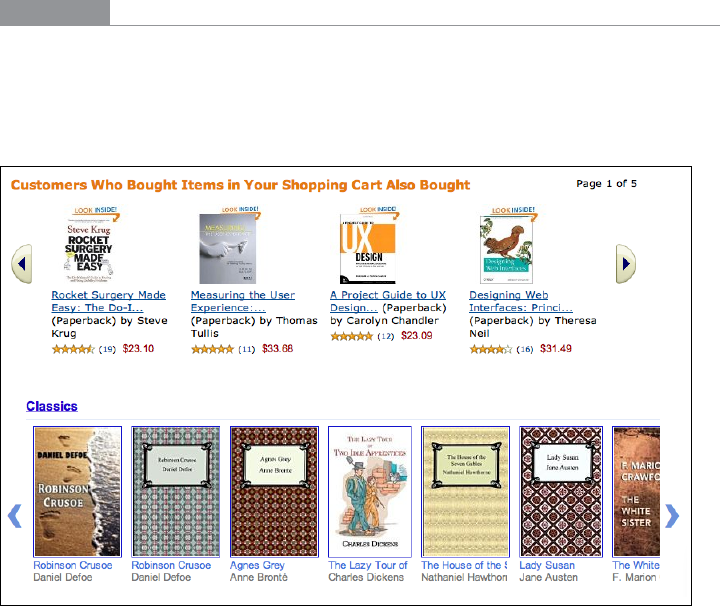
Many websites use a basic, linear Carousel for browsing products. Amazon and Google
Books show book covers this way (see Figure 5-17); note the different amounts of text
metadata and the implications for design. How much information should be provided
with each book? How tightly packed should the book covers be?
Figure 5-17.
Amazon and Google Books
218 Chapter 5: Lists of Things
Apple and Flickr (Figures 5-18 and 5-19) provide horizontal scrollbars along with their
Carousels. These may contain a lot of items, so a scrollbar is needed for fast progress
through them. Note that Apple’s
Carousel uses an Annotated Scrollbar (Chapter 3) to help
users find product categories. The horizontal aspect of this list makes for a graceful pre-
sentation of the product names, but it wouldn’t scale much beyond a small handful of
categories—it’s quite unusual to present a categorized list in a
Carousel. Flat lists usually
work better.
Figure 5-18.
Apple product carousel
Figure 5-19.
Flickr organizational tools
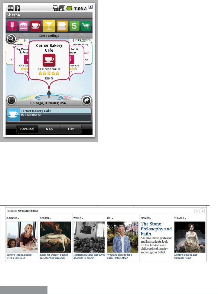
Cover Flow (Figure 5-20) is essentially a media Carousel that enlarges the central, selected
item. Compare it to a curved
Carousel in an Android app (Figure 5-21); these are similar
in behavior, but very different in visual styling.
Figure 5-20.
Cover Flow in iTunes
The Patterns 219
Figure 5-21.
Sherpa for Android (image courtesy of http://www.androidtapp.com/sherpa-discover-your-
world/sherpa-nearest-dining-on-carousel/)
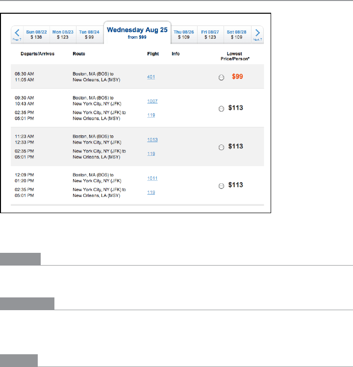
The New York Times presents some of its feature articles in a Carousel (see Figure 5-22).
These are the kinds of articles that may tempt a user to look at each one and browse
slowly; it wouldn’t work for all of the Times’ countless daily articles, since people mostly
skim the headlines and cherry-pick articles of interest. Features are different, however.
Figure 5-22.
New York Times feature articles
In other libraries
http://developer.yahoo.com/ypatterns/selection/carousel.html
http://ui-patterns.com/patterns/Carousel
http://welie.com/patterns/showPattern.php?patternID=carrousel
220 Chapter 5: Lists of Things
Row Striping
Figure 5-23.
JetBlue
What
Use two similar shades to alternately color the backgrounds of the table rows.
Use when
Your interface presents data in a large multicolumn table, but the table’s rows are difficult
to separate visually. Users will need to look up specific data items in the table.
Why
Blocks of gentle color define and delineate the information contained inside them, even
when you can’t use whitespace to separate the data into “chunks.” Cartographers and
graphic designers have known this color-block technique for ages. (Remember that col-
ored backgrounds are also effective for defining page sections and articulating a visual
hierarchy. See Chapter 4 for more information.)

The Patterns 221
When someone looks at a large data table with a single background color, she will tend to
see the columns as coherent objects due to proximity—the table entries in a column are
closer to one another than they are to the other entries in their rows. But you want the
viewer to read the table “row-wise” as well as column-wise. By coloring adjacent rows dif-
ferently, you turn the rows into coherent visual objects, too. (This takes advantage of the
Gestalt principles of continuity and closure; again, see Chapter 4.)
Specifically,
Row Striping helps a user:
• Follow a row from left to right and back again, without confusing the rows
• See the “footprint” of the table itself, as separate from its containing page
However,
Row Striping introduces more visual noise into the page. Some users in some
contexts may find that it slows them down or that it makes the table harder to use.
Two studies on
Row Striping, also known as zebra striping, indicate that it has a small but
noticeable benefit for lookup speed and accuracy—under some conditions. The tables for
which lookup improved were fairly large, with many rows and several widely spaced col-
umns; a smaller table showed no benefit one way or the other. The researchers also noted
that when asked about it, users said they preferred
Row Striping! See the two articles at
the following URLs for discussions of these studies, and for links to the original research
performed by Formulate Information Design:
http://www.alistapart.com/articles/zebrastripingdoesithelp/
http://www.alistapart.com/articles/zebrastripingmoredataforthecase/
How
Pick a pair of quiet, low-saturation colors that are similar in value but not identical. (In
other words, one needs to be a wee bit darker than the other.) Good choices are light blue
and white, beige and white, or two similar shades of gray—assuming the text on top of
them is dark. Generally, one of the colors is your page’s background color.
Alternate the color from row to row. If the rows are thin, you could also experiment with
grouping the rows—the first three are white, the next three are blue, and so on—but the
research described a few paragraphs up found that users preferred single-line striping.
222 Chapter 5: Lists of Things
This pattern virtually eliminates the need for horizontal lines between the rows (though
you could use them if they are very thin and inconspicuous). If your columns are aligned
with one another, you don’t need vertical lines between them, nor a heavy border around
the table—the viewer’s sense of visual closure will kick in, and the row colors will define
the edges of the table for you. However, if row striping isn’t working well for your users,
you might try very thin horizontal lines instead, since they have a similar effect of forcing
the eye to see horizontal groups instead of vertical groups.
Examples
The JetBlue example at the top of the pattern (Figure 5-23) shows several lines per row.
The data itself is multiline and carefully formatted; some row separation other than
whitespace was needed here. Lightweight horizontal rules may have worked too, but
Row
Striping
makes coherent shapes out of the rows.
Single-row striping is more common. iTunes uses it to good effect, as shown in Figure 5-24.
Figure 5-24.
iTunes
The Excel ledger spreadsheet shown in Figure 5-25 permits the user to change gridline
styles, and
Row Striping is among the possibilities. This sheet makes it fairly easy to follow
the lines from left to right and back again.