Tidwell J. Designing Interfaces (Second Edition)
Подождите немного. Документ загружается.

Pushing the Boundaries 243
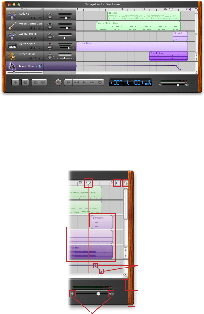
Figure 6-1.
GarageBand
But look harder at the far right of the window, between the red line and the wood-grain
edge. To your eyes, what pieces of the interface look clickable? Why? If you want, you can
look ahead to Figure 6-2 and cheat. (And if you already know GarageBand, please bear
with me.)
Draggable along the horizontal axis.
When you click “play,” the music starts
where the red bar is.
Also draggable along the horizontal axis.
This purple arrow defines the end of the song.
Brings up a menu of values for the time line grid:
1/2 note, 1/4 note, 1/8 note, etc.
Selectable “regions” of each track, which can
also be multiple-selected, dragged, and moved
from row to row.
Movable “spheres” that act like control points
for the volume: up to make it louder, down
to make it softer, side to side to adjust the
slope of the line.
The “playhead lock” button, whatever that does.
Resizes the window when dragged.
Click to move the slider all the
way down or all the way up.
Figure 6-2.
GarageBand actions
244 Chapter 6: Doing Things: Actions and Commands
Figure 6-2 shows which objects on the interface perform actions. You clearly couldn’t
have known what they all do, since this book doesn’t give you the benefit of tool tips, roll-
over cursors, or experimentation. But did you figure out that some of these objects could
be clicked or manipulated? I’m guessing you did.
How? You probably know that interfaces that look like this offer a lot of functionality
through direct manipulation, so you have good grounds for assuming that every interest-
ing visual feature does something. You might know that sliders, such as the volume slider
at the bottom, sometimes have “jump buttons” at the ends—and you might have recog-
nized the volume slider itself from iTunes. You might guess that tiny squarish icons tend
to be buttons, often for presentation-related actions; Word and PowerPoint use a lot of
them. You might have seen a vertical line topped with an inverted triangle in some other
context—maybe movable, maybe not. But didn’t this triangle look like it was movable?
When an object looks like it might let you do something, such as click it or drag it, we
say it “affords” performing that action. Traditional raised-edge buttons afford pushing; a
slider thumb affords dragging; a text field affords typing; a blue underlined word affords
clicking. And anything that reacts to the mouse cursor affords something, although you
can’t necessarily tell what!
Figure 6-2 points out the affordances in the GarageBand interface. This is an important
concept. In software interfaces, the user doesn’t get many sensory clues about what can be
tweaked or handled: visuals give most of the clues, and mouse rollovers do the rest. Use
them to communicate affordances well.
Here’s some specific design advice:
• Follow conventions whenever possible. Reuse UI concepts and controls that people
already know, such as the volume sliders in the example.
• Use pseudo-3D shading and drop shadows to make things look “raised.”
• When the mouse pointer hovers over items that can be clicked or dragged, turn the
pointer into something different, such as a finger or a hand.
• Use tool tips, or some other descriptive text, to tell the user what the objects under
the mouse pointer do. If you don’t need them, that’s great—you have a self-describing
design—but many users expect tool tips anyway.
The Patterns 245
The Patterns
The first patterns in this chapter talk about three of the many ways to present actions.
When you find yourself reflexively putting actions on an application’s menu bar or pop-
up menu, stop for a moment and consider using one of these instead.
1.
Button Groups
2. Hover Tools
3. Action Panel
Prominent “Done” Button
improves the single most important button on many web pages
and dialog boxes.
Smart Menu Items is a technique for improving some of the actions you
put on menus; this is a very general pattern, useful for many kinds of menus (or buttons
or links).
4.
Prominent “Done” Button
5. Smart Menu Items
We’d like it if all the user-initiated actions in an application could be completed instantly,
but that’s not reality.
Preview shows the user what’s going to happen before a time-
consuming action is committed.
Progress Indicator is a well-known technique for letting
the user know what’s going on while an operation proceeds, while
Cancelability refers to a
UI’s ability to stop an operation when the user asks it to.
6.
Preview
7. Progress Indicator
8. Cancelability
The last three patterns—Multi-Level Undo, Command History, and Macros—all deal with
sequences of actions. These three interlocking patterns are most useful in complex ap-
plications, especially those whose users are committed to learning the software well and
using it extensively. (That’s why the examples come from complex software such as Linux,
Photoshop, Word, and MATLAB.) Be warned that these patterns are not easy to imple-
ment. They require the application to model a user’s actions as discrete, describable, and
sometimes reversible operations, and such a model is very hard to retrofit into an ex-
isting software architecture. The Command pattern in the classic book Design Patterns
(Addison-Wesley Professional) is one good place to look for implementation advice.
And that’s as close as this book gets to implementation details. We’ll now return to the
realm of interface design.
9.
Multi-Level Undo
10. Command History
11. Macros
246 Chapter 6: Doing Things: Actions and Commands
Button Groups
1
3
4
2
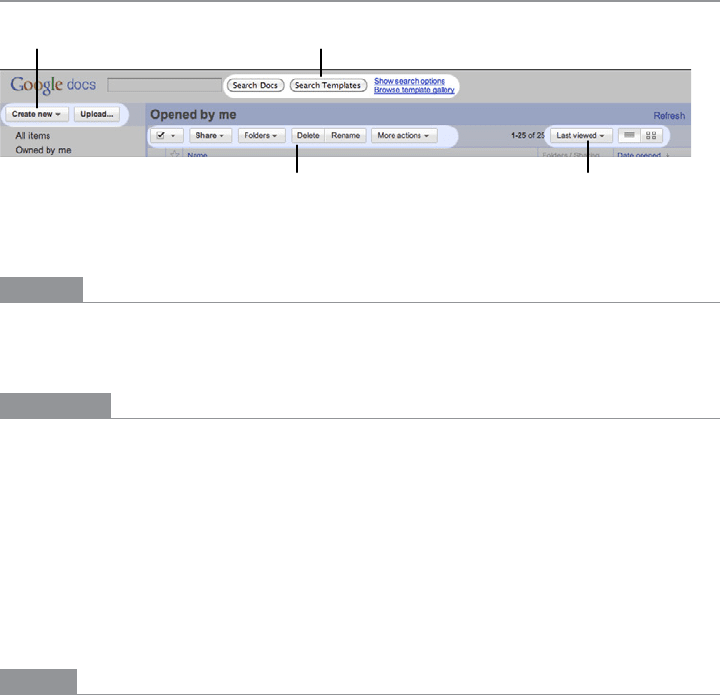
Figure 6-3.
Google Docs main screen header, with four button groups highlighted
What
Present related actions as a small cluster of buttons, aligned and with similar graphic
treatments. Create multiple groups if there are more than three or four actions.
Use when
There are many actions to show on the interface. You want to make sure they are all visible
all the time, but you need to visually organize them so that they’re not chaotic or hard to
sort out. Some of these actions are similar to each other—they have similar or comple-
mentary effects, for instance, or they operate with similar semantics—and they can thus
be assembled into groups of two to five.
Button Groups can be used for app-wide operations (such as Open or Preferences), item-
specific actions (Save, Edit, Delete), or any other scope. Actions with different scope
ought not to be grouped together, however.
Why
Button Groups help make an interface self-describing. Well-defined clusters of buttons are
easy to pick out of a complex layout, and because they’re so visible, they instantly com-
municate the availability of those actions. They announce, “These are the actions you’ve
got to work with in this context.”
The Gestalt principles discussed in Chapter 4 apply here. Proximity hints at relatedness;
if the buttons are all together, they probably do similar things. So does visual similarity;
if you make all the buttons the same dimensions, for instance, they look like they belong
together. Conversely, button groups that are separated in space—or that are different in
shape—imply unrelated groups of actions.

The Patterns 247
Proper sizing and alignment help the Button Group form a larger composite visual shape
(this is the principle of closure).
How
Make a group out of the buttons in question. Label them with short but unambiguous
verbs or verb phrases, and don’t use jargon unless users expect it. Do not mix buttons that
affect different things or have different scope; separate them into different groups.
All buttons in the group should have the same graphic treatment: borders, color, height
and/or width, icon style, dynamic effects, and so on. You can line them up in a single col-
umn, or arrange them in a single row if they aren’t too wide.
(However, treat them differently if one action is a “primary” action, such as a Submit but-
ton on a web form. A primary action is an action that you want most users to take, or that
most users will expect to take. Give that button a stronger graphic treatment to make it
stand out among the others.)
If all the buttons in a group act on the same object or objects, put the
Button Group to
the left or right of those objects. You could put them below the objects instead, but users
often have a “blind spot” at the bottom of complex UI elements such as multicolumn lists
and trees—the buttons may not be seen at all. To make them more visible, keep the rest
of the interface clean and uncluttered. If you have a specific design that works better with
the buttons at the bottom, usability-test it and find out. If there are enough buttons and
if they have icons, you could also put them on a toolbar or toolbar-like strip at the top of
the page.
By using
Button Groups, you’re trying to avoid a crowded mess of buttons and links, or
perhaps a long and plodding list of actions with no apparent differentiation at all. With
this pattern, you create a miniature visual hierarchy of actions: the user can see at a glance
what’s related and what’s important.
Examples
Standard tools for WYSIWYG editors are often grouped by function. The two examples
shown in Figure 6-4, from Word and Flash Builder, show some common tools in group-
ings that actually aid recognition.
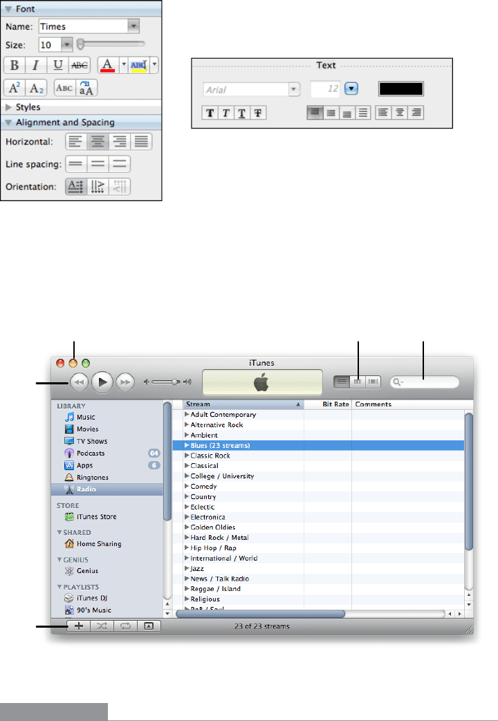
As shown in Figure 6-5, iTunes places
Button Groups at each of the four corners of the
main window, plus the standard title bar buttons (such as close and minimize). When the
user browses the Music Store, even more actions are contained in the web-page-like third
panel (not shown)—links constitute many of the actions there—and a button for each
song in the table.
248 Chapter 6: Doing Things: Actions and Commands
Figure 6-4.
Microsoft Word and Adobe Flash Builder
There are no fewer than 13 buttons on this interface, and I’m not even counting the four
scrollbar buttons or the three clickable table headers. There’s a lot to do here, but thanks to
careful visual and semantic organization, the interface is never overwhelming.
Alternative
views
Standard title
bar buttons
Player
controls
Playlist
actions
Search
Figure 6-5.
iTunes
In other libraries
http://quince.infragistics.com/Patterns/Button%20Groups.aspx
The Patterns 249
Hover Tools
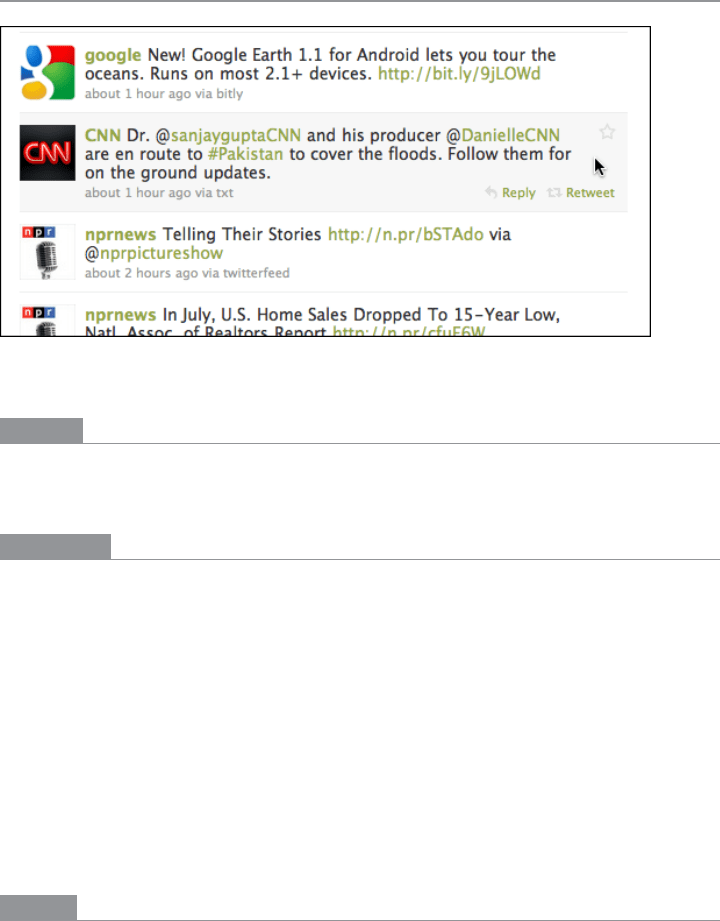
Figure 6-6.
Twitter
What
Place buttons and other actions next to the items they act upon, but hide them until the
user hovers the pointer over them.
Use when
There are many actions to show on the interface. You want a clean, uncluttered look most
of the time, but you have to put those actions somewhere, preferably on or next to the
items they act upon. You’ve already allocated the space to show those actions, but they just
make things too crowded and busy if they’re all visible all the time.
Hover Tools are commonly used in list interfaces, in which many small items—photos,
messages, search results, and so on—are displayed in a column or list. The user can per-
form a number of actions on each one.
You don’t intend the interface to be used with fingertips, as with a touchpad device—
you’re certain that almost all users will interact with your UI via a mouse. (If your UI is a
web page, consider carefully whether it should behave differently on a touchpad versus a
desktop or laptop platform.)
Why
Hover Tools reveal themselves exactly when and where they’re needed. They stay out of
sight otherwise, allowing the UI to remain clean and uncluttered. They appear when the
user requests them, and by appearing in response to the user’s gesture, they draw attention
to themselves.

250 Chapter 6: Doing Things: Actions and Commands
Pop-up (right-click) menus, pull-down menus, and menu bars also meet these criteria,
but they are not discoverable enough for some kinds of interfaces—they’re best used on
traditional desktop applications, not web-based interfaces. (And sometimes they’re not
the best choice on traditional applications, either.)
Hover Tools are more easily discoverable
because the gesture that produces them—a rollover—is so simple and natural.
Unfortunately,
Hover Tools currently don’t work so well on touch devices. A rollover with
a mouse is an easy, natural act that leads to discovery; but on a touchpad, the only way a
user can see the
Hover Tools is if she actually touches the hover area, which is a more com-
mitting act. It doesn’t help much with discovery at all.
How
Design each item or hover area with enough space to show all the available actions. Hide
the ones that clutter the interface too much, and show them only when the user hovers the
mouse pointer over the area in question.
Respond quickly to the hover, and don’t use an
Animated Transition—simply show the
tools immediately, and hide them immediately when the user moves the pointer away.
Likewise, never enlarge the hover area or otherwise rearrange the page when the user
hovers the pointer over it. The idea is to make the hover action as lightweight and quick
as possible so that the user can easily reach the necessary tools.
If the hover area is an item in a list, you may wish to highlight the item by changing its
background color or drawing a border around it. The act of showing tools will draw the
user’s eyes to that area, but highlighting the item will do so even more.
Consider
Hover Tools as an alternative to a drop-down menu, a pop-up menu, an Action
Panel
, a List Inlay with buttons in it, or a set of buttons repeated in each item.
Examples
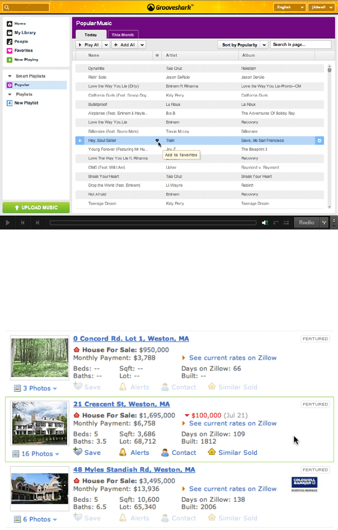
Grooveshark uses Hover Tools to show per-song actions (see Figure 6-7). The alternatives
would have been to show all the tools all the time—busy, but not terrible—or to move the
tools to the top toolbar, where they would only operate on songs selected in the list. That’s
rather complicated for the designer, the programmer, and especially the user: she would
have to figure out how to select a song, and then make the spatial and logical connection
between the selected song(s) and the tools at the top of the table. In contrast, the
Hover
Tools
are right there and self-explanatory.
The Patterns 251
Figure 6-7.
Grooveshark
The benefit of the Hover Tools pattern is a cleaner interface, but one drawback is that the
user can’t immediately see the available actions. Zillow’s search results page, shown in
Figure 6-8, shows one possible compromise: “gray out” the tools normally, and show them
more strongly when the mouse hovers over the item.
Figure 6-8.
Zillow
252 Chapter 6: Doing Things: Actions and Commands
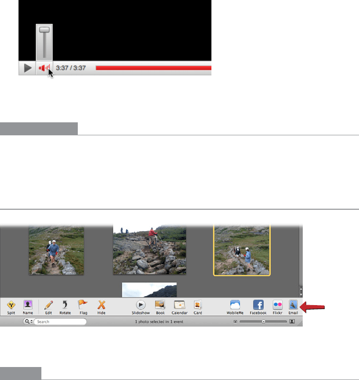
Some implementations of Hover Tools use a lightweight overlay to show buttons or con-
trols such as sliders. This is similar to the
Dropdown Chooser pattern in Chapter 8, the
only difference being your intent to use it for actions and not settings. In Figure 6-9, the
YouTube player uses a hover to show the volume slider.
Figure 6-9.
YouTube player
In other libraries
http://patternry.com/p=hover-reveal-tools/
http://www.flickr.com/photos/designingwebinterfaces/tags/hoverrevealtools/
Action Panel
Figure 6-10.
iPhoto
What
Instead of using menus, present a group of related actions on a UI panel that’s richly or-
ganized and always visible.