Tidwell J. Designing Interfaces (Second Edition)
Подождите немного. Документ загружается.

The Patterns 233
Why
By spreading the hierarchy out across several scrolled lists, you show more of it at once. It’s
that simple. Visibility is helpful when you’re dealing with complex information structures.
Also, laying the items out in lists organizes them nicely—a user can more easily keep track
of what level he’s dealing with than he could with an outline format, since the hierarchy
levels are in nice, predictable, fixed-position lists.
How
Put the first level of the hierarchy in the leftmost list (which should use single-selection
semantics). When the user selects an item in it, show that item’s children in the next list
to the right. Do the same with the child items in this second list; show its selected item’s
children in the third list. And so on.
Once the user reaches items with no children—the “leaf” items, as opposed to “branches”—
you might want to show the details of the last-selected item at the far right. An image file
typically displays a thumbnail; you might instead offer a UI for editing an item, reading
its content, or whatever is appropriate for your particular application.
A nice thing about this pattern is that you can easily associate buttons with each list: delete
the current item, move up, move down, and so on. Many toolkits will let you do this in
tree controls via direct manipulation, but for those that don’t have built-in tree controls,
this is a viable alternative.
Examples
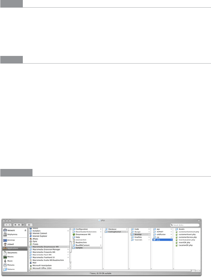
The Mac OS Finder screenshot shown in Figure 5-35 is an extreme example, with seven
levels. But it shows that the pattern scales well, letting the user drill down into deep file-
system hierarchies while staying oriented. (Warning: this can be confusing for people who
aren’t familiar with this pattern and the concept of a hierarchy.)
Figure 5-35.
Mac OS Finder
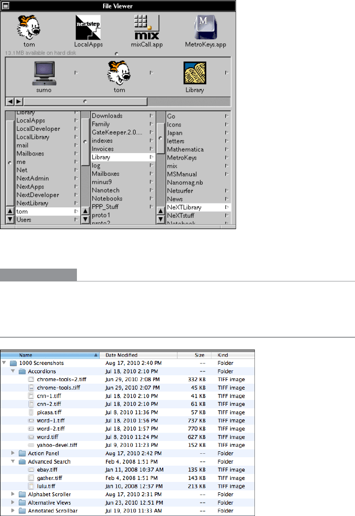
NeXTSTEP originally used this technique in its own File Viewer, circa 1990 or so. The
example in Figure 5-36 is from http://www120.pair.com/mccarthy/nextstep/intro.htmld/
Workspace.html.
234 Chapter 5: Lists of Things
Figure 5-36.
NeXTSTEP File Viewer
In other libraries
http://quince.infragistics.com/Patterns/Cascading%20Lists.aspx
Tree Table
Figure 5-37.
Mac OS Finder
The Patterns 235
What
Put item fields in table-like columns, but use an indented outline structure in the first
column to illustrate the tree structure.
Use when
The items in a list are highly structured, with specific attributes that are of interest to
users. You can show them in a multicolumn list or table. But the items are primarily orga-
nized as a hierarchy, so you also want a tree to display them most of the time.
Your users are relatively sophisticated with respect to interface usage; this is not an easy
pattern for naive computer users to understand (and the same can be said about most
hierarchical views, including trees and
Cascading Lists).
Why
Combining the two data-viewing approaches into one view gives you the best of both
worlds, at the cost of some visual and programming complexity. You can show the hierar-
chy of items, plus a matrix of additional data or item attributes, in one unified structure.
How
The examples show what you need to do: put the tree (really an outline) in the first col-
umn, and the item attributes in the subsequent columns. The rows—one item per row—
are usually selectable. Naturally, this can be combined with
Sortable Tables to produce a
more browsable, interactive structure. Sorting on the columns disrupts the tree ordering,
so you’ll need to provide an extra button or some other affordance to re-sort the table into
the order required by the tree.
This technique seems to have found a home in email clients and news readers, where
threads of discussion form tree-like structures.
Examples
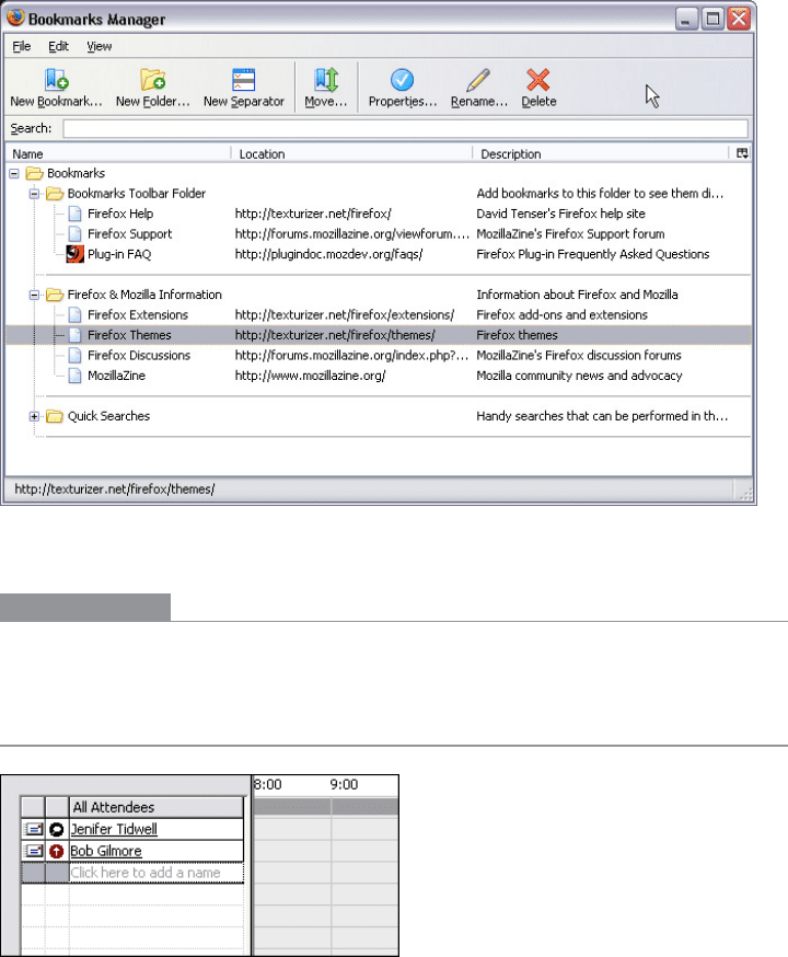
The Firefox browser once used a distinctive-looking Tree Table in one of its dialog boxes.
The separators—horizontal lines—help to visually group the items in different categories,
which isn’t a bad idea at all (see Figure 5-38).
236 Chapter 5: Lists of Things
Figure 5-38.
Firefox Bookmarks Manager, from an early version of the browser
In other libraries
http://quince.infragistics.com/Patterns/Tree-Table.aspx
New-Item Row
Figure 5-39.
Microsoft Outlook
The Patterns 237
What
Use the last or first row in the list or table to create a new item in place.
Use when
The interface contains a table, list, tree view, or any other vertical presentation of a set of
items (one item per row). At some point, the user needs to add new items to it. But you
don’t have a lot of room to spare on the UI for extra buttons or options, and you want to
make item creation very efficient and easy for the user.
Why
By letting the user type directly into the end (or the beginning) of the table, you put the
act of creation into the same place where the item will ultimately “live.” It’s conceptually
more coherent than putting it in some other part of the UI. Also, it makes the interface
more elegant than having an entirely different UI for item creation—it uses less screen
real estate, it reduces the amount of navigation that needs to be done (thus eliminating a
“jump” to another window), and it’s less work for your users.
How
Give the user an easy and obvious way to initiate a new object from the first empty table
row. A single mouse click in that row might start editing, for instance, or the row might
contain a “New Whatever” pushbutton, or it might contain a dummy item as shown at the
top of the pattern in Figure 5-39.
At that point, the UI should create the new item and put it in that row. Each column in
the table (if it’s a multicolumn table) should then be editable, thus letting the user set up
the values of that item. The cells could have text fields in them, or drop-down lists, or
whatever else is necessary to set the values quickly and precisely. As with any form-like
user input,
Good Defaults (Chapter 8) help save the user work by prefilling those values;
the user doesn’t have to edit every column.
There are still some loose ends to clean up, though. What happens if the user abandons the
new item before finishing? You can establish a valid item right from the beginning—if the
user abandons the edits at any time, the item exists until the user goes back and deletes it.
Again,
Good Defaults help by prefilling valid values if there are multiple fields.
Depending on how it’s implemented, this pattern can resemble
Input Prompt (Chapter 8).
In both cases, a dummy value is set up for the user to edit into a real value, and that
dummy value is worded as a “prompt” that shows the user what to do.
Do wnl oa d fr om W ow! e Bo ok < ww w.w ow eb oo k. co m>
Examples
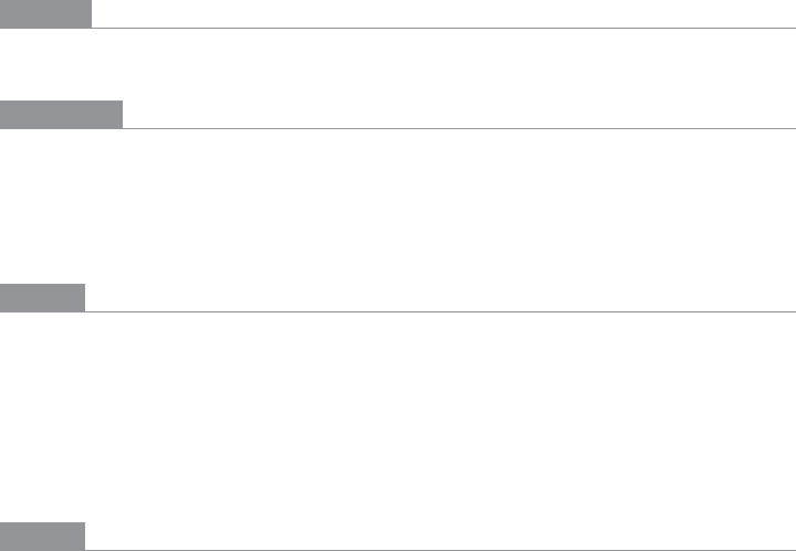
Excel’s built-in spreadsheet templates, such as the one shown in Figure 5-40 for budget-
ing, mark the
New-Item Row very clearly by putting a blue box around the entire row. The
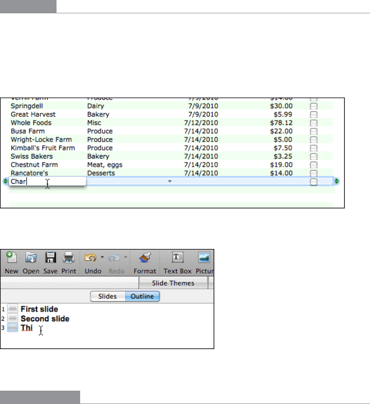
PowerPoint outline view shown in Figure 5-41 affords creation of new slides by typing
into the bottom row, but the interface is subtler and hard to notice. (I went looking for this
feature before I found it; I never knew beforehand that it existed.)
Figure 5-40.
New entry in an Excel ledger
Figure 5-41.
New slide in a PowerPoint slideshow
In other libraries
http://quince.infragistics.com/Patterns/New-Item%20Row.aspx
http://www.welie.com/patterns/showPattern.php?patternID=list-entry-view

Chapter 6
Doing Things: Actions and Commands
This chapter is devoted to the “verbs” in the interface. We’ve spent a lot of pages talking
about overall structure and flow, visual layout, and “nouns”—such as windows, text, links,
and static elements in pages. Chapter 7 spends even more pages on nouns, and Chapter 8
handles traditional (and a few nontraditional) controls and widgets: things that let users
supply information and set state, but that don’t actually do much.
So now let’s talk about buttons and menus.
Sounds exciting, doesn’t it? Probably not. Desktop interfaces have used menu bars as long
ago as the first Macintosh, and buttons for even longer. What we think of as “buttons” are
only a visual rendering of a physical device that long predated GUIs.
It’s true that there is a lot of history here, and there are many best practices to follow. The
standard platform style guides, such as those for Windows and Macintosh, will generally
get you pretty close to a workable UI. Most users depend upon learned conventions to
negotiate menus and find buttons, so it behooves you to follow those conventions, even
when they feel restrictive or nonsensical.
Common functionality such as cut, copy, and paste also carries lots of historical baggage—if
it could be reinvented now, it would probably work differently—but even moderately ex-
perienced desktop computer users have learned how it’s “supposed to work.” The same is
true for pop-up menus (context menus), which some users seem to look for everywhere,
and other users never think to look for at all. Drag-and-drop isn’t as bound by history,
but it absolutely has to work the way users intuitively expect it to, or the illusion of direct
manipulation is broken.
That being said, you can do many things to make your interface less dull and more usable.
Your goals should be to make the right actions available, label them well, make them easy
to find, and support sequences of actions. There are a few creative ways to do it.
240 Chapter 6: Doing Things: Actions and Commands
First, I’ll list the common ways actions are rendered to the user:
Buttons
Buttons are placed directly onto the interface, without requiring the user to perform
any action to see them, and are usually grouped semantically. (See the
Button Groups
pattern.) They’re big, readable, obvious, and extremely easy to use for even the most
inexperienced computer users. But they take up a lot of space on the interface, unlike
menu bars and pop-up menus. On landing pages, such as corporate home pages and
product startup pages, calls to action are usually represented as single, large, eye-
catching buttons—this is entirely appropriate for their purpose, which is to attract
attention and say, “Click me!”
Menu bars
Menu bars are standard on most desktop applications. They generally show an ap-
plication’s complete set of actions, organized in a mostly predictable way (such as
File, Edit, or View). Some actions operate on the entire application, and some operate
only on individually selected items. Menu bars often duplicate functionality found
in context menus and toolbars because they are accessible—screen readers can read
them, users can reach them via keyboard accelerators, and so on. (Accessibility alone
makes menu bars indispensable in many products.) Menu bars appear in some web
applications, especially productivity software, drawing programs, and other products
that emulate desktop apps.
Pop-up menus
Also known as context menus, pop-up menus are raised with a right-mouse click or
some similar gesture on panels or items. They usually list context-specific, common
actions, not all the actions that are possible on the interface. Keep them short.
Drop-down menus
Users raise these menus by clicking on a drop-down control such as a combo box.
However, drop-down controls are intended for selecting choices on a form, not for
performing actions. Avoid using them for actions.
Toolbars
The canonical toolbar is a long, thin row of iconic buttons. Often they have other
kinds of buttons or controls on them too, such as text fields or
Dropdown Choosers
(see Chapter 8). Iconic toolbars work best when the portrayed actions have obvious
visual renderings; when the actions really need to be described with words, try other
controls, such as combo boxes or buttons with text labels. Cryptic icons are a classic
source of confusion and unusability.
Links
Buttons 9don’t need borders. Thanks to the Web, everyone understands that colored
text (especially blue text) usually indicates a clickable link. In a UI area where actions
are expected but where you don’t need to draw attention or clutter the page, you can
241
use simple clickable “link” text for actions instead of buttons. When the user rolls the
mouse over the text, change the cursor and underline the text to reinforce the impres-
sion of clickability.
Action panels
These are essentially menus that the user doesn’t need to post; they’re always visible
on the main interface. They are a fine substitute for toolbars when actions are better
described verbally than visually. See the
Action Panel pattern.
Hover tools
If you \want to show two or more actions for each item on an interface but you don’t
want to clutter the page with lots of repeated buttons, you can make those buttons
invisible until the mouse hovers over the item. (This is great for mouse-driven inter-
faces, but it doesn’t work well for touch screens.) See the
Hover Tools pattern for more.
Then there are invisible actions, which don’t have any labels at all to announce what they
do. Users need to know (or guess) that they’re there, unless you put written instructions
on the UI. Therefore, they don’t help with discovery at all, since users can’t read over them
to find out what actions are possible. With buttons, links, and menus, the UI actions are
available for inspection, so users learn from those. In usability tests, I’ve seen many users
look at a new product and methodically walk down the menu bar, item by item, just to
find out what it can do.
That being said, you almost always need to use one or more of the following invisible ac-
tions. People often expect to be able to double-click on items, for example. However, the
keyboard (or the equivalent) is sometimes the only means of access for visually impaired
users and people who can’t use a mouse. In addition, the expert users of some operating
systems and applications prefer to work by typing commands into a shell and/or by using
its keyboard actions.
Double-clicking on items
Users tend to view double-clicking as either “open this item” or “do whatever the de-
fault thing is with this item,” depending on context. In a graphical editor, for instance,
double-clicking on an element often means opening a property sheet or specialized
editor for it. Double-clicking an application’s icon in most operating systems launch-
es that application. Double-clicking a piece of text might edit it in place.
Keyboard actions
Keyboard shortcuts, such as the well-known Ctrl-S to save, should be designed into
most desktop applications for accessibility and efficient use. The major UI platforms,
including Windows, Mac, and some Linux environments, each have style guides that
describe the standard shortcuts—and they’re all very similar. Additionally, menus
and controls often have underlined access keys, which let users reach those controls
without mouse-clicking or tabbing. (Press the Alt key, and then press the key corre-
sponding to the underlined letter, to invoke these actions.)
242 Chapter 6: Doing Things: Actions and Commands
Drag-and-drop
Dragging and dropping items on an interface usually means either “move this here”
or “do this to that.” In other words, someone might drag a file onto an application
icon to say, “Open this file in that application.” Or she might drag that file from one
place in a file finder to another place, thus moving or copying the item. Drag-and-
drop is context-dependent, but it almost always results in one of these two actions.
Typed commands
Command-line interfaces generally allow free-form access to all the actions in the
software system, whether it’s an operating system or an application. I consider these
kinds of actions “invisible” because most command-line interfaces (CLIs) don’t eas-
ily divulge the available commands. They’re not very discoverable, though they’re
quite powerful once you learn what’s available—much can be done with a single well-
constructed command. As such, CLIs are best for users committed to learning the
software very well.
Pushing the Boundaries
Some application idioms give you freedom to design nonstandard buttons and controls.
Visual editors, media players, applications intended mostly for experts, instant messaging,
games, and anything that’s supposed to be fun and interesting all have users who might
be curious enough to figure out how to use unusual but well-designed interface elements.
Where can you be more creative? Consider the items on the first list in the preceding sec-
tion; visible buttons and menus are easier to use than invisible actions, such as keyboard
shortcuts. Generalizing from that, actions could be:
• Clickable icons
• Clickable text that doesn’t look like a button
• Something that reacts when the mouse pointer rolls over it
• Some object that looks like it may be manipulated by the user
• Something placed on almost any piece of screen real estate
But how much creativity can you get away with before the application becomes too hard
to figure out?
For a real-life example, we’ll look at the GarageBand application, shown in Figure 6-1.
There’s a lot going on in this interface. Some objects are obviously buttons, such as the
player controls—rewind, play, fast forward, and so forth—and the scrollbar arrows. You
will find some sliders and knobs, too.