Tidwell J. Designing Interfaces (Second Edition)
Подождите немного. Документ загружается.

The Basics of Information Graphics 293
Iterative
They let a user refine the search, query, or filter until she gets the desired results.
They might also combine these operations: a user might do a search, get a screenful
of results, and then filter those results down to what she wants.
Contextual
They show results in context with surrounding data, to make it easier for a user to un-
derstand where they are in a data space. This is also true for other kinds of searches,
as it happens; the best text search facilities show the search terms embedded in sen-
tences, for instance.
Complex
They go beyond simply switching entire data sets on and off, and allow the user to
specify nuanced combinations of conditions for showing data. For instance, can this
information graphic show me all the items for which conditions X, Y, and Z are true,
but A and B are false, within the time range M–N? Such complexity lets users test
hypotheses about the data, and explore the data set in creative ways.
The Actual Data: What Are the Specific Data Values?
Several common techniques help a viewer get specific values out of an information graph-
ic. Know your audience—if they’re only interested in getting a qualitative sense of the
data, there’s no need for you to spend large amounts of time or pixels labeling every little
thing. But some actual numbers or text is usually necessary.
Since these techniques all involve text, don’t forget the graphic design principles that will
make text look good: readable fonts, appropriate font size (not too big, not too small),
proper visual separation between unrelated text items, alignment of related items, no
heavy-bordered boxes, and no unnecessary obscuring of data.
Labels
Many information graphics put labels directly on the graphic, such as town names on a
map. Labels can also identify the values of symbols on a scatter plot, bars on a bar graph,
and other things that might normally force the user to depend on axes or legends.
Labels are easier to use. They communicate data values precisely and unambiguously
(when placed correctly), and they’re located in or beside the data point of interest—no
going back and forth between the data point and a legend. The downside is that they
clutter up a graphic when overused, so be careful.
Legends
When you use color, texture, line style, symbols, or size on an information graphic
to represent values (or categories or value ranges), the legend shows the user what
represents what. You should place the legend on the same page as the graphic itself so
the user’s eyes don’t need to travel far between the data and the legend.
294 Chapter 7: Showing Complex Data: Trees, Charts, and Other Information Graphics
Axes, rulers, scales, and timelines
Whenever position represents data, as it does on plots and maps (but not on most
diagrams), these tell the user what values those positions represent. They are refer-
ence lines or curves on which reference values are marked. The user has to draw an
imaginary line from the point of interest to the axis, and maybe interpolate to find the
right number. This is more of a burden on the user than direct labeling. But labeling
clutters things when the data is dense, and many users don’t need to derive precise
values from graphics; they just want a more general sense of the values involved. For
those situations, axes are appropriate.
Datatips
This chapter describes the
Datatips pattern. Datatips, which are tool tips that show
data values when the user hovers over a point of interest, have the physical proxim-
ity advantages of labels without the clutter. They only work in interactive graphics,
though.
Data Spotlight
Like
Datatips, a data spotlight highlights data when the user hovers over a point of
interest. But instead of showing the specific point’s value, it displays a “slice” of the
data in context with the rest of the information graphic, often by dimming the rest of
the data. See the
Data Spotlight pattern.
Data brushing
A technique called data brushing lets users select a subset of the data in the informa-
tion graphic and see how that data fits into other contexts. You use this with two
or more information graphics; for instance, selecting some outliers in a scatter plot
causes those same data points to be highlighted in a table showing the same data. For
more information, see the
Data Brushing pattern in this chapter.
The Patterns
Because this book is about interactive software, most of these patterns describe ways to
interact with the data: moving through it; sorting, selecting, inserting, or changing items;
and probing for specific values or sets of values. A few of them deal only with static graph-
ics: information designers have known about
Multi-Y Graph and Small Multiples for a while
now, but they translate well to the world of software.
The Patterns 295
And don’t forget the patterns elsewhere in this book. From Chapter 2, recall Alternative
Views
, which can help you structure an interactive graphic. Chapter 3 offers Annotated
Scrollbar
and Animated Transition, which help users to stay oriented within large and com-
plex data spaces. If your graphic is a table, you might also use some of the patterns in
Chapter 5, such as
Row Striping, Alphabet Scroller, and Jump to Item.
The first group of patterns can be applied to most varieties of interactive graphics, regard-
less of the data’s underlying structure. (Some are harder to learn and use than others, so
don’t throw them at every data graphic you create—
Data Brushing and Local Zooming in
particular, are “power tools,” best for sophisticated computer users.) These six interactive
tools permit users to focus on certain parts of the data set while maintaining the context
of the entire graphic.
1.
Overview Plus Detail
2. Datatips
3. Data Spotlight
4. Dynamic Queries
5. Data Brushing
6. Local Zooming
The remaining patterns are ways to construct complex data graphics for multidimension-
al data—data that has many attributes or variables. They encourage users to ask different
kinds of questions about the data, and to make different types of comparisons among data
elements.
7.
Sortable Table
8. Radial Table
9. Multi-Y Graph
10. Small Multiples
11. Treemap
296 Chapter 7: Showing Complex Data: Trees, Charts, and Other Information Graphics
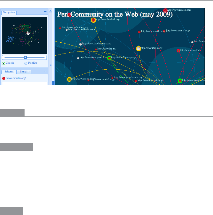
Overview Plus Detail
Figure 7-11.
Perl community diagram (http://labs.linkfluence.net/fpw09/map/)
What
Place an overview of the graphic next to a zoomed “detail view.” As the user drags a view-
port around the overview, show that part of the graphic in the detail view.
Use when
You’re showing a large data set in a large information graphic—especially an image or a
map. You want users to stay oriented with respect to the “big picture,” but you also want
them to zoom down into the fine details. Users will browse through the data, inspect
small areas, or search for points of interest. High-level overviews are necessary for finding
those points of interest, but users don’t need to see all available detail for all data points at
once—zooming in on a small piece is sufficient for getting fine detail.
Why
It’s an age-old way of dealing with complexity: present a high-level view of what’s going on
and let the users zoom from that view into the details as they need to, keeping both levels
visible on the same page for quick iteration.
Edward Tufte uses the terms micro reading and macro reading to describe a similar con-
cept for printed maps, diagrams, and other static information graphics. The user has the
large structure in front of her at all times, while being able to peer into the small details at
will: “The pace of visualization is condensed, slowed, and personalized.” Similarly, users
of
Overview Plus Detail can scroll methodically through the content, jump around, com-
pare, contrast, move quickly, or move slowly.
Finally, the overview can serve as a “You are here” sign. A user can tell at a glance where
she is in the context of the whole data set by looking for the viewport on the overview.
The Patterns 297
How
Show an overview of the data set at all times. It can be an inset panel, as in the example at
the top of the pattern (see Figure 7-11 at the top of the pattern). It could also be a panel
beside the detail view, or even another window, in the case of a multiwindow application
such as Photoshop.
On that overview, place a viewport. They’re usually red boxes by convention, but they
don’t have to be—they just need to be visible at a glance, so consider the other colors used
in the overview panel. If the graphic is typically dark, make it light; if the graphic is light,
make it dark. Make the viewport draggable with the pointer, so users can grab it and slide
it around the overview.
The detail view shows a magnified “projection” of what’s inside the viewport. The two
should be synchronized. If the viewport moves, the detail view changes accordingly; if the
viewport is made smaller, the magnification should increase. Likewise, if the detail view
has scrollbars or some other panning capability, the viewport should move along with it.
The response of one to the other should be immediate, within one-tenth of a second (the
standard response time for direct manipulation).
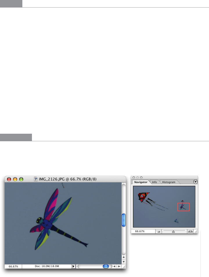
Examples
Photoshop places the image canvas (the “detail view”) on the left and the overview on the
right. The Navigator window shows the whole image, with a red box showing the size and
scroll position of the image’s canvas window (see Figure 7-12).
Figure 7-12.
Photoshop
298 Chapter 7: Showing Complex Data: Trees, Charts, and Other Information Graphics
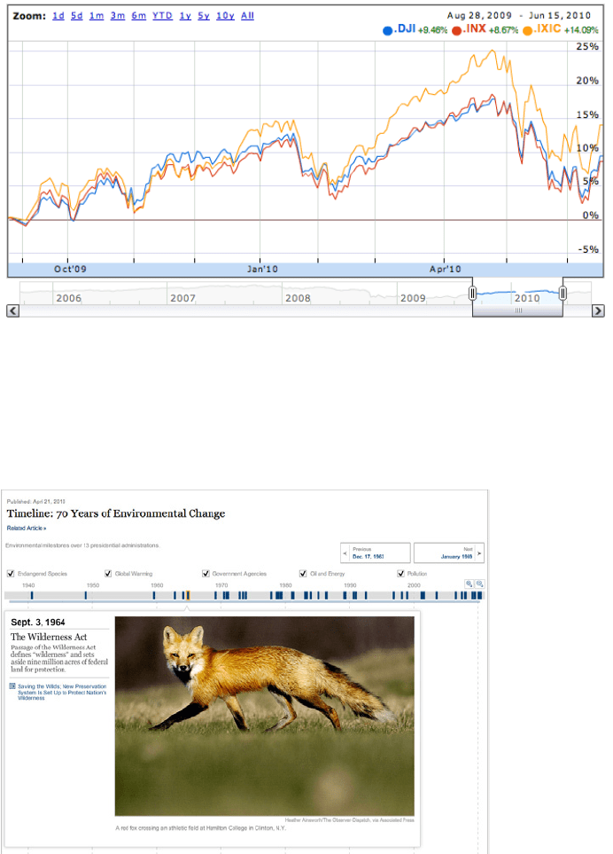
Google Finance uses an interactive overview panel to let the user adjust the time period
shown on the graph. Note the grab handles on the viewport sides and the year labels that
tell the user what timescale the overview uses (see Figure 7-13).
Figure 7-13.
Google Finance
The New York Times also uses a timeline to drive its infographic about environmental
change (see Figure 7-14). Users select events on the timeline to see details about them.
A
Pyramid navigation pattern is also at work here: the user can jump to the next item by
clicking the Next button in the upper right.
Figure 7-14.
The New York Times interactive feature (http://www.nytimes.com/interactive/2010/04/22/
science/earth/20100422_environment_timeline.html)
The Patterns 299
In other libraries
http://patternbrowser.org/code/pattern/pattern_anzeigen.php?4,226,17,0,0,247
http://quince.infragistics.com/Patterns/Overview%20Plus%20Detail.aspx
The broad concept of “overview and detail” can be found in numerous books on informa-
tion visualization, including those by Edward Tufte, mentioned earlier.
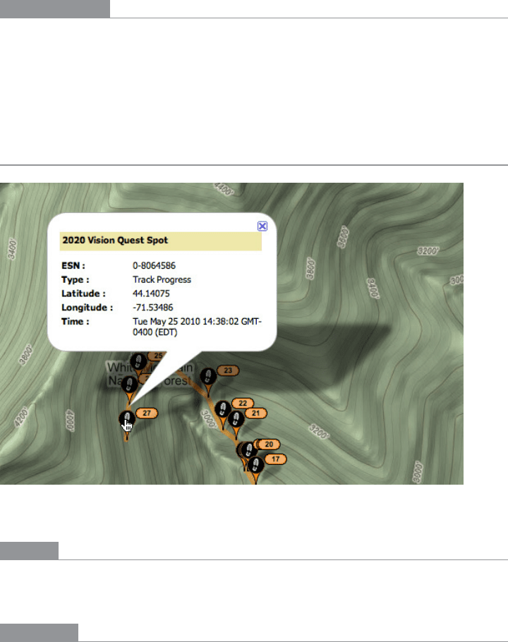
Datatips
Figure 7-15.
SPOT Adventures live map
What
As the mouse rolls over a point of interest on the graphic, put the data values for that point
into a tool tip or some other floating window.
Use when
You’re showing an overview of a data set, in almost any form. More data is “hidden be-
hind” specific points on that graphic, such as the names of streets on a map or the values
of bars in a bar chart. The user is able to “point at” places of interest with a mouse cursor
or a touch screen.

300 Chapter 7: Showing Complex Data: Trees, Charts, and Other Information Graphics
Why
Looking at specific data values is a common task in data-rich graphics. Users will want the
overview, but they might also look for particular facts that aren’t present in the overview.
Datatips let you present small, targeted chunks of context-dependent data, and they put
that data right where the user’s attention is focused: the mouse pointer. If the overview is
reasonably well organized, users will find it easy to look up what they need, and you won’t
need to put it all on the graphic.
Datatips can substitute for labels.
Also, some people might just be curious. What else is here? What can I find out?
Datatips
offer an easy, rewarding form of interactivity. They’re quick (no page loading!), they’re
lightweight, and they offer intriguing little glimpses into an otherwise invisible data set.
If you find yourself trying to use a
Datatip to show an enlargement of the data that it’s
hovering over, rather than data values, consider using the
Local Zooming pattern instead.
How
Use a tool tip–like window to show the data associated with that point. It doesn’t have to
be technically a “tool tip”—all that matters is that it appears where the pointer is, it’s lay-
ered atop the graphic, and it’s temporary. Users will get the idea pretty quickly.
Inside that window, format the data appropriately. Denser is usually better, since a tool tip
window is expected to be small; don’t let the window get so large that it obscures too much
of the graphic while it’s visible. And place it well. If there’s a way to programmatically posi-
tion it so that it covers as little content as possible, try that.
You might even want to format the
Datatip differently depending on the situation. An
interactive map might let the user toggle between seeing place names and seeing latitude/
longitude coordinates, for example. If you have a few data sets plotted as separate lines on
one graph, the
Datatips might be labeled differently for each line, or have different kinds
of data in them.
Many
Datatips offer links that the user can click on. This lets the user “drill down” into
parts of the data that may not be visible at all on the main information graphic. The
Datatip is beautifully self-describing—it offers not only information, but also a link and
instructions for drilling down.
An alternative way of dynamically showing hidden data is to reserve some panel on or
next to the graphic as a static data window. As the user rolls over various points on the
graphic, data associated with those points appears in the data window. It’s the same idea,
but using a reserved space rather than a temporary
Datatip. The user has to shift her at-
tention from the pointer to that panel, but you never have a problem with the rest of the
graphic being hidden. Furthermore, if that data window can retain its data, the user can
view it while doing something else with the mouse.
The Patterns 301
In contemporary interactive infographics, Datatips often work in conjunction with a Data
Spotlight
mechanism. The spotlight shows a slice through the data—for example, a line or
set of scattered points—while the
Datatips shows the specific data point that’s under the
mouse pointer.
Examples
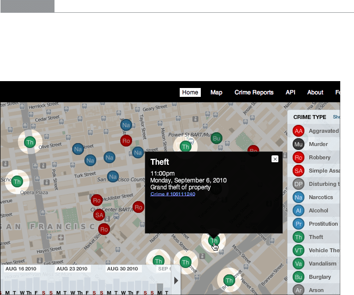
The San Francisco Crimespotting feature uses both Datatips (see Figure 7-16) and a Data
Spotlight
. All incidents of theft are highlighted on the map (via the spotlight), but a Datatip
describes the particular incident at which the user is pointing. Note also the link to the
raw data about this crime.
Figure 7-16.
San Francisco Crimespotting (http://sanfrancisco.crimespotting.org/)
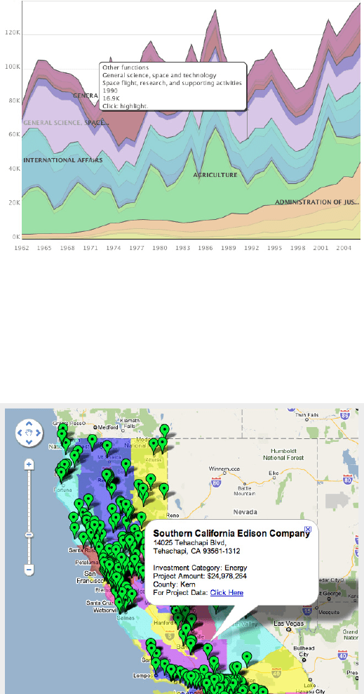
Some data sets are so dense or text-rich that they can’t easily be labeled at all. The graph
from IBM’s Many Eyes project, shown in Figure 7-17, depends upon
Datatips to commu-
nicate critical labels to the user. The
Datatip offers plenty of space to express the text and
numbers of interest—far more than labels can. It also tells the user that clicking on this
part of the graph will highlight the relevant data—again, a
Data Spotlight in action.
302 Chapter 7: Showing Complex Data: Trees, Charts, and Other Information Graphics
Figure 7-17.
Many Eyes graph (http://manyeyes.alphaworks.ibm.com/manyeyes/visualizations/us-
government-expenses-1962-2004)
So many geographic information graphics are built upon Google Maps that it deserves
a particular mention. Its API makes it fairly easy to create
Datatips specialized to the ap-
plication’s needs, such as the SPOT Adventures example at the top of the pattern (Figure
7-15) and in the example in Figure 7-18.
Figure 7-18.
California Stimulus Map (http://www.recovery.ca.gov/html/funding/stimulus%20map/
districtsmap.jsp)