Tidwell J. Designing Interfaces (Second Edition)
Подождите немного. Документ загружается.

The Patterns 323
Radial Table
Figure 7-38.
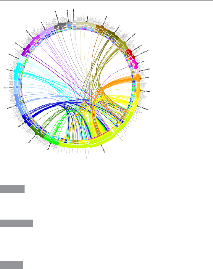
Analysis of car purchases (http://mkweb.bcgsc.ca/circos/intro/general_data/)
What
Show a table or list of items as a circle instead of a column. Draw connections among
items through the interior of the circle.
Use when
You have a long list or table of items and you need to show arbitrary relationships among
them: flows, connections, affinities, similarities, and even numerical values (encoded by
the thickness of the connection).
Why
A circular presentation enables free-form connection lines to be visualized far more eas-
ily than a line or column of elements would permit. Such connections have a shorter,
straighter distance to travel when drawn between points on an arc than points on a line,

324 Chapter 7: Showing Complex Data: Trees, Charts, and Other Information Graphics
and viewers can usually see patterns in the data more easily. (This is not always the case.
If you can, try out different types of connection visualizations to see if it’s true for your
particular data sets.)
Even when there are no connections to draw, some kinds of tabular data might be easier
to see when drawn as a circle—very long data sets with both large-scale and small-scale
features, for instance. Large-scale features might include groups and clusters, upper levels
of a hierarchy, or labels for large numbers of items. See the examples for illustrations.
From the website of Circos, a creator of radial table designs, comes this explanation:
Within the circle, the resolution varies linearly, increasing with radial position. This
makes the center of the circle ideal for compactly displaying summary statistics or
indicating points of interest (i.e. low resolution data) which the reader can then follow
outward to explore the data in greater detail (i.e. high resolution data).
*
Finally, radial information graphics can be beautiful. When drawn skillfully, these kinds
of visualizations are fresh, attractive, and engaging.
How
Bend the linear table or list into a circle and put the text labels around the outside of the
circle (if you need them). Some
Radial Tables place the x-axis on one half of the circle and
the y-axis on the other half; this is useful if your data table is trying to show connections
between two one-dimensional sets of items.
If the original table shows multiple columns of dependent data—numbers, bars, pictograms,
scatter plots, and so on—arrange those either inside or outside the circle, depending on the
visual scale and interrelatedness of these features. Large-scale, convergent features should
go inside; small-scale, detailed, divergent features should go outside, where they have
more space.
If the items in the table are categorized, you could encode those categories as groups
separated by gaps, or in different colors, or as arcs parallel to the circle (either inside or
outside the data axis).
Inside the circle, draw relationships among the items. Those relationships might take the
shape of free-form lines or arcs between table cells. The line color and thickness can en-
code additional variables about the relationships, such as source or destination (color),
and volume or strength (thickness). Sometimes these relationships need to be drawn so
thickly that they’re hard to distinguish from each other. Here are some ways to deal with
that problem:
* http://mkweb.bcgsc.ca/circos/intro/circular_approach/
The Patterns 325
• Eliminate superfluous lines; draw only what you want viewers to focus on.
• Use drawing algorithms that can cluster lines together and keep them visually
organized.
• If the graphic is interactive, use techniques such as
Data Spotlight and Dynamic Queries
to let the user see chosen subsets of the lines.
You may need to explain how to interpret a
Radial Table. These graphics can be very useful
to the patient and informed viewer, but their meaning may not be immediately apparent
to a viewer who is naive or not motivated to spend time studying the graphic carefully. If
your users are likely to move on without understanding the
Radial Table, consider simplify-
ing it or using an easier alternative rendering.
Examples
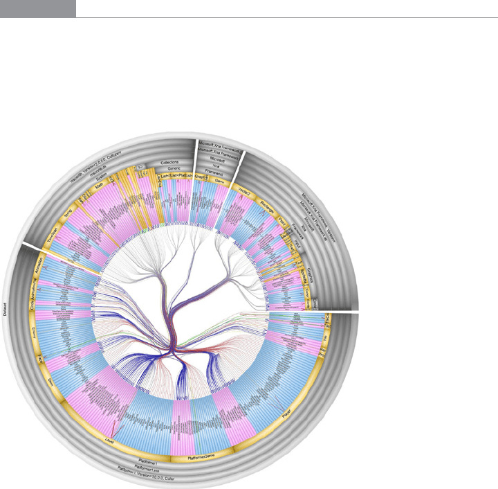
SolidSX Software Explorer is an application that draws Radial Tables of software packages.
Figure 7-39 shows dependencies, calls, and hierarchical relationships among code ele-
ments in a library. Note the containing arcs around the outside of the circle (showing the
static hierarchy), and the call-graph lines within the circle, which are carefully drawn for
clarity.
Figure 7-39.
SolidSX Software Explorer (http://www.solidsourceit.com/products/SolidSX-source-code-
dependency-analysis.html)
326 Chapter 7: Showing Complex Data: Trees, Charts, and Other Information Graphics
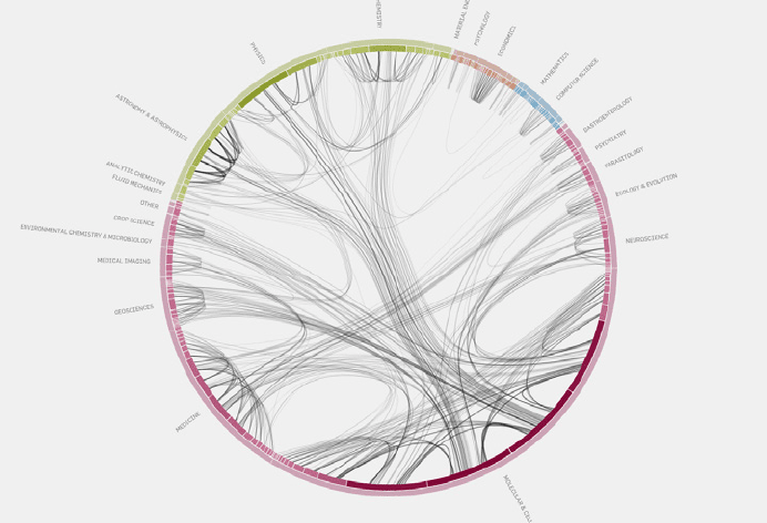
From the Eigenfactor Project and Moritz Stefaner comes an elegant diagram of citation
patterns among branches of science, shown in Figure 7-40. There are many connections,
but they are drawn so well that the viewer can follow them with some degree of success.
The diagram shows which fields of science are more insular than others (e.g., economics)
and which are better connected.
Figure 7-40.
Eigenfactor science citation patterns (http://well-formed.eigenfactor.org/radial.html)
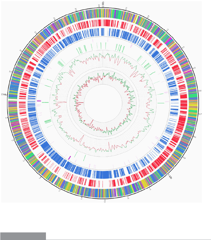
The genetics diagram in Figure 7-41 demonstrates that the curved format can be effective
in illustrating data patterns other than connections. The diagram could have been “un-
rolled” into a horizontal strip-chart format, but this version is more compact and arguably
more readable than a long, thin linear chart. Note that the line charts on the inside of the
table are a larger-scale feature than the tiny multicolored slivers around the outside of the
circle, so they are appropriately shown inside the circle.
The Patterns 327
Figure 7-41.
Genomic chart of a bacterium (http://www.plosone.org/article/info:doi/10.1371/journal.
pone.0011748)
In other libraries
http://patternbrowser.org/code/pattern/pattern_anzeigen.php?4,217,17,0,0,238
For many more examples, visit the Circos and Visual Complexity websites:
http://mkweb.bcgsc.ca/circos/
http:/visualcomplexity.com/
328 Chapter 7: Showing Complex Data: Trees, Charts, and Other Information Graphics
Multi-Y Graph
Figure 7-42.
New York Times graphic
What
Stack multiple graph lines in one panel; let them all share the same x-axis.
Use when
You present two or more graphs, usually simple line plots, bar charts, or area charts (or
any combination thereof). The data in those graphs all share the same x-axis, often a time-
line, but otherwise they describe different things, perhaps with different units or scale on
the y-axis. You want to encourage the viewer to find “vertical” relationships among the
data sets being shown—correlations, similarities, unexpected differences, and so on.
Why
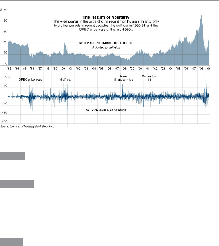
Aligning the graphs along the x-axis first tells the viewer that these data sets are relat-
ed, and then it lets her make side-by-side comparisons of the data. In Figure 7-42, the
proximity of the two graphs makes visible the correlations in the curves’ shapes; you can
see that spikes in the bottom graph generally line up with interesting features in the top
graph, and the grid lines enable precise observation. For instance, the vertical grid line
between 1990 and 1991 lines up peaks in both curves.
You could have done this by superimposing one graph upon the other. But by showing
each graph individually, with its own y-axis, you enable each graph to be viewed on its
own merits without visual interference from the other.
The Patterns 329
Also, these data sets have very different Y values: one ranges from zero to nearly 150,
while the other ranges from −30 to +20! You couldn’t put them on the same y-axis anyhow
without the first one looking like a flat line. You’d need to draw another y-axis along the
left side, and then you’d need to choose a scaling that doesn’t make the graph look too
odd. Even so, direct superimposition encourages the viewer to think that the data sets use
the same Y scale, and to compare them on that basis—“apples to apples,” instead of “apples
to oranges.” If that’s not the case, superimposing them can be misleading.
How
Stack one graph on top of the other. Use one x-axis for both, but separate the y-axes into
different vertical spaces. If the y-axes need to overlap somewhat, they can, but try to keep
the graphs from visually interfering with each other.
Sometimes you don’t need y-axes at all; maybe it’s not important to let the user find exact
values (or maybe the graph itself contains exact values, such as labeled bar charts). In that
case, simply move the graph curves up and down until they don’t interfere with each other.
Label each graph so that its identity is unambiguous. Use vertical grid lines if possible;
they let viewers follow an X value from one data set to another, for easier comparison.
They also make it possible to discover an exact value for a data point of interest (or one
close to it) without making the user take out a straightedge and pencil.
Examples
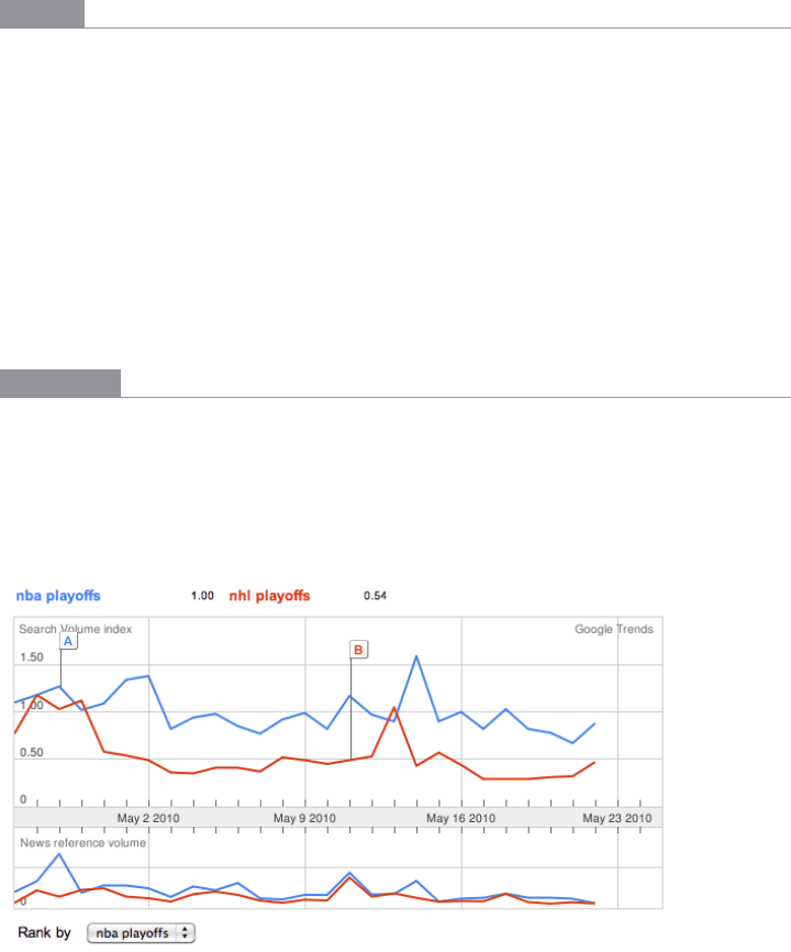
Google Trends allows a user to compare the use frequency of different search terms. The
example in Figure 7-43 shows two sports-related terms that are comparable in volume, so
they’re easy to compare in one simple chart. But Google Trends goes beyond that. Relative
search volume is illustrated on the top chart, while the bottom chart shows news reference
volume. The metrics and their scales are different, so Trends uses two separate y-axes.
Figure 7-43.
Google Trends
330 Chapter 7: Showing Complex Data: Trees, Charts, and Other Information Graphics
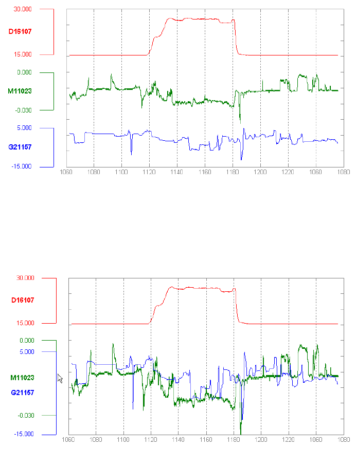
The example in Figure 7-44 shows an interactive multi-Y graph constructed in MATLAB.
You can manipulate the three data traces’ y-axes, color-coded on the left, with the mouse—
you can drag the traces up and down the graph, “stretch” them vertically by sliding the
colored axis end caps, and even change the displayed axis range by editing the y-axis lim-
its in place. Here’s why that’s interesting: you might notice that the traces look similar, as
though they were correlated somehow—all three drop in value just after the vertical line
labeled 1180, for instance. But just how similar are they? Move them and see.
Figure 7-44.
MATLAB plot
Your eyes are very, very good at discerning relationships among data graphics. By stacking
and superimposing the differently scaled plot traces shown in Figure 7-45, a user might
gain valuable insight into whatever phenomenon produced this data.
Figure 7-45.
MATLAB plot, again

The Patterns 331
The information graphics in a multi-Y display don’t need to be traditional graphs. The
weather chart shown in Figure 7-46 uses a series of pictograms to illustrate expected
weather conditions; these are aligned with the same time-based x-axis that the graph uses.
(This chart hints at the next pattern,
Small Multiples.)
Figure 7-46.
Weather chart from The Weather Channel
In other libraries
http://quince.infragistics.com/Patterns/Multi-Y%20Graph.aspx
Small Multiples
Figure 7-47.
Climate heat map, from a University of Oregon publication

332 Chapter 7: Showing Complex Data: Trees, Charts, and Other Information Graphics
What
Create many small pictures of the data using two or three data dimensions. Tile them on
the page according to one or two additional data dimensions, either in a single comic-
strip sequence or in a 2D matrix.
Use when
You need to display a large data set with more than two dimensions or independent
variables. It’s easy to show a single “slice” of the data as a picture—as a plot, table, map,
or image, for instance—but you find it hard to show more dimensions than that. Users
might be forced to look at one plot at a time, flipping back and forth among them to see
differences.
When using
Small Multiples, you need to have a fairly large display area available. Mobile
devices rarely do this well, unless each individual picture is very tiny. Use this pattern
when most users will be seeing these on a large screen or on printed paper.
That being said, sparklines are a particular type of
Small Multiples that can be very effective
at tiny scales, such as in running text or in a column of table cells. They are essentially
miniature graphs, stripped of all labels and axes, created to show the shape or envelope of
a simple data set.
Why
Small Multiples are data-rich—they show a lot of information at one time, but in a compre-
hensible way. Every individual picture tells a story. But when you put them all together,
and demonstrate how each picture varies from one to the next, an even bigger story is told.
As Edward Tufte put it in his classic book, Envisioning Information (Graphics Press), “Small
multiple designs, multivariate and data bountiful, answer directly by visually enforcing
comparisons of changes, of the differences among objects, of the scope of alternatives.”
(Tufte named and popularized Small Multiples in his famous books about visualization.)
Think about it this way. If you can encode some dimensions in each individual picture,
but you need to encode an extra dimension that just won’t fit in the pictures, how could
you do it?
Sequential presentation
Express that dimension varying across time. You can play them like a movie, use
Back/Next buttons to page one at a time, and so on.
3D presentation
Place the pictures along a third spatial axis, the z-axis.
Small multiples
Reuse the x- and y-axes at a larger scale.