Givan A.L. Flow Cytometry. First Principles
Подождите немного. Документ загружается.

is not a¨ected by small numbers of these ``o¨ scale'' events or by a
few cells with very high or very low ¯uorescence (``outliers''). For this
reason, the median has been recommended by many. However, as-
suming that there are no events o¨ scale, the mean value will be more
directly related to biochemical or bulk measurements of concentra-
tion. It should also be added that, if a distribution is symmetrically
distributed around the mean, the mean, the mode, and the median
will be identical numbers.
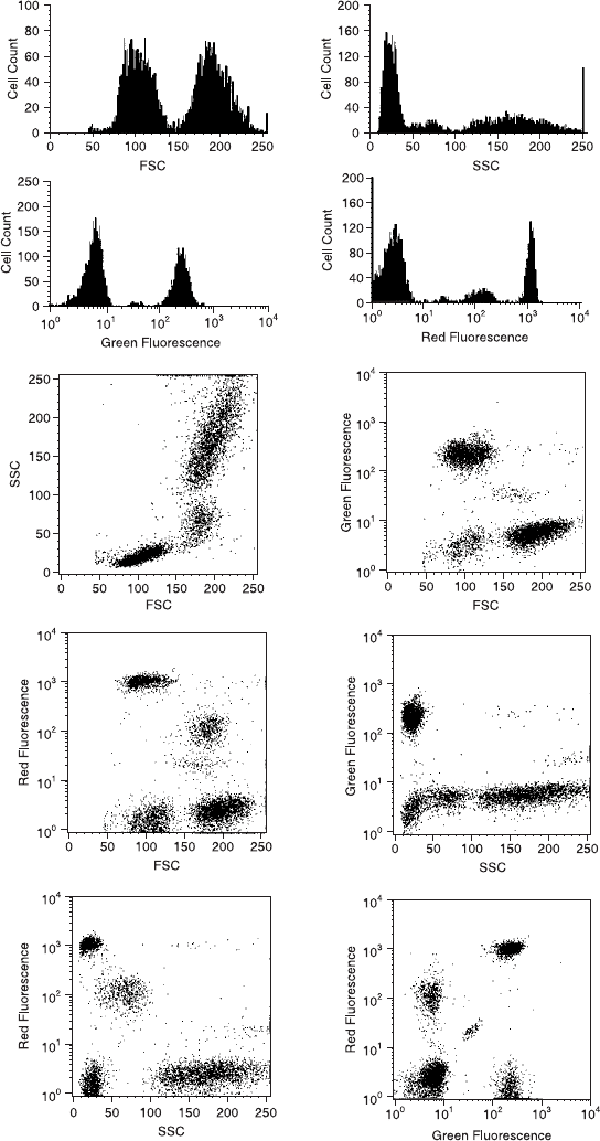
If we now want to go further and correlate one parameter with
another, software analysis packages implement the drawing of two-
dimensional plots. Each cell is placed on the plot according to its
intensity channel for each of the selected two parameters. Six two-
parameter correlations can be derived from our four-parameter data
(Fig. 4.2; keep in mind that each two-parameter correlation could be
plotted with the x and y axes reversed). Dot plots show, simply, a dot
on the page or screen at each locus de®ning quantitatively (according
to channel number) the two relevant characteristics of each particle
in the sample. Dot plots su¨er, graphically, from black-out in that
an area of a display can get no darker than completely black; if
the number of particles at a given point are very dense, their visual
impact, in comparison with less dense areas, will decrease as greater
numbers of particles are displayed.
Contour plots, as another type of two-dimensional graph, display
the same kind of correlation as dot plots, but can provide more visual
information about the frequency of particles at any given point in the
display. They allow the display of data according to the number of
cells in any particular cluster (think of the contour lines describing
peaks on a mountaineer's map). Lines are assigned to various levels
of cell density (as contour maps assign lines to di¨erent altitudes)
according to any one of several di¨erent strategies. While changes in
the assignment of lines will not change the values calculated for the
number of cells in a cluster, they may radically change the way the
data set appears. Figures 4.3 and 4.4 show examples of how the same
data plotted with di¨erent cell density assignments for contour lines
ÐÐÐÐÐÐÐÐÐÐÐÐÐÐÐÐÐÐÐÐÐÐÐÐÐÐÐÐÐÐÐÐÐÐÐÐÐÐÐÐÐÐÐ
f
Fig. 4.2. The four histograms and six dual-parameter plots derived from the data
from a four-parameter cytometer. Each of the six dual-parameter plots could be
drawn with the x and y axes reversed.
Flow Cytometry48
Harnessing the Data 49
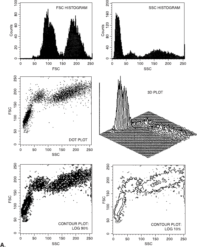
Fig. 4.3. Di¨erent methods of plotting one set of two-dimensional (forward scatter
vs. side scatter) data. A: Two separate histograms, a dot plot, a three-dimensional
plot, and contour plots according to two di¨erent plotting algorithms. B: Four ad-
ditional contour plotting algorithms for the same data.
Flow Cytometry50
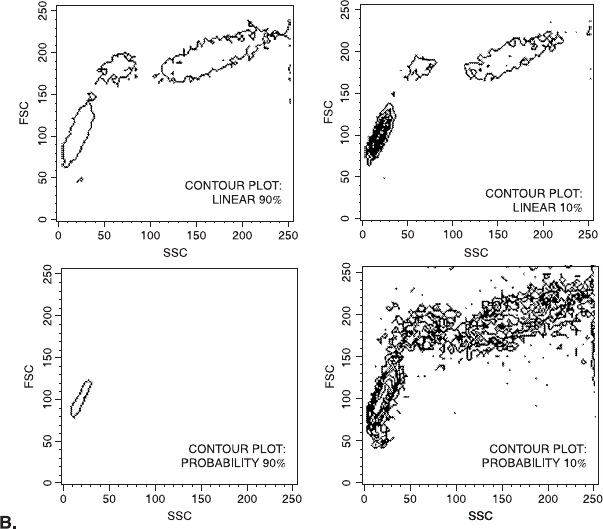
can make messy data look tidy (or vice versa) and can even make
three peaks look like a single distribution. The message here is simply
that we need an informed eye when looking at contour plots gen-
erated from other people's data.
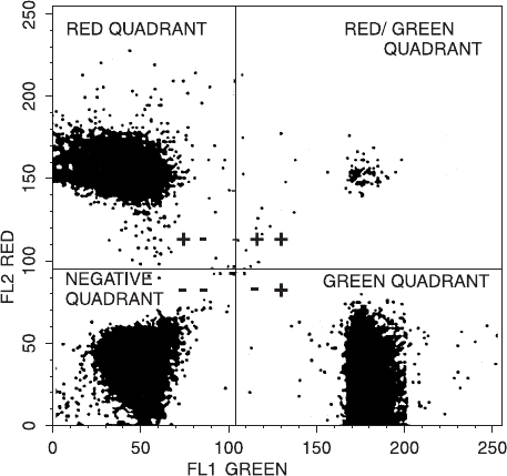
Once the data from a sample have been plotted in two dimensions,
the distribution of particles can then be analyzed. Quadrants dividing
the plot into four rectangles is the term used for the cursors applied in
two-dimensional analysis. As with one-dimensional histograms, these
cursors simply divide the light intensity channels into areas of inter-
est. The number of particles in each of the de®ned areas can then be
counted. A standard analysis procedure might use unstained control
cells to de®ne the channels delimiting background red and green ¯u-
orescence. Quadrants can then be drawn based on these channels,
Fig. 4.3 (continued )
Harnessing the Data 51
and the quadrants will therefore de®ne the staining intensities that we
would consider to represent green particles, red particles, and so-
called double-positive particles that are both red and green, as well as
the double-negative (unstained) cells (Fig. 4.5).
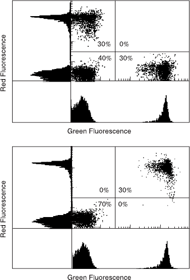
As an intellectual exercise, you should always attempt to visualize
the single-dimensional histograms that would result from dot plot or
contour plot data. Figure 4.6 indicates dot plots from two di¨erent
sets of data (with their respective histograms); it is clear that the his-
tograms from these two data sets are identical but that the dot plots
are quite di¨erent. This example should serve to emphasize that more
information is obtained from dual-stained preparations with their
two-dimensional plots than from two successive single-dimensional
(one color) analyses.
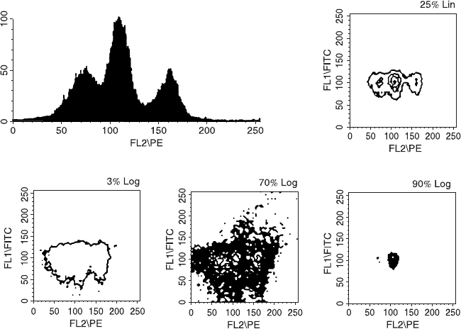
Fig. 4.4. A histogram of ¯uorescence and contour plots (plotted according to dif-
ferent line assignments) of the same data. Comparison between the histogram and
the contour plots allows us to see at what ``altitudes'' the contour lines have been
drawn for each contour plot and why the resulting displays look so di¨erent.
Flow Cytometry52
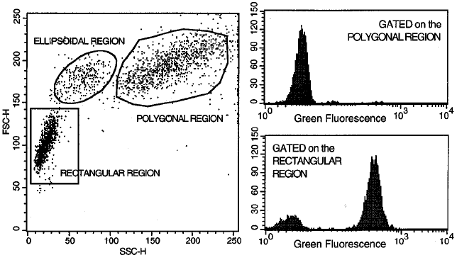
We now need to de®ne gating, one of the most subjective aspects of
¯ow cytometry. Gating is based on the de®ning of regions. A region
is a way of specifying the characteristics of a subset of particles (in
terms of forward scatter, side scatter, and/or ¯uorescence intensity
channel numbers). A region may encompass, for example, all the cells
that fall between a certain range of green intensities, or all cells with a
certain set of forward and side scatter characteristics, or all cells that
are both orange and green. A gate, in contrast, is a combination of
regions that de®ne all the cells that we want to include in our ®nal
analysis. Cells that pass through the gate get analyzed. A gate can
be identical to a single region; that is, the cells we want to include
in our ®nal analysis may simply be all the cells that fall into a
single, de®ned region. This is why people often confuse the terms
``gate'' and ``region.'' However, a gate can also be de®ned as a com-
bination of two or more individual regions. For example, a gate may
include all the cells that fall into region 1 AND into region 2; or
Fig. 4.5. Quadrants are cursors or markers for delineating the intensity (according to
channel number) of cells of interest in dual-parameter analysis.
Harnessing the Data 53
all the cells that fall into region 1 OR into region 2; or all the cells
that fall into region 1 but NOT into region 2. If you are young
enough, you will have used Boolean algebra in school to combine
sets, and these de®nitions will not present you with any problems.
Whether a gate is co-equal to a single region or involves a combina-
tion of several regions, any particle that ful®lls the de®ned gate
characteristics will pass through the gate and will be included in the
next analysis step (Fig. 4.7).
Our gate could, in fact, be a ``live gate'' or an ``analysis gate.'' A
live gate de®nes the characteristics of cells that need to be ful®lled
before the data from those cells are accepted for storage in a com-
puter for further analysis; the information about all other cells will be
lost. For this reason, a live gate should be avoided unless data storage
Fig. 4.6. Identical single-color histograms derived from quite di¨erent cell samples.
The dual-parameter dot plots allow us to distinguish these two populations of cells.
Flow Cytometry54
space is limited. An analysis gate, in contrast, selects cells with de-
®ned characteristics from within a large heterogeneous sample of
cells, all of whose characteristics have already been stored in a data
®le. We still have the ability to move the regions around to adapt to
di¨erent analytical strategies, and we can also calculate the propor-
tion that the gated cells are of the total. The use of either type of gate
is rather analogous to the process of, by eye, disregarding all eryth-
rocytes, monocytes, and neutrophils in a microscopic ®eld and then
counting only lymphocytes to determine the percentage of lympho-
cytes that are stained. A trained microscopist's eye is, in that way,
de®ning a lymphocyte gate based on nuclear pattern, shape, and size.
A cytometrist can de®ne a lymphocyte's gate in terms of forward and
side scatter intensities.
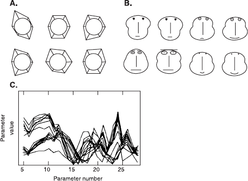
Dual-parameter correlations constitute the standard procedure for
analysis of much ¯ow cytometric data. Most cytometers provide us
with four or ®ve or more parameters of information. Because humans,
in general, are used to thinking in two dimensions, actually correlating
three or more parameters with each other can seem rather di½cultÐ
in terms of both computer software and our ability to keep track of
the strategy (Fig. 4.8). For purposes of data analysis, the most com-
Fig. 4.7. Regions can be drawn to de®ne clusters of cells. Regions can then be used
(individually or in Boolean combination) to form gates for restricting subsequent
analysis to certain groups of cells.
Harnessing the Data 55
mon procedures use the extra parameters to allow gating (including
or excluding) of particles before the ®nal analysis, which is almost
invariably just one or two dimensional.
Thus far, we have followed cells into the center of a sheath stream
¯owing from a nozzle or through a chamber past a focused light
beam; we have seen how scatter and ¯uorescence signals can be gen-
erated from those cells when they are hit by that light beam; we have
accounted for the registering of those light signals by photodetectors
so that the intensities of the signals can be represented by the discrete
channels (256 or 1024) of an ADC; we have described the way am-
pli®cation applied to the output of a photodetector will determine the
intensity range represented by the ADC channels; we have seen the
way in which the channel number for each of the several parameters
characterizing each cell can be stored as list mode data for each cell
in sequence in the sample; and we have described the general ways in
which the stored data can be displayed and analyzed. We should,
therefore, have a clear picture of the ¯uidic, optical, electronic, and
computational characteristics that form the basis for ¯ow cytometric
analysis. The chapters that follow will deal with the ways in which
these principles are applied to experimental situations. Because the
®rst decisions that are made in designing a ¯ow experiment often
Fig. 4.8. Three di¨erent ways to visualize multivariate data. From Dean (1990).
Flow Cytometry56
concern the speci®cation of reagents for staining cells, we will initially
take a short detour to the principles of photochemistry and laser
optics in order to understand the requirements that a ¯ow cytometer
imposes on these decisions.
FURTHER READING
Chapter 5 in Shapiro, Chapter 30 in Volume I of Weir, Section 10 in Current
Protocols in Cytometry, Chapter 7 in Darzynkiewicz, and Chapter 22 in
Melamed et al. are all good discussions of various aspects of ¯ow data
analysis. In addition, an entire book by Watson (1992) is devoted to this
subject.
Harnessing the Data 57