Griffiths D. Head First Statistics
Подождите немного. Документ загружается.


you are here 4 611
correlation and regression
The Case of the High Sunscreen Sales
An intern at a sunscreen manufacturer has been given the task of
looking at sunscreen sales in order to see how they can best market
their particular brand.
He’s been given a pile of generated scatter diagrams that model
sunscreen sales against various other factors. He’s been asked to pull
out ones where there seems to be some relationship between the
two factors on the diagram, as this will help the sales team.
The first diagram that the intern finds plots sunscreen sales for
the day against pollen count. He’s surprised to see that when
there’s a high pollen count, sales of sunscreen are significantly
higher, and he decides to tell the sales team that they need to think
about using pollen count in their advertising.
When the sales team hears his suggestion, they look at him blankly.
What do you think the sales team should do?
Does a high pollen count make people buy sunscreen?
Five Minute
Mystery
Five Minute
Mystery
612 Chapter 15
We know we haven’t shown you how to analyze bivariate data yet,
but see how you get on with analyzing the scatter diagram for
the concert organizers.
What sort of patterns do you see in the chart? How can you relate
this to the underlying data? What do you expect open air concert
attendance to be like if it’s sunny? What about if it’s overcast?
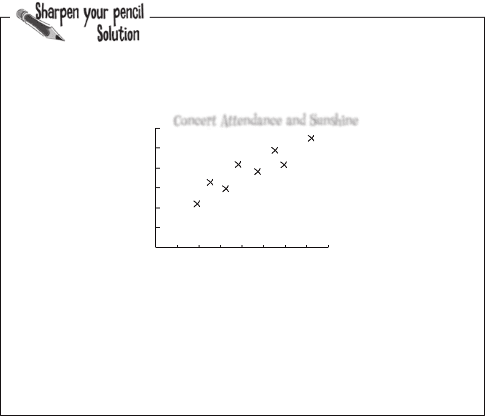
First of all, the chart shows that the data points are clustered around a straight line on the chart, and this
line slopes upwards. It looks like, if the predicted number of hours of sunshine in a day is relatively low, then the
concert attendance is low too. If the number of hours sunshine is high, then we can expect concert attendance to
be high too. This basically means that the sunnier the weather, the more people you can expect to go to the open
air concert.
One thing that’s important to note is that we can only be confident about saying this within the range of the
data. We have no data to say what the pattern is like if the number of hours of sunshine is below 2 hours or
above 7.5 hours.
Scatter diagrams show you patterns
As you can see, scatter diagrams are useful because they show the
actual pattern of the data. They enable you to more clearly visualize
what connection there is between two variables, if indeed there’s any
connection at all.
The scatter diagram for the concert data shows a distinct pattern—
the data points are clustered along a straight line. We call this a
correlation.
sharpen solution
sunshine (hours)
attendance (100’s)
Concert Attendance and Sunshine
0 1 2 3 4 5 6 7 8
0
10
20
30
40
50
60
you are here 4 613
correlation and regression
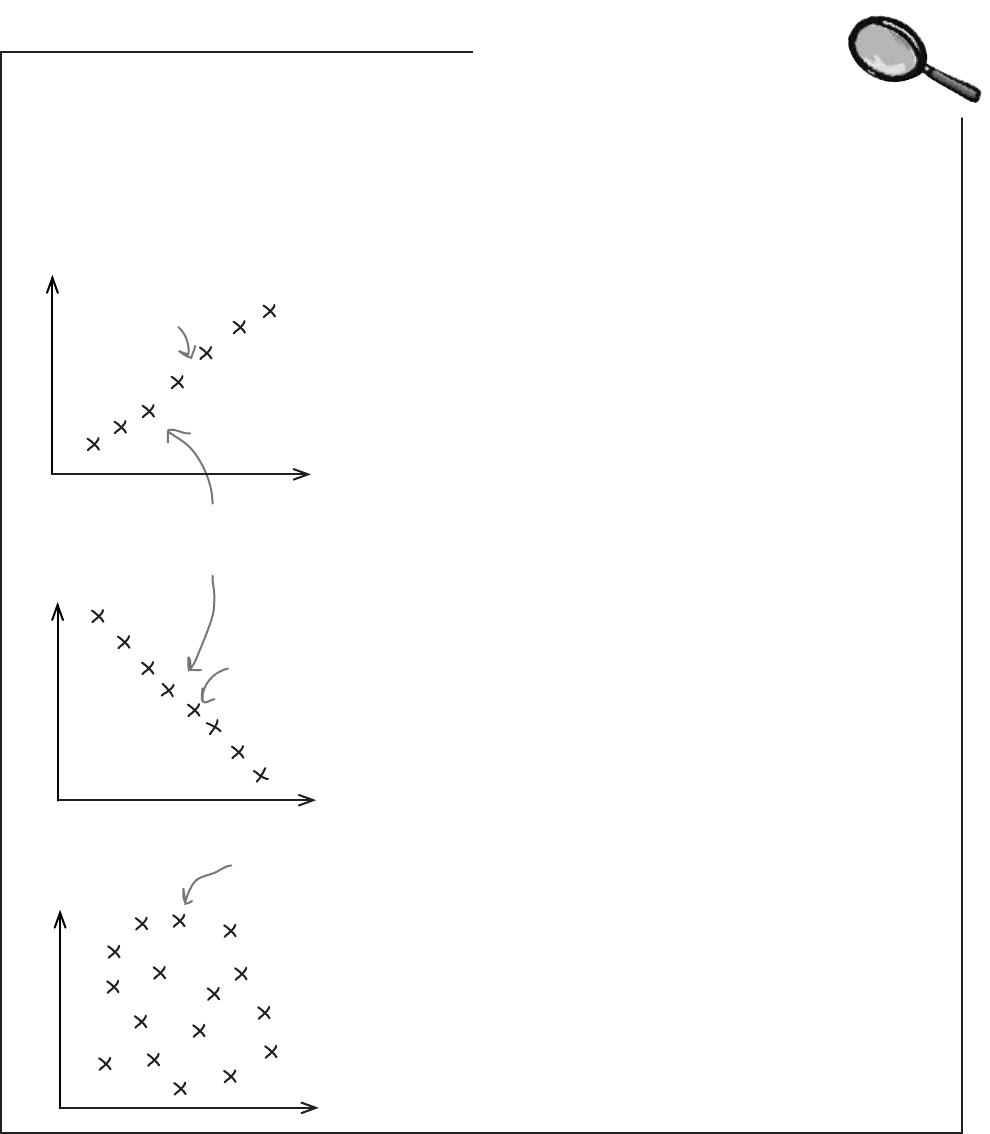
Positive linear correlation
Positive linear correlation is when low values on the x-axis
correspond to low values on the y-axis, and higher values of
x correspond to higher values of y. In other words, y tends to
increase as x increases.
Negative linear correlation
Negative linear correlation is when low values on the x-axis
correspond to high values on the y-axis, and higher values of
x correspond to lower values of y. In other words, y tends to
decrease as x increases.
No correlation
If the values of x and y form a random pattern, then
we say there’s no correlation.
Scatter diagrams show the correlation between pairs of values.
Correlations are mathematical relationships between variables. You can
identify correlations on a scatter diagram by the distinct patterns they form.
The correlation is said to be linear if the scatter diagram shows the points
lying in an approximately straight line.
Let’s take a look at a few common types of correlation between two variables:
Linear Correlations Up Close
The points plotted for x and y are
centered around a straight line.
The line points up, as
it’s positive.
The line points
down, as it’s
negative.
This chart shows a
random pattern, so
there’s no correlation.
614 Chapter 15
Correlation vs. causation
So if there’s a correlation,
does that mean one of the
variables caused the value
of the other?
A correlation between two variables doesn’t necessarily
mean that one caused the other or that they’re actually
related in real life.
A correlation between two variables means that there’s some sort of
mathematical relationship between the two. This means that when we
plot the values on a chart, we can see a pattern and make predictions about
what the missing values might be. What we don’t know is whether there’s an
actual relationship between the two variables, and we certainly don’t know
whether one caused the other, or if there’s some other factor at work.
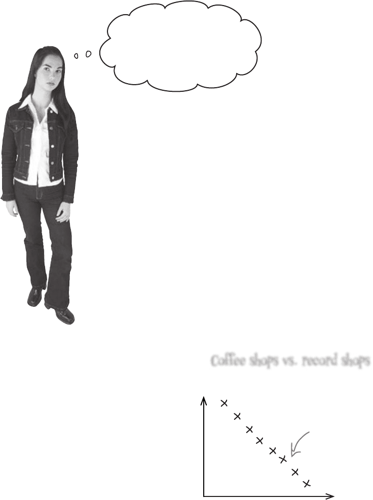
As an example, suppose you gather data and find that over time, the number
of coffee shops in a particular town increases, while the number of record
shops decreases. While this may be true, we can’t say that there is a real-life
relationship between the number of coffee shops and the number of record
shops. In other words, we can’t say that the increase in coffee shops caused the
decline in the record shops. What we can say is that as the number of coffee
shops increases, the number of record shops decreases.
No. coffee shops
No. record shops
Record shops decrease as coffee
shops increase, but this doesn’t mean
that the increase in coffee shops has
caused the decrease in record shops.
difference between correlation and causation
Coffee shops vs. record shops

you are here 4 615
correlation and regression
Solved: The Case of the High Sunscreen Sales
Does a high pollen count make people buy sunscreen?
One of the sales team members walks over to the intern.
“Thanks for the idea,” she says, “but we’re not going
to use it in our advertising. You see, the high pollen
count doesn’t make people buy more sunscreen.”
The intern looks at her, confused. “But it’s all here on
this scatter diagram. As pollen count increases, so do
sunscreen sales.”
“That’s true,” says the salesperson, “but that doesn’t mean that the high
pollen count has caused the high sales. The days when the pollen count
is high are generally days when the weather is sunny, so people are going
outside more. They’re buying more sunscreen because they’re spending
the day outside.”
Five Minute
Mystery
Solved
Five Minute
Mystery
Solved

616 Chapter 15
Q:
So are we saying that the predicted sunshine causes low
ticket sales?
A: The bivariate data shows that there is a mathematical
relationship between the two variables, but we can’t use it to
demonstrate cause and effect. It’s intuitively possible that more
people will go to open air concerts when it’s sunny, but we can’t say
for certain that sunshine causes this. We’d need to do more research,
as there may be other factors.
Q:
Other factors? Like what?
A: One example would be the popularity of the artist performing. If
a well-known artist is holding a concert, then fans may want to go to
the concert no matter what the weather. Similarly, an unpopular artist
is unlikely to have the same dedication from fans.
Q:
Do scatter diagrams use populations or samples of data?
A: They can use either. A lot of the time, you’ll actually be using
samples, but the process of plotting a scatter diagram is the same
irrespective of whether you have a sample or a population.
Q:
If there’s a correlation between two variables, does it have
to be linear?
A: Correlation measures linear relationships, but not all
relationships are linear. As an example, a strong relationship
between two variables could be a distinctive curve, such as y = x
2
. In
this chapter, we’re only going to be dealing with linear relationships,
though.
Far out, dude, I’m liking
the way the sunshine and
attendance connect.
no dumb questions

you are here 4 617
correlation and regression
But hold on, man! How can we
predict concert attendance
based on predicted sunshine?
If the concert attendance
drops below 3,500, we’ll have to
bail out, and that’d be a burn.
We need to predict the concert attendance
So far we’ve looked at what bivariate data is, and how scatter diagrams
can show whether there’s a mathematical relationship between the two
variables. What we haven’t looked at yet is how we can use this to make
predictions.
What we need to do next is see how we can use the data to make
predictions for concert attendance, based on predicted hours of sunshine.
How do you think we could go about making predictions like this for bivariate
data?
618 Chapter 15
0 1 2 3 4 5 6 7 8
0
10
20
30
40
50
60
A line of best fit? And
you just guess what the line is
based on what looks good to
you? That’s hardly scientific.
Drawing the line in this way is just a best guess.
The trouble with drawing a line in this way is that it’s an estimate, so
any predictions you make on the basis of it can be suspect. You have
no precise way of measuring whether it’s really the best fitting line. It’s
subjective, and the quality of the line’s fit depends on your judgment.
Predict values with a line of best fit
So far you’ve seen how scatter diagrams can help you see whether there’s a
correlation between values, by showing you if there’s some sort of pattern.
But how can you use this to predict concert attendance, based on the
predicted amount of sunshine? How would you use your existing scatter
diagram to predict the concert attendance if you know how many hours of
sunshine are expected for the day?
One way of doing this is to draw a straight line through the points on the
scatter diagram, making it fit the points as closely as possible. You won’t be
able to get the straight line to go through every point, but if there’s a linear
correlation, you should be able to make sure every point is reasonably close
to the line you draw. Doing this means that you can read off an estimate
for the concert attendance based on the predicted amount of sunshine.
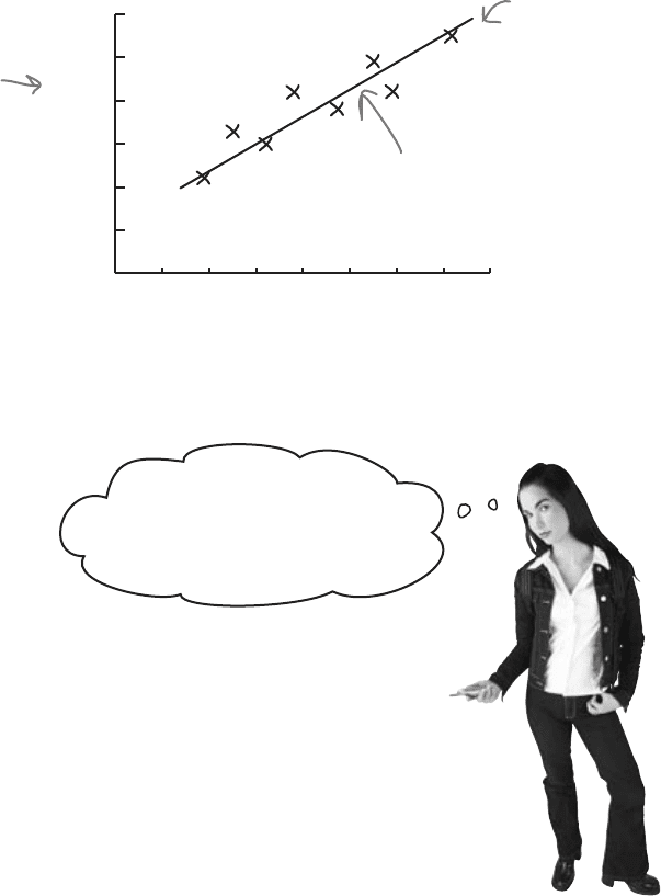
Here’s your original
scatter diagram.
Here’s the line. It goes straight
through the heart of where the
data points are.
sunshine (hours)
attendance (100’s)
You can use the line to estimate
concert attendance for a certain
number of hours predicted sunshine.
The line that best fits the data points is called the line of best fit.
line of best fit
you are here 4 619
correlation and regression
sunshine (hours)
attendance (100’s)
0 1 2 3 4 5 6 7 8
0
10
20
30
40
50
60
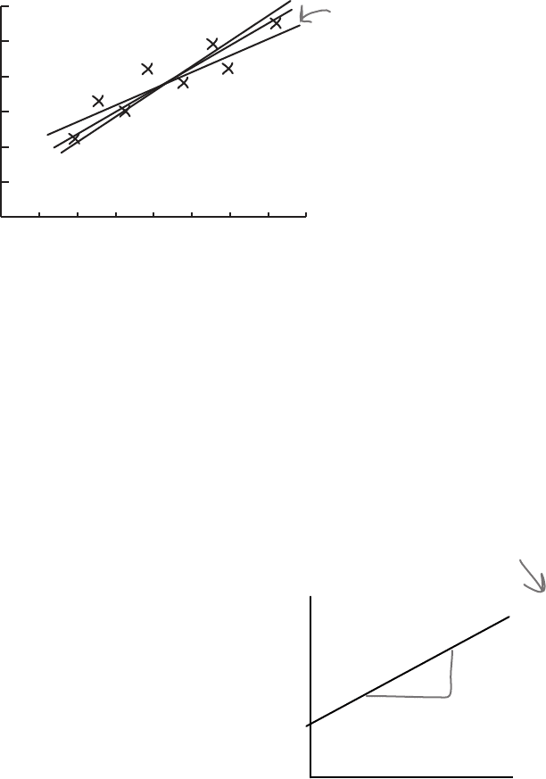
These are all different
lines for the same data,
so which do you use?
Your best guess is still a guess
Imagine if you asked three different people to draw what each of them
think is the line of best fit for the open air concert data. It’s quite likely
that each person would come up with a slightly different line of best fit,
like this:
All three lines could conceivably be a line of best fit for the data, but
what we can’t tell is which one’s really best.
What we really need is some alternative to drawing the line of best
fit by eye. Instead of guessing what the line should be, it will be more
reliable if we had a mathematical or statistical way of using the data
we have available to find the line that fits best.
We need to find the equation of the line
The equation for a straight line takes the form y = a + bx, where
a is the point where the line crosses the y-axis, and b is the slope
of the line. This means that we can write the line of best fit in the
form y = a + bx.
In our case, we’re using x to represent the predicted number of
hours of sunshine, and y to represent the corresponding open
air concert figures. If we can use the concert attendance data to
somehow find the most suitable values of a and b, we’ll have a
reliable way to find the equation of the line, and a more reliable
way of predicting concert attendance based on predicted hour of
sunshine.
x
y
a
b
y = a + bx
y = a + bx is the
equation of a line,
where a and b are
numbers.
620 Chapter 15
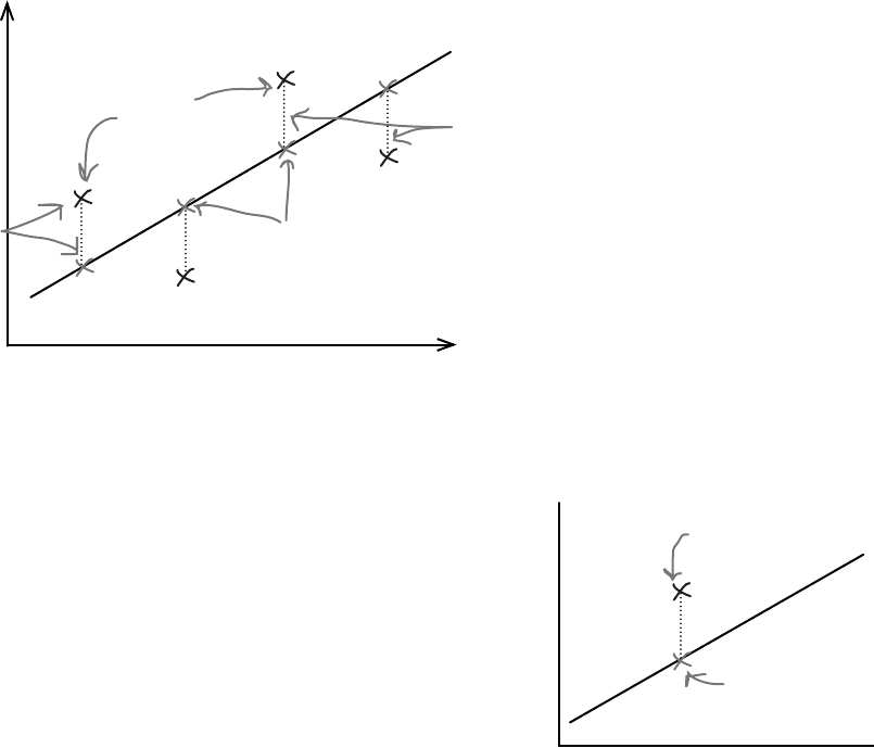
We need to minimize the errors
Let’s take a look at what we need from the line of best fit, y = a + bx.
The best fitting line is the one that most accurately predicts the true values of
all the points. This means that for each known value of x, we need each of
the y variables in the data set to be as close as possible to what we’d estimate
them to be using the line of best fit. In other words, given a certain number
of hours sunshine, we want our estimates for open air concert attendance to
be as close as possible to the actual values.
The line of best fit is the line y = a + bx that minimizes the distances between
the actual observations of y and what we estimate those values of y to be for
each corresponding value of x.
Let’s represent each of the y values in our data set using y
i
, and its
estimate using the line of best fit as y
i
. This is the same notation that
we used for point estimators in previous chapters, as the ^ symbol
indicates estimates.
We want to minimize the total distance between each actual value of y
and our estimate of it based on the line of best fit. In other words, we
need to minimize the total differences between y
i
and y
i
. We could try
doing this by minimizing
Σ(y
i
- y
i
)
but the problem with this is that all of the distances will actually cancel
each other out. We need to take a slightly different approach, and it’s
one that we’ve seen before.
^
^
^
line of best fit and sum of squared errors
y = a + bx
These are the
actual values.
These are the values
we predict based on
the line of best fit
If we can find the line that minimizes all the
distances between the observed and expected
values of y, we’ll have the line of best fit.
x
y
These are the
actual and
estimated values
of y for the
same value of x.
y
i
is the actual value.
y
i
is the value we
estimate it to be
from the line.
^
x
y