Schmuller J. Statistical Analysis with Excel For Dummies
Подождите немного. Документ загружается.

69
Chapter 3: Show and Tell: Graphing Data
How do you create a graph like Figure 3-16? Follow along:
1. Enter your data into a worksheet.
Once again, already done.
2. Select the data that go into the chart.
For this example, that’s cells B3 through F3.
Whoa! Did I forget something? What about that little trick I showed you
before where you hold down the CTRL key and select additional cells?
Couldn’t I do that and select the top row of years for the x-axis?
Nope. Not this time. If I do that, Excel thinks 1990, 1991, 1992, 1993, and
1994 are just another series of data points to plot on the graph. I’ll show
you another way to put those years on the x-axis.
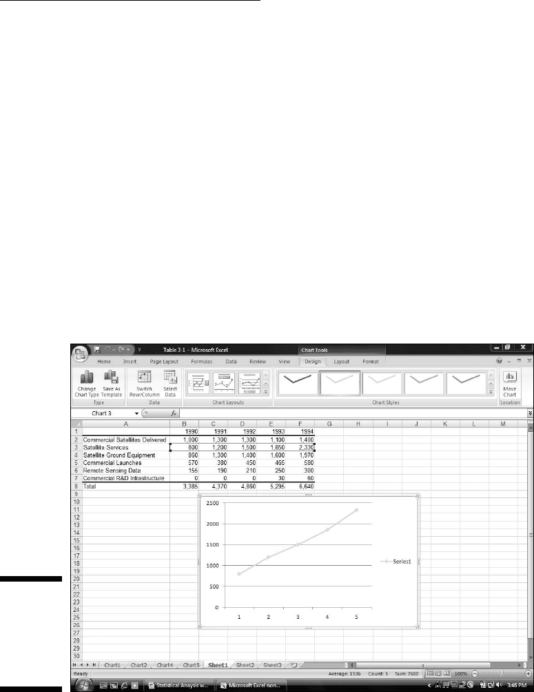
3. In Charts area of the Insert tab, select the chart type.
This time, it’s Insert | Line and then the fourth subtype, Line with
Markers. This creates the chart in Figure 3-17.
Figure 3-17:
Insert | Line
| Line With
Markers
creates the
line chart.
08 454060-ch03.indd 6908 454060-ch03.indd 69 4/21/09 7:20:00 PM4/21/09 7:20:00 PM
70
Part II: Describing Data
4. Modify the chart.
The line on the chart is a little hard to see. Selecting Design | Chart
Styles and the leftmost option makes the line darker.
Next, I added the titles for the chart and for the axes. Clicking the down
arrow of Design | Chart Layouts opens a box with 12 possibilities.
Selecting the tenth one creates text boxes for the titles on the chart.
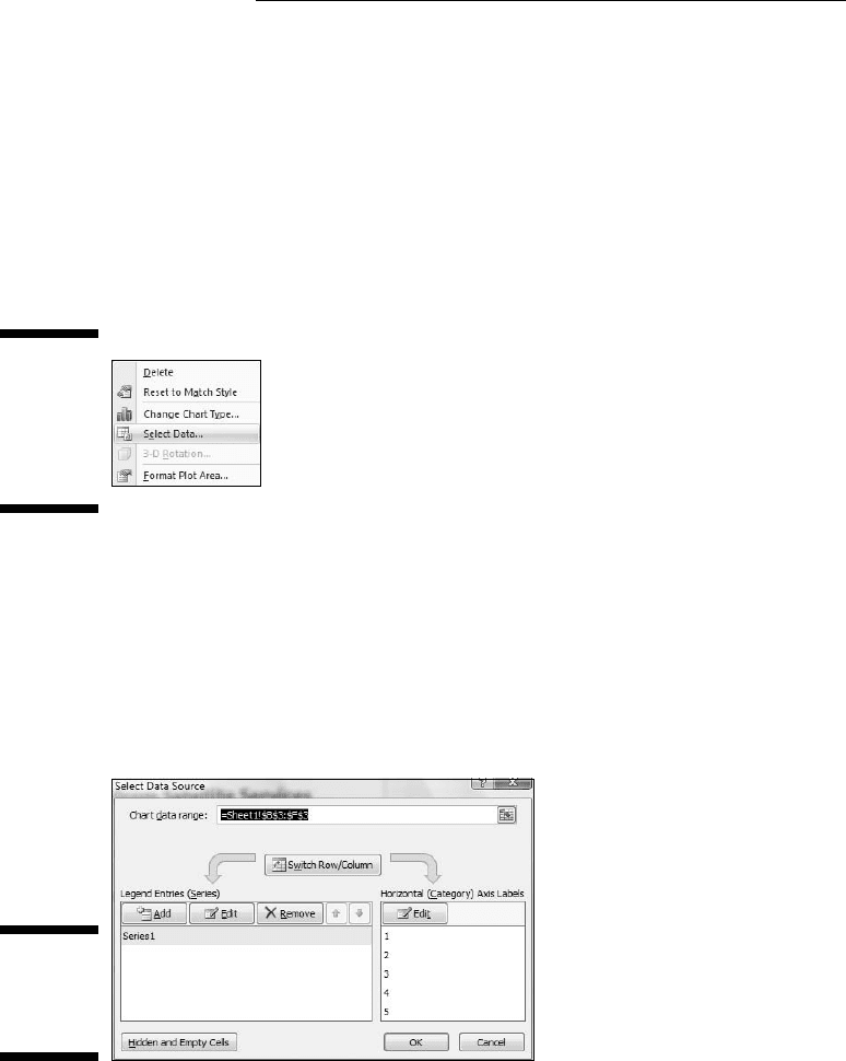
I still have to put the years on the x-axis. To do this, I right-clicked inside
the chart to open the menu in Figure 3-18.
Figure 3-18:
Right-
clicking
inside the
chart opens
this menu.
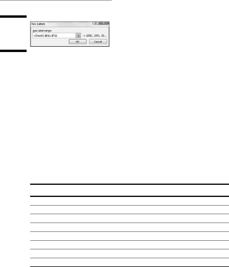
Clicking Select Data opens the Select Data Source dialog box. (See Figure
3-19.) In the box labeled Horizontal (Category) Axis Labels, clicking
the Edit button opens the Axis Labels dialog box (Figure 3-20). A blink-
ing cursor in the Axis label range box shows it’s ready for business.
Selecting cells B1 through F1 and clicking OK closes this dialog box.
Clicking OK closes the Select Source dialog box and puts the years on
the x-axis.
Figure 3-19:
The Select
Source dia-
log box.
One more modification completes the graph. The legend (showing
“Series 1”) isn’t necessary. Right-click on it and choose Delete from the
pop-up menu.
08 454060-ch03.indd 7008 454060-ch03.indd 70 4/21/09 7:20:00 PM4/21/09 7:20:00 PM
71
Chapter 3: Show and Tell: Graphing Data
Figure 3-20:
The Axis
Labels
dialog box.
Passing the Bar
Excel’s bar chart is a column chart laid on its side. This is the one that
reverses the horizontal-vertical convention. Here, the vertical axis holds the
independent variable, and it’s referred to as the x-axis. The horizontal axis is
the y-axis and it tracks the dependent variable.
When would you use the bar graph? This type of graph fits the bill when you
want to make a point about reaching a goal, or about the inequities in attain-
ing one.
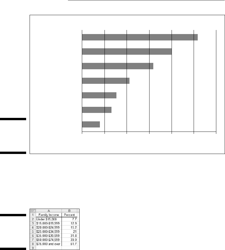
Table 3-2 shows the data on (what I feel, anyway) is an important social issue.
The data, from the U.S. Census Bureau (via the U.S. Statistical Abstract), are
for the year 2000. Percent means the percentage of children in each income
group.
Table 3-2 Children’s Use of the Internet at Home (2000)
Family Income Percent
Under $15,000 7.7
$15,000-$19,999 12.9
$20,000-$24,999 15.2
$25,000-$34,999 21.0
$35,000-$49,999 31.8
$50,000-$74,999 39.9
Over $75,000 51.7
The numbers in the table are pretty dramatic. Casting them into a bar chart
renders them even more so, as Figure 3-21 shows.
08 454060-ch03.indd 7108 454060-ch03.indd 71 4/21/09 7:20:00 PM4/21/09 7:20:00 PM
72
Part II: Describing Data
Figure 3-21:
A bar chart
of the data
in Table 3-2.
Children’s Home Use of the Internet (2000)
$75,000 and over
Family Income
$50,000 - $74,999
$35,000 - $49,999
$25,000 - $34,999
$20,000 - $24,999
$15,000 - $19,999
Under $15,000
0102030
Percent
40 50 60
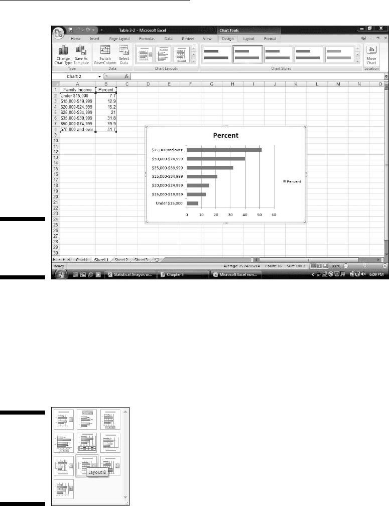
To create this graph, follow these steps:
1. Enter your data into a worksheet.
Figure 3-22 shows the data entered into a worksheet.
Figure 3-22:
Table 3-2
data in a
worksheet.
2. Select the data that go into the chart.
For this example, the data are cells A1 through B8.
3. In the Charts area of the Insert tab, select the chart type.
I clicked the down arrow for Insert | Bar and selected the first subtype
(Clustered Bar). The result appears in Figure 3-23. The title is wrong and
the legend is unnecessary, but I deal with that in Step 4.
08 454060-ch03.indd 7208 454060-ch03.indd 72 4/21/09 7:20:00 PM4/21/09 7:20:00 PM
73
Chapter 3: Show and Tell: Graphing Data
Figure 3-23:
The Initial
Excel bar
chart.
4. Modify the chart.
The first modification is to select a layout. This is a little confusing,
because Design | Chart Layouts holds the desired look, rather than
a ribbon area within the Layout tab. Go figure. The trick is to select a
layout that puts text boxes for the titles onto the graph. The option that
does this (Layout 8) is shown selected in Figure 3-24. (The other way to
do this is with Layout | Labels as I showed you earlier.)
Figure 3-24:
The layout
for adding
axis titles
and chart
title to the
bar chart.
After entering the labels, I deleted the legend. Then I darkened the bars
via Design | Chart Styles. Right-clicking on each label brings up the
menu for increasing the font size.
08 454060-ch03.indd 7308 454060-ch03.indd 73 4/21/09 7:20:00 PM4/21/09 7:20:00 PM
74
Part II: Describing Data
The Plot Thickens
You use an important statistical technique called linear regression to deter-
mine the relationship between one variable, x, and another variable, y. For
more information on linear regression, see Chapter 14.
The basis of the technique is a graph that shows individuals measured on
both x and y. The graph represents each individual as a point. Because the
points seem to scatter around the graph, the graph is called a scatterplot.
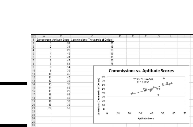
Suppose you’re trying to find out how well a test of aptitude for sales pre-
dicts salespeople’s productivity. You administer the test to a sample of sales-
persons and you tabulate how much money they make in commissions over a
two-month period. Each person’s pair of scores (test score and commissions)
locates him or her within the scatterplot.
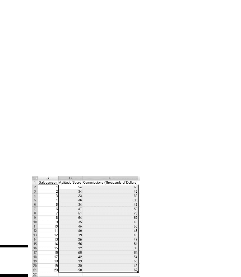
To create a scatterplot, follow the steps:
1. Enter your data into a worksheet.
Figure 3-25 shows the entered data.
Figure 3-25:
Scatterplot
data.
2. Select the data that go into the chart.
Figure 3-25 shows the selected cells — B2 through C21. (Including B1
creates the same chart, but with an incorrect title.) The cells in Column
A are just placeholders that organize the data.
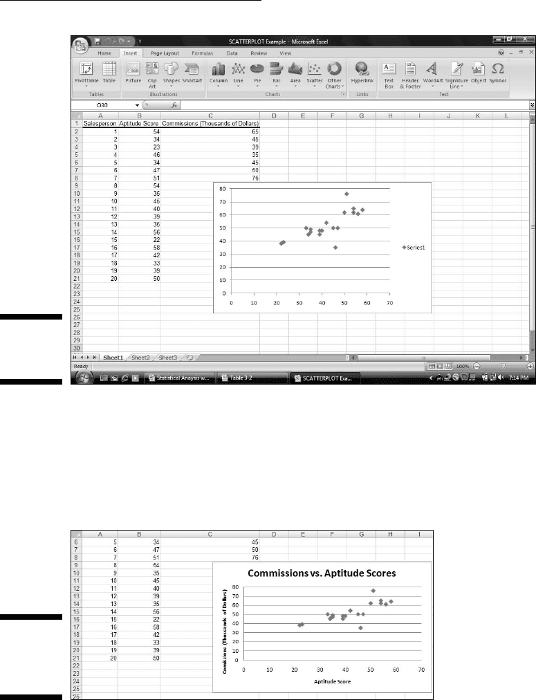
3. In the Charts area of the Insert tab, select the chart type.
I chose the first subtype of Insert | Scatter, resulting in the chart shown
in Figure 3-26.
08 454060-ch03.indd 7408 454060-ch03.indd 74 4/21/09 7:20:01 PM4/21/09 7:20:01 PM
75
Chapter 3: Show and Tell: Graphing Data
Figure 3-26:
The initial
scatterplot.
4. Modify the chart.
Clicking Design | Chart Layouts and selecting the first layout puts the
text box on the chart for each title. I typed the title for the chart and the
titles for the axes and then deleted the legend. The result is the scatter-
plot in Figure 3-27.
Figure 3-27:
The almost-
finished
scatterplot.
For the other graphs, that would just about do it, but this one’s special.
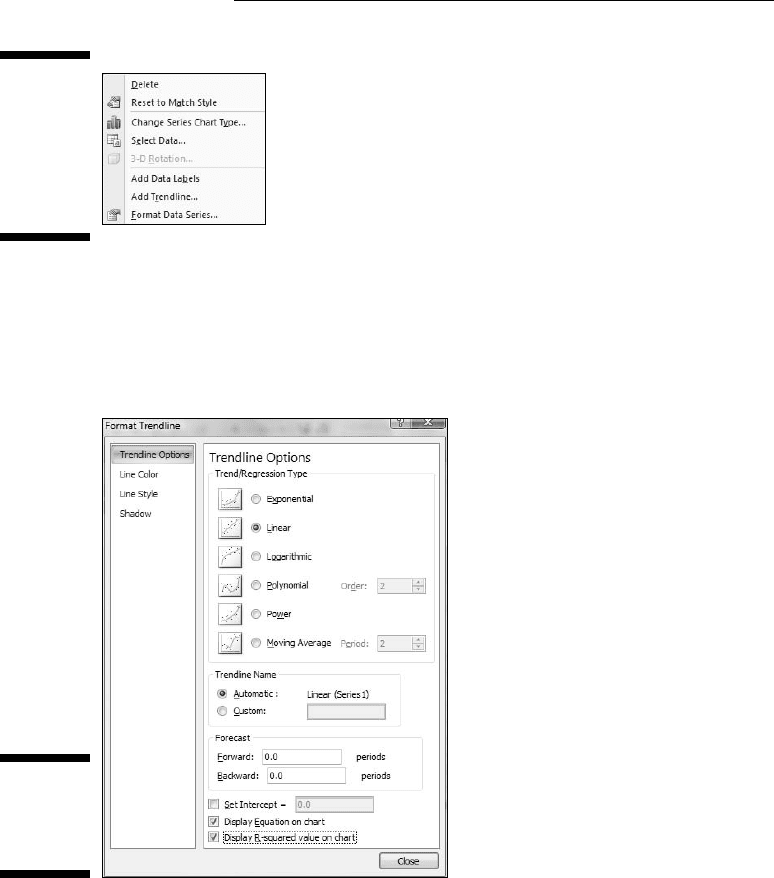
Right-clicking any of the points in the scatterplot opens the pop-up menu in
Figure 3-28.
08 454060-ch03.indd 7508 454060-ch03.indd 75 4/21/09 7:20:01 PM4/21/09 7:20:01 PM
76
Part II: Describing Data
Figure 3-28:
Right-
clicking any
point on the
scatterplot
opens this
menu.
Selecting Add Trendline opens the Format Trendline dialog box. I selected
the Linear radio button and clicked the two bottom checkboxes. They’re
labeled Display Equation on Chart and Display R-Squared Value on Chart
(Figure 3-29).
Figure 3-29:
The Format
Trendline
dialog box.
Clicking OK closes the Format Trendline dialog box. A couple of additional
items are now on the scatterplot, as Figure 3-30 shows. A line passes through
the points. Excel refers to it as a trendline, but it’s really called a regression
line. A couple of equations are there, too. (For clarity, I dragged them from
their original locations.) What do they mean? What are those numbers all
about?
08 454060-ch03.indd 7608 454060-ch03.indd 76 4/21/09 7:20:02 PM4/21/09 7:20:02 PM
77
Chapter 3: Show and Tell: Graphing Data
You’ll just have to read Chapter 14 to find out.
Figure 3-30:
The scat-
terplot, with
additional
information.
08 454060-ch03.indd 7708 454060-ch03.indd 77 4/21/09 7:20:02 PM4/21/09 7:20:02 PM

78
Part II: Describing Data
08 454060-ch03.indd 7808 454060-ch03.indd 78 4/21/09 7:20:02 PM4/21/09 7:20:02 PM