Schmuller J. Statistical Analysis with Excel For Dummies
Подождите немного. Документ загружается.

59
Chapter 3: Show and Tell: Graphing Data
3. In the Charts area of the Insert tab, select the chart type.
When you select a chart type, a box opens that presents a variety of sub-
types. Choose one and Excel creates a chart in your worksheet.
4. Modify the chart.
Click on the chart, and Excel adds a Design tab and a Layout tab to the
Ribbon. These tabs allow you to make all kinds of changes to your chart.
It’s really that simple. The next section shows what I mean.
By the way, here’s one more important concept about Excel graphics. In Excel,
a chart is dynamic. This means that after you create a chart, changing its work-
sheet data results in an immediate change in the chart.
Becoming a Columnist
In this section, I show you how to create that spiffy graph in Figure 3-1.
Follow these steps:
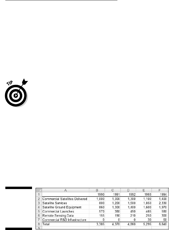
1. Enter your data into a worksheet.
Figure 3-3 shows the data from Table 3-1 entered into a worksheet.
Figure 3-3:
Table 3-1
data entered
into a
worksheet.
2. Select the data that go into the chart.
I selected A1:F7. The selection includes the labels for the axes but
doesn’t include row G, which holds the column totals.
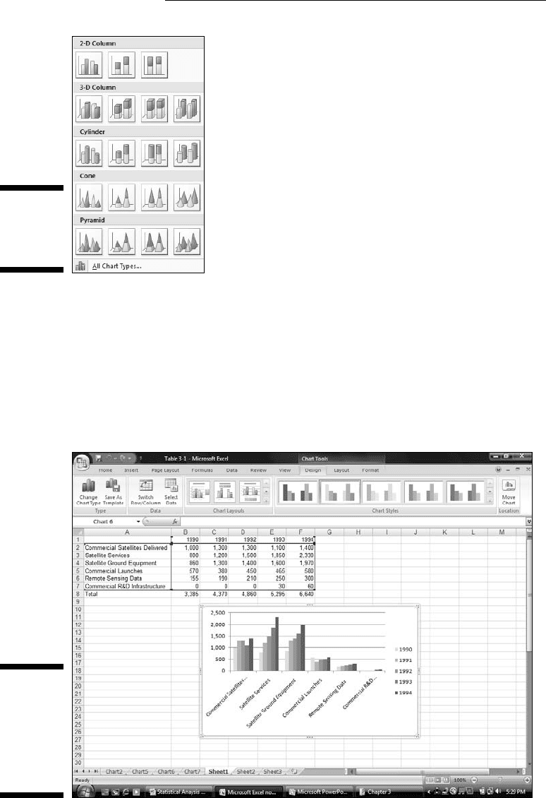
3. In the Charts area of the Insert tab, select the chart type.
For this example, the chart type is Column. Selecting Insert | Charts |
Column opens the gallery in Figure 3-4. Here, you select the specific type
of column chart for the data. I selected the first choice in the top row
(Clustered Column).
08 454060-ch03.indd 5908 454060-ch03.indd 59 4/21/09 7:19:56 PM4/21/09 7:19:56 PM
60
Part II: Describing Data
Figure 3-4:
The gallery
for a column
chart.
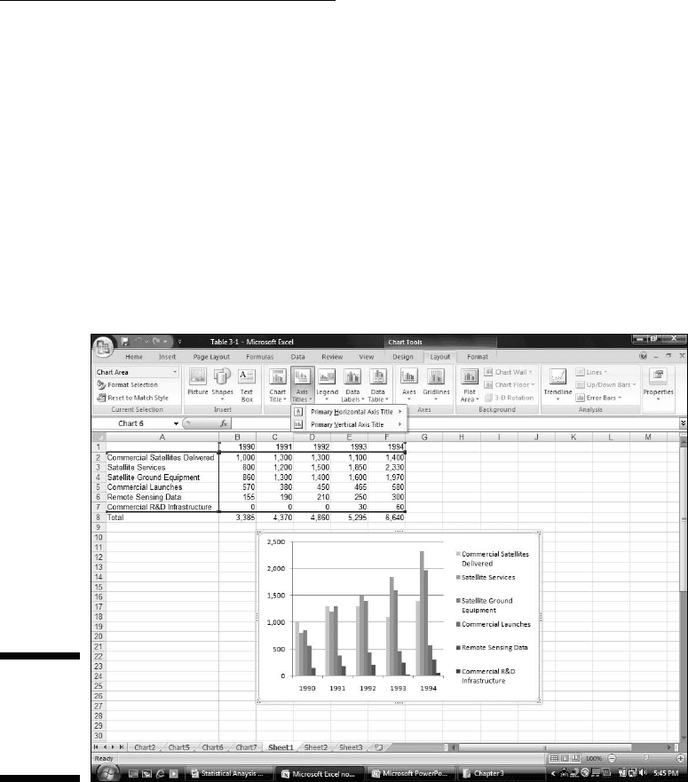
4. Modify the chart.
Figure 3-5 shows the resulting chart, as well as the Design tab and the
Layout tab. As you can see, I have to do some heavyweight modifying.
Why? Excel has guessed wrong about how I wanted to design the chart.
It looks okay, but it’s not. Rather than the years on the x-axis, Excel laid
out the industry types. In other words, it interchanged the rows and
columns.
Figure 3-5:
The semi-
finished
graph —
based on a
bad guess
By Excel.
08 454060-ch03.indd 6008 454060-ch03.indd 60 4/21/09 7:19:56 PM4/21/09 7:19:56 PM
61
Chapter 3: Show and Tell: Graphing Data
Fortunately, Excel provides a quick fix. Figure 3-5 shows the Design tab
selected. In the Design | Data area, the choice on the left is Switch Row/
Column. So . . . selecting Design | Data | Switch Row/Column does the
trick.
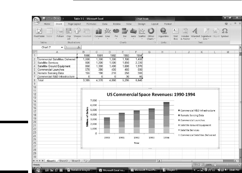
Some work remains. The axes aren’t labeled yet, and the graph has no
title. Here’s where the Layout tab comes into play. Figure 3-6 shows
Layout | Axis Titles selected, along with the drop-down menu that
allows you to add the title for each axis. Primary Horizontal Axis Title
and Primary Vertical Axis Title provide options for laying out the axis
titles. Layout | Chart Title does the same for the title of the chart.
Adding the titles finishes things off. The result looks like the chart in
Figure 3-1.
Figure 3-6:
The Layout
tab enables
you to add
titles.
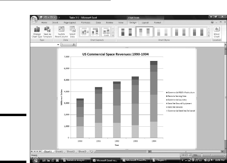
Stacking the columns
If I had selected Column’s second subtype — Stacked Column — I would have
created a set of columns that presents the same information in a slightly dif-
ferent way. Each column represents the total of all the data series at a point
on the x-axis. Each column is divided into segments. Each segment’s size is
proportional to how much it contributes to the total. Figure 3-7 shows this.
08 454060-ch03.indd 6108 454060-ch03.indd 61 4/21/09 7:19:57 PM4/21/09 7:19:57 PM
62
Part II: Describing Data
Figure 3-7:
A stacked
column
graph of
the data in
Table 3-1.
Notice that the data series are in reverse order from the way they’re set up
in the first column graph. Excel sets them up in this order for the stacked col-
umns, and in the other order for the clustered columns.
I inserted each graph into the worksheet. Excel also allows you to move a
graph to a separate page in the workbook. Select Design | Location | Move
Chart (it’s on the extreme right of the Design tab) to open the Move Chart
dialog box. Click the New Sheet radio button to add a worksheet and move
the chart there. Figure 3-8 shows how the chart looks on its own page.
In Appendix C, by the way, I show you another use for the stacked column
chart.
This is a nice way of showing percentage changes over the course of time. If
you just want to focus on percentages in one year, another type of graph is
more effective. I discuss it in a moment, but first I want to tell you . . .
08 454060-ch03.indd 6208 454060-ch03.indd 62 4/21/09 7:19:57 PM4/21/09 7:19:57 PM
63
Chapter 3: Show and Tell: Graphing Data
Figure 3-8:
The stacked
column
chart on its
own
worksheet.
One more thing
Statisticians often use column graphs to show how frequently something occurs.
For example, in a thousand tosses of a pair of dice how many times does a 6 come
up? How many tosses result in a 7? The x-axis shows each possible outcome
of the dice-tosses, and the heights of the columns represent the frequencies.
Whenever the heights represent frequencies, your column graph is a histogram.
It’s easy enough to use Excel’s graphics capabilities to set up a histogram,
but Excel makes it easier still. Excel provides a data analysis tool that does
everything you need to create a histogram. It’s called — believe it or not —
Histogram. You provide an array of cells that hold all the data — like the
outcomes of many dice-tosses, and an array that holds a list of intervals —
like the possible outcomes of the tosses (the numbers 2–12). Histogram goes
through the data array, counts the frequencies within each interval, and then
draws the column graph. I describe this tool in greater detail in Chapter 7.
08 454060-ch03.indd 6308 454060-ch03.indd 63 4/21/09 7:19:58 PM4/21/09 7:19:58 PM
64
Part II: Describing Data
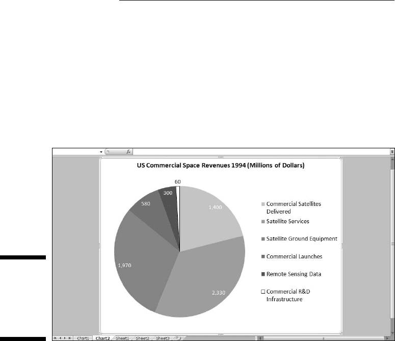
Slicing the Pie
On to the next chart type. To show the percentages that make up one total, a
pie graph gets the job done effectively.
Suppose you want to focus on the U.S. commercial space revenues in 1994 —
that is, on the last column of data in Table 3-1. You’ll catch people’s attention
if you present the data in the form of a pie graph, like the one in Figure 3-9.
Figure 3-9:
A pie graph
of the last
column
of data in
Table 3-1.
Here’s how to create this graph:
1. Enter your data into a worksheet.
Pretty easy, as I’ve already done this.
2. Select the data that go into the chart.
I want the names in column A and the data in column F. The trick is to
select column A (cells A2 through A7)in the usual way and then press
and hold the CTRL key. While holding this key, drag the cursor through
F2 through F7. Voilà — two nonadjoining columns are selected
3. In the Charts area of the Insert tab, select the chart type.
I selected Insert | Pie and then chose the first subtype.
08 454060-ch03.indd 6408 454060-ch03.indd 64 4/21/09 7:19:58 PM4/21/09 7:19:58 PM
65
Chapter 3: Show and Tell: Graphing Data
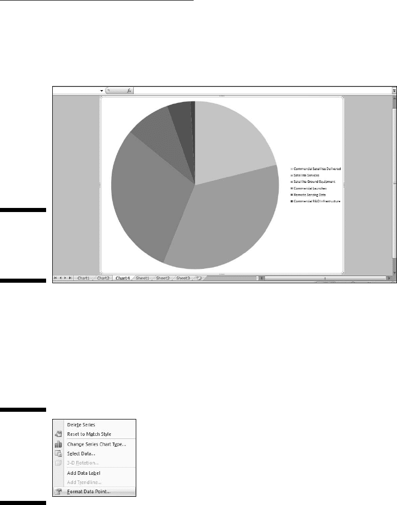
4. Modify the chart.
Figure 3-10 shows the initial pie chart on its own page. To get it to look
like Figure 3-9, I had to do a lot of modifying.
Figure 3-10:
The initial
pie chart
on its own
page.
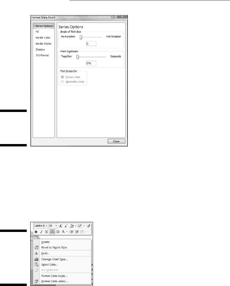
The little slice filled in black represents 1 percent of the pie (Commercial
R&D Infrastructure) and might be hard to see. I changed the fill color
from black to white and added a border. How? I clicked on that slice
and several slices were selected. Clicking again isolated it. Then I right-
clicked to open the menu in Figure 3-11. Choosing Format Data Point
opens the Format Data Point dialog box (Figure 3-12). I worked with Fill
and Border to change the slice to a white fill with a black border.
Figure 3-11:
Right-
clicking an
isolated pie
chart slice
opens this
menu.
08 454060-ch03.indd 6508 454060-ch03.indd 65 4/21/09 7:19:58 PM4/21/09 7:19:58 PM
66
Part II: Describing Data
Figure 3-12:
The Format
Data Point
dialog box.
I selected Layout | Data Labels | Best Fit to add the data to each slice.
With the data labels selected, I right-clicked to open a couple of menus
(Figure 3-13) that enabled me to manipulate the color and size of the
data label font. After I made them all white, the label outside the small
slice became invisible, but right-clicking in its area allowed me to reset
its font to black. Right-clicking on the legend brings up the same menus
for modifying the size of the font in the legend.
Figure 3-13:
Menus for
manipulat-
ing the color
and size of
the data
label font.
Pulling the slices apart
One variant of the pie chart is to explode the slices. I’m not particularly fond
of this type of graph, but you might be. In some circumstances, it might come
in handy.
08 454060-ch03.indd 6608 454060-ch03.indd 66 4/21/09 7:19:59 PM4/21/09 7:19:59 PM
67
Chapter 3: Show and Tell: Graphing Data
One of the nice things about Excel’s graphics capabilities is that you can
“what-if” to your heart’s content. So . . . after I finish creating the pie chart,
I can explode it. To do that, I click on the chart and select Design | Change
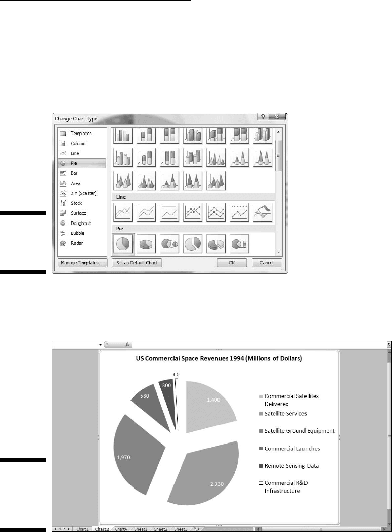
Chart Type. This opens the Change Chart Type dialog box shown in Figure
3-14. Selecting the pie chart subtype that separates the slices (Exploded Pie)
creates the chart in Figure 3-15.
Figure 3-14:
The Change
Chart Type
dialog box.
Whenever you set up a pie graph — whether intact or exploded — always
keep in mind . . . .
Figure 3-15:
The
exploded
version of
Figure 3-9.
08 454060-ch03.indd 6708 454060-ch03.indd 67 4/21/09 7:19:59 PM4/21/09 7:19:59 PM
68
Part II: Describing Data
A word from the wise
Social commentator, raconteur, and former baseball player Yogi Berra once
went to a restaurant and ordered a whole pizza.
“How many slices should I cut,” asked the waitress, “four or eight?”
“Better make it four,” said Yogi, “I’m not hungry enough to eat eight.”
Yogi’s insightful analysis leads to a useful guideline about pie graphs: They’re
more digestible if they have fewer slices. If you cut a pie graph too fine,
you’re likely to leave your audience with information overload.
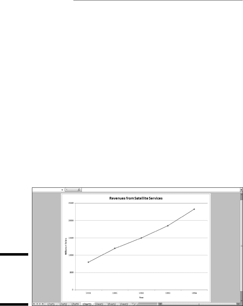
Drawing the Line
In the preceding example, I focused on one column of data from Table 3-1. In
this one, I focus on one row. The idea is to trace the progress of one space-
related industry across the years 1990–1994. In this example, I graph the
revenues from Satellite Services. The final product, shown on its own page, is
Figure 3-16.
Figure 3-16:
A line graph
of the sec-
ond Row
of Data in
Table 3-1.
A line graph is a good way to show change over time, when you aren’t deal-
ing with too many data series. If you try to graph all six industries on one line
graph, it begins to look like spaghetti.
08 454060-ch03.indd 6808 454060-ch03.indd 68 4/21/09 7:19:59 PM4/21/09 7:19:59 PM