Schmuller J. Statistical Analysis with Excel For Dummies
Подождите немного. Документ загружается.

49
Chapter 2: Understanding Excel’s Statistical Capabilities
To start, click the Office Button and select Excel Options. Doing this opens
the Excel Options dialog box. Then follow these steps:
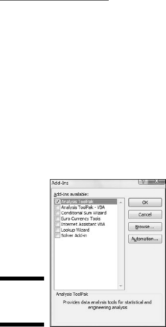
1. In the Excel Options dialog box, select Add-Ins.
Oddly enough, this opens a list of add-ins.
2. Near the bottom of the list, you see a drop-down list labeled Manage.
From this list, select Excel Add-Ins.
3. Click Go.
This opens the Add-Ins dialog box. (See Figure 2-23.)
4. Click the check box next to Analysis Toolpak and then click OK.
Figure 2-23:
The Add-Ins
dialog box.
When Excel finishes loading the Toolpak, you’ll find a Data Analysis button in
the Analysis area of the Data tab. In general, the steps for using a data analy-
sis tool are:
1. Enter your data into an array.
2. Click Data | Data Analysis to open the Data Analysis dialog box.
3. In the Data Analysis dialog box select the data analysis tool you want
to work with.
4. Click OK (or just double-click the selection) to open the dialog box for
the selected tool.
5. In the tool’s dialog box, enter the appropriate information.
I know this sounds like a cop-out, but each tool is different.
6. Click OK to close the dialog box and see the results.
06 454060-ch02.indd 4906 454060-ch02.indd 49 4/21/09 7:18:52 PM4/21/09 7:18:52 PM
50
Part I: Statistics and Excel: A Marriage Made in Heaven
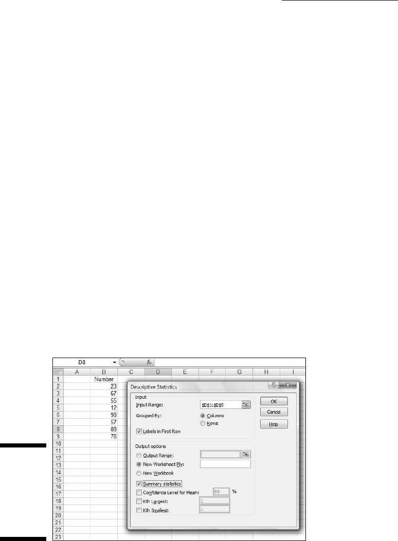
Here’s an example to get you accustomed to using these tools. In this exam-
ple, I go through the Descriptive Statistics tool. This tool calculates a number
of statistics that summarize a set of scores.
1. Enter your data into an array.
Figure 2-24 shows an array of numbers in cells B2 through B9, with a
column header in B1.
2. Click Data | Data Analysis to open the Data Analysis dialog box.
3. Click Descriptive Statistics and click OK (or just double-click
Descriptive Statistics) to open the Descriptive Statistics dialog box.
4. Identify the data array.
In the Input Range box, enter the cells that hold the data. For this
example, that’s B1 through B9. The easiest way to do this is to move
the cursor to the top cell (B1), press the Shift key, and click the bottom
cell (B9). That puts the absolute reference format $B$1:$B$9 into Input
Range.
5. Click the Columns radio button to indicate that the data are organized
by columns.
6. Check the Labels in First Row checkbox, because the Input Range
includes the column heading.
7. Click the New Worksheet Ply radio button, if it isn’t already selected.
This tells Excel to create a new tabbed sheet within the current work-
sheet, and to send the results to the newly created sheet.
Figure 2-24:
Working
with the
Descriptive
Statistics
Analysis
tool.
06 454060-ch02.indd 5006 454060-ch02.indd 50 4/21/09 7:18:52 PM4/21/09 7:18:52 PM
51
Chapter 2: Understanding Excel’s Statistical Capabilities
8. Click the Summary Statistics checkbox and leave the others
unchecked. Click OK.
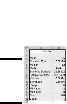
The new tabbed sheet (ply) opens, displaying statistics that summarize
the data. Figure 2-25 shows the new ply, after I widened Column A.
Figure 2-25:
The out-
put of the
Descriptive
Statistics
Analysis
tool.
For now, I won’t tell you the meaning of each individual statistic in the
Summary Statistics display. I leave that for Chapter 7 when I delve more
deeply into descriptive statistics.
Accessing Commonly Used Functions
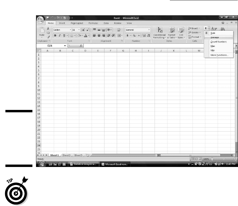
Need quick access to a few commonly used Statistical functions? You can get
to AVERAGE, MIN (minimum value in a selected cell range), and MAX (maxi-
mum value in a selected range) by clicking the down arrow next to a button
on the Home tab. Clicking this down arrow also gets you to the Mathematical
functions SUM and COUNT NUMBERS (counts the numerical values in a cell
range).
For some reason, this button is in the Editing area. It’s labeled Σ. Figure 2-26
shows you exactly where it is and the menu its down arrow opens.
By the way, if you just click the button
Home | Σ
and not the down arrow, you get SUM.
The last selection on that menu is yet another way to open the Insert
Function dialog box.
06 454060-ch02.indd 5106 454060-ch02.indd 51 4/21/09 7:18:52 PM4/21/09 7:18:52 PM
52
Part I: Statistics and Excel: A Marriage Made in Heaven
Figure 2-26:
The Home
| Σ button
and the
menu its
down arrow
opens.
One nice thing about using this menu — it eliminates a step: When you select
a function, you don’t have to select a cell for the result. Just select the cell
range and the function inserts the value in a cell immediately after the range.
06 454060-ch02.indd 5206 454060-ch02.indd 52 4/21/09 7:18:52 PM4/21/09 7:18:52 PM

Part II
Describing Data
07 454060-pp02.indd 5307 454060-pp02.indd 53 4/21/09 7:19:28 PM4/21/09 7:19:28 PM

In this part . . .
H
ere’s where you learn how to use statistics to sum-
marize and describe data. I begin by showing you
how to use the Excel graphics capabilities to produce the
kinds of graphs statisticians use. From there, I move on
to descriptive statistics — average, variance, standard
deviation, and some others. I tell you how to combine a
couple of these statistics to standardize scores. Finally,
I describe the normal distribution, a very important topic
in statistics. Along the way, you find out about Excel func-
tions and data analysis tools that cover all the statistical
ideas in this part.
07 454060-pp02.indd 5407 454060-pp02.indd 54 4/21/09 7:19:29 PM4/21/09 7:19:29 PM

Chapter 3
Show and Tell: Graphing Data
In This Chapter
▶ Introducing graphs
▶ Working with Excel’s graphics capabilities
▶ Creating graphs for statistical work
T
he visual presentation of data is extremely important in statistics. Visual
presentation enables you to discern relationships and trends you might
not see if you just look at numbers. Visual presentation helps in another way:
It’s valuable for presenting ideas to groups and making them understand
your point of view.
Graphs come in many varieties. In this chapter, I explore the types of graphs
you use in statistics and when it’s advisable to use them. I also show you how
to use Excel to create those graphs.
Why Use Graphs?
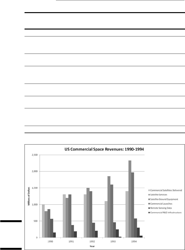
Suppose you have to make a pitch to a Congressional committee about com-
mercial space revenues in the early 1990s.
Which would you rather present? The data in Table 3-1, or the graph in
Figure 3-1 that shows the same data? (The data, by the way, are from the U.S.
Department of Commerce, via the Statistical Abstract of the U.S.)
08 454060-ch03.indd 5508 454060-ch03.indd 55 4/21/09 7:19:54 PM4/21/09 7:19:54 PM
56
Part II: Describing Data
Table 3-1 US Commercial Space Revenues from 1990
through 1994 (In Millions of Dollars)
Industry 1990 1991 1992 1993 1994
Commercial
Satellites
Delivered
1,000 1,300 1,300 1,100 1,400
Satellite
Services
800 1,200 1,500 1,850 2,330
Satellite
Ground
Equipment
860 1,300 1,400 1,600 1,970
Commercial
Launches
570 380 450 465 580
Remote
Sensing Data
155 190 210 250 300
Commercial
R&D
Infrastructure
0 0 0 30 60
Total 3,385 4,370 4,860 5,295 6,640
Figure 3-1:
Graphing
the data in
Table 3-1.
08 454060-ch03.indd 5608 454060-ch03.indd 56 4/21/09 7:19:54 PM4/21/09 7:19:54 PM

57
Chapter 3: Show and Tell: Graphing Data
Which one would have a greater and more lasting impact? Although the
table is certainly informative, most would argue that the graph gets the point
across better and more memorably. Eyes that glaze over when looking at
numbers often shine brighter when looking at pictures.
The graph shows you trends you might not see as quickly on the table.
(Satellite services rose fastest. Commercial launches, not so much.) Bottom
line: Tables are good, graphs are better.
Graphs help bring concepts to life that might otherwise be difficult to under-
stand. In fact, I do that throughout the book. I illustrate points by . . . well . . .
illustrating points!
Some Fundamentals
Like the graph in Figure 3-1, most graph formats have a horizontal axis and
a vertical axis. The pie graph, a format I show you later in this chapter, does
not. By convention, the horizontal axis is also called the x-axis and the verti-
cal axis is also called the y-axis.
Also, by convention, what goes on the horizontal axis is called the indepen-
dent variable and what goes on the vertical axis is called the dependent vari-
able. One of Excel’s graph formats reverses that convention, and I bring that
to your attention when I cover it.
Just to give you a heads up, Excel calls that reversed-axis format a bar graph.
You might have seen the graph in Figure 3-1 referred to as a bar graph. So
have I. Excel calls Figure 3-1 a column graph, so I use “columns” from here on.
Getting back to “independent” and “dependent,” those terms imply that
changes in the vertical direction depend (at least partly) on changes in the
horizontal direction.
Another fundamental principle of creating a graph: Don’t wear out the view-
er’s eyes! If you put too much into a graph in the way of information or spe-
cial effects, you defeat the whole purpose of the graph.
For example, in Figure 3-1 I had to make some choices about filling in the
columns. Color-coded columns would have been helpful, but the page you’re
looking at only shows black, white, and shades of gray.
A lot of graph creation comes with experience, and you just have to use
your judgment. In this case, my judgment came into play with the horizontal
gridlines. In most graphs, I prefer not to have them. Here, they seem to add
08 454060-ch03.indd 5708 454060-ch03.indd 57 4/21/09 7:19:56 PM4/21/09 7:19:56 PM

58
Part II: Describing Data
structure and help the viewer figure out the dollar value associated with each
column. But then again, that’s just my opinion.
Excel’s Graphics Capabilities
As I mention a couple of paragraphs ago, the graph in Figure 3-1 is a column
graph. It’s one of many types of graphs you can create with Excel. Of all the
graphics possibilities Excel provides, however, only a few are useful for sta-
tistical work. Those are the ones I cover in this chapter.
In addition to the column graph, I show you how to create pie graphs, bar
graphs, line graphs, and scatter plots. Excel refers to each one as a chart
rather than a “graph.” In this chapter, I use the two terms interchangeably.
Inserting a chart
In Excel 2007, you insert a chart into a spreadsheet. This immediately clues
you that the chart creation tools are in the Charts area of the Insert tab. (See
Figure 3-2.)
Figure 3-2:
The Charts
area of the
Insert tab.
In Excels past a Chart Wizard guided you step by step through chart creation.
The chart took shape within the wizard as you worked. You didn’t see the full
chart on the worksheet (or on a separate page) until you closed the wizard.
Excel 2007 turns the process inside out and simplifies it. Instead of making
decisions within the wizard (which is no longer available), you immediately
insert a chart into your spreadsheet. Then you use Design and Layout capa-
bilities to modify the chart and make it look just the way you want it.
You follow these steps:
1. Enter your data into a worksheet.
2. Select the data that go into the chart.
08 454060-ch03.indd 5808 454060-ch03.indd 58 4/21/09 7:19:56 PM4/21/09 7:19:56 PM