Schmuller J. Statistical Analysis with Excel For Dummies
Подождите немного. Документ загружается.

129
Chapter 7: Summarizing It All
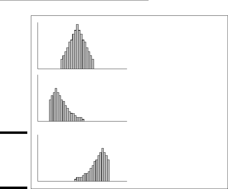
Figure 7-6:
Three his-
tograms
showing
three kinds
of skew-
ness.
Symmetric: Skewness = 0
Skewed to the right: Skewness is positive
Skewed to the left: Skewness is negative
I include this formula for completeness. If you’re ever concerned with skew-
ness, you probably won’t use this formula anyway because Excel’s SKEW
function does the work for you.
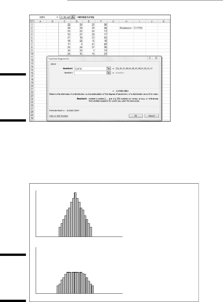
To use SKEW:
1. Type your numbers into a worksheet and select a cell for the result.
For this example, I’ve entered scores into the first ten rows of columns
C, D, E, and F. (See Figure 7-7.) I selected cell I2 for the result.
2. From the Statistical Functions menu, select SKEW to open the Function
Arguments dialog box for SKEW.
3. In the Function Arguments dialog box, type the appropriate values for
the arguments.
In the Number1 box, enter the array of cells that holds the data. For this
example, the array is C1:F10. With the data array entered, the Function
Arguments dialog box shows the skewness, which for this example is
negative.
4. Click OK to put the result into the selected cell.
12 454060-ch07.indd 12912 454060-ch07.indd 129 4/21/09 7:22:39 PM4/21/09 7:22:39 PM
130
Part II: Describing Data
Figure 7-7:
Using the
SKEW
function to
calculate
skewness.
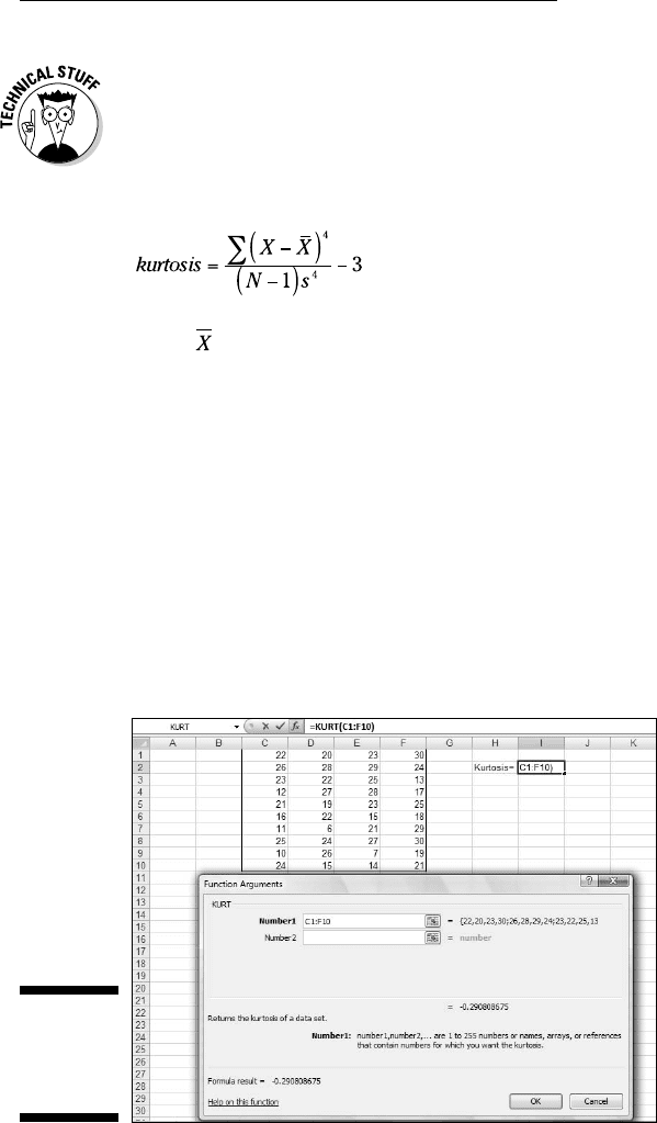
KURT
Figure 7-8 shows two histograms. The first has a peak at its center, the
second is flat. The first is said to be leptokurtic. Its kurtosis is positive. The
second is platykurtic. Its kurtosis is negative.
Figure 7-8:
Two his-
tograms
showing
two kinds of
kurtosis.
Leptokurtic: Kurtosis is positive
Platykurtic: Kurtosis is negative
12 454060-ch07.indd 13012 454060-ch07.indd 130 4/21/09 7:22:39 PM4/21/09 7:22:39 PM
131
Chapter 7: Summarizing It All
Negative? Wait a second. How can that be? I mentioned earlier that kurtosis
involves the sum of fourth powers of deviations from the mean. Because four
is an even number, even the fourth power of a negative deviation is positive. If
you’re adding all positive numbers, how can kurtosis ever be negative?
Here’s how. The formula for kurtosis is
where is the mean of the scores, N is the number of scores, and s is the
standard deviation.
Uh . . . why 3? The 3 comes into the picture because that’s the kurtosis of
something special called the standard normal distribution. (I discuss the
normal distribution at length in Chapter 8.) Technically, statisticians refer to
this formula as kurtosis excess — meaning that it shows the kurtosis in a set
of scores that’s in excess of the standard normal distribution’s kurtosis. If
you’re about to ask the question “Why is the kurtosis of the standard normal
distribution equal to 3?” don’t ask.
This is another formula you’ll probably never use because Excel’s KURT func-
tion takes care of business. Figure 7-9 shows the scores from the preceding
example, a selected cell, and the Function Arguments dialog box for KURT.
Figure 7-9:
Using KURT
to calculate
kurtosis.
12 454060-ch07.indd 13112 454060-ch07.indd 131 4/21/09 7:22:39 PM4/21/09 7:22:39 PM

132
Part II: Describing Data
To use KURT:
1. Enter your numbers into a worksheet and select a cell for the result.
For this example, I entered scores into the first ten rows of columns C,
D, E, and F. I selected cell I2 for the result.
2. From the Statistical Functions menu, select KURT to open the Function
Arguments dialog box for KURT.
3. In the Function Arguments dialog box, enter the appropriate values
for the arguments.
In the Number1 box, I entered the array of cells that holds the data.
Here, the array is C1:F10. With the data array entered, the Function
Arguments dialog box shows the kurtosis, which for this example is
negative.
4. Click OK to put the result into the selected cell.
Tuning In the Frequency
Although the calculations for skewness and kurtosis are all well and good,
it’s helpful to see how the scores are distributed. To do this, you create a fre-
quency distribution, a table that divides the possible scores into intervals and
shows the number (the frequency) of scores that fall into each interval.
Excel gives you two ways to create a frequency distribution. One is a work-
sheet function, the other is a data analysis tool.
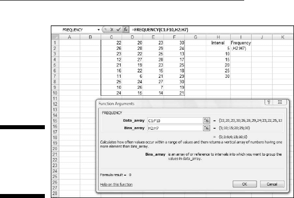
FREQUENCY
I show you the FREQUENCY worksheet function in Chapter 2 when I intro-
duce array functions. Here, I give you another look. In the upcoming example,
I reuse the data from the skewness and kurtosis discussions so you can see
what the distribution of those scores looks like.
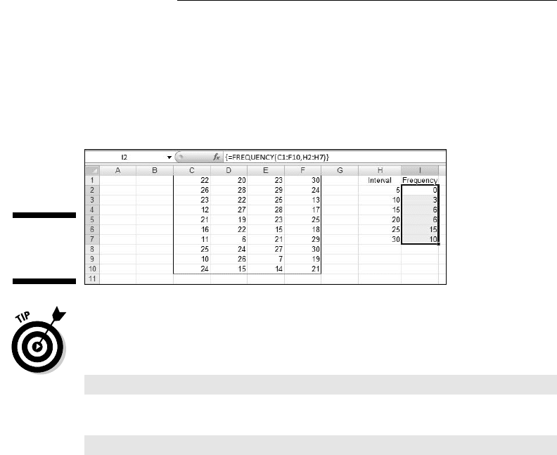
Figure 7-10 shows the data once again, along with a selected array, labeled
Frequency. I’ve also added the label Intervals to a column, and in that column
I put the interval boundaries. Each number in that column is the upper bound
of an interval. The figure also shows the Function Arguments dialog box for
FREQUENCY.
12 454060-ch07.indd 13212 454060-ch07.indd 132 4/21/09 7:22:40 PM4/21/09 7:22:40 PM
133
Chapter 7: Summarizing It All
Figure 7-10:
Finding the
frequencies
in an array
of cells.
This is an array function, so the steps are a bit different from the functions I
showed you so far in this chapter.
1. Enter the scores into an array of cells.
The array, as in the preceding examples is C1:F10.
2. Enter the intervals into an array.
I entered 5, 10, 15, 20, 25, and 30 into H2:H7.
3. Select an array for the resulting frequencies.
I put Frequency as the label at the top of column I, so I selected I2
through I7 to hold the resulting frequencies.
4. From the Statistical Functions menu, select FREQUENCY to open the
Function Arguments dialog box for FREQUENCY.
5. In the Function Arguments dialog box, enter the appropriate values
for the arguments.
In the Data_array box I entered the cells that hold the scores. In this
example, that’s C1:F10.
FREQUENCY refers to intervals as “bins,” and holds the intervals in the
Bins_array box. For this example, H2:H7 goes into the Bins_array box.
After I identified both arrays, the Function Arguments dialog box shows
the frequencies inside a pair of curly brackets. Look closely at Figure 7-10
and you see that Excel adds a frequency of zero to the end of the set of
frequencies.
12 454060-ch07.indd 13312 454060-ch07.indd 133 4/21/09 7:22:40 PM4/21/09 7:22:40 PM
134
Part II: Describing Data
6. Press Ctrl+Shift+Enter to close the Function Arguments dialog box.
Use this keystroke combination because FREQUENCY is an array function.
When you close the Function Arguments dialog box, the frequencies go into
the appropriate cells, as Figure 7-11 shows.
Figure 7-11:
FREQUENCY’s
frequencies.
If I had assigned the name Data to C1:F10 and the name Interval to H2:H7, and
used those names in the Function Arguments dialog box, the resulting formula
would have been
=FREQUENCY(Data,Interval)
which might be easier to understand than
=FREQUENCY(C1:F10,H2:H7)
(Don’t remember how to assign a name to a range of cells? Take another look
at Chapter 2.)
Data analysis tool: Histogram
Here’s another way to create a frequency distribution — with the Histogram
data analysis tool. To show you that the two methods are equivalent, I use
the data from the FREQUENCY example. Figure 7-12 shows the data along
with the Histogram dialog box.
The steps are:
1. Enter the scores into an array, and enter intervals into another array.
2. Click on Data | Data Analysis to open the Data Analysis dialog box.
3. From the Data Analysis dialog box, select Histogram to open the
Histogram dialog box.
12 454060-ch07.indd 13412 454060-ch07.indd 134 4/21/09 7:22:40 PM4/21/09 7:22:40 PM
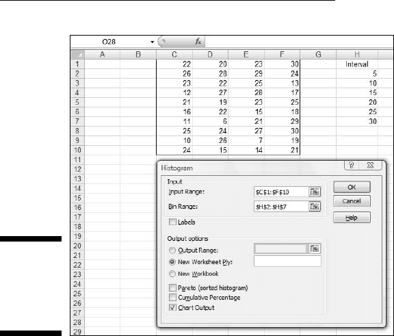
135
Chapter 7: Summarizing It All
Figure 7-12:
The
Histogram
analysis
tool.
4. In the Histogram dialog box, enter the appropriate values.
The data are in cells C1 through F10, so C1:F10 goes into the Input Range
box. The easiest way to enter this array is to click on C1, press and
hold the Shift key, and then click F10. Excel puts the absolute reference
format ($C$1:$F$10) into the Input Range box.
In the Bin Range box, I enter the array that holds the intervals. In this
example, that’s H2 through H7. I click on H2, press and hold the Shift
key, and then click H7. The absolute reference format ($H$2:$H$7)
appears in the Bin Range box.
5. Click the New Worksheet Ply radio button to create a new tabbed
page and to put the results on the new page.
6. Click the Chart Output checkbox to create a histogram and visualize
the results.
7. Click OK to close the dialog box.
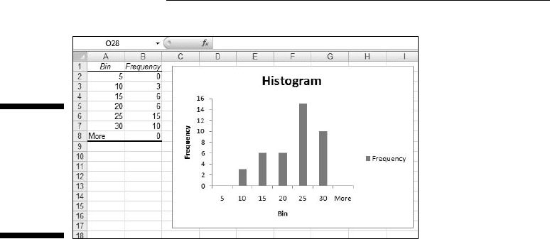
Figure 7-13 shows Histogram’s output. The table matches up with what
FREQUENCY produces. Notice that Histogram adds “More” to the Bin column.
The size of the histogram is somewhat smaller when it first appears. I used
the mouse to stretch the histogram and give it the appearance you see in the
figure. The histogram shows that the distribution does tail off to the left (con-
sistent with the negative skewness statistic) and seems to not have a distinc-
tive peak (consistent with the negative kurtosis statistic).
12 454060-ch07.indd 13512 454060-ch07.indd 135 4/21/09 7:22:40 PM4/21/09 7:22:40 PM
136
Part II: Describing Data
Figure 7-13:
The
Histogram
tool’s out-
put (after I
stretched
the chart).
By the way, the other checkbox options on the Histogram dialog box are
Pareto chart and Cumulative percentage. The Pareto chart sorts the inter-
vals in order from highest frequency to lowest before creating the graph.
Cumulative percentage shows the percentage of scores in an interval com-
bined with the percentages in all the preceding intervals. Checking this box
also puts a cumulative percentage line in the histogram.
Can You Give Me a Description?
If you’re dealing with individual descriptive statistics, the worksheet func-
tions I’ve discussed get the job done nicely. If you want an overall report that
presents just about all the descriptive statistical information in one place,
use the Data Analysis tool I describe in the next section.
Data analysis tool: Descriptive Statistics
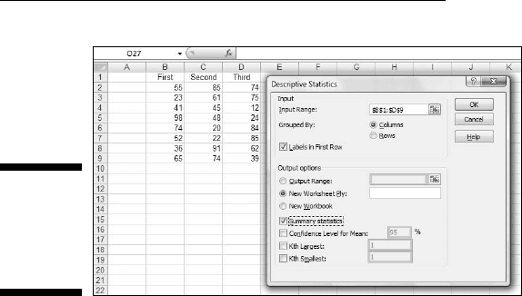
In Chapter 2, I show you the Descriptive Statistics tool to introduce Excel’s
data analysis tools. Here’s a slightly more complex example. Figure 7-14
shows three columns of scores and the Descriptive Statistics dialog box. I’ve
labeled the columns First, Second, and Third so you can see how this tool
incorporates labels.
Here are the steps for using this tool:
1. Enter the data into an array.
12 454060-ch07.indd 13612 454060-ch07.indd 136 4/21/09 7:22:40 PM4/21/09 7:22:40 PM
137
Chapter 7: Summarizing It All
Figure 7-14:
The
Descriptive
Statistics
tool at work.
2. Select Data | Data Analysis to open the Data Analysis dialog box.
3. Choose Descriptive Statistics to open the Descriptive Statistics
dialog box.
4. In the Descriptive Statistics dialog box, enter the appropriate values.
In the Input Range box, I enter the data. The easiest way to do this is to
move the cursor to the upper-left cell (B1), press the Shift key, and click
the lower-right cell (D9). That puts $B$1:$D$9 into Input Range.
5. Click the Columns radio button to indicate that the data are organized
by columns.
6. Check the Labels in First Row checkbox, because the Input Range
includes the column headings.
7. Click the New Worksheet Ply radio button to create a new tabbed
sheet within the current worksheet, and to send the results to the
newly created sheet.
8. Click the Summary Statistics checkbox, and leave the others
unchecked.
9. Click OK to close the dialog box.
The new tabbed sheet (ply) opens, displaying statistics that summarize
the data.
As Figure 7-15 shows, the statistics summarize each column separately.
When this page first opens, the columns that show the statistic names
are too narrow, so the figure shows what the page looks like after I wid-
ened the columns.
12 454060-ch07.indd 13712 454060-ch07.indd 137 4/21/09 7:22:40 PM4/21/09 7:22:40 PM
138
Part II: Describing Data
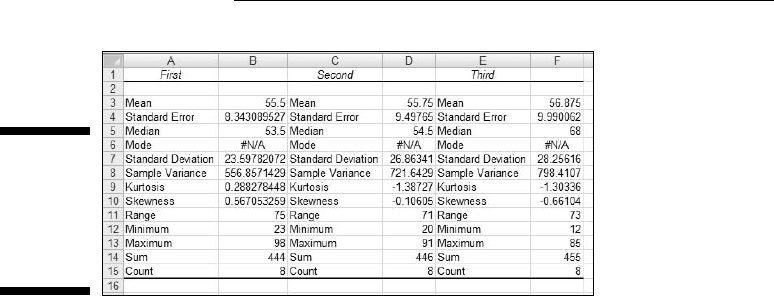
Figure 7-15:
The
Descriptive
Statistics
tool’s
output.
The Descriptive Statistics tool gives values for these statistics: mean, stan-
dard error, median, mode, standard deviation, sample variance, kurtosis,
skewness, range, minimum, maximum, sum, and count. Except for standard
error and range, I’ve discussed all of them.
Range is just the difference between the maximum and the minimum.
Standard error is more involved, and I defer the explanation until Chapter 9.
For now, I’ll just say that standard error is the standard deviation divided by
the square root of the sample size and leave it at that.
By the way, one of the checkboxes left unchecked in the example’s Step 6
provides something called the Confidence Limit of the Mean, which I also
defer until Chapter 9. The remaining two checkboxes, Kth Largest and Kth
Smallest, work like the functions LARGE and SMALL.
Instant Statistics
Suppose you’re working with a cell range full of data. You might like to
quickly know the status of the average and perhaps some other descrip-
tive statistics about the data without going to the trouble of using several
Statistical functions.
You can customize the Status bar at the bottom of the worksheet to track
these values for you and display them whenever you select the cell range.
To do this, right-click the status bar to open the Customize Status Bar menu.
(See Figure 7-16.) In the area second from the bottom, checking all the items
displays the values I mention in the preceding section (along with the count
of items in the range — numerical and non-numerical).
12 454060-ch07.indd 13812 454060-ch07.indd 138 4/21/09 7:22:41 PM4/21/09 7:22:41 PM